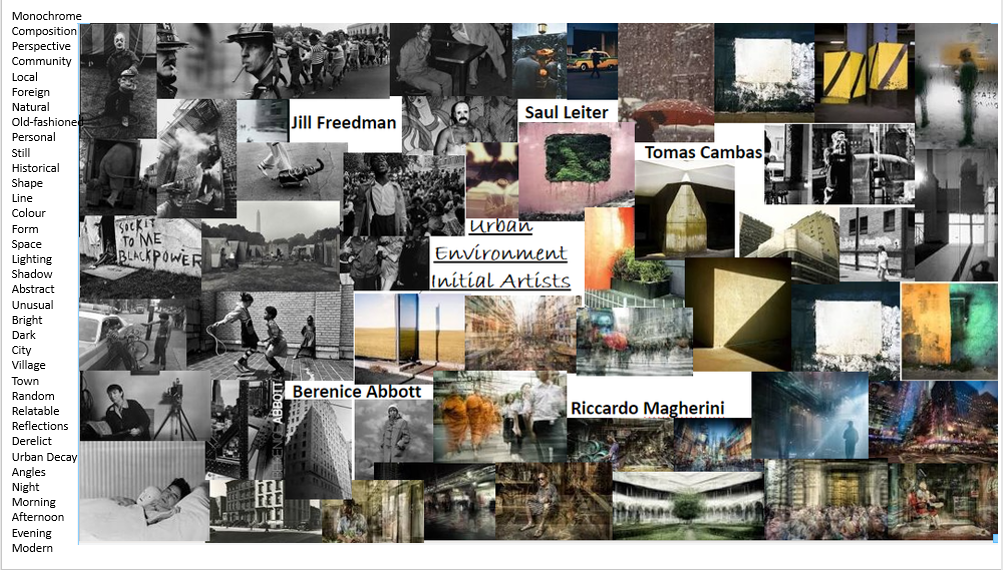
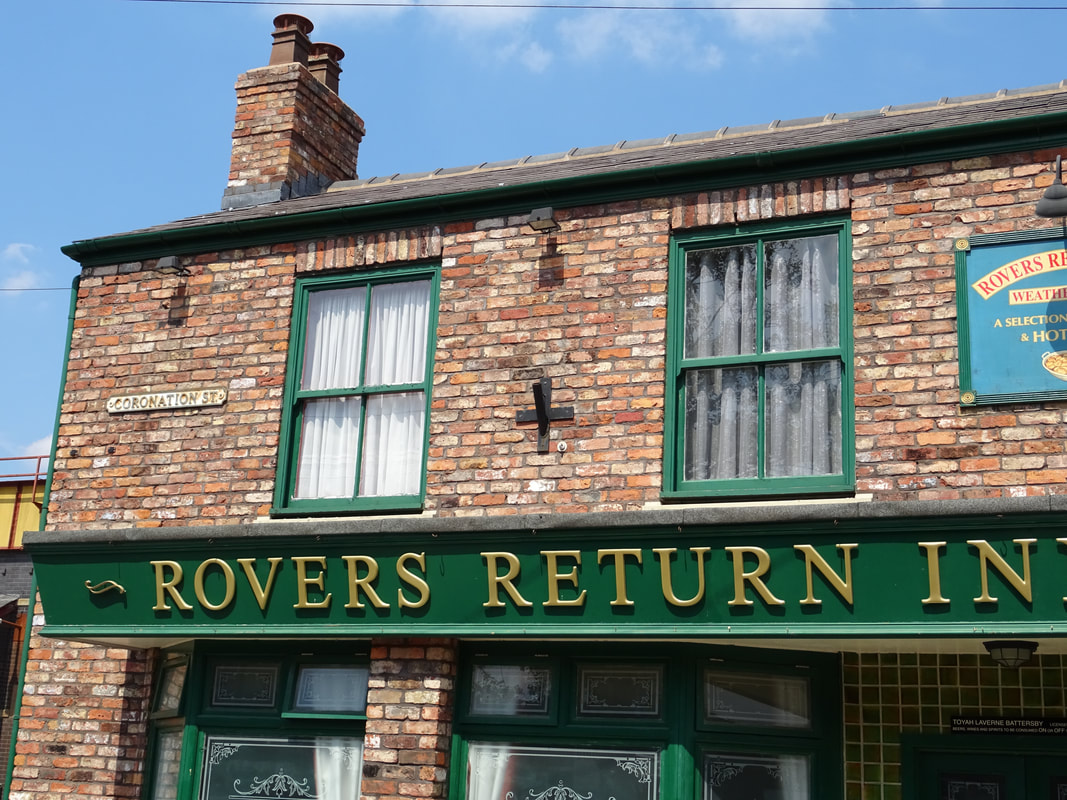
Personal Projects: Urban Environment
|
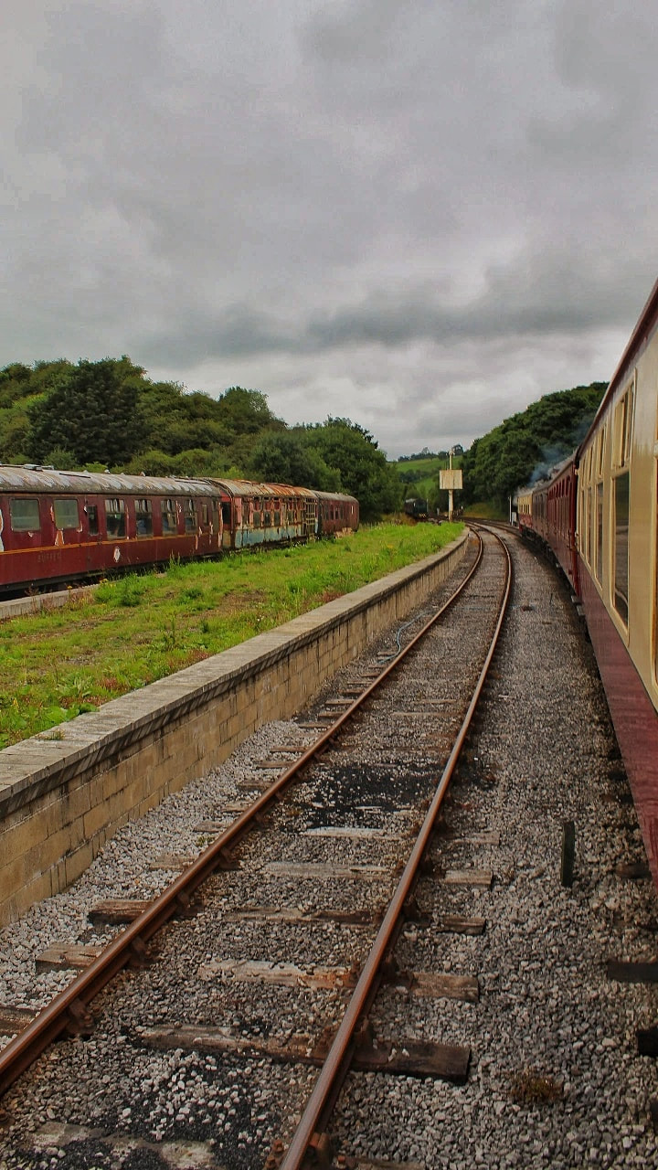
An urban area is the are surrounding a city. Most inhabitants of urban areas have non-agricultural jobs. Urban areas are very developed, meaning there is a density of human structures such as houses, commercial buildings, roads, bridges, and railways.
|
In an urban environment, a church building is a thing of the past. What I like about cities is that everything is king size, the beauty and the ugliness. All great art is born of the metropolis. |
Initial Research:

Urban Photographers:
Artist Research/Jill Freedman:
|
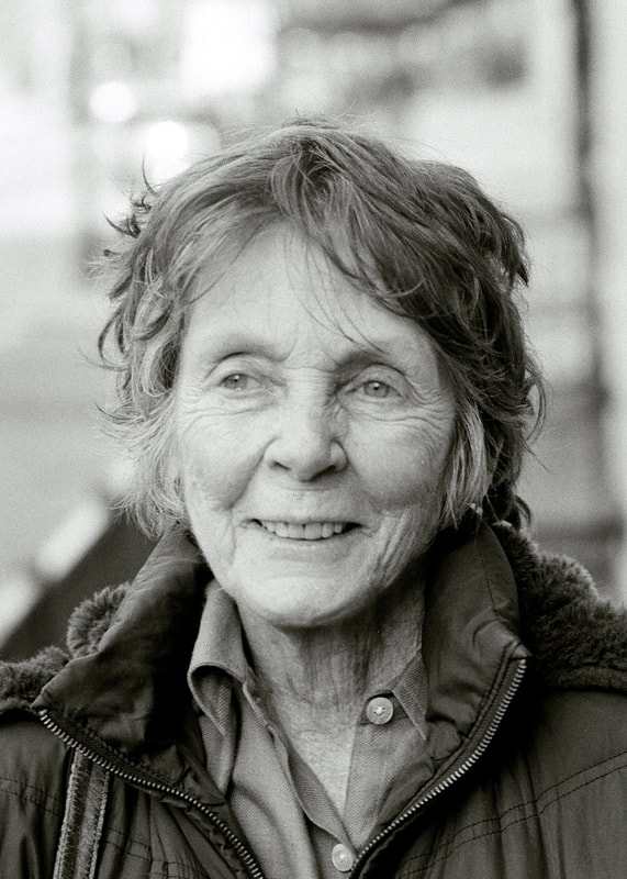
Jill Freedman was best known for her street and documentary photography. She often worked amongst street cops, firefighters, circus performers and other tribes she felt were misunderstood- when doing so, she joined a circus for several months. Freedman regularly took part in demonstrations, with or without her camera. She mainly works in America, specifically areas classed as 'sleazy'. Unsurprisingly, she studied sociology and human behaviour. Born in October 1930, Freedman lived through and photographed many major historic events before sadly dying of cancer in October 2019, 10 days before her birthday. “I set out to deglamourize violence,” Freedman told the New York Times in 2015. |
|


I chose Jill Freedman as my favourite artist as her work captured me upon first glance- she somehow manages to take photographs which include such common sights and make them dramatic, confusing, funny and questionable. For the younger generations, these images aren't as common in real life, due to tighter restrictions- before and during the COVID-19 pandemic; this gives the photographs a sense of familiarity, except we experience them through more modern means. For example, instead of seeing equality preaches on the street, we see them on social media. Overall, I believe I was drawn to her photography as it holds elements of history and informality.
Shoot Plan/Jill Freedman:
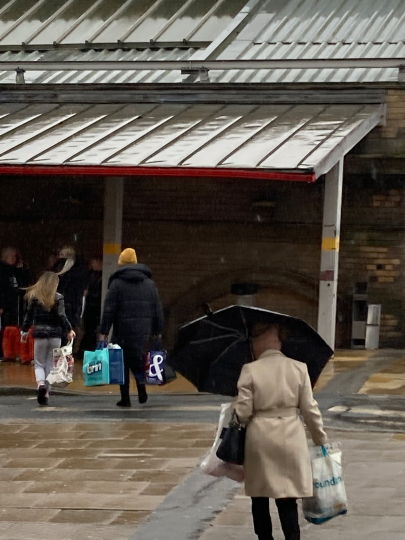
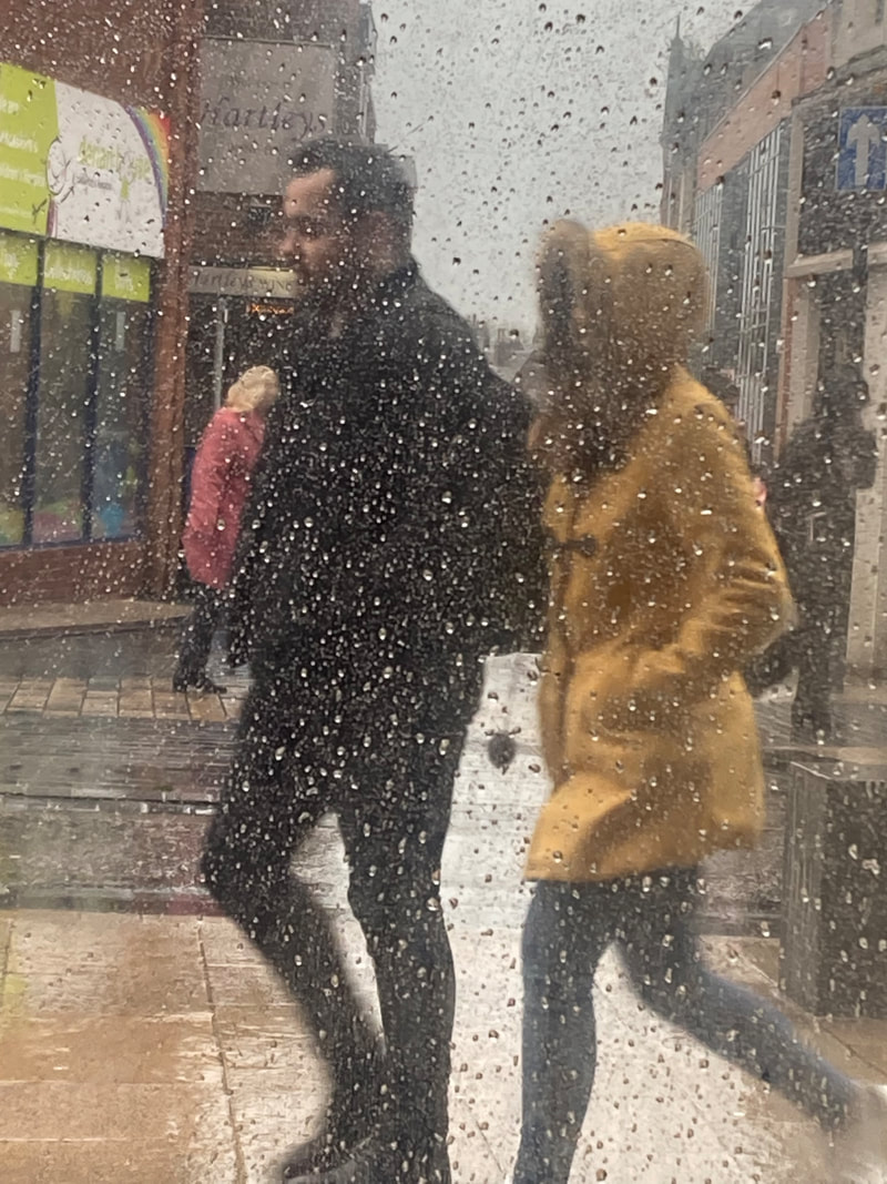
To emulate Freedman's images at home I would most likely go to more populated areas where protests are common, then to rural areas where the communities are rather tight knitted. For the protests idea, they will probably be based around the covid vaccine, climate change, human rights (gender and race equality) and other topics which appear to have been a big issue recently. This will include places like town centres, London, Edinburgh and others. Then, more isolated places were children and adults are free to connect and do things without judgement from others.
Obviously, it'd be extremely difficult to recreate the same images as time was different then and I'm located in a different environment. This means another idea could be instead of attempting to portray the same meaning behind each image, I'm going to show how times have changed.
This means instead of the police connected with others and being friendly, it'll illustrate police brutality and protests against them. Instead of a child running along the top of a building freely, it'd be a parent scared to let their child out of their sight. Instead of a community gathering or two siblings fighting, a group on their phones- bored and silent. Instead of 'living in the moment', taking pictures and videos on their phones to show off to their Instagram followers.
Additionally, I will also take the images at different times of the day- this is because I would like to capture a wide variety of subjects and actions within/around the urban environment which portrays the type of area it is. As mentioned multiple times, I believe the images which captures peoples attention for the longest are those which portray a story- the time of day and type of weather largely influences the illustration of the photograph. This is why I would like to include a large range.
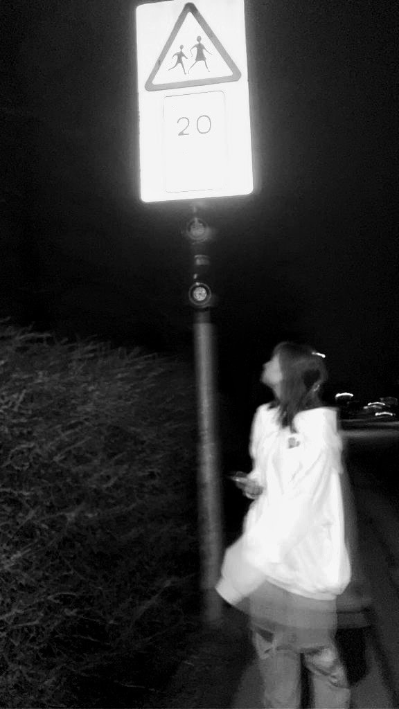
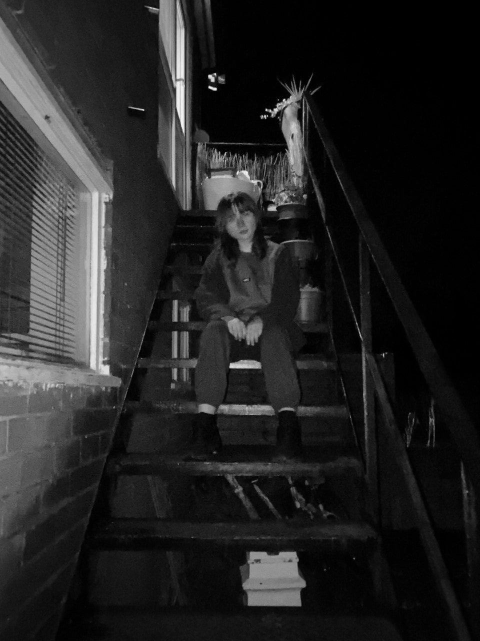
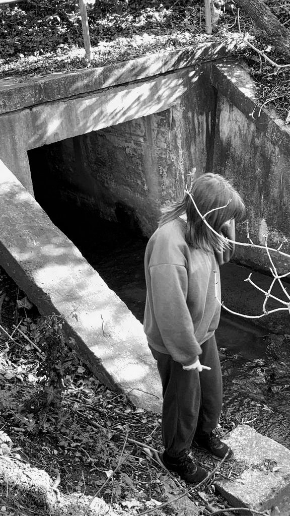
To take these images I will most likely use a low-quality video camera which portrays a vintage affect and a DSLR 4000D for more modern, high quality images. Unless I'm in the actual image, I would prefer not to use a tripod as I think it stops the 'capturing the moment' vibe which Freedman attempts to show.
After the images are taken, I intend to add a monochrome filter before increasing and decreasing the highlights and shadows. If there are any aberrations within the image I will most likely not edit them out as the small defects add to the unedited, old and vintage aura.
Obviously, it'd be extremely difficult to recreate the same images as time was different then and I'm located in a different environment. This means another idea could be instead of attempting to portray the same meaning behind each image, I'm going to show how times have changed.
This means instead of the police connected with others and being friendly, it'll illustrate police brutality and protests against them. Instead of a child running along the top of a building freely, it'd be a parent scared to let their child out of their sight. Instead of a community gathering or two siblings fighting, a group on their phones- bored and silent. Instead of 'living in the moment', taking pictures and videos on their phones to show off to their Instagram followers.
Additionally, I will also take the images at different times of the day- this is because I would like to capture a wide variety of subjects and actions within/around the urban environment which portrays the type of area it is. As mentioned multiple times, I believe the images which captures peoples attention for the longest are those which portray a story- the time of day and type of weather largely influences the illustration of the photograph. This is why I would like to include a large range.
To take these images I will most likely use a low-quality video camera which portrays a vintage affect and a DSLR 4000D for more modern, high quality images. Unless I'm in the actual image, I would prefer not to use a tripod as I think it stops the 'capturing the moment' vibe which Freedman attempts to show.
After the images are taken, I intend to add a monochrome filter before increasing and decreasing the highlights and shadows. If there are any aberrations within the image I will most likely not edit them out as the small defects add to the unedited, old and vintage aura.
Thoughts on images/Jill Freedman:

|
This is certainly my favourite of all Jill Freedman's images, its an unusual sight in what appears to be an ordinary place. Its a scene out of every animal-circus animation, yet its real life. We see a male next to the lorry, though his expression isn't clear we can assume he's realised they have a slight dilemma- this may cause us think of how they managed to get the elephant in the vehicle in the end.
Due to the unusualness of Freedman's images, it will most likely be very difficult to emulate her work. This means to take the images to the best of my ability, it will have to be done over multiple weeks as to give me enough time to find unique scenarios. Once the photographs have been taken, I will edit them with the sepia and monochrome filter, before adjusting more specific settings such as highlights and shadows.
|
"I hate cheap hate pictures that make people look like they're not worth much, just to prove a photographer's point."
-Jill Freedman
|
This is also another of my favourite photographs taken by Freedman. In the image, we notice a man with what appears to be blood splattered across his face and then another, much cleaner, man leaning into the photograph, in what we infer is some sort of bar. The man sat down seems to be in scruffy, worker gear which suggests he had a bad accident in possibly a mine, which then leads us to wonder if the other man is his boss. However, we will most likely never know. |

|
Semi Analysis/Jill Freedman:

|
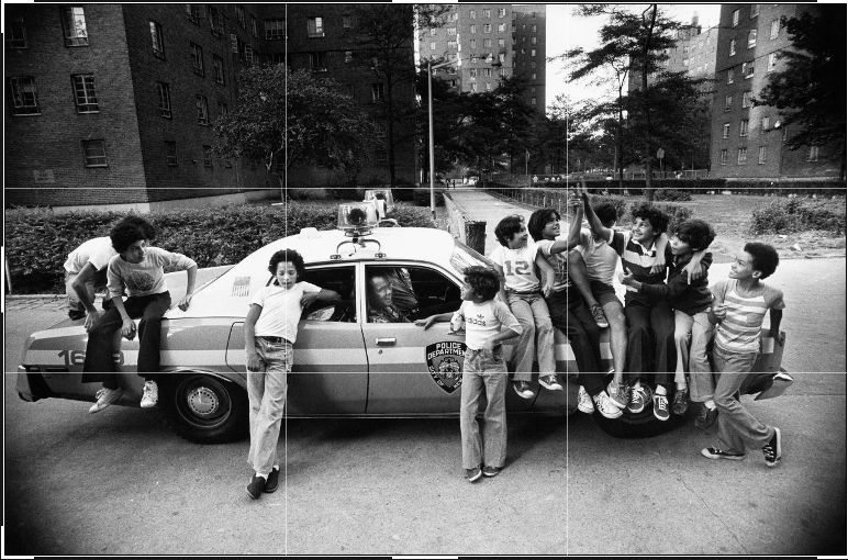
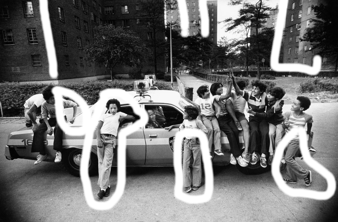
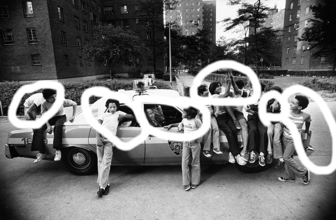
The photographer of this image is called Jill Freedman, a woman best known for her combination of monochrome street and documentary photography. This image is part of her portfolio 'Street Cops' 1978-1981, the genre being everything from portraiture and identity to documentary and street photography. In this picture there are many children, two policemen and a police car; however, I don't believe Freedman would refer to them as props, but more subjects and models.
The children, as previously mentioned, are crowded around and climbing on a police car- messing about and having fun whilst the policemen appear to be chatting to them through the window. The composition of the car and children allow us to infer the police mean no harm to the younger generations, as we would have believed if they were in a different, more violent, position. The rule of thirds appears to have been used, demonstrated by the image to the left. The viewers eye is led towards the middle before slowly moving around the image, capturing the urban background which consists of tall, tower block buildings which could possibly be council houses- this suggests a poorer neighbourhood, further backed up by the car, which seems rather run down- or at least, not as modern as we are used to. Freedman took the image from eye level, suggesting she was wondering around, without a tripod; this could strongly imply the photograph was not set up and Freedman just happened to be in the right place, at the right time. The photographer employs numerous visual and physical elements in her work, the most common being line and shape. Line is shown by the straight legged jeans and buildings, whilst shape is shown by their poses (this also portrays line.) The image was obviously taken outside with natural lighting, which appears to be sunny- further suggesting the children were just outside playing as the image was taken. The highlights and shadows which occur in the image due to the monotone colours allow the car to stand out beneath the kids, drawing our eyes there initially. Honestly, I don't think I'd be able to emulate this image if I tried- it's simply too unique. However, I could attempt to find a situation which reminds me of Freedman's work and photograph that, though it may be more staged and tense than hers appear. Lastly, I believe Freedman was trying to convey the positive affects of racial segregation- we notice everyone in the image appears to be of one race and the buildings in the background look like the council houses of the black community around the time the image was taken. I think she was trying to show how happy, content and peaceful they are in that tight-knit community, which contrasts to the unexplainable anger some of the white communities felt against them. |

|

|

|

|

|

|
Tap images below for related videos:
|
|
|
Contact Sheet/Jill Freedman:
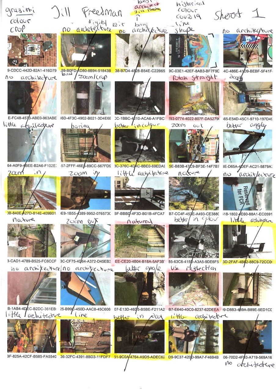
|
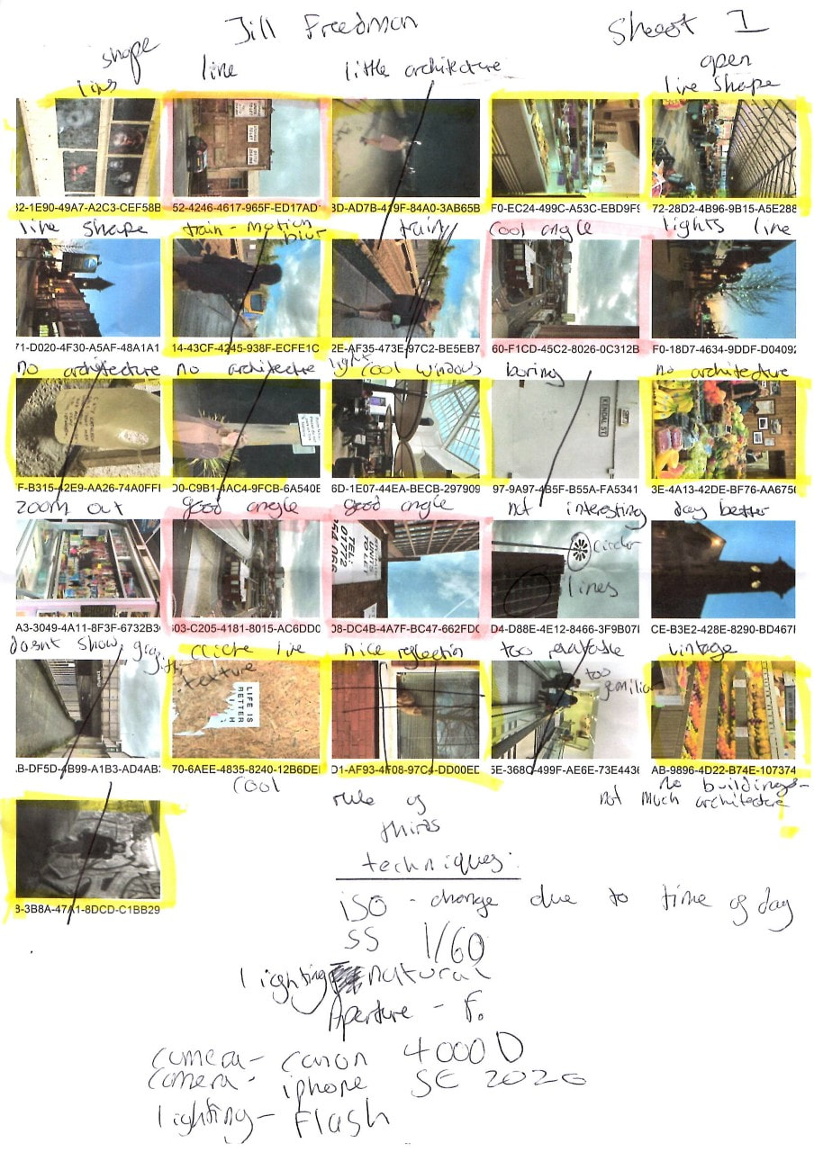
|
Shoot/Best Edits/Jill Freedman:
Editing techniques:
|
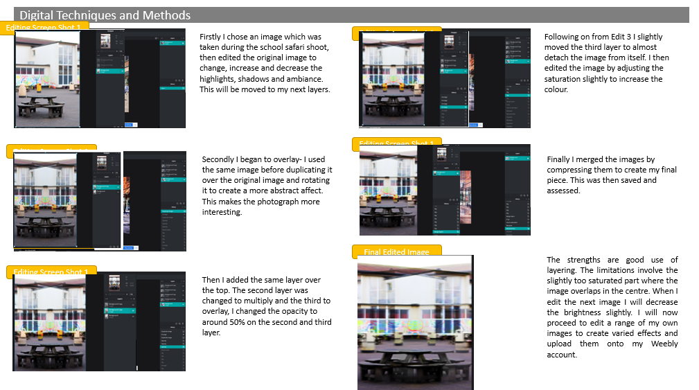
On PIXLR E I used the monochrome tool to change my images from their original colour to black and white. Continuing with the monochrome editing, I increased the highlights and decreased the shadows to add contrast to the images. Lastly, I adjusted the exposure and curves to achieve the best results. |
|
|
|
Evaluation/Jill Freedman:
|
|
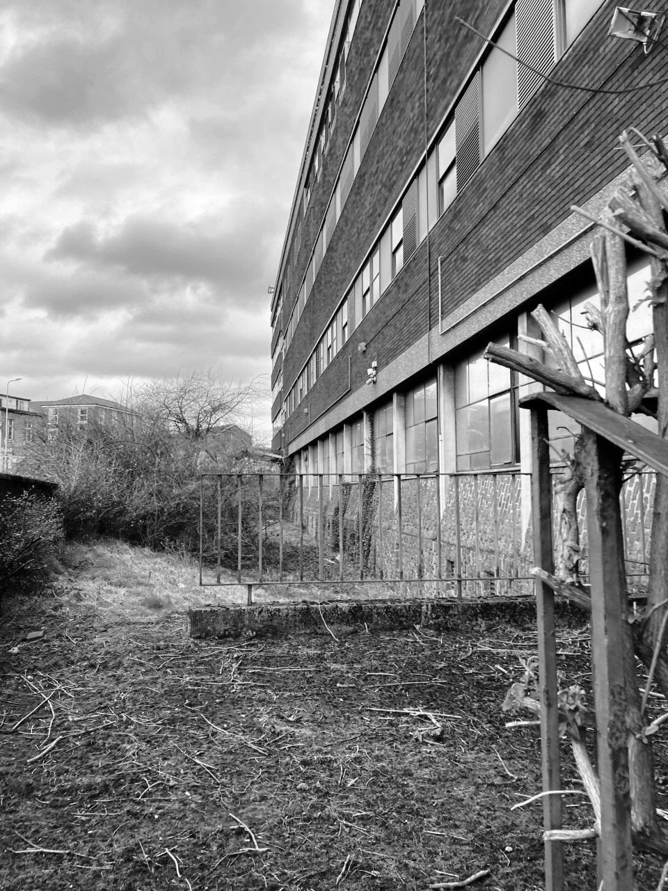
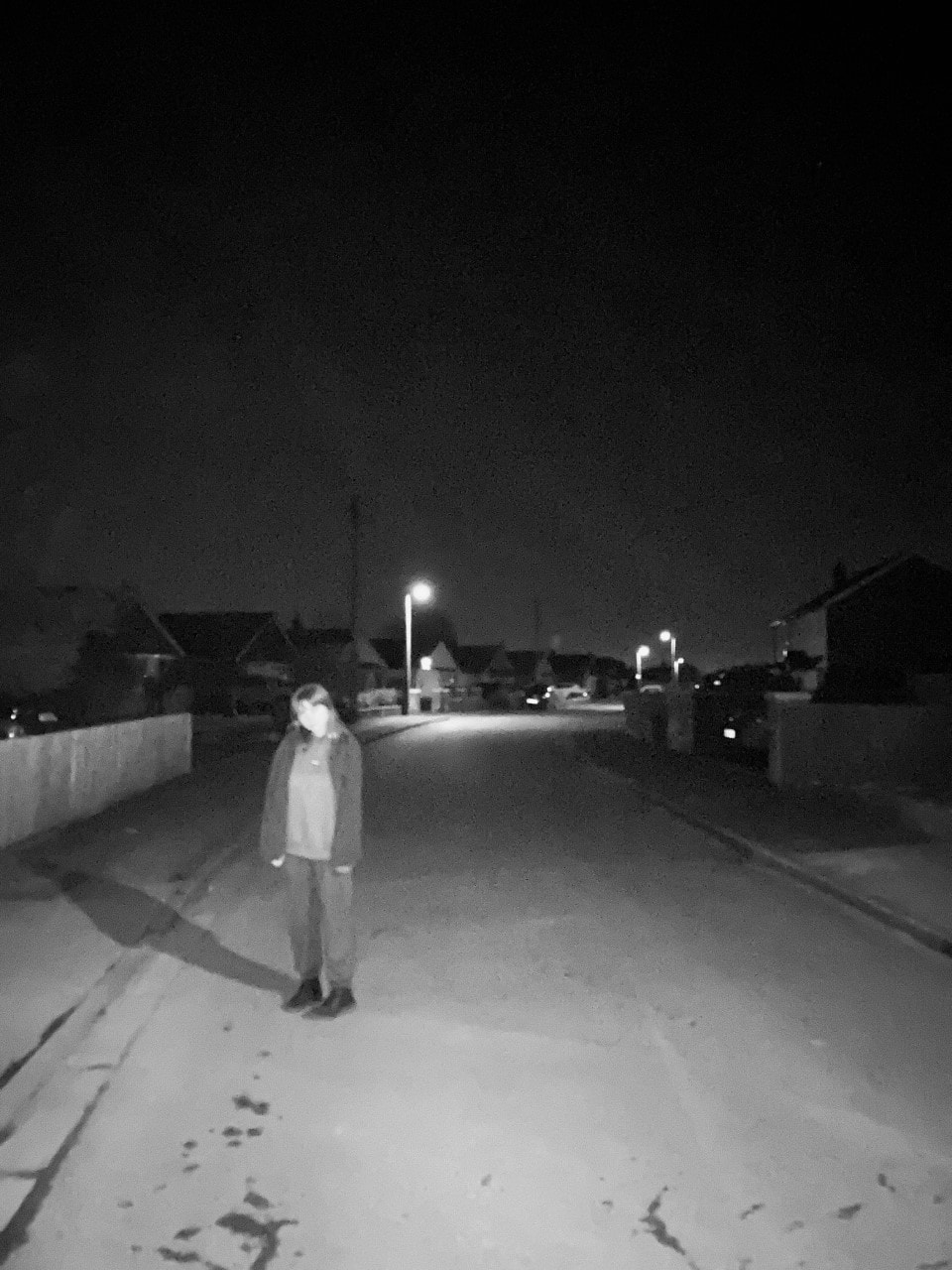
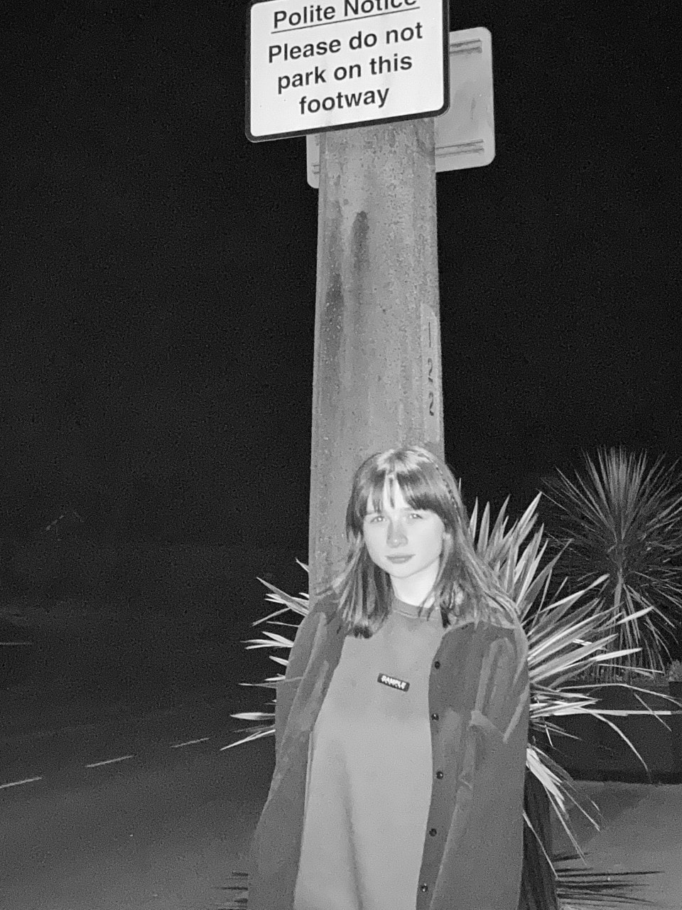
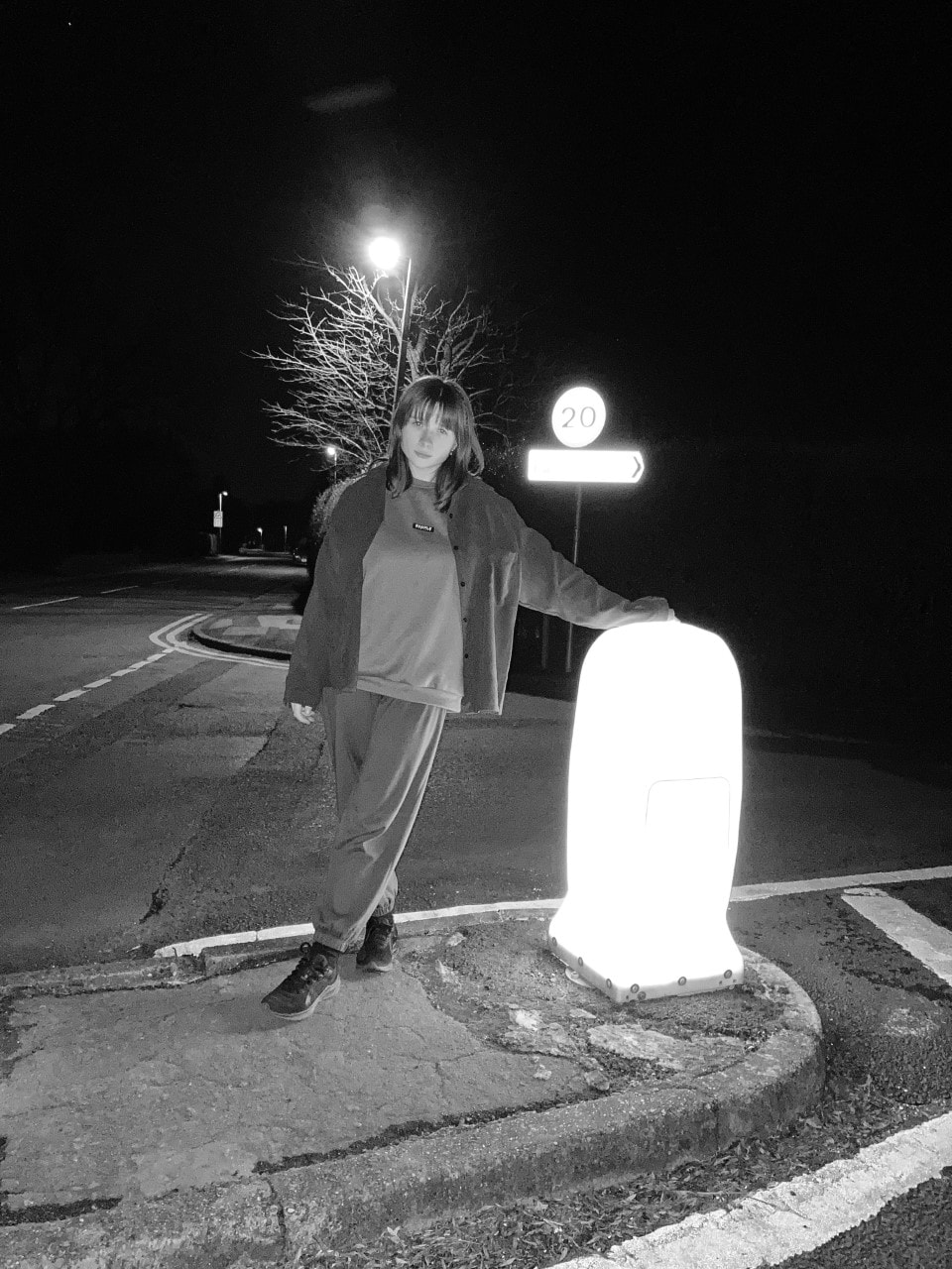
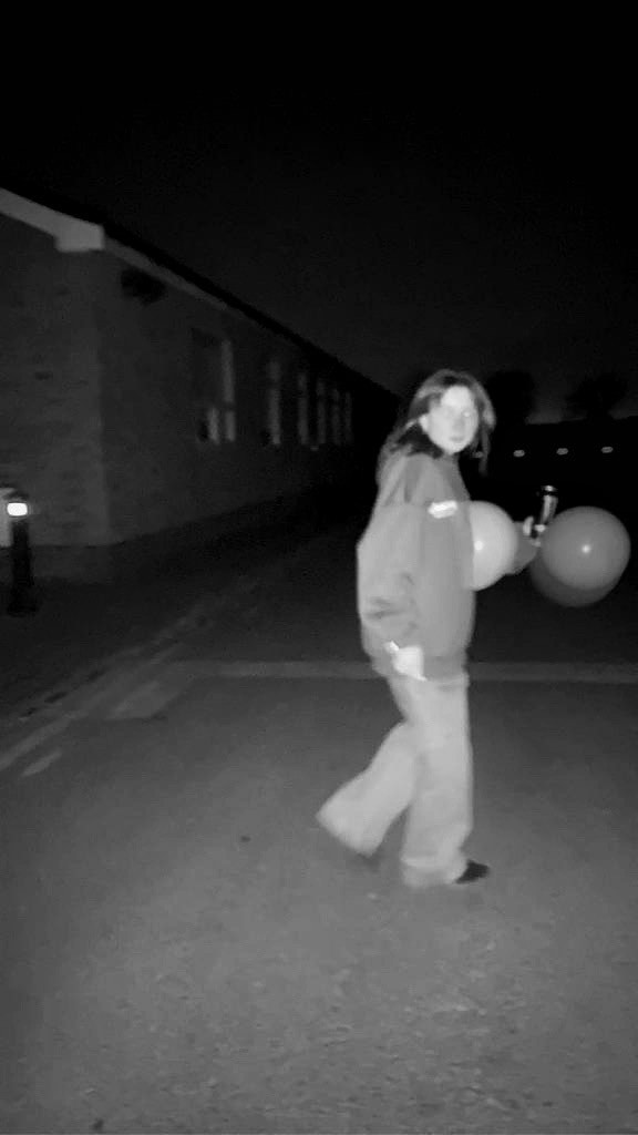
This image is one of my favourites from the Jill Freedman shoot, despite the few resemblances to her work. However, the overall theme of urban environment is largely portrayed through the architecture of the tall building. Moreover, many elements are illustrated- especially line and texture. Line is shown through the bricks, bill board, office blocks, windows and plane trail. Texture is noticed from the soft clouds and rough building materials. I believe my favourite part of this image is the plane trail which includes both of the main elements. The image was digitally edited to become a light contrast of monochrome, which I think greatly improves the image. This photo is also one of my most preferred; it is also much more similar to Jill Freedman's mixture of portraiture and urban environment. The overall atmosphere of the image is also similar to that of Freedman's.
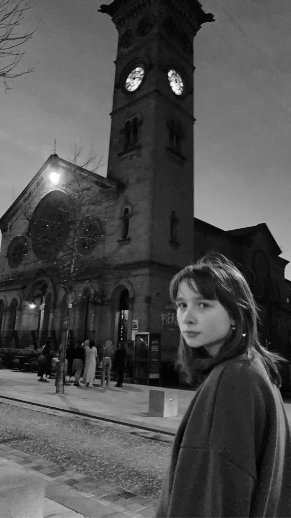
The simple clichés of the image- teen out at night- contrasts against some of the more unusual aspects the more we look. For example, the balloons. However, its is mainly relatable and familiar- the hoodie and jeans, small public/community building and general aesthetic/nature of the photo. To improve this picture I would keep the same props, clothes and location. However, I would move further down and change the setting slightly to the park which is just around the corner. I intend to do another shoot in this location. |
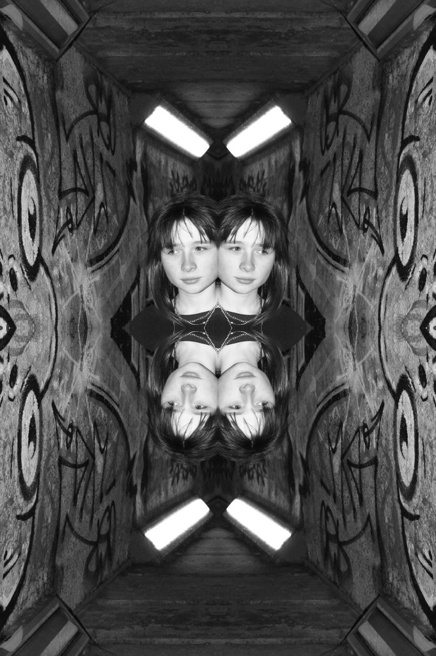
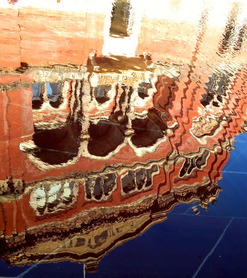
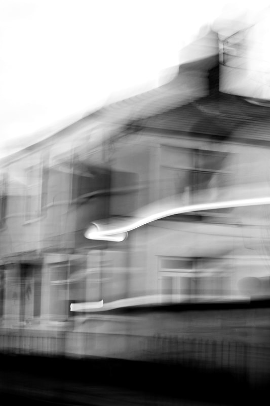
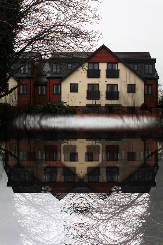
Digital Manipulation /Reflection/Jill Freedman:
|
|
|
|
Artist Research/Saul Leiter:

|
Saul Leiter was known for his street photography. In 1948, he began taking colour photographs, though many claim they do not outshine his early monochrome work. By 1953, numerous black and white images taken by Leiter were on display in the exhibition 'Always the Young Stranger' in the museum of Modern Arts. He went through a considerable number of cameras, often leaving them accidentally due to random distractions, but it was said his most-used camera was the Leica M4.
|


I chose Saul Leiter as one of my favourite urban landscape photographers due to his colourful images. Unlike Jill Freedman, his photographs are relatable because they're familiar to everyone, not just the newer generations. Every random person in the pictures give me a sense of sonder- the realization that each random passer by is living a life as vivid and complex as your own. The photos appear to be taken in winter, around Christmas time, which is around now- this will be helpful when emulating Leiter's work.
Thoughts on images/Saul Leiter:
|
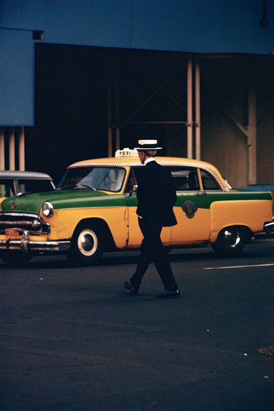
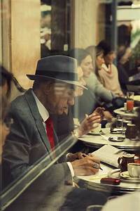
This photograph is one of my preferred from Saul Leiter's; the dark clothing match the road and highlight old-fashioned, yellow and green car. The man wears a white hat with a black strip, despite the drowsy weather, which was rather common in and around the 1900's- the traditional, taxi styled vehicle, backs up the now out dated style. We wonder where the man is going dressed in a suit and hat- if we knew the time in this was taken we could most likely guess. If it was recent, we infer he was walking towards the car which seems to be from the same era. However, if it was less recent we would probably remain uncertain. |
|
This is also one of my favourite photographs from the project so far. Yet again, from the clothing, accessories and interior décor, we infer this photograph was taken a while ago, most likely when racism and segregation began to decrease. We notice no-one in the photograph is smiling or laughing, as if the atmosphere is tense- nowadays, that thankfully isn't the case mostly. However, the man seems unaffected as he appears to be filling out something in the local newspaper, whilst the people in the background are simply minding their own business- most likely talking among themselves. This allows us to wonder if its just a coincidence, though we will never know. There are the things that are out in the open and then there are the things that are hidden, and life has more to do, the real world has more to do with what is hidden, maybe. You think? |
|
Comparative Semi Analysis/Saul Leiter:
|
Jill Freedman's image:
|

|


|
Though I'm unsure of the title, the photographer of this image is Saul Leiter. The genre appears to be a mixture of street and possibly portraiture, which fits in nicely with urban environment. Considering the photograph is most likely two random strangers waiting for their train, there is a lack of still props in this image- however, as they are in the picture they can still be regarded and observed as props. This would mean the image has multiple props, including a train, two people and large neon signs advertising brands.
This largely juxtaposes against my previous analysis of Jill Freedman's work-her photography appears to focus more on the genre of documentary. This image can be seen as vibrant, loud, modern and very stereotypical, whilst Freedman's is monochrome, unusual and old-fashioned. Despite these differences, both manage to capture the viewers attention with ease. In this image, the onlookers attention is immediately drawn to the large sign advertising the brand coca cola, before moving to the dark silhouettes which stand out before moving around the image- slowly resting back onto the red sign. This is also extremely different to Freedman's 'street cops' which draws the viewers eye to the middle immediately as the main source of attraction. This photograph contains many objects to inspect, whilst the other has one. However, the sole subject in street cops holds much to look at, whilst in Leiter's nothing is worth inspecting thoroughly or in much detail- nevertheless, depending on the person, the same could be said for Freedman's work. Additionally, there is a wide range of highlights and shadows due to the lights against the dark night sky. These allow other subjects which do not have a light to light up- this also means the photographer does not need a flash which could disturb the image and its contents. This portrays similar elements to Freedman's work- one of the very few things the two have in common. On the other hand, 'street cops' was taken in the day time. This means the highlights and shadows are inevitable. Unlike Freedman's picture, I don't believe this has a proper meaning. There are no clear signs that there is a story behind this; so, if I was to emulate this image, I might try to add something old fashioned (like a paper boy or something not often seen in todays new society) which would add contrast to the image. Leiter's and Freedman's work are very different despite sharing multiple of the genres. In particular, the time of day appears to vary between the images- Leiter's at night whilst Freedman's in the day. This could be either a coincidence or on purpose, if Leiter's was taken in the day then the neon lights would not have as much as an affect, and if Freedman's was taken at night it would be much harder to notice details such as pattern. |

|

|

|

|

|
Shoot Plan/Saul Leiter:
To emulate his work, I will go outside, most likely for a short walk, with my camera and take images of anything which reminds me of his work before repeating this multiple times. To digitally edit my photographs I will manipulate each according to what looks best; however, I will use Adobe Lightroom and apply filters, then change the settings from there. This will add a more professional look. When taking the images, I'll have to be careful as to not accidentally capture the face of an unknown person as this would defy privacy laws.
His work largely inspires me- just like Freedman's it involves aspects of 'old-fashioned' environments, though he substitutes some characteristics for more modern ones. For example, many of the images advertise new brands and bright colours, whilst also conveying parts which are slightly out-dated, such as vintage technology and grainy filters. This means the image will be taken place within a more suburb town, with hints of modernisation.
I intend to use very few props, apart from the actual camera, as Leiter's images seem to be rather spontaneous. This means instead of carrying around a tripod constantly, the images will be hand-held and candid. Many of his photographs which include models appear to be random people, meaning I will either choose a place isolated with very few people, chose people I know or allow random people in the image, whilst keeping their identity hidden.
This shoot will require harsh weather such as rain, snow or a storm. Obviously, the subject will be outside, as that's where the majority of Leiter's images are based. To create a more natural affect, a flash will not be used- that's more of Freedman's style. As the weather is supposed to be negatively influencing, back lighting will probably be used.
I'll use a mixture of the Canon DSLR 4000D and iPhone SE 2020, to capture these images. As no long exposure is required, these photos will be taken handheld, as that is easiest to create a candid photograph. For the images on the camera, the settings will be a low ISO, a narrow aperture and quick shutter speed.
After the images are taken, I intend to digitally edit them to create a dull affect which emulate Leiter's work.
Tap images below for related videos:
|
|
|
Saul Leiter/Contact Sheet/Shoot:


Saul Leiter/Best Unedited Pictures:
|
|
|
|
Saul Leiter/Evaluation/Shoot:

|
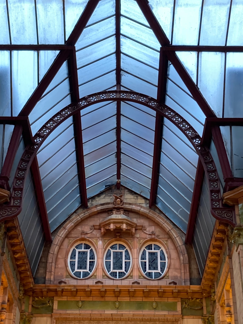
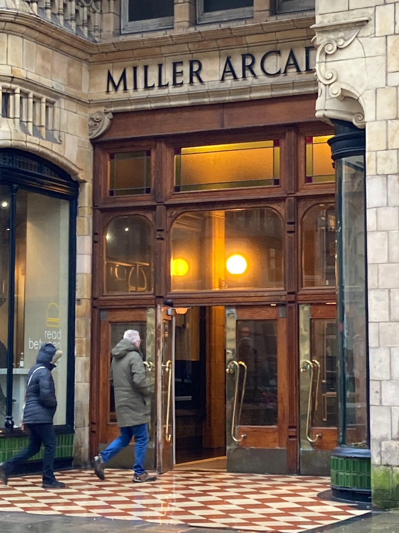
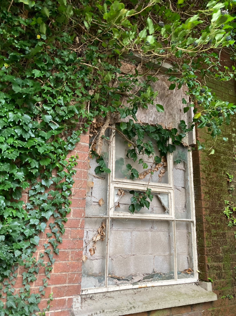
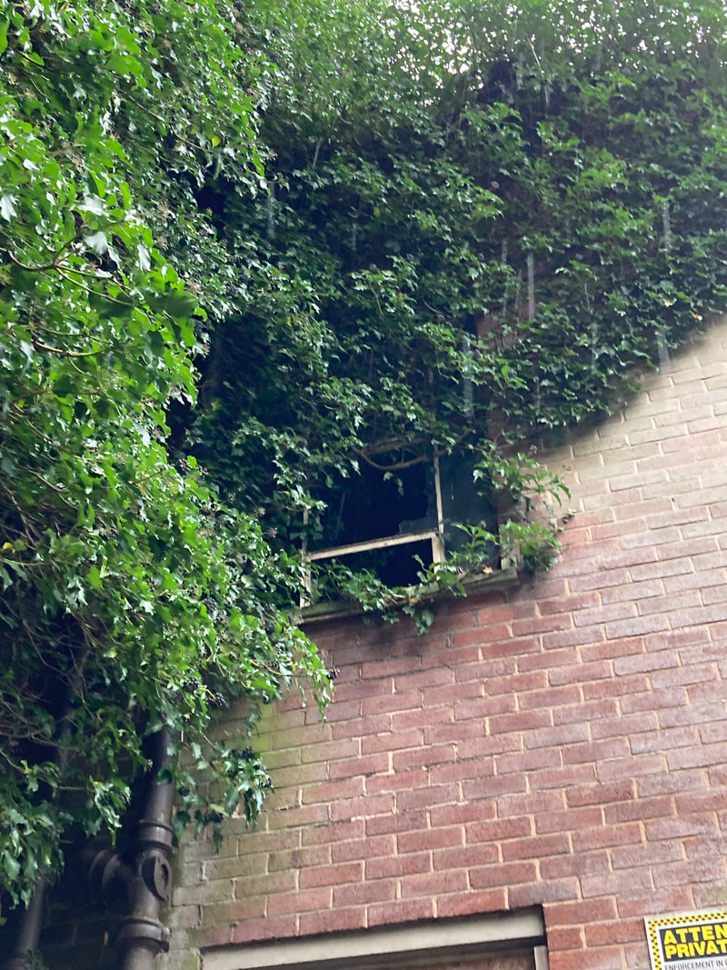
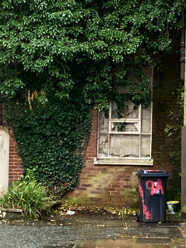
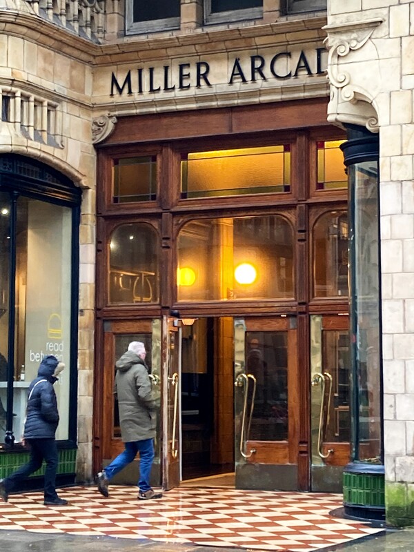
This image is largely considered one of my favourites- the run-down, old fashioned, derelict building largely contrasts to the new growth illustrated by the greenery. This visual juxtaposition is only increased by the vandalised bin, which may suggest someone lives in the abandoned place; or at least, someone did- this only adds to our interest in the image. Unknown to the viewer, the window shown is the window of an abandoned children hospital- this may imply the bin does not belong to the building due to the small size. Additionally, the black-red bin and smaller green-yellow appears modern in comparison to the broken and barricaded window. Overall, the image conveys urban environment and Saul Leiter's work in a way which involves partly unnatural, partly natural, decay and growth. This range of contrasts is very difficult to achieve. I also prefer this photograph as it is such a cliché scene- the stereotypical setting of a family-run, surname-orientated business appears to give a traditional aspect to the photo. This traditional, old-fashioned vibe is further backed up by the brown-beige colours; additionally, the brown colour scheme is broken by the two unsuspecting photobombers.
The two strangers add towards the atmosphere, allowing the viewer to infer it was raining. The more we look at the image, the more we notice little things which defy the traditional scene set by the building. For example, how the man in the image is in front of the female (traditionally, this would have been frowned upon). However, in todays society is much more acceptable and understandable. The physical positioning of the people, as just mentioned, defies old-fashioned expectation which contrast to the traditional arcade building- this is why the image interests the viewer. This photography includes many photographical techniques, a main reason for my liking towards the image. The technical processes include: angle/perspective, line, space, form, shape, colour/tone and depth of field.
Angle and perspective is obviously shown from the high viewpoint- this allows us to understand how tall some of the buildings (mainly the church) are. Contrastingly, it also illustrates how small some of the lower buildings are. |
Digital Manipulation /Reflection/Saul Leiter:
|
|
|
|
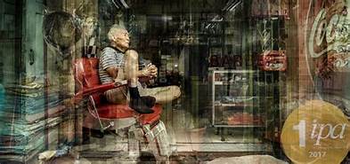
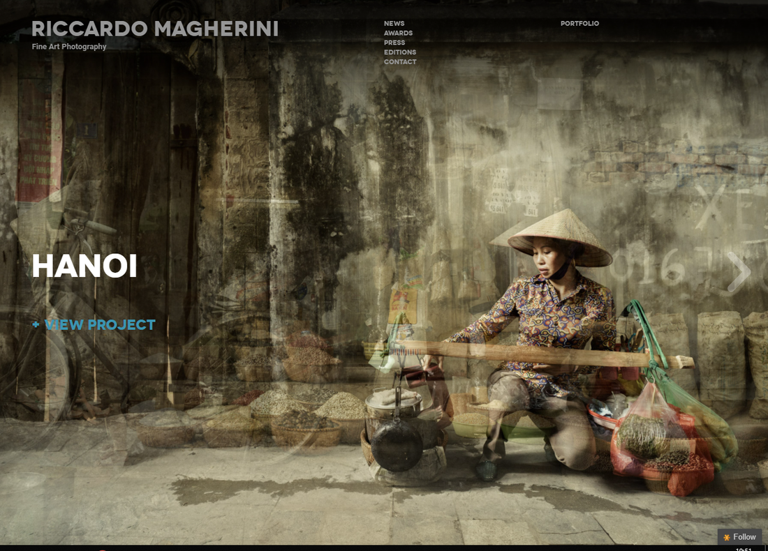
Artist Research/Riccardo Magherini

|
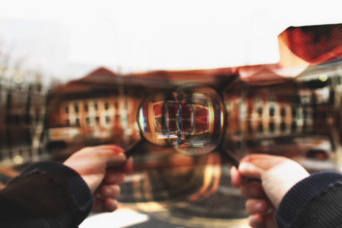
Riccardo Magherini is most well known for his commercial and advertising, based in Italy. However, after taking a trip to Tokyo in 2011 he began to include fine art photography into his work, naming his first series simply 'Tokyo'. In June 2013, his work was chosen to feature in vogue, which opened his images into the public eye. Double exposure and motion blur are often seen in his pictures.
My works are made of fragments, like memories. Almost all the pictures that I take from a place or a ‘street story’ are shots that I wanted. |


I chose Riccardo Magherini as one of my favourite photographers because his work is so abstract and confusing, yet simple when you look at it and pick specific details out- this is quite unusual. His work seems to be mainly located in the city at night time- when the environment would often be sparse but is not. The images look to be taken in a candid fashion, mostly. The buildings in his pictures seem to tower over the people, making us wonder how many more people are in the buildings, which I find interesting.
To emulate Riccardo Magherini's work I will use my images from London and double or multi expose them on one another, just enough so you can make out each individual image- this will probably be 2-4 still photographs or 2 long exposure/blurry photos. However, to add my own twist I might mix different locations and styles, these categories will consist of: Landscape, portraiture, Urban and Isolated. I believe the tones of nature will greatly juxtapose the overpopulated towns, creating an image which contrasts itself.
Thoughts on images/Riccardo Magherini:
|
This is one of my favourite photographs from this artist because the sheer amount of options to analyse. Firstly, our eyes are led to an older man sat flexibly in a child-like pose- his hands are clasped together tightly, as if he's being shouted at or deep in thought, we assume the latter as he's the only person in frame. Next, we notice the cola logo, causing us to wonder why the brand is making an appearance.
|
|
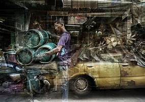
I also admire this image because it misleads us to think there's a car under vast amounts of clutter, along with a teenage, young-ish male who appears to be taking part in labour. We may assume the boy works in a garage, due to the car, however it also may be there to deceive us. The colours, which look like they should be vibrant, but are dull and rusty- we wonder if this is a consequence of age or editing.
Overall, the image could hold so much history, contrasting against the youth presented by the figure, which I would like to emulate in my work too. |
|
Comparative Semi Analysis/Riccardo Magherini:
|
Jill Freedman's work:
Saul Leiter's work: |
|

|


|
This photograph was taken by Riccardo Magherini, and from the modern architecture seems to have been taken within the last few decades- though I am unsure of a specific date or year. The genre of this is different from the usual street, documentary and portraiture categories which have been mentioned in my previous analysis'; this contains candid, architecture and portraiture, the key one being architecture.
In this image more than others visual elements are used in a way which conveys incredible skill. Magherini's use of pattern, line, space and colour allows different parts of the image to stand out in different, unique ways- this is extremely similar to Leiter's work yet contrasts largely to 'street cops' by Jill Freedman, in which her image is monochrome. In particularly, pattern stands out to me most due to the cramped crowds, delicate windows and decorated building. First of all, the dozens upon dozens of people which linger around create a complicated design which, upon further inspection, are people. The people seem to be looking at something behind the photographer, which makes us wonder what could be more interesting and why Magherini was looking the other way. Upon first glance, many things stand out to the viewer: the large crowd, the building, the colour and all the different details. I believe this was deliberately done by Magherini as an attempt to capture the viewers attention for as long as possible. Though still props were not used, the photographer used moved so the people were in front of him- this means, unlike the usual pictures where people try to receive the tourist destination without the tourists, we can gage the different expressions of different people. This work is relevant to 'urban environment' in terms of the enormous architecture presented in the background. I honestly don't believe this image can be improved easily- in particular, the use of settings presented boldly within the image is magnificent in a way that would usually be messy but is actually strangely elegant. Lastly, I would like to draw your attention to the different depths of field in the different photographs; this was touched on lightly earlier. Jill Freedman's is in full focus, Leiter's partly in focus and Magherini's full focus again, yet somehow blurry. |

|

|

|

|

|

|
Tap images below for related articles:
|
|
|
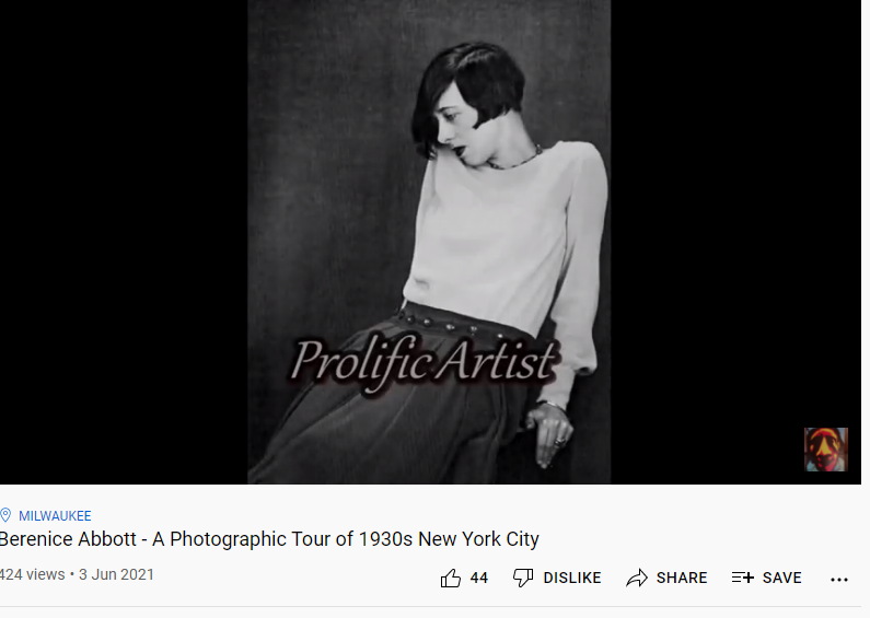
Artist Research/Berenice Abbott
|
Berenice Abbott is largely regarded as a highly important documentary photographer. She began her work in France, as the assistant to Man Ray, before moving to New York in 1929 to continue her career. Her photographs show the nineteenth and twentieth centuries colliding in a dizzying interplay of cultures and monochromatic colours; she mainly captured urban landscapes and people in their 'natural habitats'- Abbott often travelled, managing to photograph multiple, very different lifestyles.
“Actually, documentary pictures include every subject in the world – good, bad, indifferent. I have yet to see a fine photograph which is not a good document.” |


I decided on using Berenice Abbott as inspiration because her work largely revolves around street photography- she manages to capture the lives of ordinary people and things then make them into something much more interesting than it would have originally looked if you had seen it yourself. She does this by using obscure angles, lenses and digital editing techniques. I find that largely unique and different to your average photographer, who may focus on more vibrant colours and more obscure subjects which could hold the onlookers attention for a longer period of time.
Semi Analysis/Berenice Abbott:


|
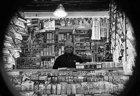
This is one of my favourite images from Abbott because the vignette out-ling the photograph, which gives off a fisheye lens affect without the distortion, yet the books give off the abstract touch desired. The single light bulb which appears to have the task of lighting up the entire shop also adds to the vignette affect.
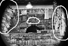
The photographer of this image is Berenice Abbott, best known for her portraiture work. Though I'm unsure of the exact date, its easy to infer it was sometime in the mid 1900's- this is evident from the temperature which practically seeps through the images and infects the viewer. we notice the person in the image wears a hat, suggesting a lack of heating- the drop in energy resources is also evident through the poor lighting which adds to the cosy affect. Obviously, the genre appears to be some sort of mixture involving lifestyle, portraiture, cultural and street. It's clear the image fits in these categories from the numerous 'props' within the photograph. The objects and general settings/things which link to the different genres include: the environment, the products being sold/loaned, the person and their clothing and just the general aura. The fact the main objects are practically in the background allows the viewer to notice whatever their eyes land on first before they gradually move around the photograph. This allows us to realise the rule of thirds is applied- intestinally or not, is unknown. The figure sits in the middle whilst the books clutter the other squares. Abbott approached and used composition extremely well in this photograph, like she does in her others too. We view the image from the perspective of a customer, as if we were actually there. I think this is one of the best positions the photographer could have been in for this image. However, I think it could have been improved from a birds-eye view perspective. This allows us to see what's behind and in front of the till. Abbott uses dozens of visual elements to enhance her photos: shadows, highlights, tones, contrast, line, shape and lots more. In this image in particular, line is used to dramatize the vignette circling the images. This allows the image to almost juxtapose itself in terms of shape. The contrast this creates is further emphasised via the darker clothing and outer tone against the pale book covers which appear to be illustrated in some sort of organised mess. In particular, Abbott uses monotone well. However, I believe colour would work fine too; the possible extravagant colour of the books would add interest to the image, along with texture. Though, we can't see the original colour of the image, meaning Abbott most likely decided monochrome was best. The photograph itself conveys almost a 'small shop in a little village' or ' family run shop' vibes. This gives off feelings of seclusion and remoteness, as if the shop is being shielded from the modern world, and has been for a long time. We imagine the shopkeeper/librarian to have local customers who know the heritage of the shop- most likely passed down throughout generations. |

|

|

|

|

|
Tap images below for related videos:
|
|
|
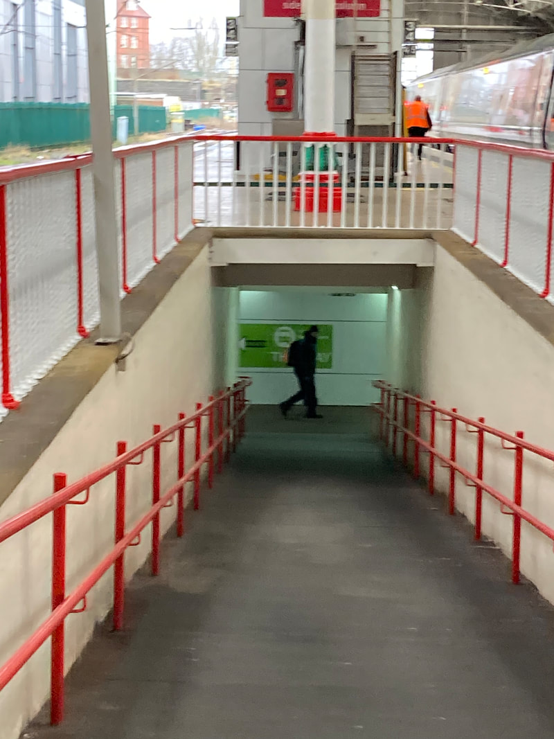
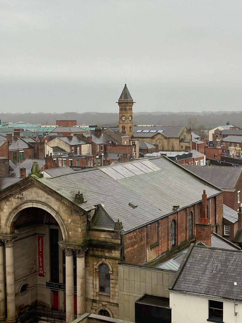
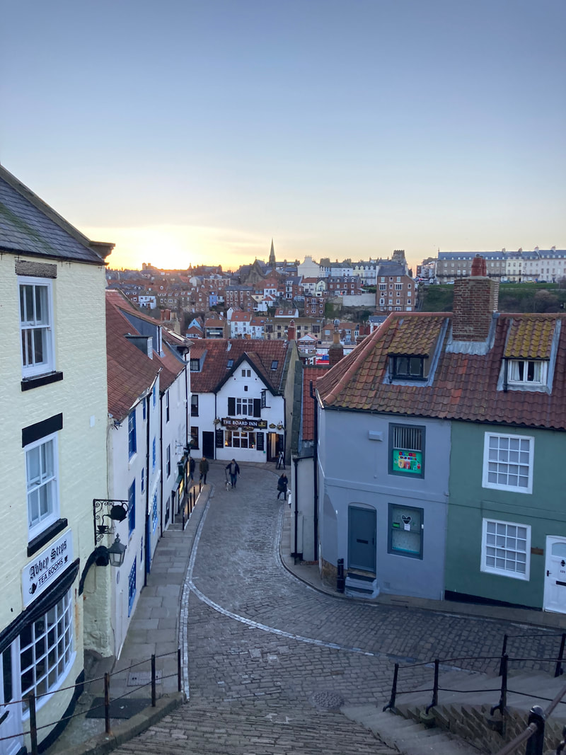
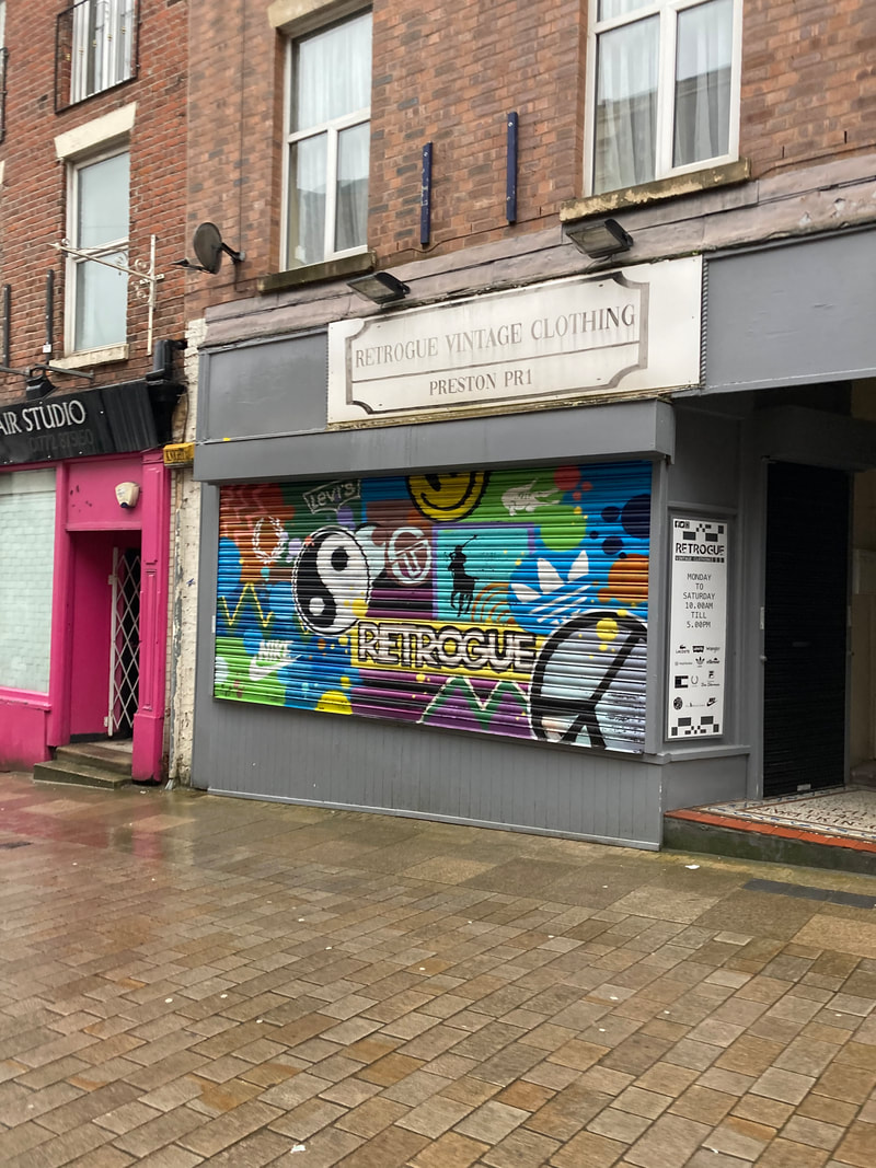
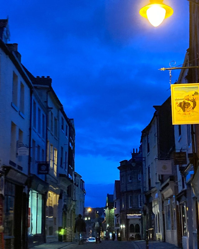
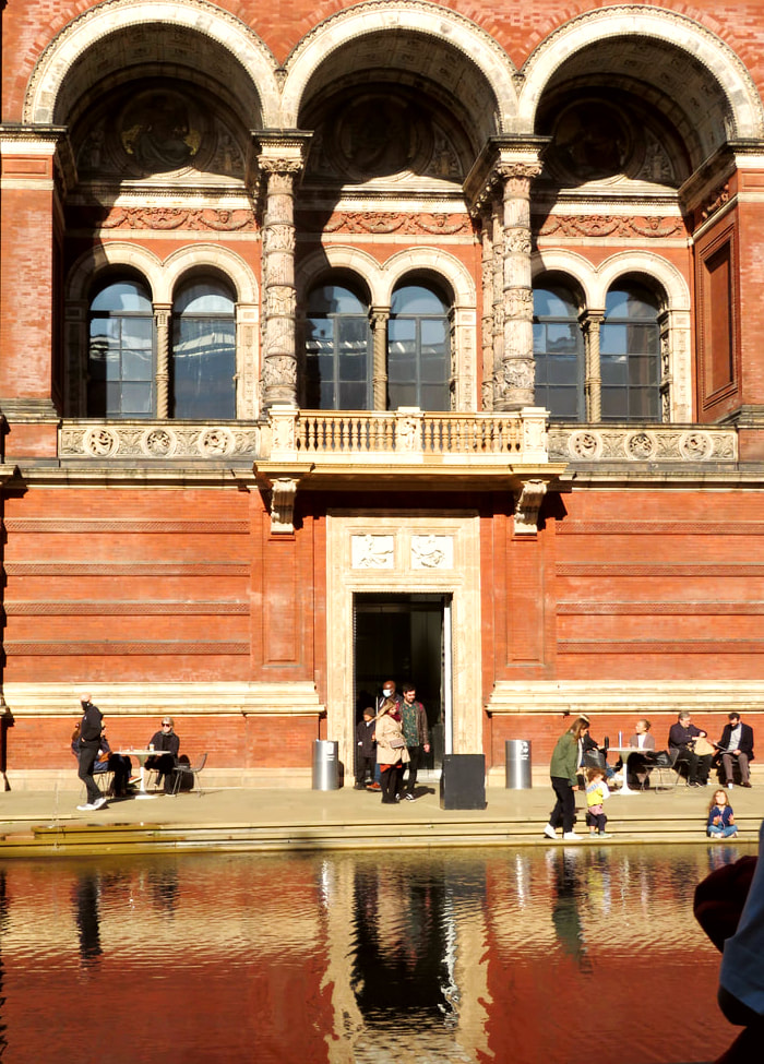
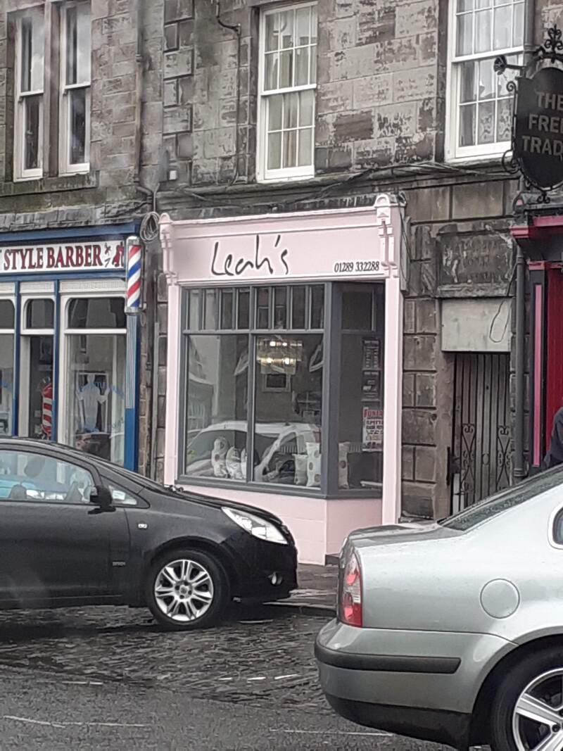
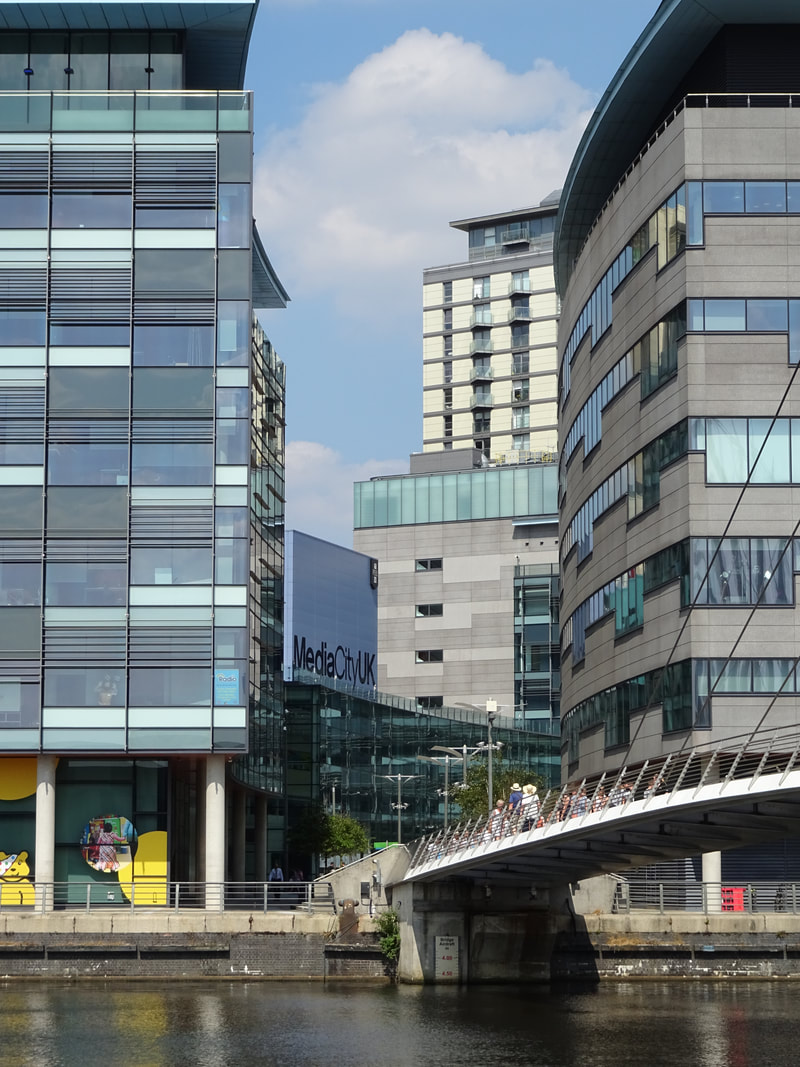
London/Unedited Images:
|
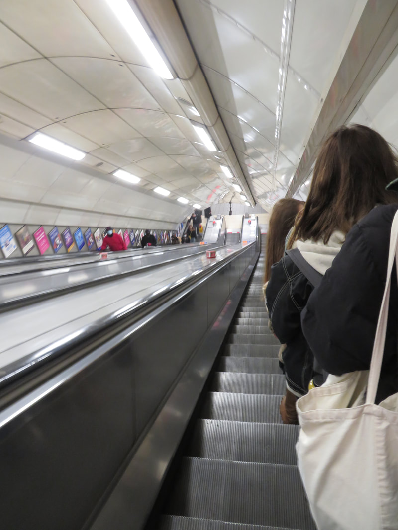
|
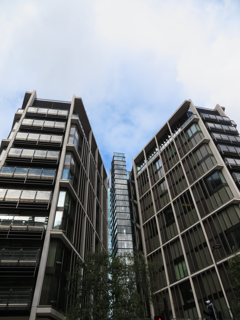
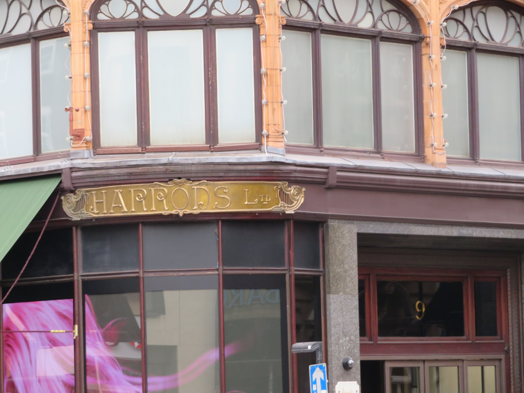
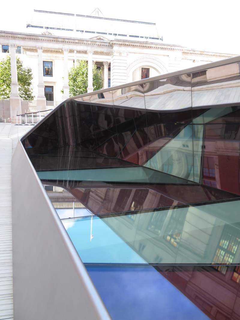
|
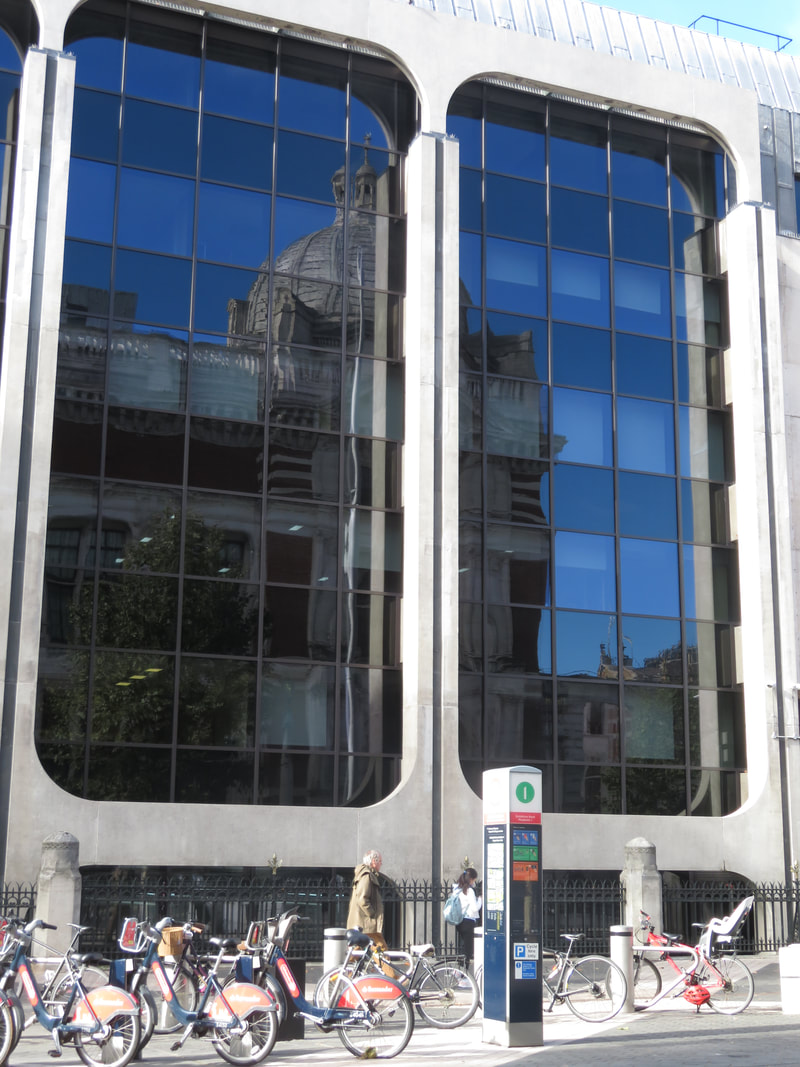
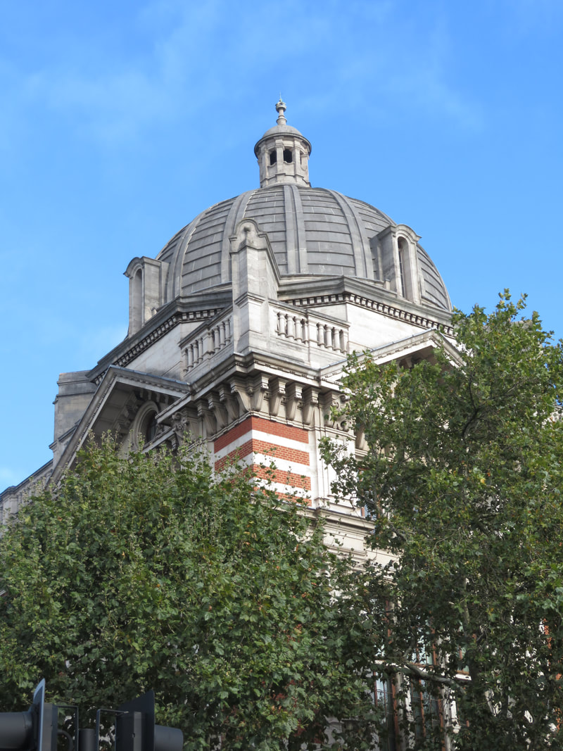
|
London/ Edited Images:
|
|
|
|
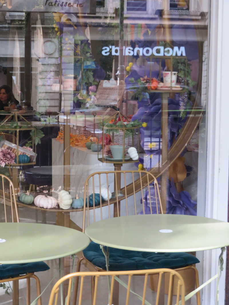
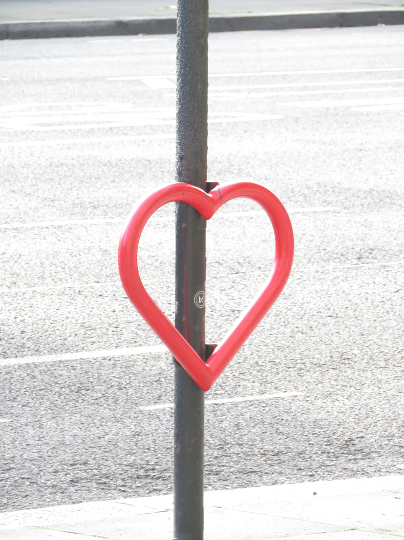
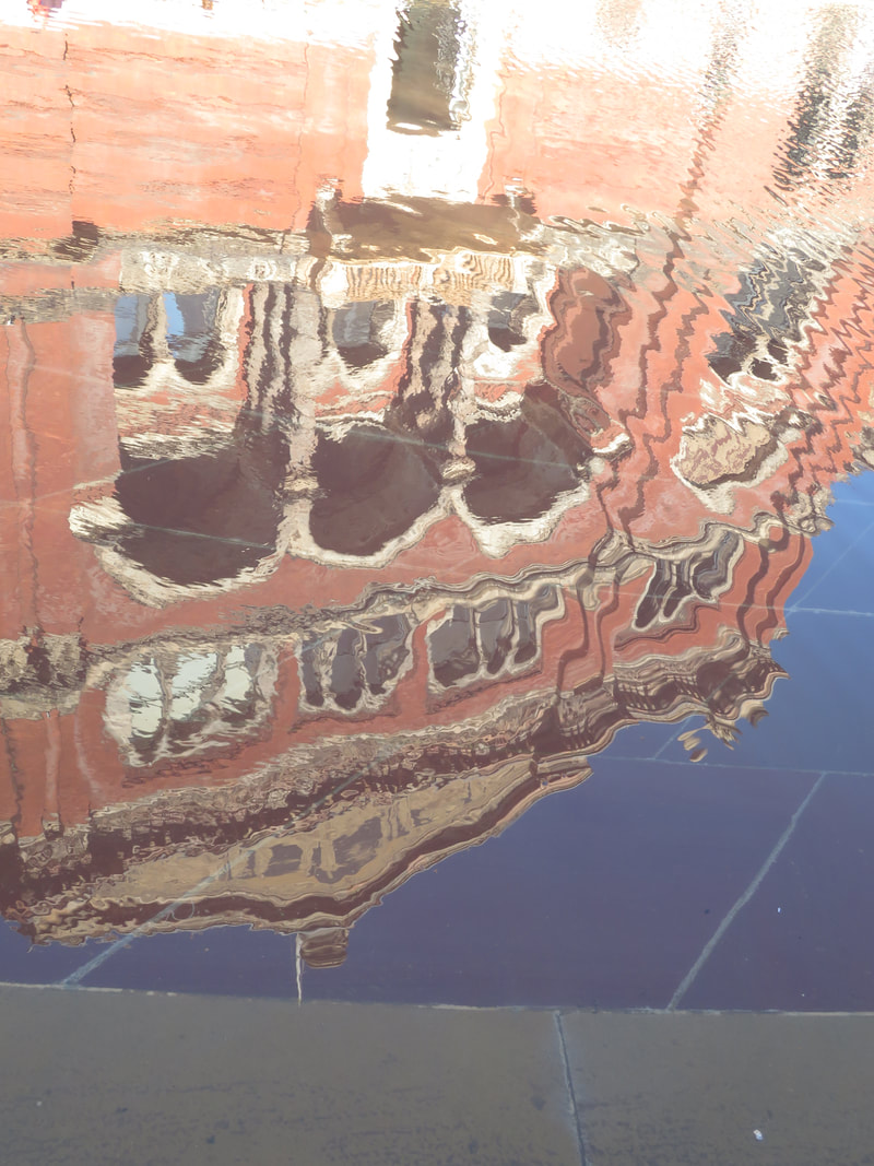
London/Best Edit & Evaluation:

|
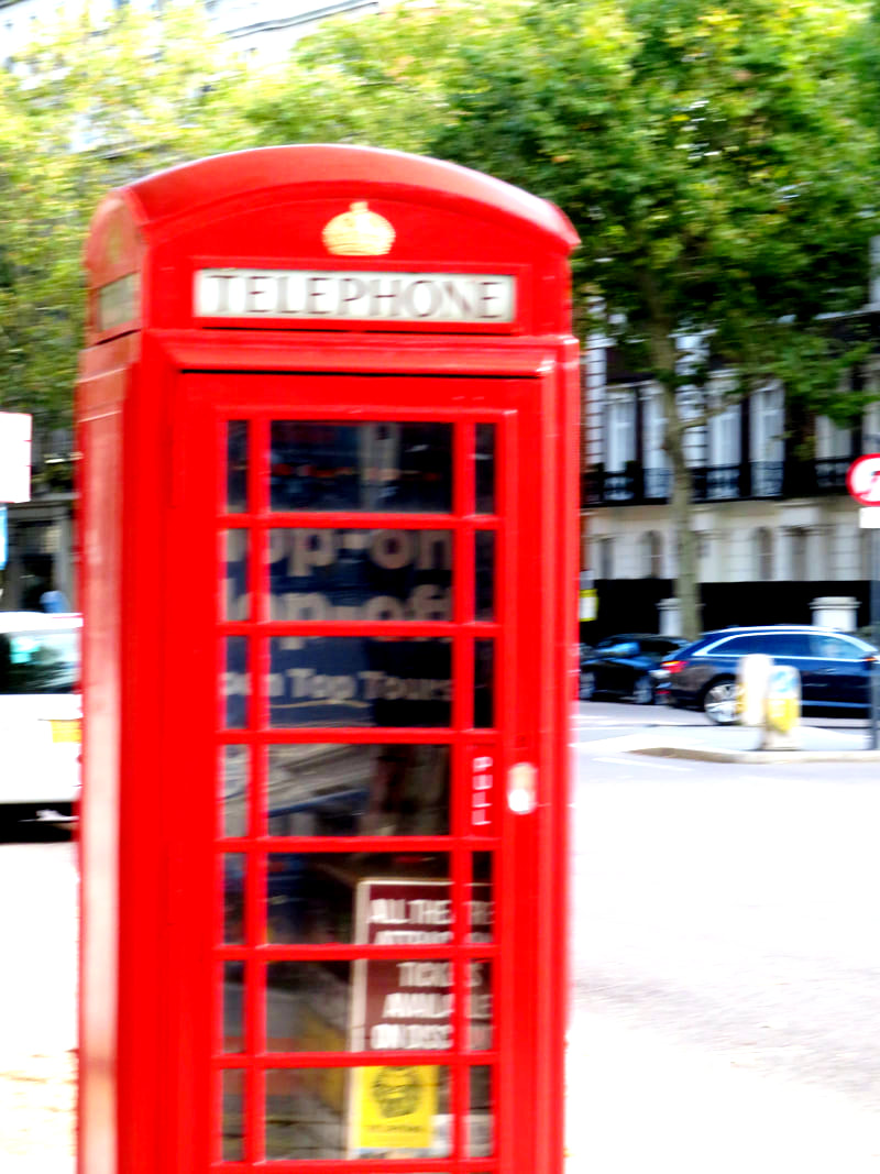
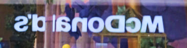
I believe this image represents the two sides of London- the stereotypical 'posh' side and the more 'run down' type. This is shown by the reflection in the café shop window, which shows a greasy fast food restaurant. The juxtaposition of the two shops show how similar yet different they are- both are rather popular, though we tend to stereotype different people in each.
I edited this image using colour pop, which allowed the colours of gold, purple and green to stand out and contrast against one another. I believe if this image was taken in monochrome, it would not have the same affect as the colours in this image convey as much as what's in the image. If I was to take this image again I would prefer different weather- I believe more British weather, such as rain or stormy clouds, would greatly enhance the image. However, this is now unachievable. As we look further into the image, we notice the festive decorations which only further develop the image- even for a day-long celebration such as Halloween, the small store 'dresses up', unlike the fast food chain which most likely only changes its anti-planet friendly plastic toys and commercial ads. If this image was just of a store sign, or looking in a small café window, it would not be as affective. Though it is only by chance this happened, it is not an unfortunate coincidence. The image may also portray an economic barrier, whilst we imagine the small shops food to be reasonably priced, it wouldn't be uncommon for it to come in small portions and slightly over-priced. Contrastingly, McDonald's is rather cheap- which is probably why it's so popular amongst the younger generations. Furthermore, whilst we image both places to be full of different types of people, they are still stereotyped. It wouldn't be uncommon to find some sort of wealthy elderly lady in the cosy café, but it might gain more attention if they're in McDonalds. Not only does this add further evidence to the previous economic barrier theory, it may make us wonder how two completely different stores arose in the same area of London. Additionally, we notice the coffee-shop type of building is rather empty, especially on the outside, despite it being a nice day. Unknown to the viewer, there was a long queue lined up surrounding McDonalds. This shows the general preference of people. |
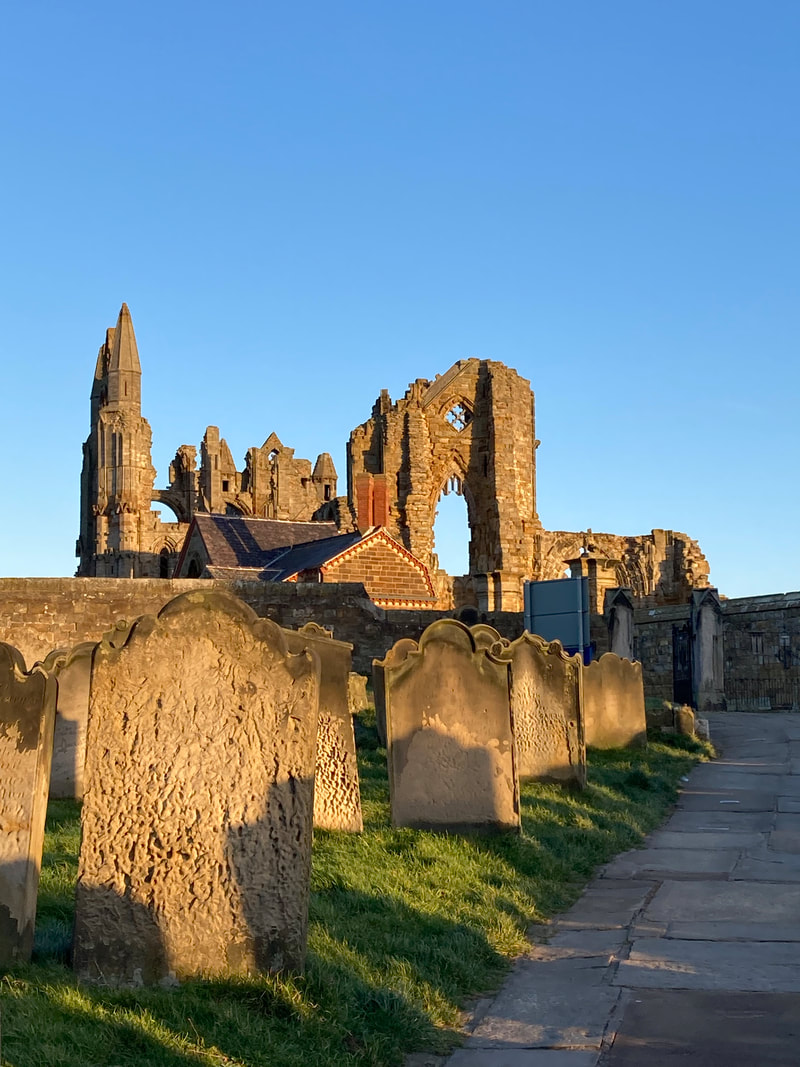
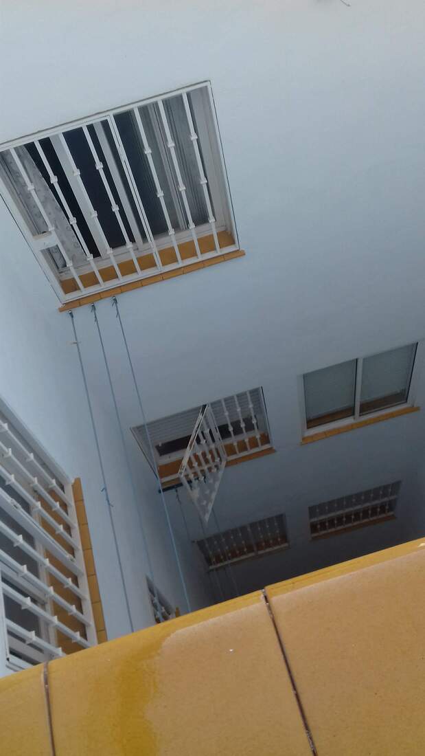
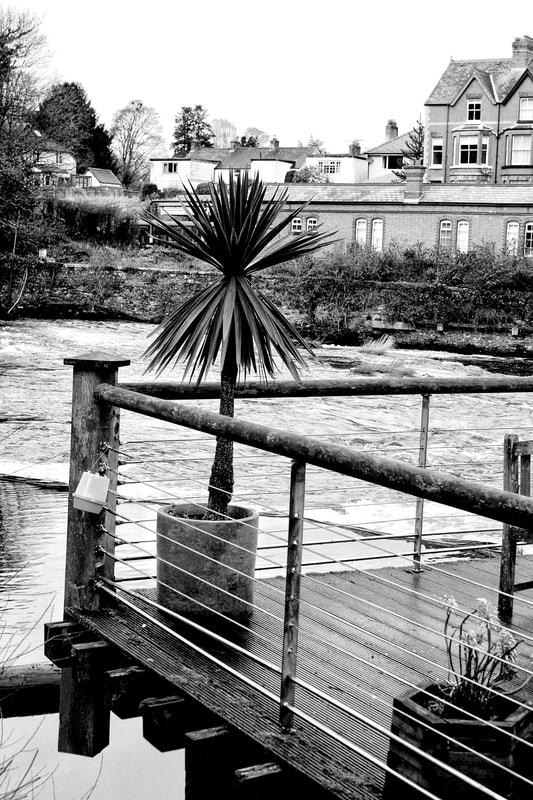
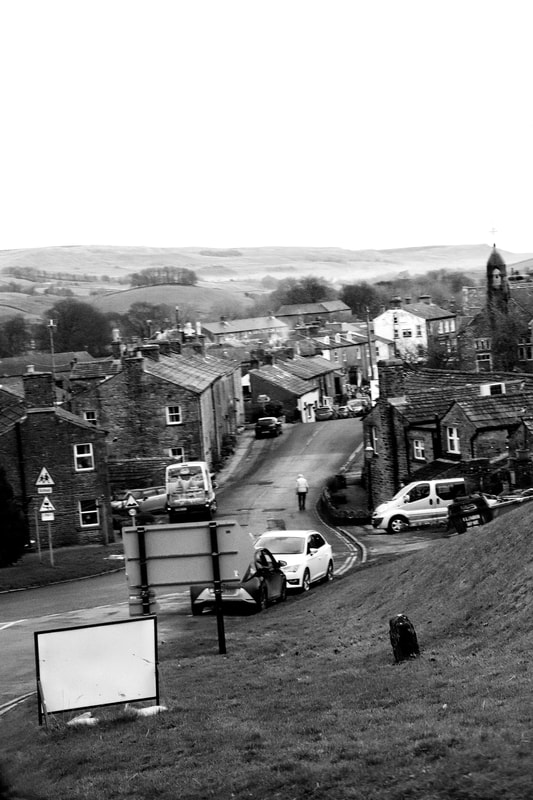
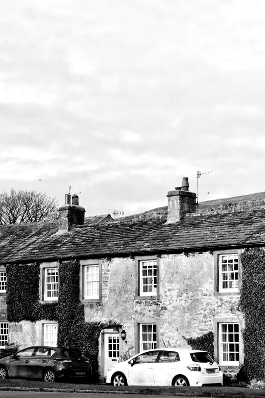
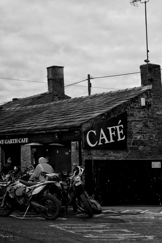
Pre-pandemic/Unedited Images:
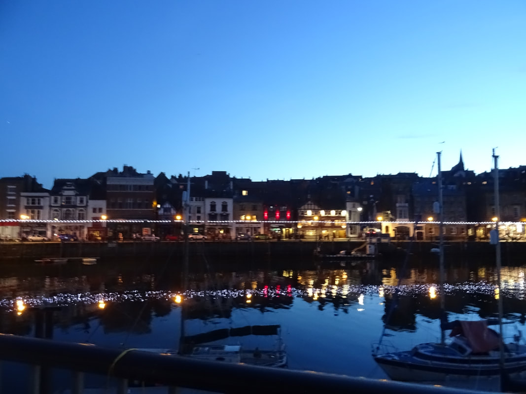
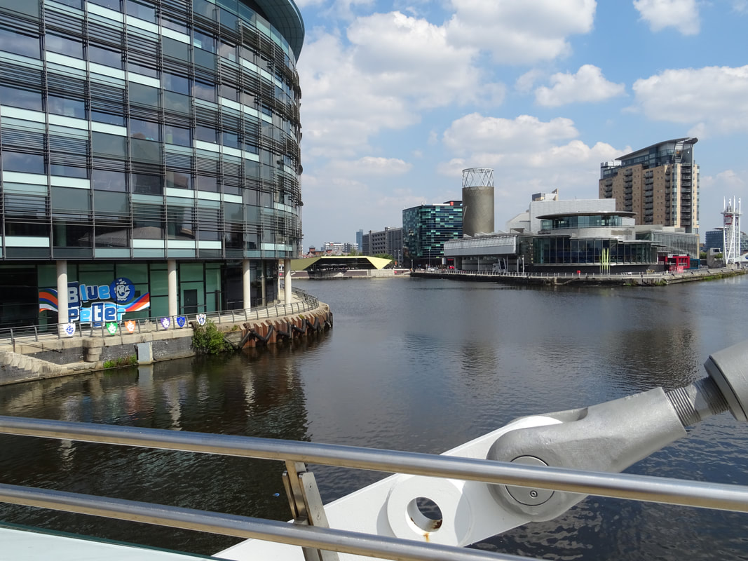
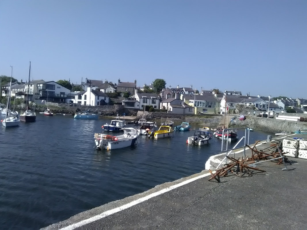


|


|
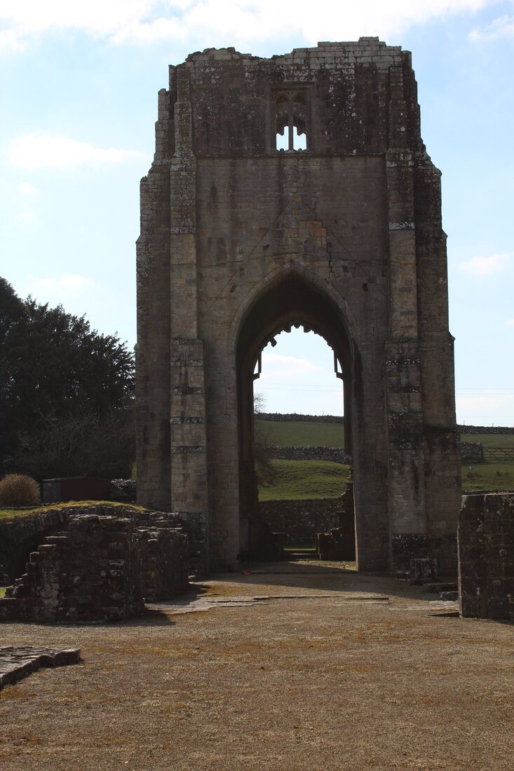


|
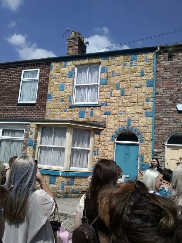
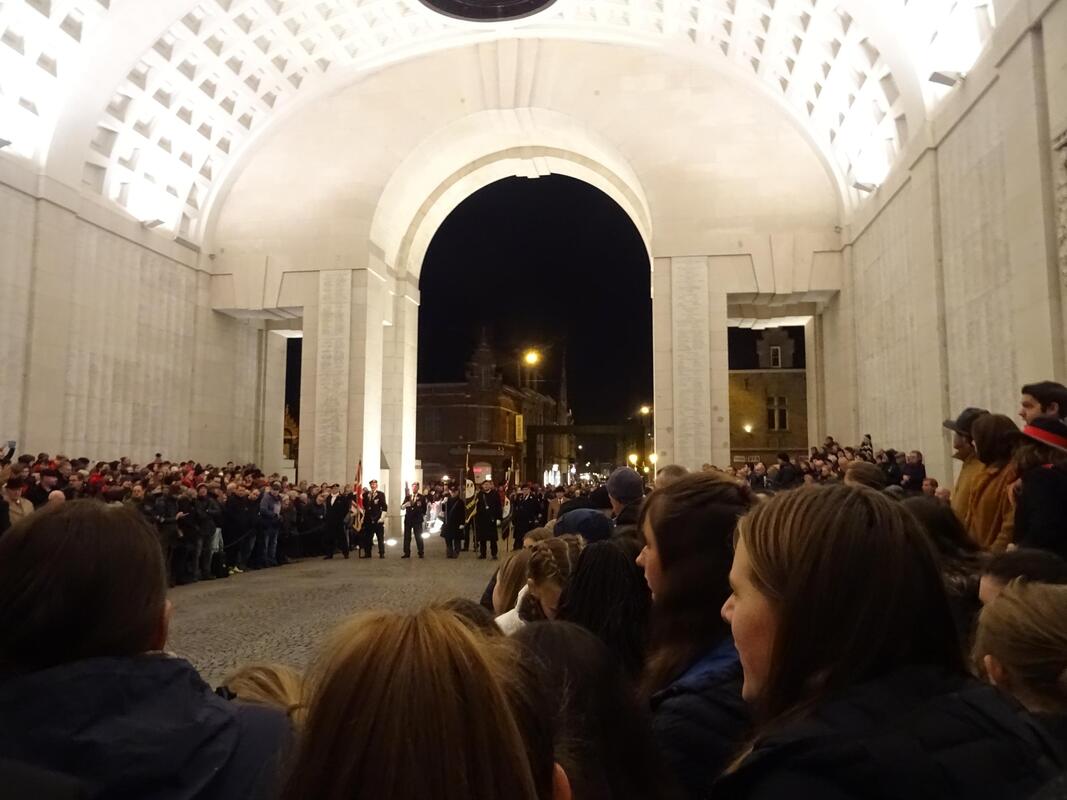
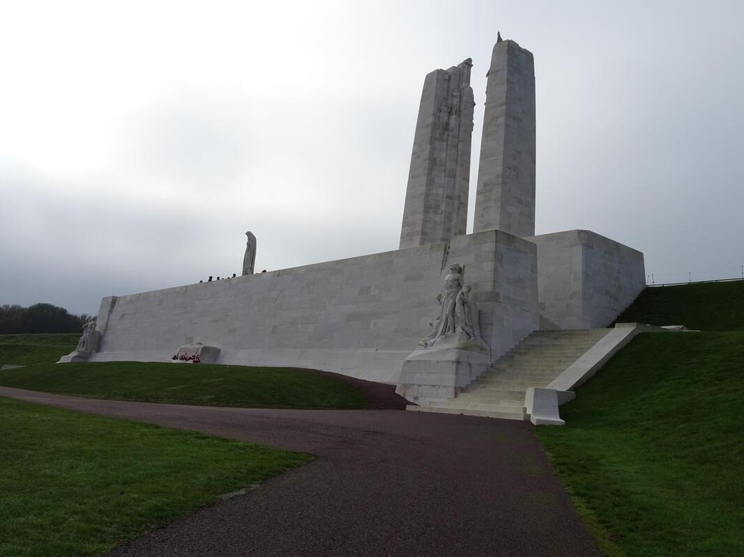
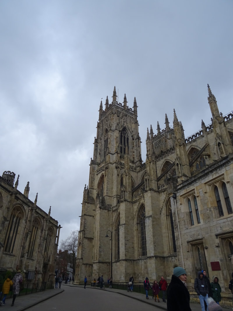


|
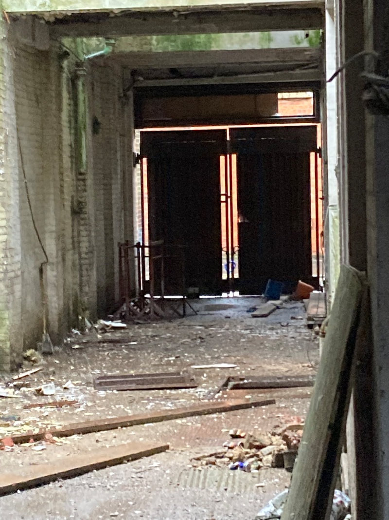
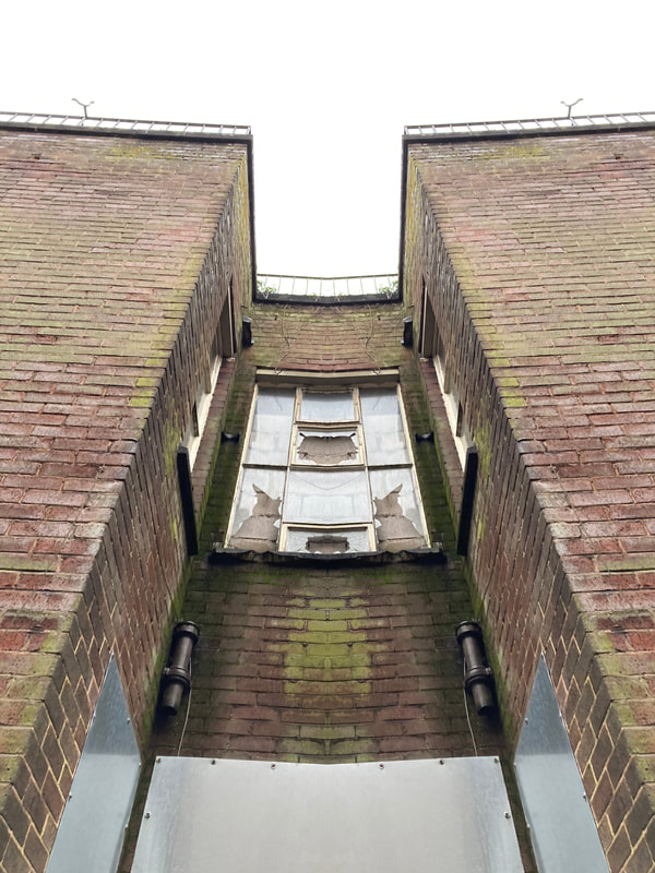
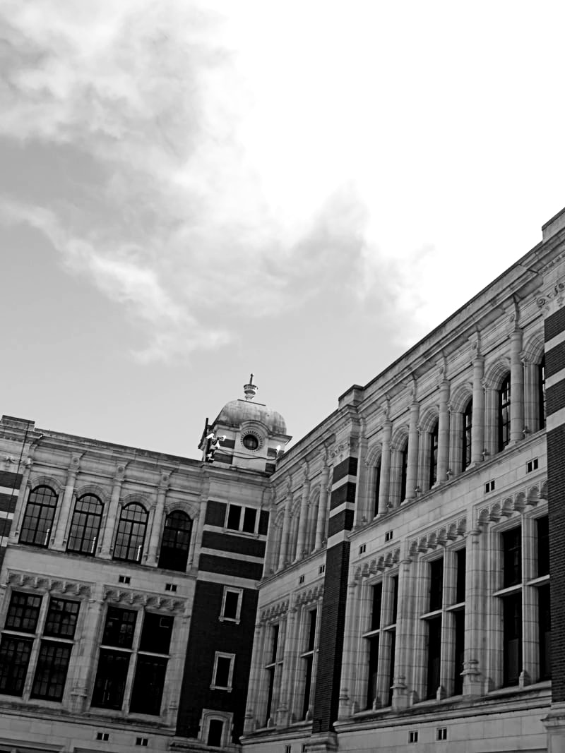
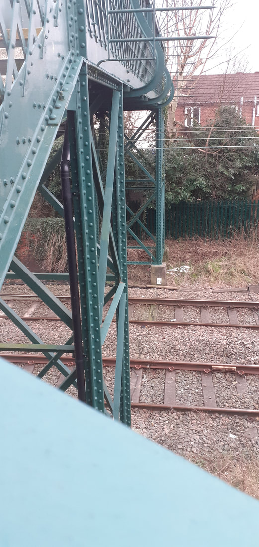
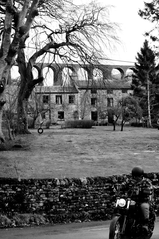
Buildings Photo Safari/Contact Sheets:


Buildings Photo Safari/Black and White:
|
|

|
|
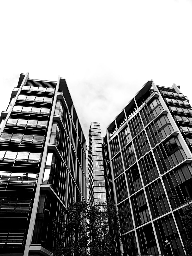
Best Image and Evaluation/Black and White:
|
|
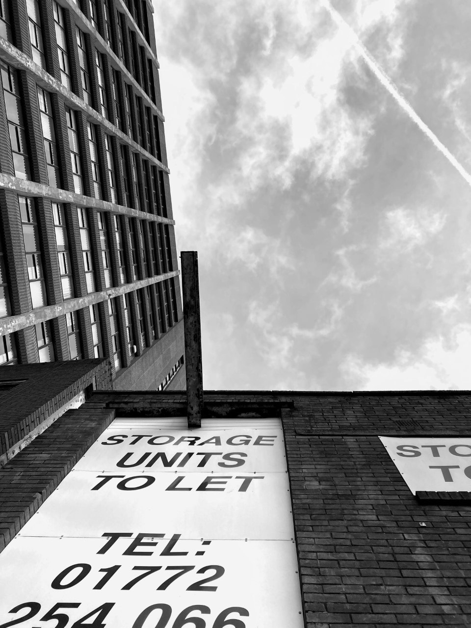
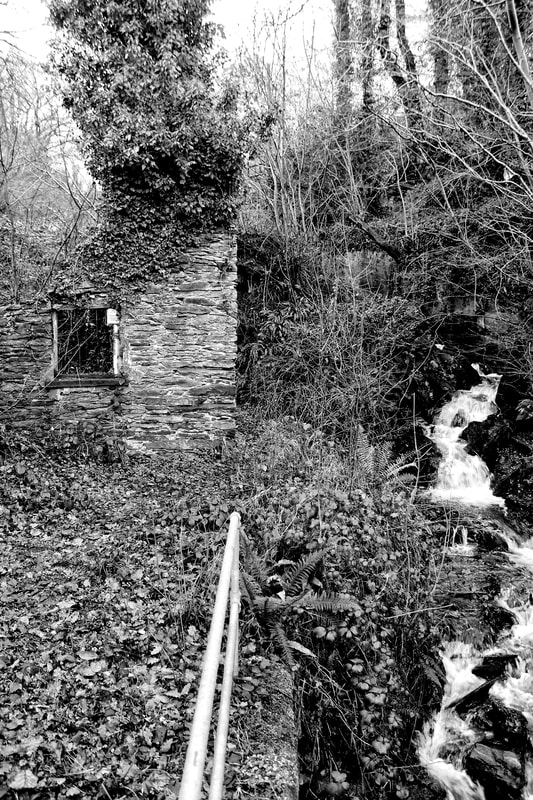
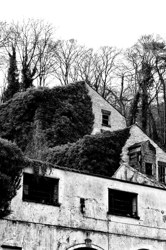
This is my best image throughout the building Safari, monochrome shoot. This is for a number of reasons, including the key elements such as form, space, shape, line, tone and texture. The image overall conveys all seven. Form and shape are shown through the fitted windows which contrast to the rest of the urban building, space is largely illustrated by the trees which stand behind it, just taller that the building, which also allows us to understand the height of the building- furthermore, the space is not only on the outside of the building, but on the inside too as we image in to be rather empty. Tone is shown through the photographs monochromatic characteristics- the small clean patches on the building and the white sky juxtapose the darker moss, trees and inside the block windows. Lastly, texture is evident from the smooth outer-edges of the derelict building, the rough-most likely slightly uneven- brick in the upper part of the house, and moss which covers half the premises and has adapted itself to the trees. |
Buildings Photo Safari/Bokeh:
|

|
|
|
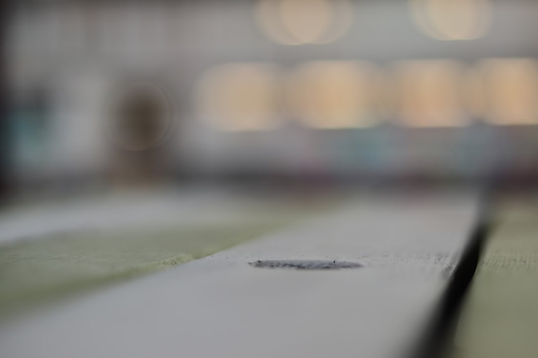
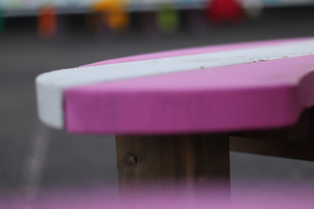
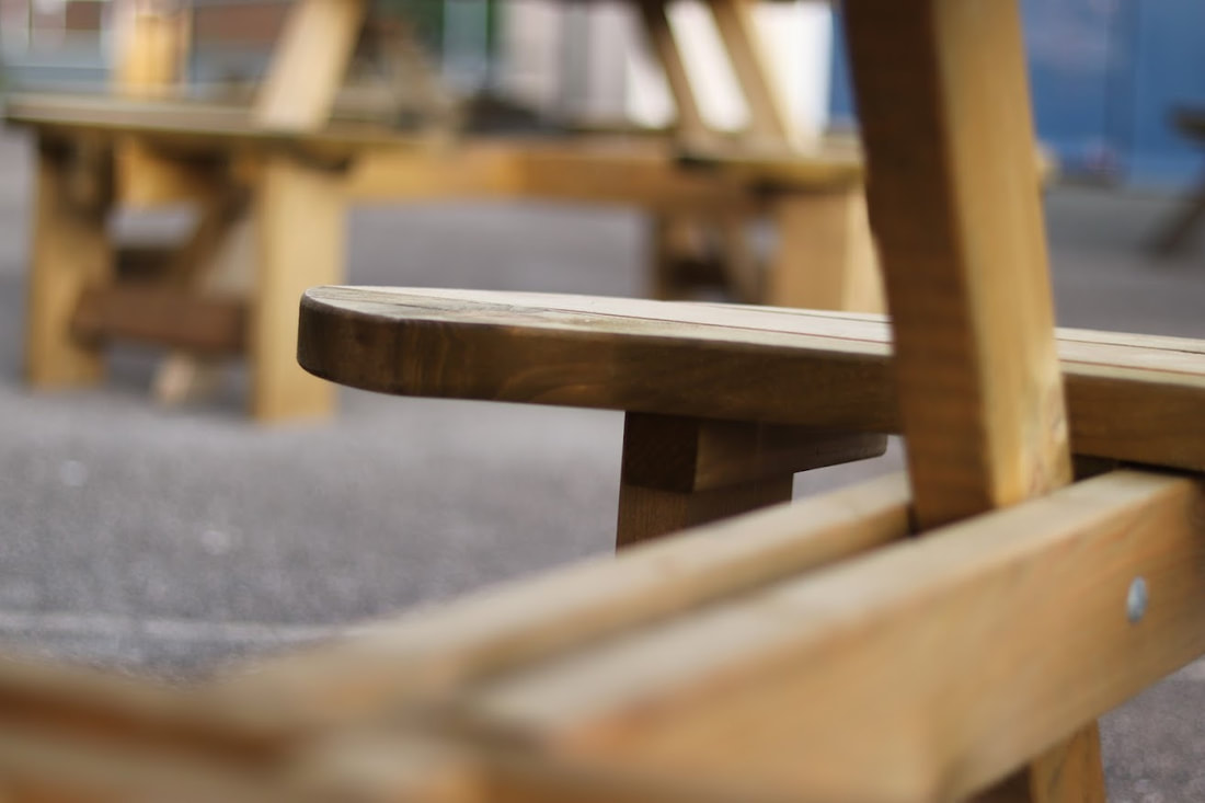
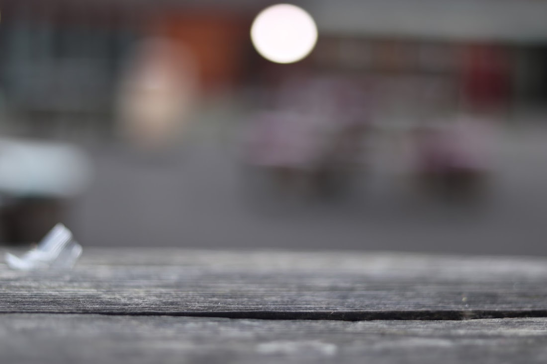
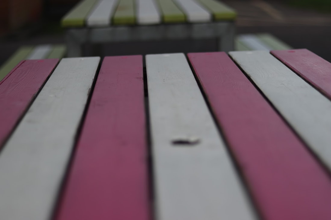
Best Image and Evaluation/Bokeh:

|
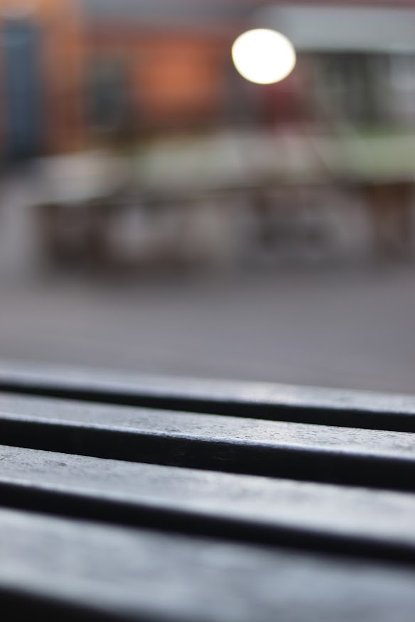
Despite the lack of originality, and overload of familiarity, this image appears to be one of my favourite from the building safari, bokeh shoot. The aperture which was used to capture under the bench resulted in a high quality image of the bench which appears to be smooth- contrasting to many older benches. The other bench in the back allows us to acknowledge the area is most likely a public place- school. Lastly, line is evident in this photography from the flat structure of the image. |
Digital Editing/techniques:
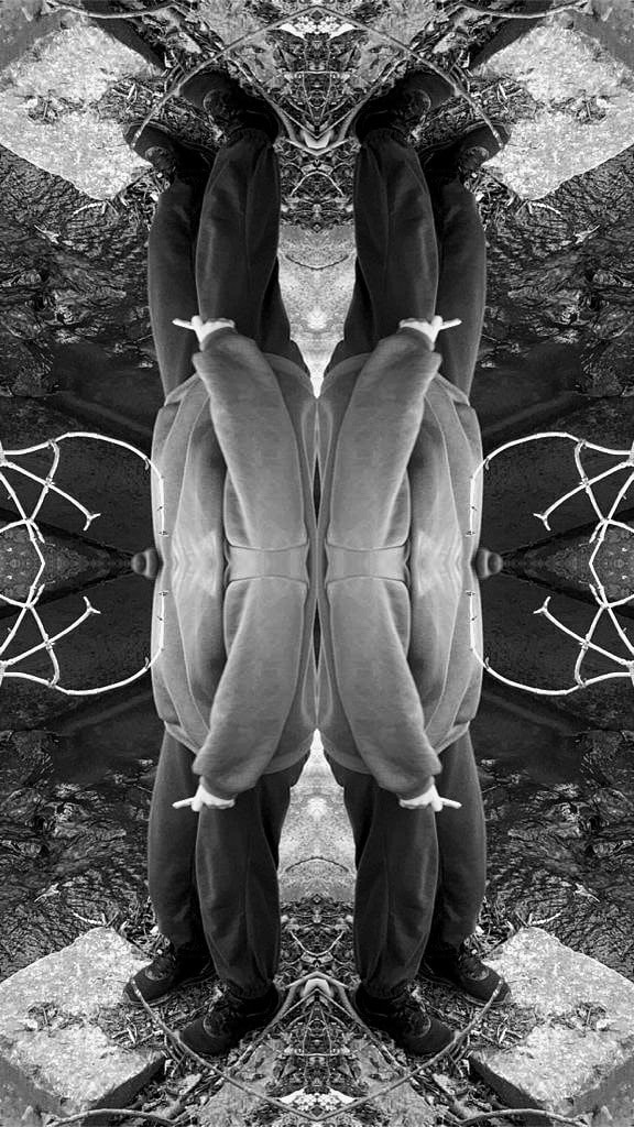
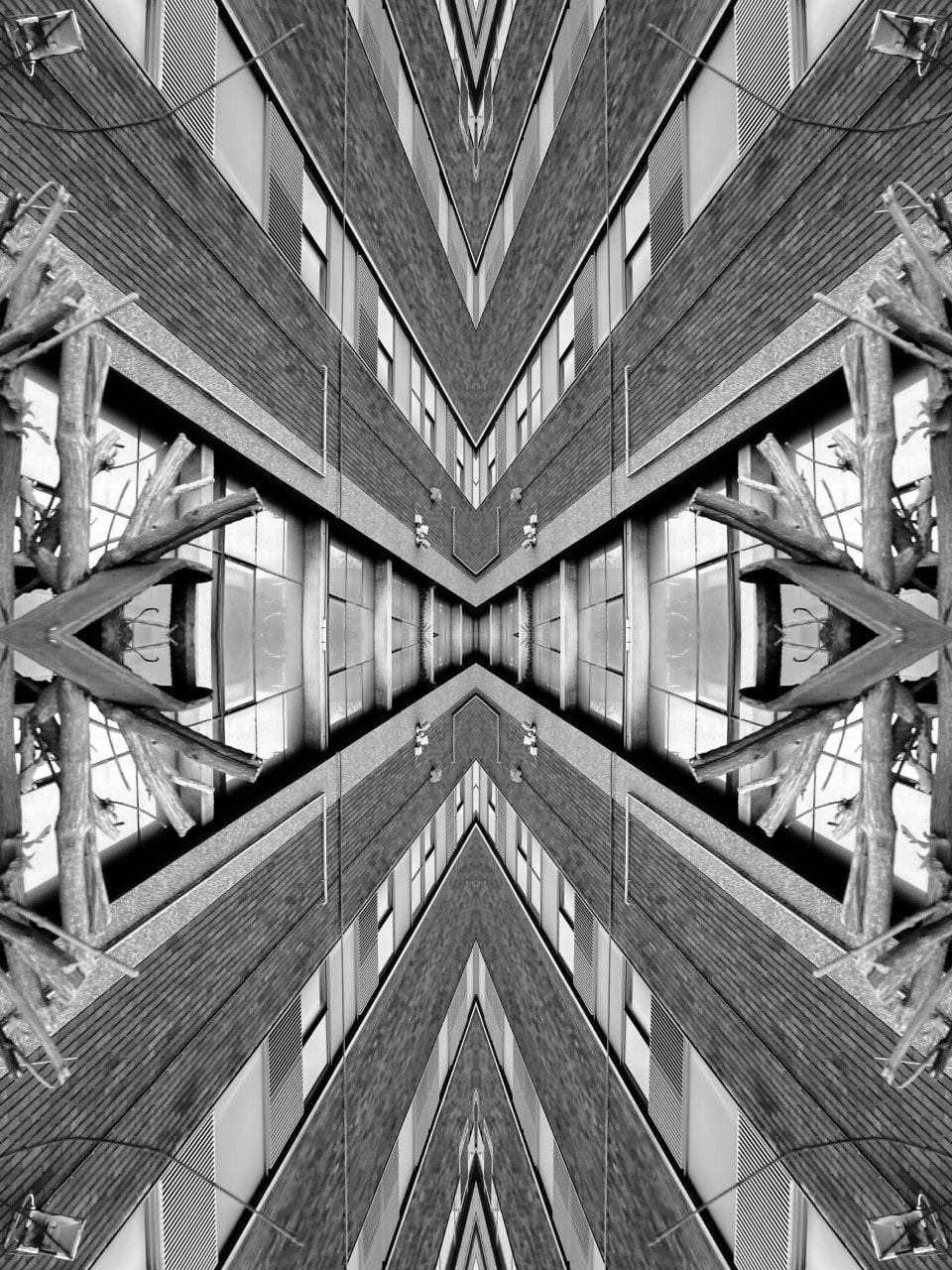
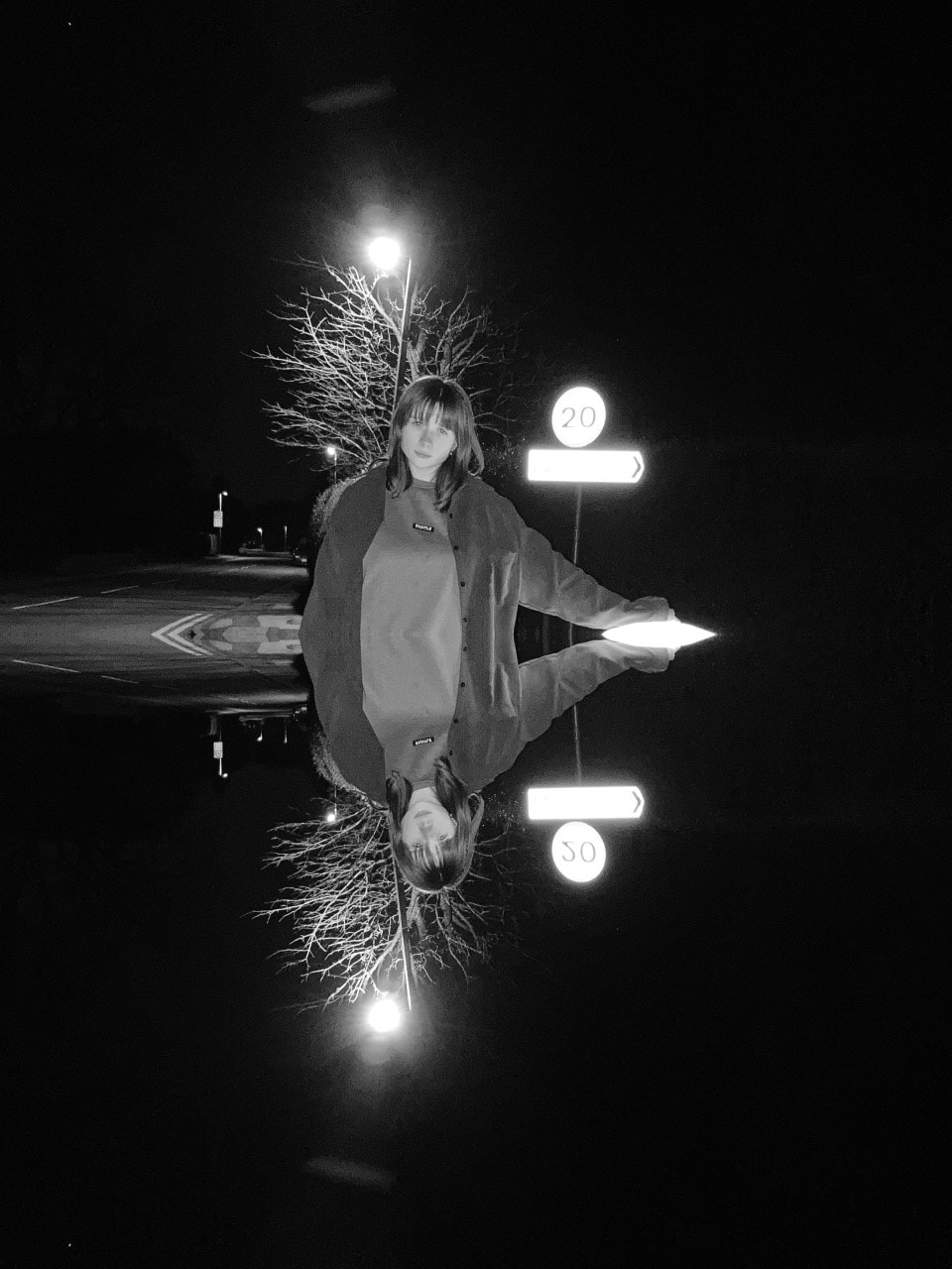
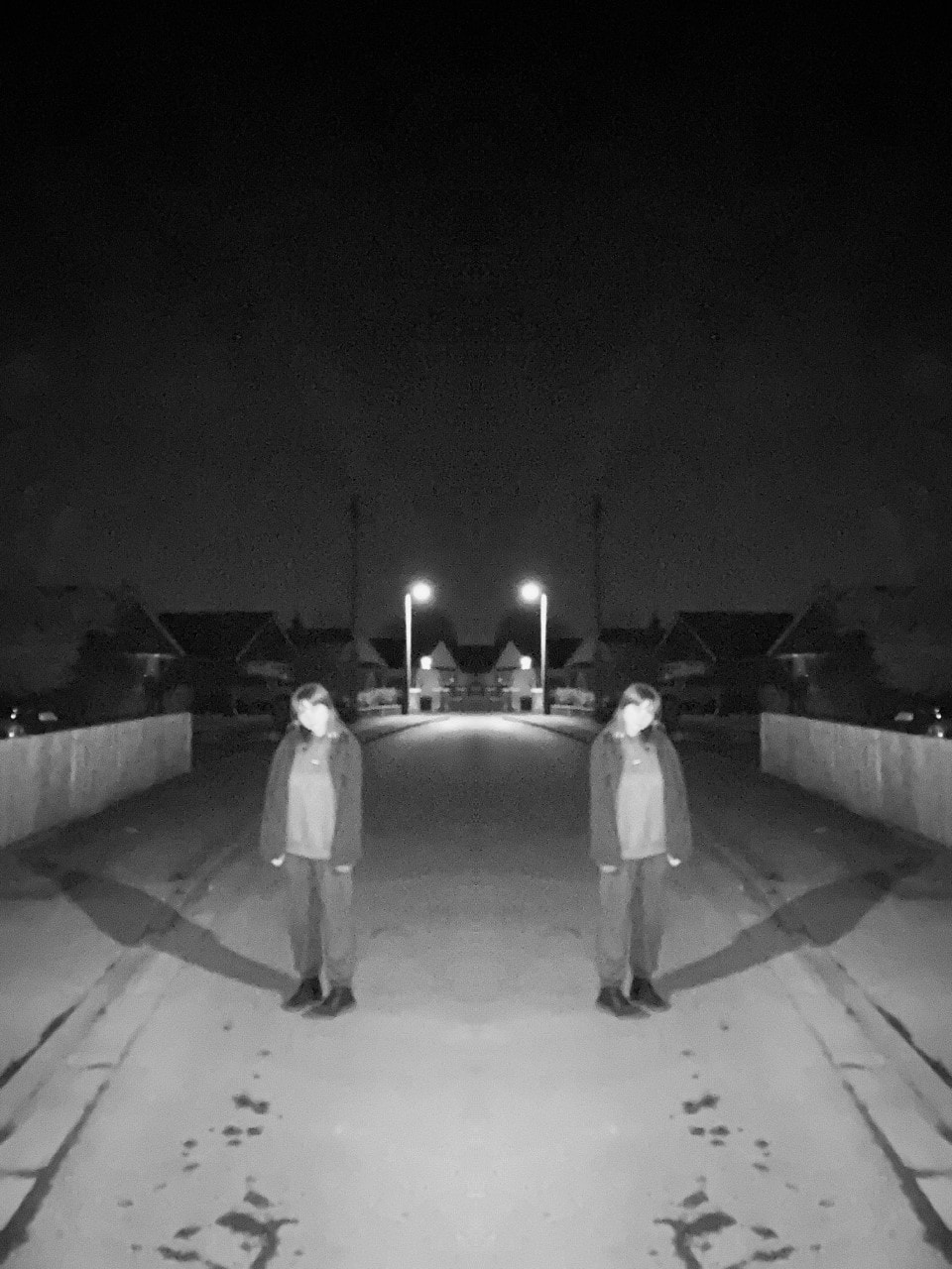
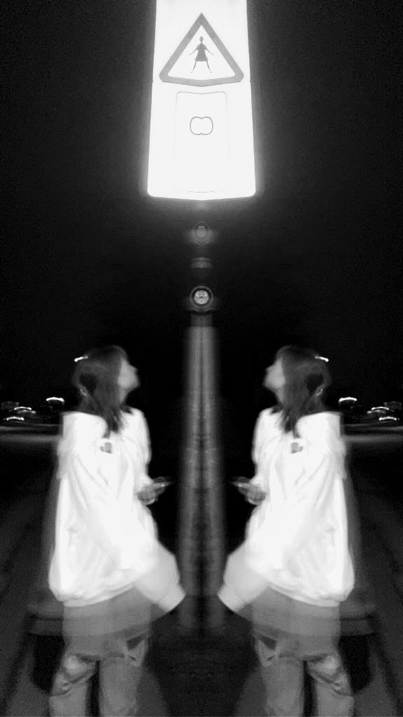
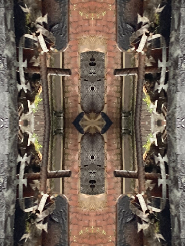
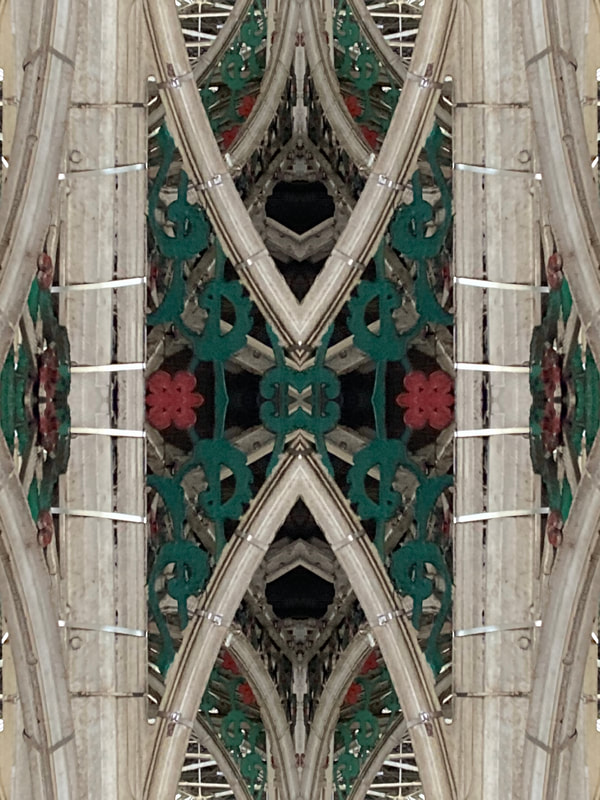
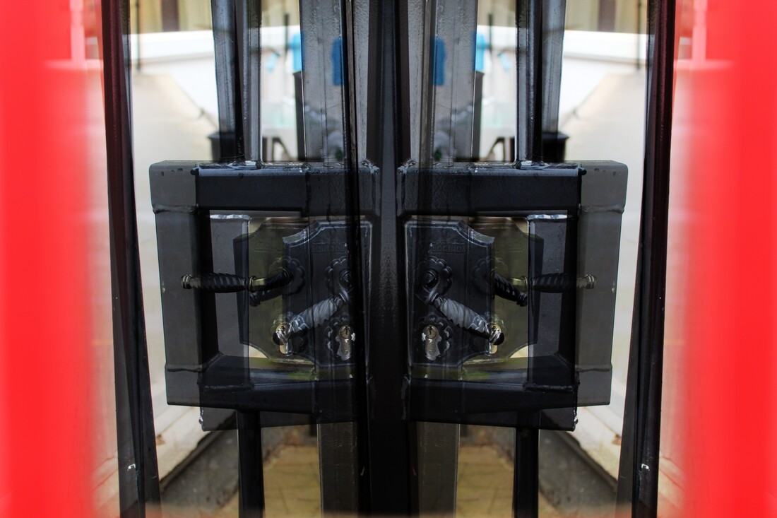
Digital Editing/Rotational:
|
|
|

|
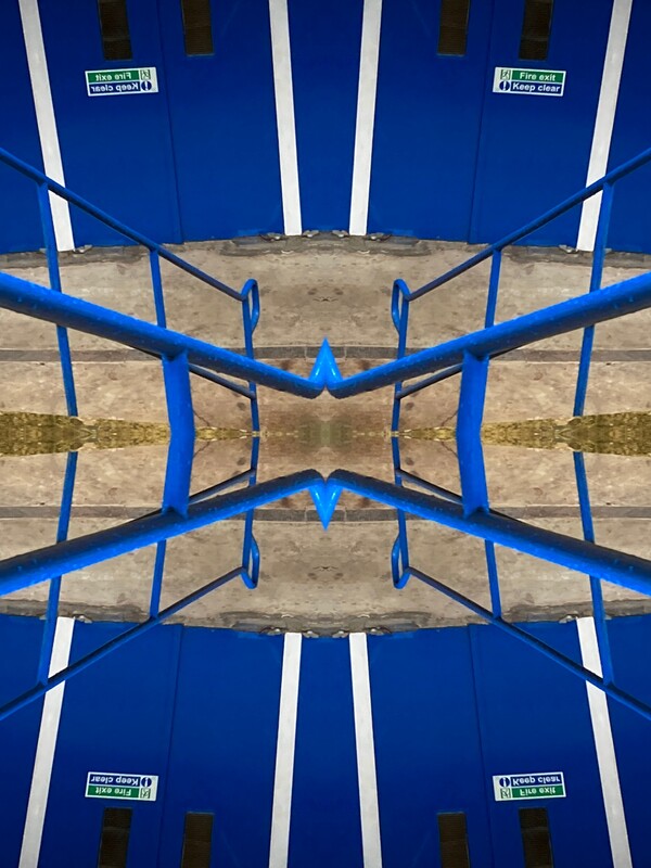
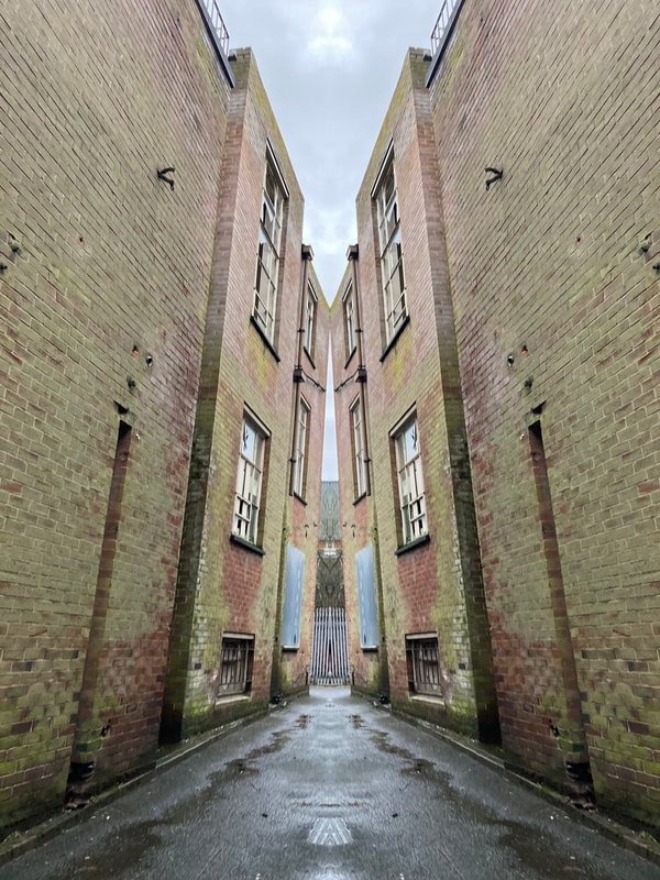
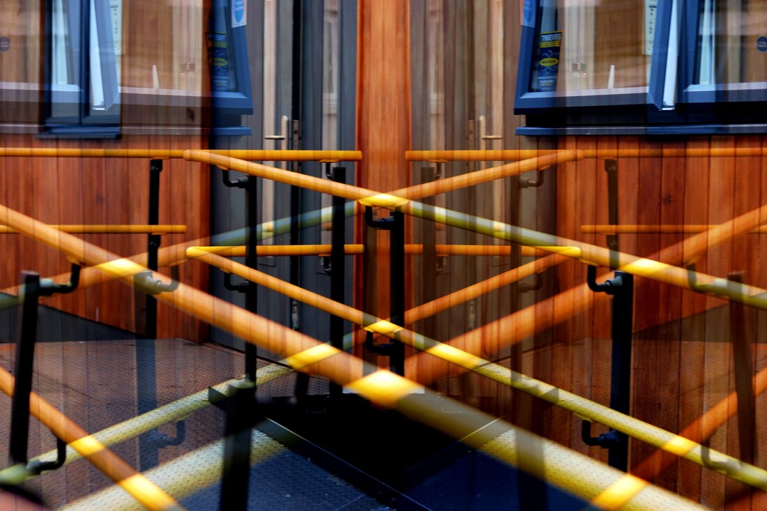
Photo Safari/Best Edited Images/Evaluation:

|
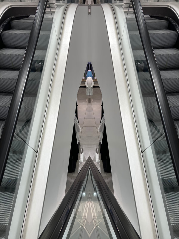
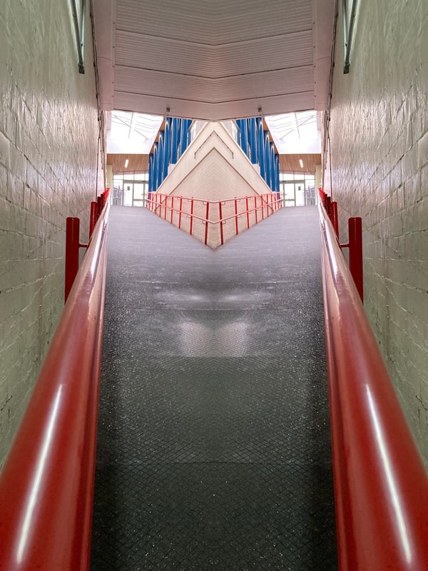
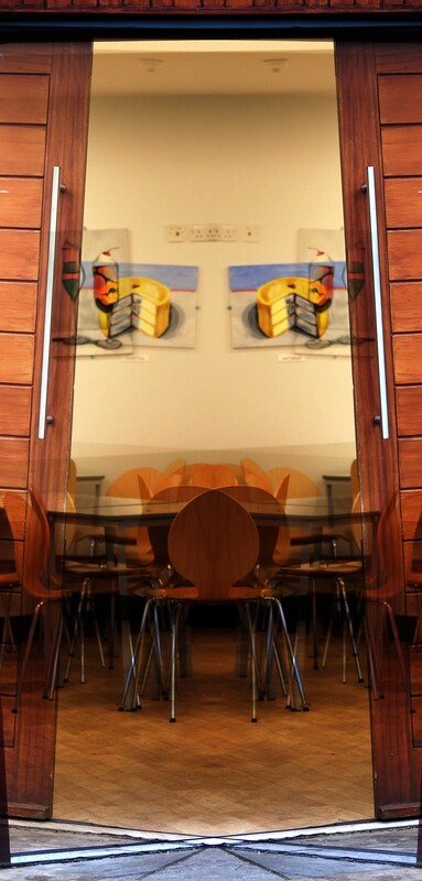
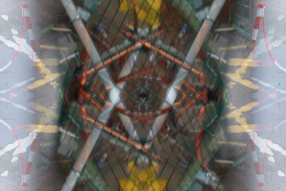
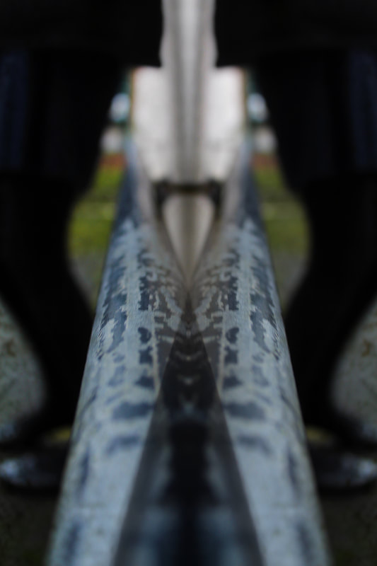
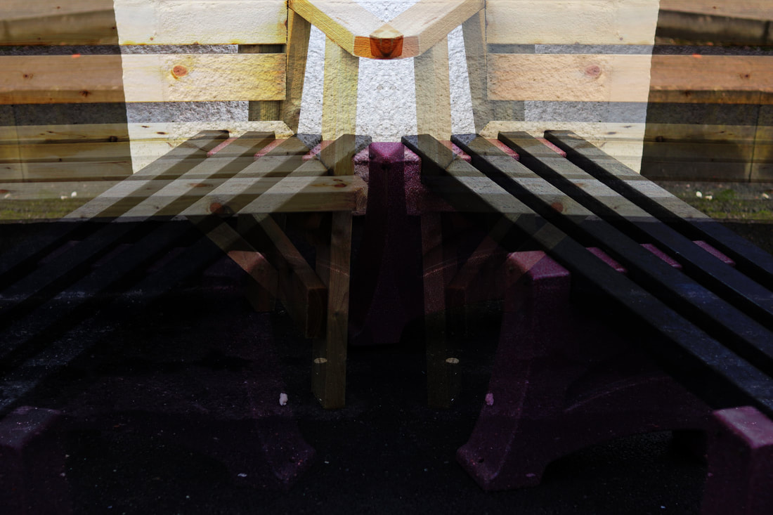
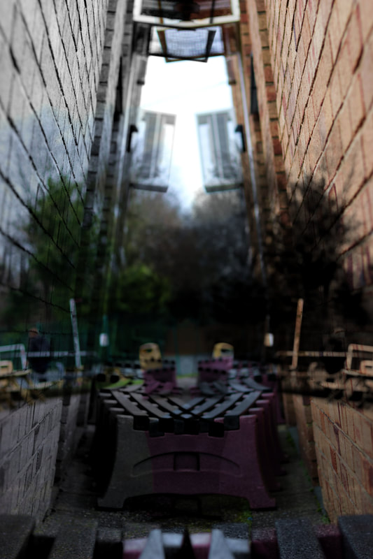
This image is certainly one of my favourites- the symmetrical digital edit definitely increases my interest in this otherwise boring image. I believe this is a perfect demonstration of how editing can drastically improve a photograph. The rusty railing juxtaposes the growth from the green grass- not only in beauty and decay but also in colour. The black-grey railings and black clothing on the person largely contrasts against the lighter colours in the background. Apart from the colour analysis, I also believe the actual decay of the railing adds the most interest to the image. The random pattern of the railing contrasts with the symmetrical tight-fitted pattern of the digital editing. |
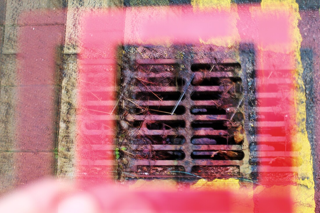
|
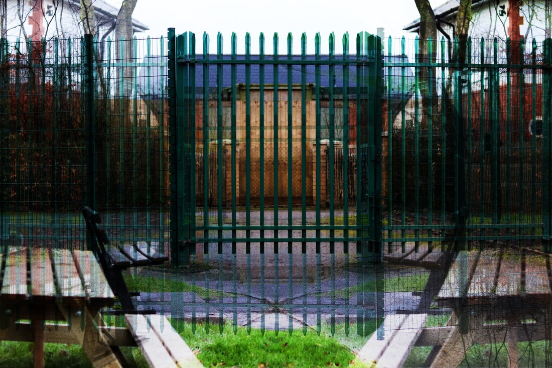
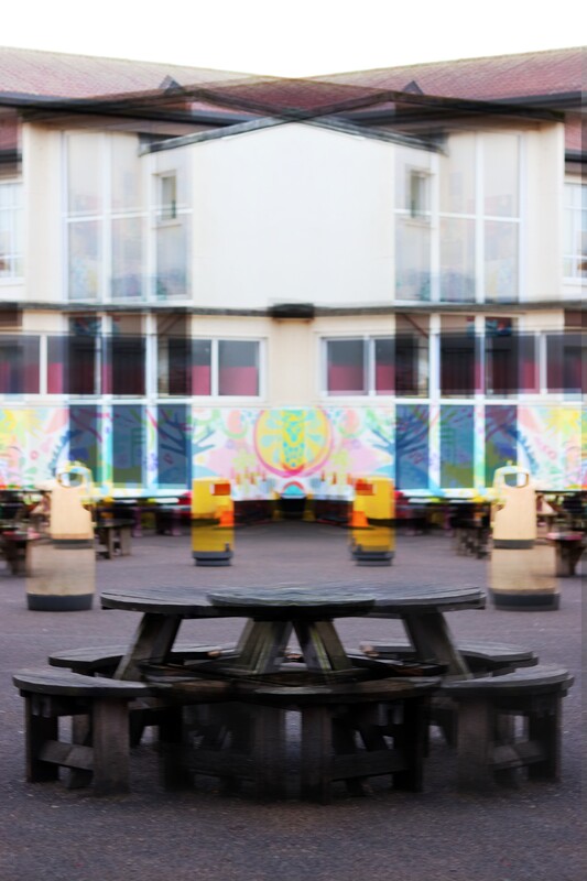
I like this image due to its symmetrical and glitchy-like qualities which interest the viewer. Upon first glance, the bench may not look so different, however if we inspect it further or look further up, then we notice its much more abstract than we originally thought. Additionally, the bright colours contrast against the few darker tones. The different shades of yellow bins match the design colours on the plain building before juxtaposing the shadowed bench, ground and outline. To improve this image, I would probably choose one of the painted benches as the subject, with the same background, as this would improve the overall highlights of the image. |
Compositions/Final Outcomes:
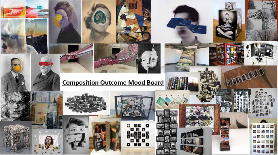
Mood Board/Inspiration:
Composition 1/Shape Manipulation:
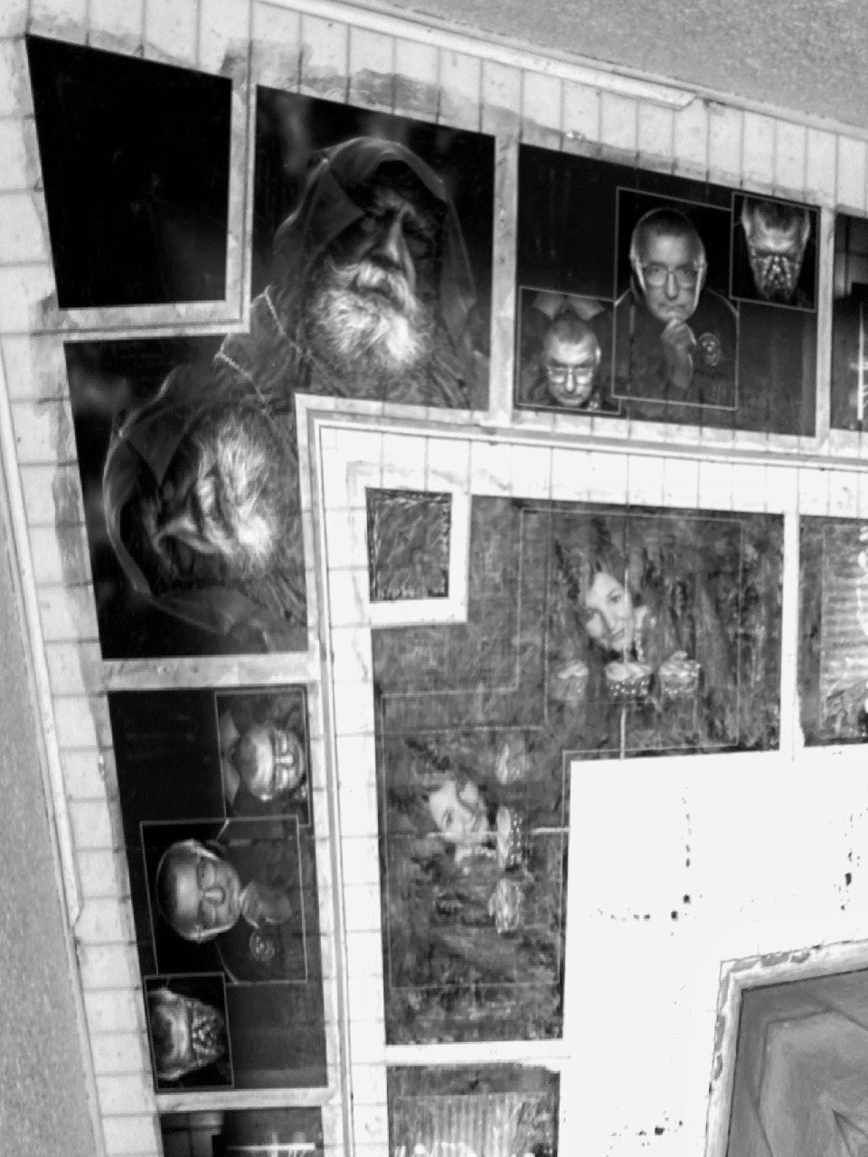
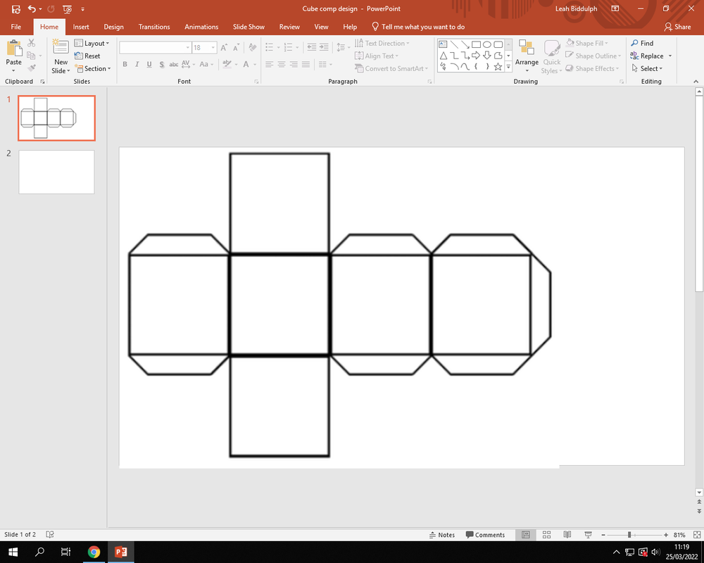
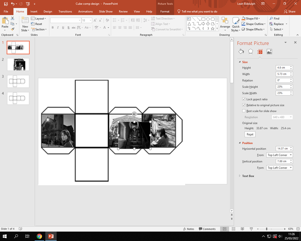
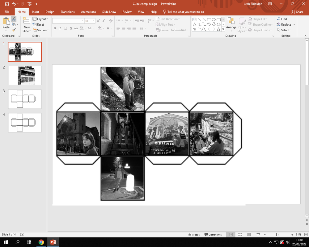
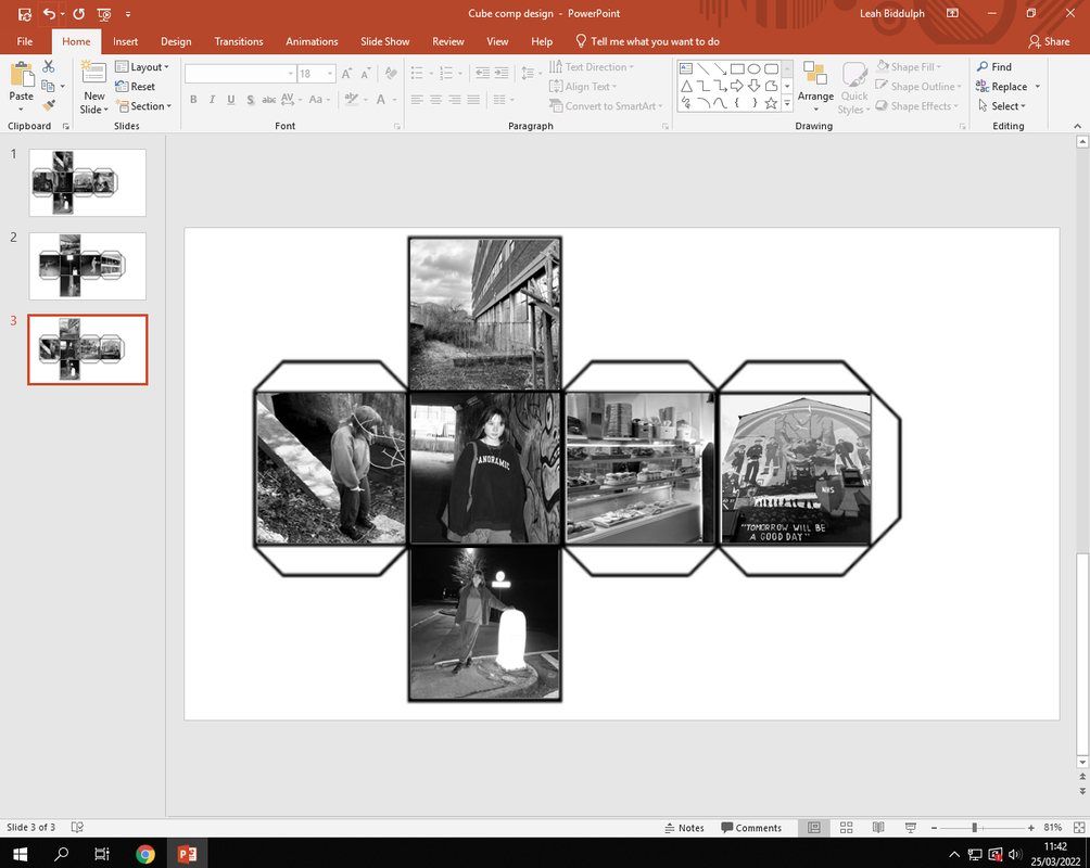
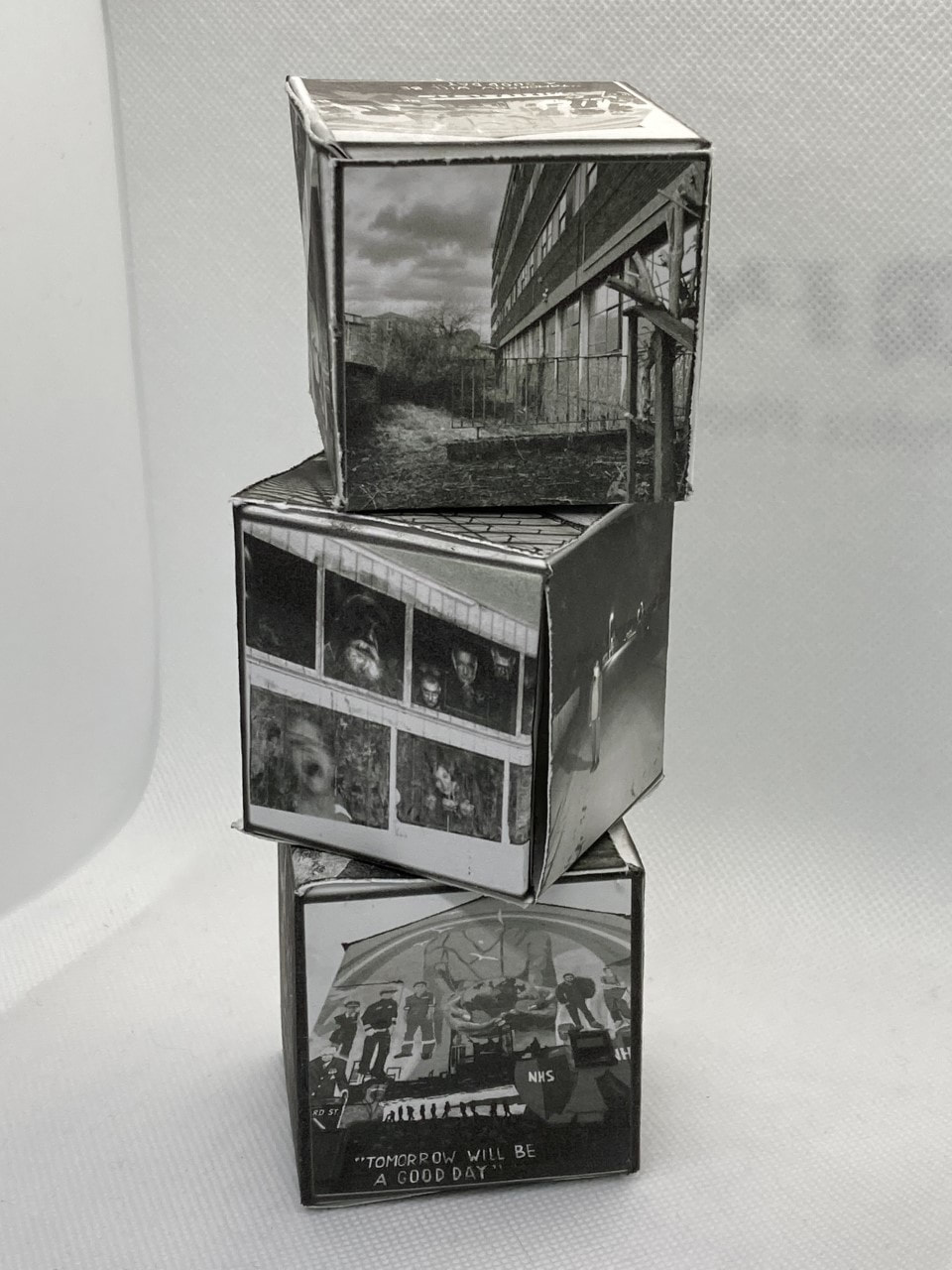
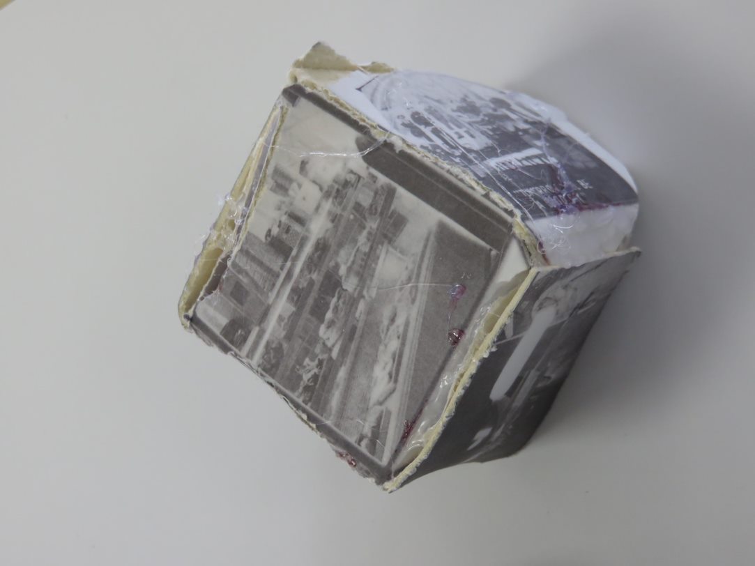
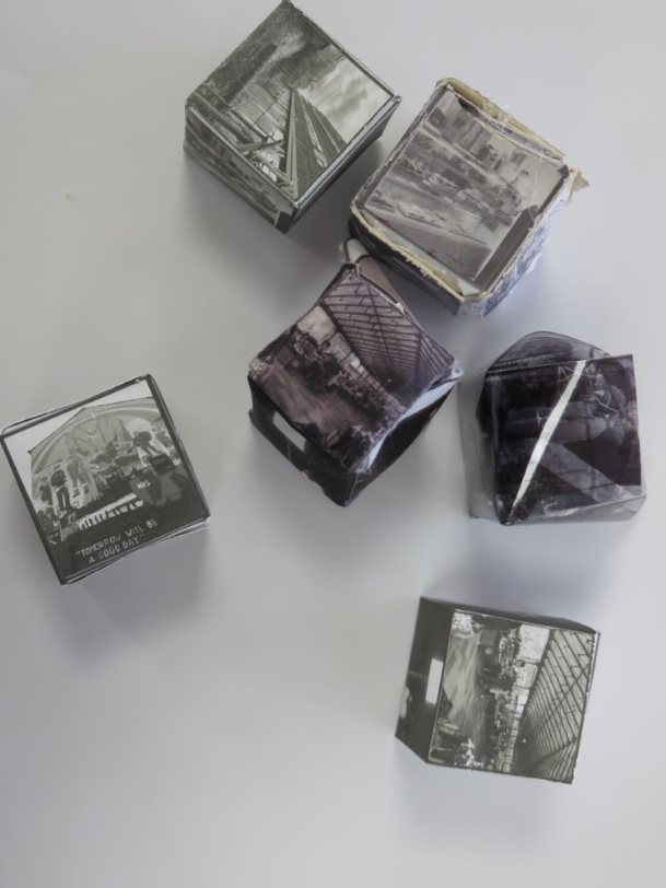
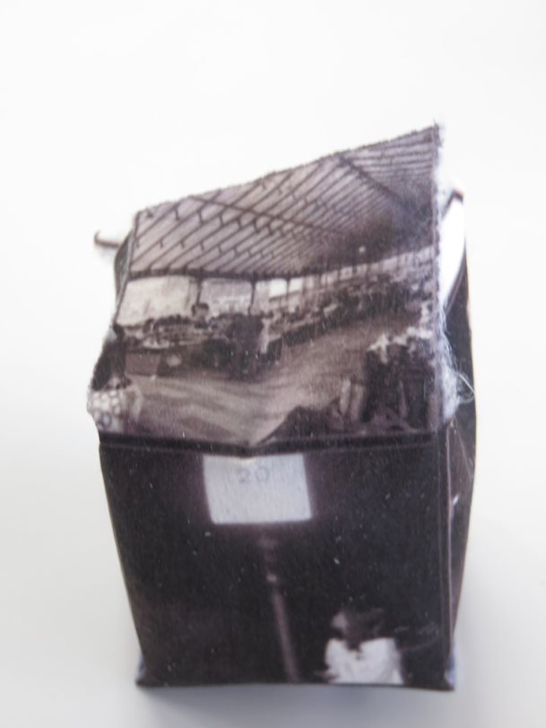
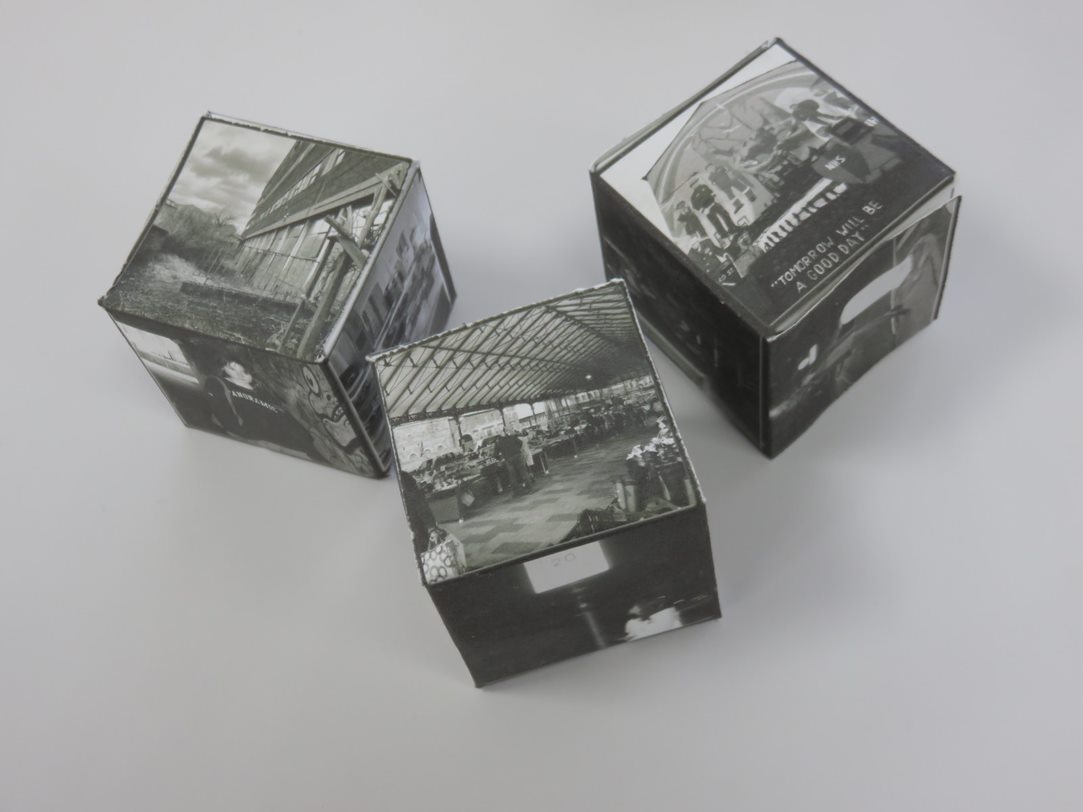
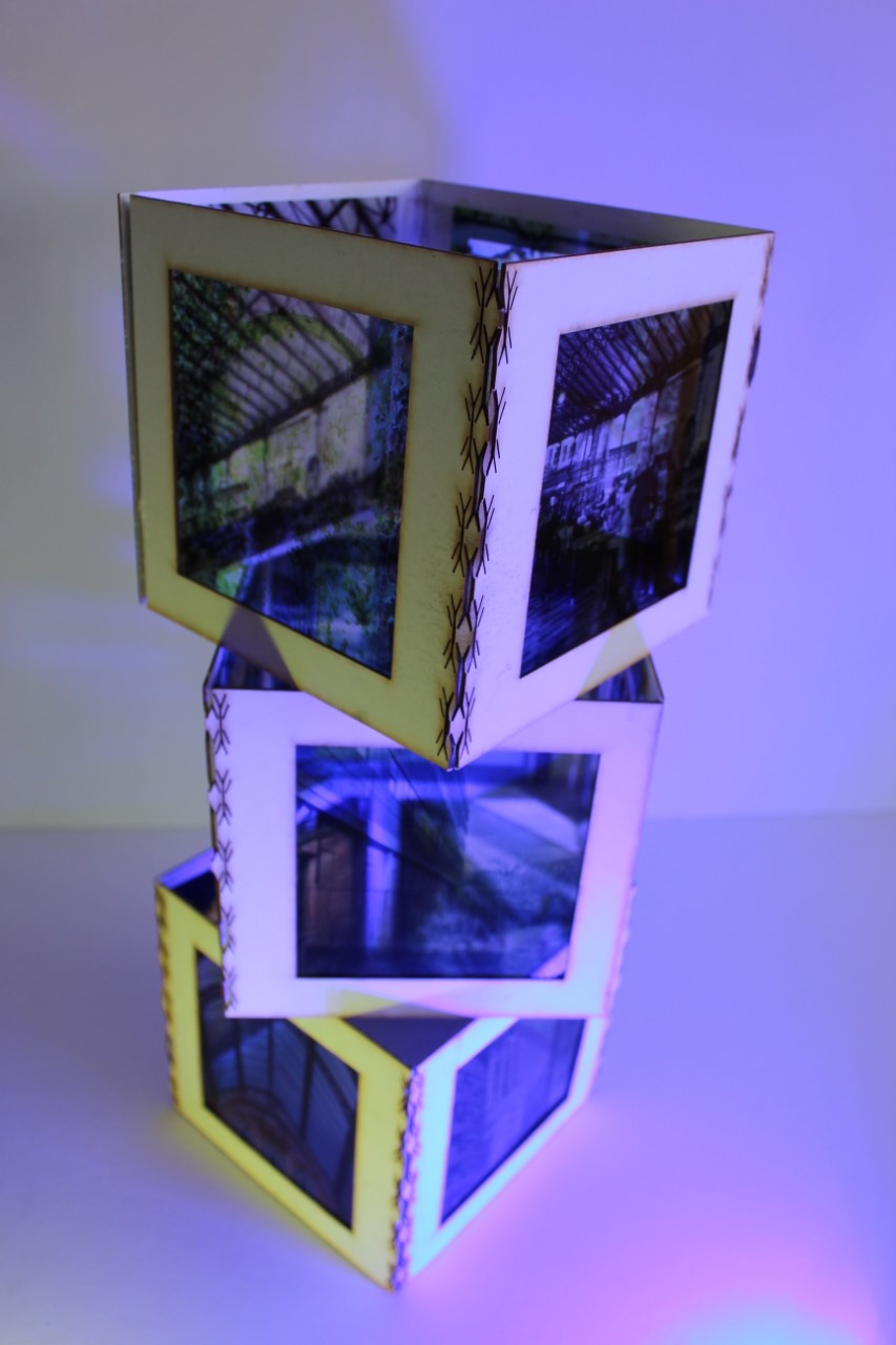
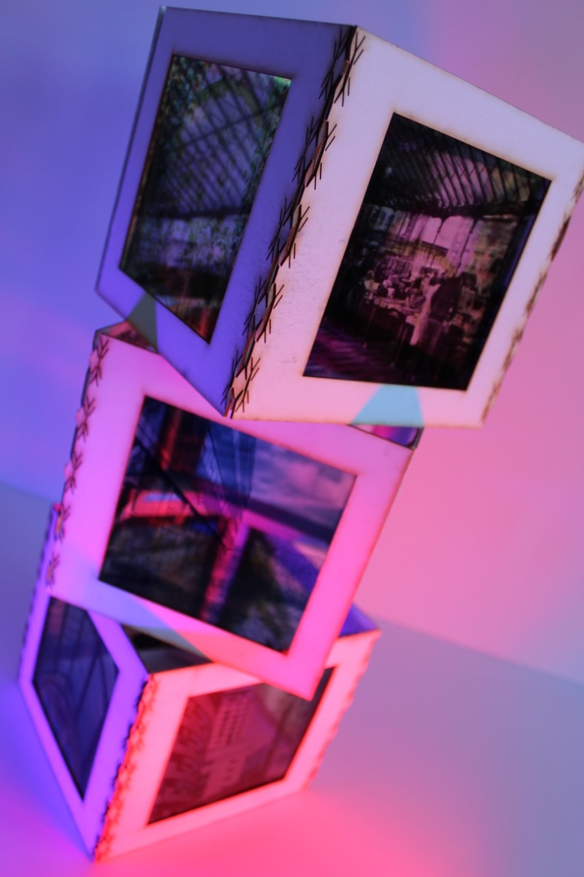
In this Composition, I will use cubes (probably of cardboard), using pictures from previous shoots to decorate them. To do this I will need to create different sizes of cubes, between 5cm and 20cm. After printing off my best previous images, most likely from the Jill Freedman shoot, I will cut them to size and stick them onto the chosen cubes with glue. Finally, I will use the monochrome cubes to create a small shape which is visually pleasing, by placing them on top of one another.
I was inspired by the cubes as they are something simple yet unique. They're almost like small, cube shaped canvases which have a personal touch. Unlike the other options, such as sewing or drawing over/into the image, this choice means I can get much more hands-on without the need to be artistic.
I was inspired by the cubes as they are something simple yet unique. They're almost like small, cube shaped canvases which have a personal touch. Unlike the other options, such as sewing or drawing over/into the image, this choice means I can get much more hands-on without the need to be artistic.
Photographs which will be used: Jill Freedman shoot/Unedited:
|
|
|
|
|
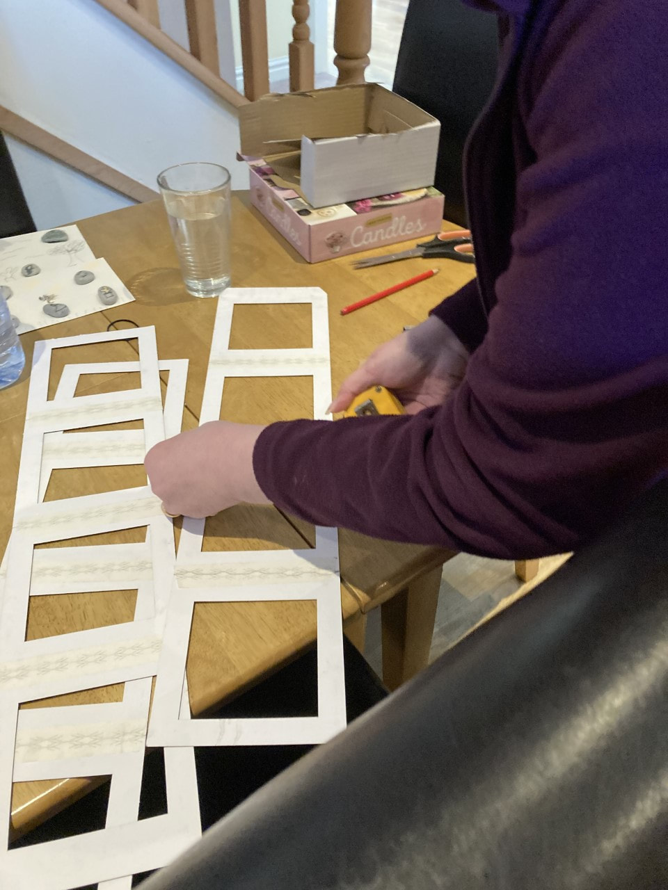
Composition 1/Shape Manipulation/Attempt and Process:
|
|

Composition 1/Shape Manipulation/Results:
|
|
Composition 2/Mobile Hanging:
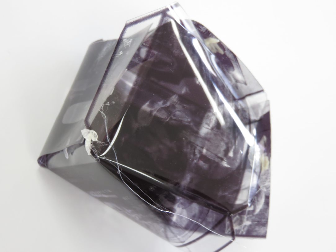
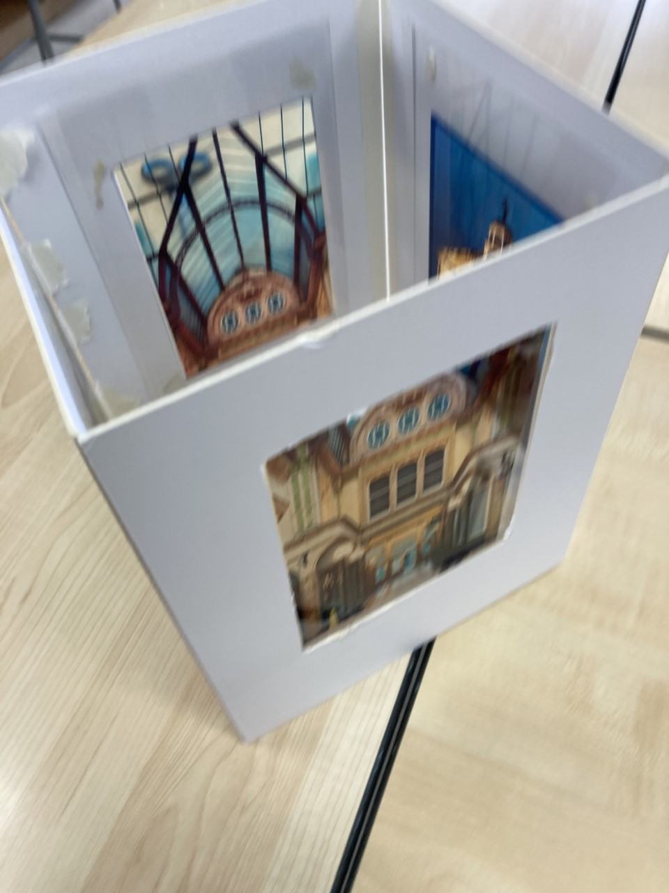
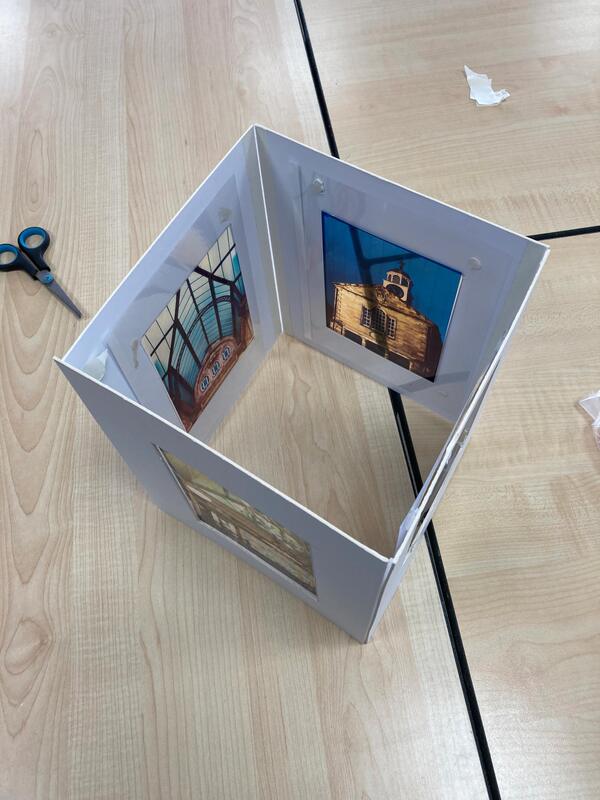
In this composition, I intend to create a frame before hanging my images off of it. To do this I will, as mentioned, create a form from straws or some other type of cardboard which is not durable, the material will need to be somewhat strong as to not break. Then, I will print off some of my best images on asatapes (which will probably be from the Saul Leiter shoot). With these images I will cut out and stick around them frames which are the same colour as the original frame which they will be hung from. After this, I will proceed to the last step- I will hang up to the images with some sort of string which matches the colour of the frames. This will create a form of mobile hanging.
I was inspired by the idea of a mobile hanging due to their use of multiple different elements such as line, shape and texture. I believe these elements will create an unusual sculpture piece which is creative and slightly abstract. The general idea of a 'mobile' is good, which I believe is only upgraded by using asatopes instead of normal paper.
I was inspired by the idea of a mobile hanging due to their use of multiple different elements such as line, shape and texture. I believe these elements will create an unusual sculpture piece which is creative and slightly abstract. The general idea of a 'mobile' is good, which I believe is only upgraded by using asatopes instead of normal paper.
Photographs which will be used: Saul Leiter shoot/Unedited:
|
|
|
|
|
Composition 2/Mobile Hanging/Attempt and process:
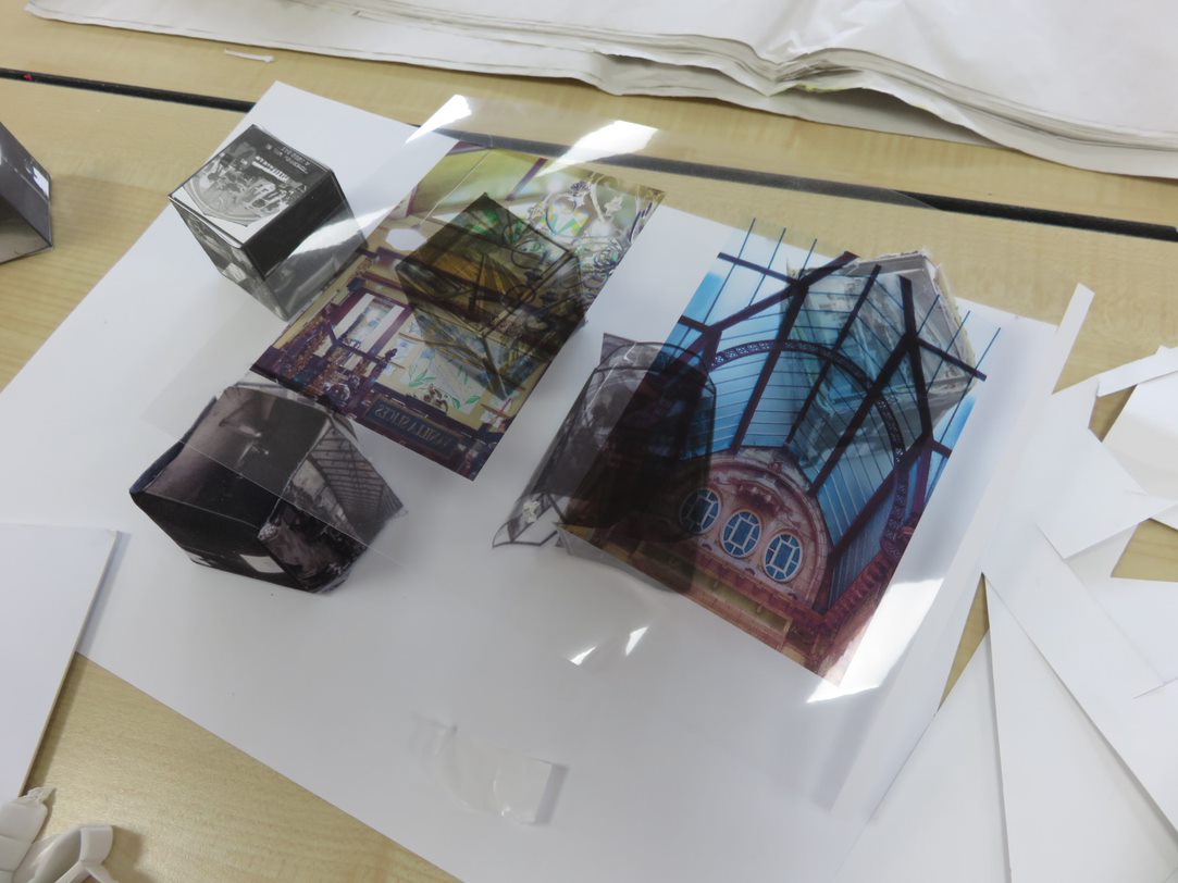
|
|
|
Composition 2/Mobile Hanging/Results:
|
|
Final Outcome/Plan:
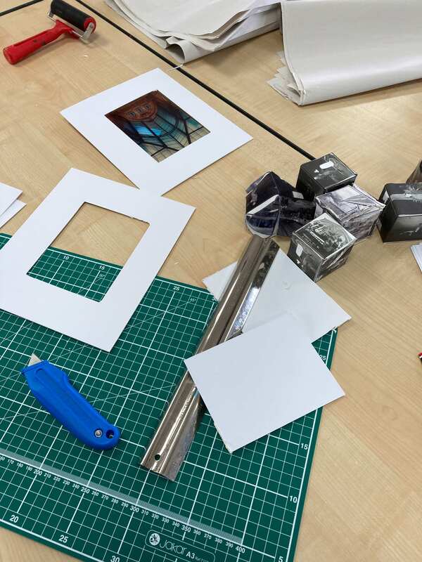
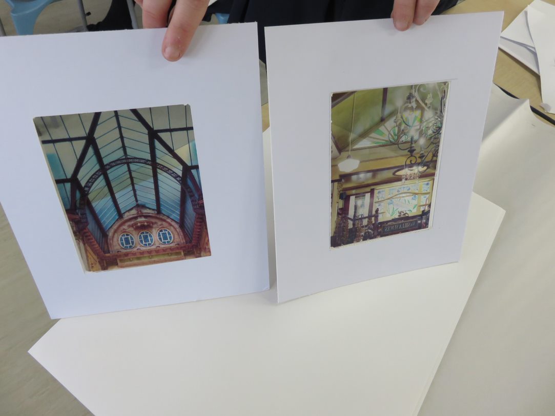
For this outcome, I will go with composition 2, in which I created a mobile hanging contraption with 'windows' containing my images printed out on asotape. However, instead of doing one large one I will create 3 small ones in the same style. Additionally, instead of using the flimsy white card I will use a wooden frame which will create a more professional, sturdy look.
Final Outcome/Process:
Final Outcome:
|
|
Final Outcome/Evaluation
I think out of all my final outcomes throughout my portfolio, this is certainly my favourite- due to the creativity and effort which went into this piece. Instead of one mobile hanging like in my second composition, I created three smaller ones which I believe create a mix of both compositions.
The first composition, in which I created several small cubes, is shown from the images above in which the cubes are placed and stacked on top of one another in a similar way the originals were. This shows composition one has enhanced my skill to set out objects in the most visually appealing way. Additionally, I have a better understanding of different materials and how to manipulate and mould them.
My second composition, which holds many similarities to my final piece, was much less educating than my first composition. In this, I created one large mobile hanging which consists of four windows filled in with asotapes mounted to a cardboard square. Not much went wrong in this outcome, unlike the material cubes. which is why I chose it for my final outcome.
Evaluation/Urban Environment:
To begin this project, I completed the basic initial research and created mood boards of artists and techniques which I planned to emulate. I believe this was a good way to start as it gave me inspiration for the rest of the project.
My first artist was Jill Freedman, I completed and wrote a paragraph of research on her life and career before finding her best images and inserting them into a grid. After analysing her images, I chose my favourite one and used it in a semi analysis- the same image was later used in a comparative analysis. Then, I wrote up a shoot plan explaining how I would emulate her work before carrying out the shoot plan and imputing the photographs into a contact sheet. After editing the contact sheet, I uploaded my edits (monochrome and reflective manipulation) of the best ones. I finished by evaluating two of my favourites from the non-reflective, monochrome shoot.
My next artist was Saul Leiter, I carried out another research about him before choosing my favourites images and explaining what techniques I favour. I then performed a comparative semi-analysis on my favourite of his images against my favourite of Jill Freedmans work. After this, I did more research about Leiter's work and put it into a shoot plan which I later used to emulate his work. I edited and uploaded a contact sheet, the best unedited images and completed an evaluation on three of my favourites. I then edited using reflection eight images and was pleased with the results.
Riccardo Magherini was my third artist of choice; I carried out a simple artist research and shoot plan on his photographs. After this, I completed another comparative semi-analysis between his work, Freedmans and Leiters. I also cpmpleted a colour splodge on my favourite of his images and added three articles about him and his work.
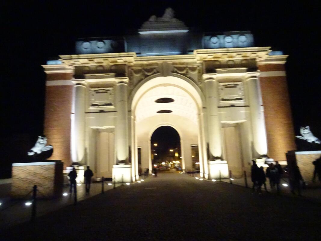
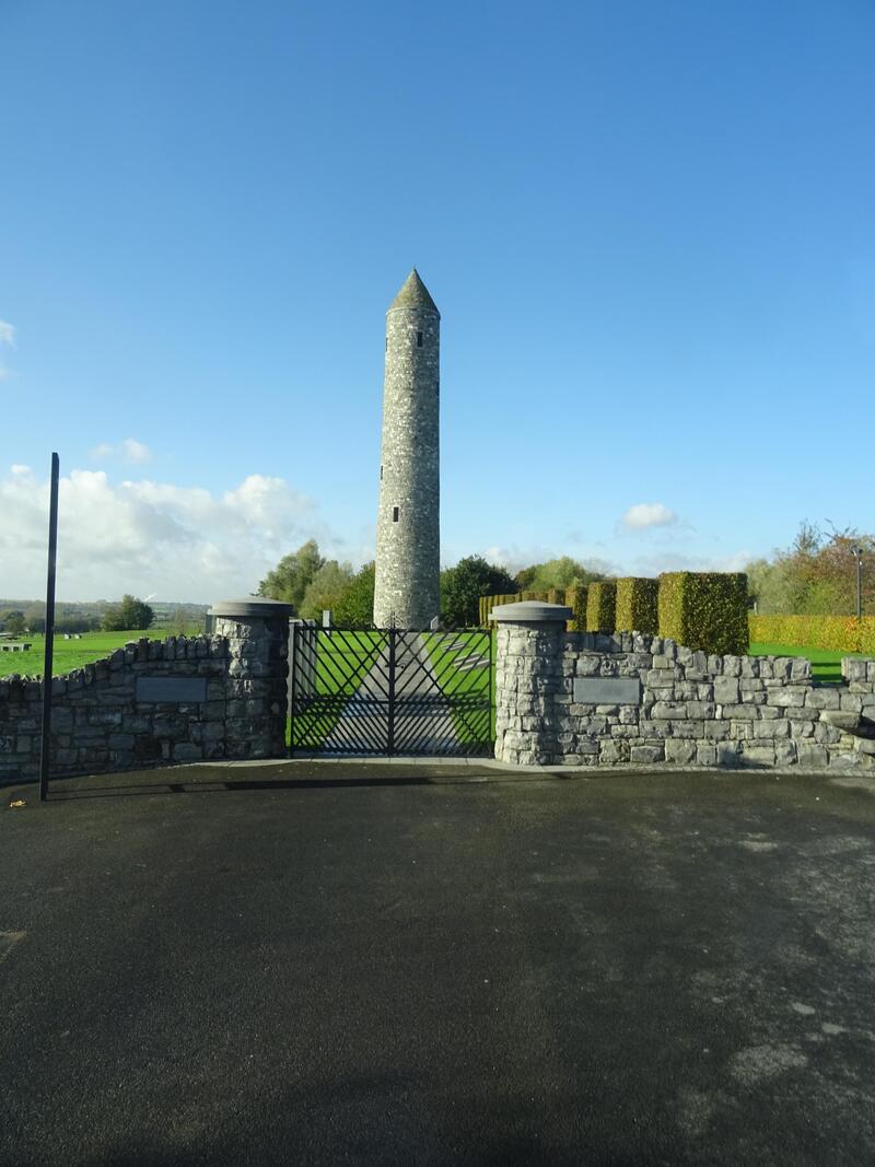
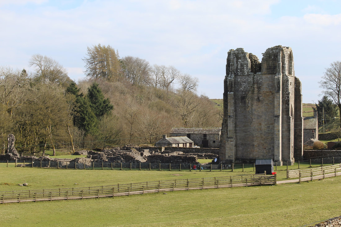
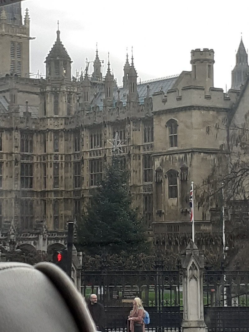
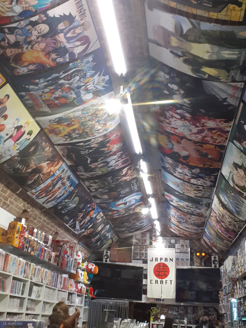
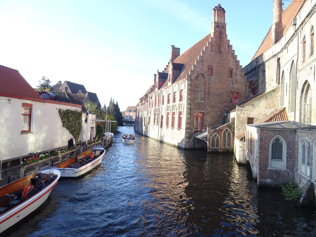
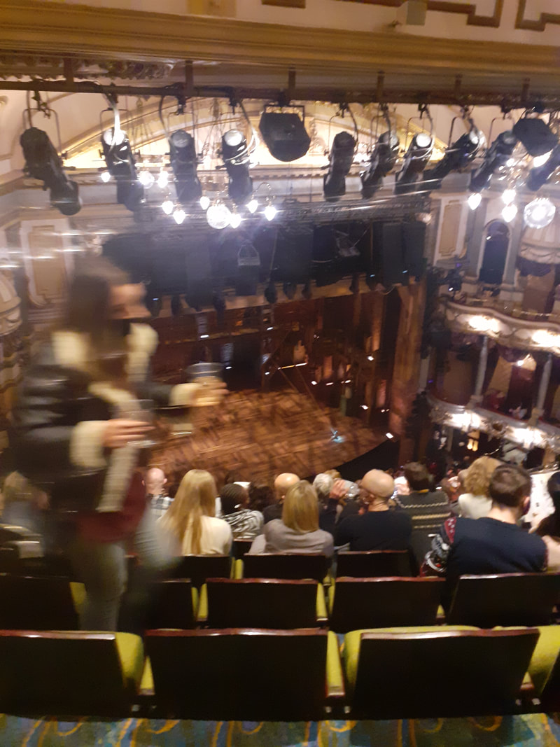
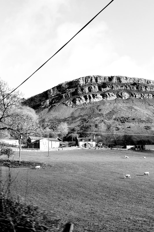
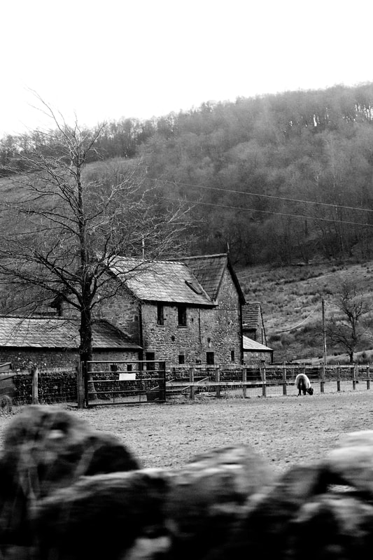
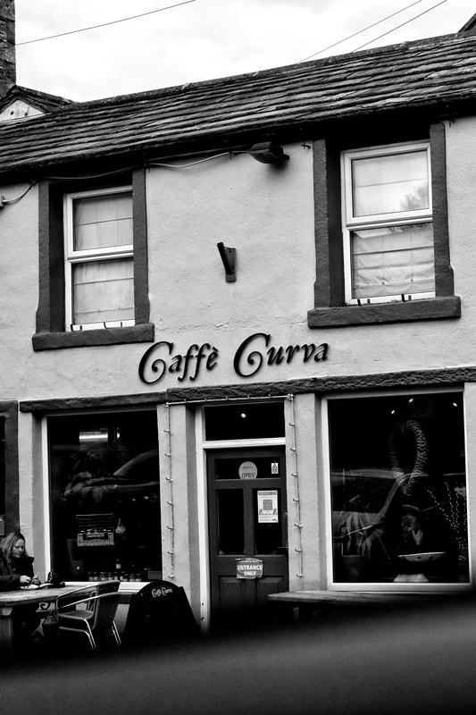
The last of the artists I analysed was Berenice Abbot. I did a similar thing for her as I did for Riccardo Magherini- I researched and commented on her career before explaining why I chose her and wrote a semi-analysis on one of her images. After researching artists, I uploaded individual shoots. My first solo shoot was in London- I uploaded over a dozen unedited images and eight best edits. After this, I wrote an evaluation on my best image. This image was later printed out in A3 as a physical copy. Then, I uploaded 'pre-pandemic' photographs from places such as Spain, Belgium, France, Wales and Cumbria. These images were taken on a phone or small compact camera and remain unedited.
Furthermore, I completed a photo safari on architectural techniques and processes. I then did a shoot based off this safari, in school, and uploaded a contact sheet of this shoot. Away from school, I took monochrome and bokeh shoots and wrote an evaluation on one image from each shoot. Using the same images, I explained the digital edited techniques I used to move these rotational before uploading numerous of the best symmetrical edits and evaluated two.
Finally, I moved onto my final compositions. For both of these, I explained the aim and process before sharing the results and an evaluation- the evaluation included in the final outcome evaluation. Lastly, I took the second composition (mobile hanging) further and recreated it for my final outcome. The final outcome was then planned and evolved.
Overall, I received many key skills and techniques from this project such as improved physical and digital manipulation skills and higher confidence in architectural photography.
My first artist was Jill Freedman, I completed and wrote a paragraph of research on her life and career before finding her best images and inserting them into a grid. After analysing her images, I chose my favourite one and used it in a semi analysis- the same image was later used in a comparative analysis. Then, I wrote up a shoot plan explaining how I would emulate her work before carrying out the shoot plan and imputing the photographs into a contact sheet. After editing the contact sheet, I uploaded my edits (monochrome and reflective manipulation) of the best ones. I finished by evaluating two of my favourites from the non-reflective, monochrome shoot.
My next artist was Saul Leiter, I carried out another research about him before choosing my favourites images and explaining what techniques I favour. I then performed a comparative semi-analysis on my favourite of his images against my favourite of Jill Freedmans work. After this, I did more research about Leiter's work and put it into a shoot plan which I later used to emulate his work. I edited and uploaded a contact sheet, the best unedited images and completed an evaluation on three of my favourites. I then edited using reflection eight images and was pleased with the results.
Riccardo Magherini was my third artist of choice; I carried out a simple artist research and shoot plan on his photographs. After this, I completed another comparative semi-analysis between his work, Freedmans and Leiters. I also cpmpleted a colour splodge on my favourite of his images and added three articles about him and his work.
The last of the artists I analysed was Berenice Abbot. I did a similar thing for her as I did for Riccardo Magherini- I researched and commented on her career before explaining why I chose her and wrote a semi-analysis on one of her images. After researching artists, I uploaded individual shoots. My first solo shoot was in London- I uploaded over a dozen unedited images and eight best edits. After this, I wrote an evaluation on my best image. This image was later printed out in A3 as a physical copy. Then, I uploaded 'pre-pandemic' photographs from places such as Spain, Belgium, France, Wales and Cumbria. These images were taken on a phone or small compact camera and remain unedited.
Furthermore, I completed a photo safari on architectural techniques and processes. I then did a shoot based off this safari, in school, and uploaded a contact sheet of this shoot. Away from school, I took monochrome and bokeh shoots and wrote an evaluation on one image from each shoot. Using the same images, I explained the digital edited techniques I used to move these rotational before uploading numerous of the best symmetrical edits and evaluated two.
Finally, I moved onto my final compositions. For both of these, I explained the aim and process before sharing the results and an evaluation- the evaluation included in the final outcome evaluation. Lastly, I took the second composition (mobile hanging) further and recreated it for my final outcome. The final outcome was then planned and evolved.
Overall, I received many key skills and techniques from this project such as improved physical and digital manipulation skills and higher confidence in architectural photography.
