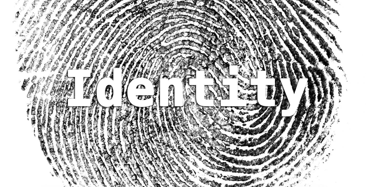
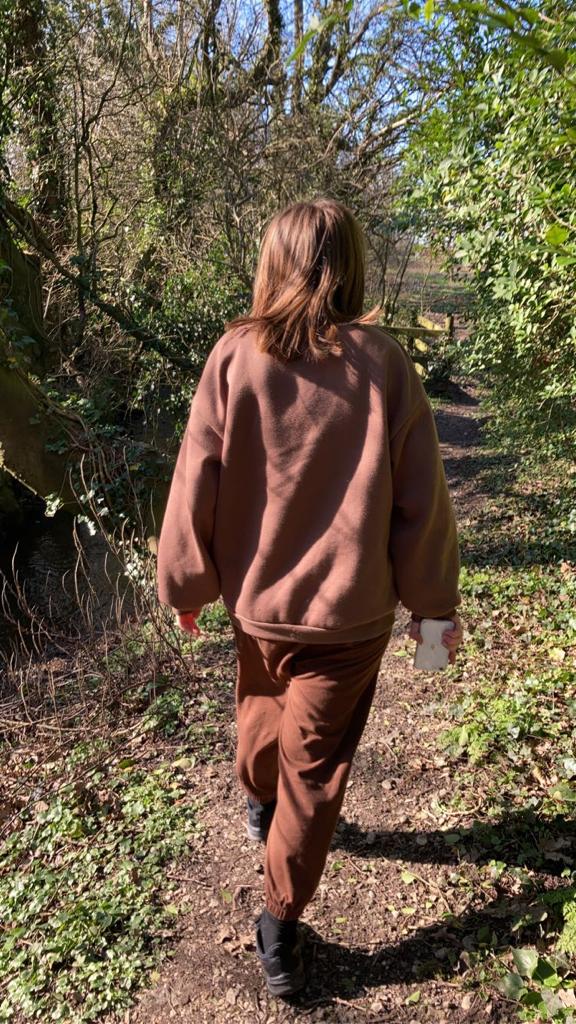
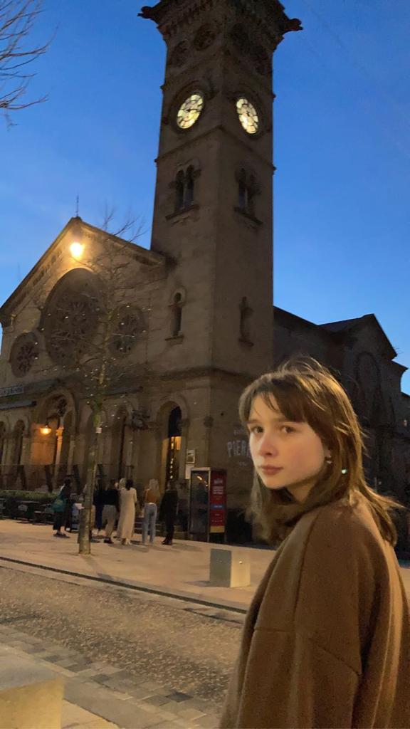
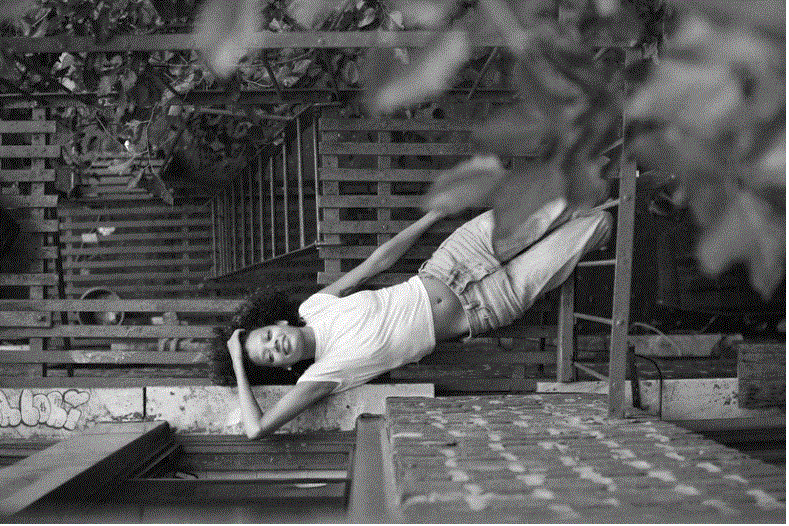
Personal Projects: Portrait & Identity
|
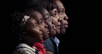
Portrait photography, or portraiture, is a type of photography aimed toward capturing the personality of a person or group of people by using effective lighting, backdrops, and poses. A portrait photograph may be artistic or clinical. Despite the stereotypical idea a face must be present in an image to be a portraiture, that's not necessarily true- as long as a physical body is present, it doesn't matter whether the face is distorted or clear.
|
“It’s one thing to make a picture of what a person looks like, it’s another thing to make a portrait of who they are.” |
I find this quote inspirational to the project because it's rather personal. It show's that a picture when someone doesn't know they're being photographed id different than to if they did. It conveys the fact no-one is the same alone as they are in public. The majority of the time, in public is what they look like and in private is who they truly are.
|
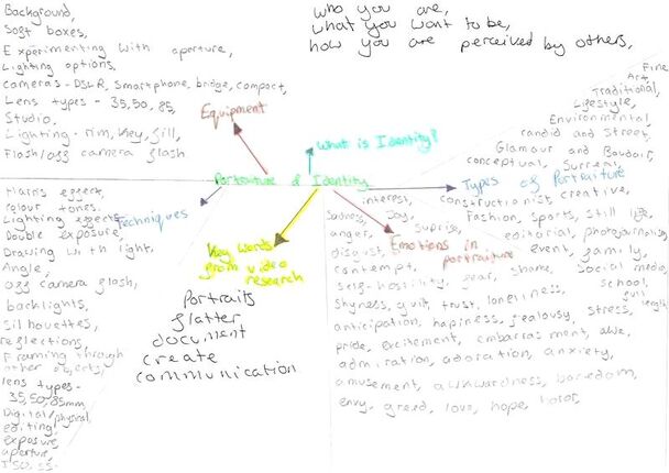
Mind Map:
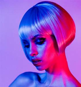
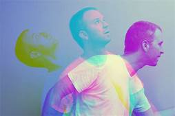
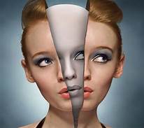
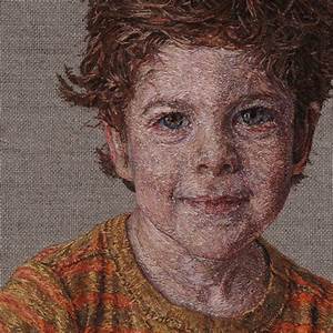
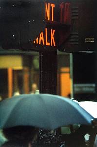
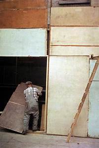
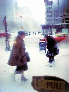
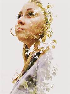
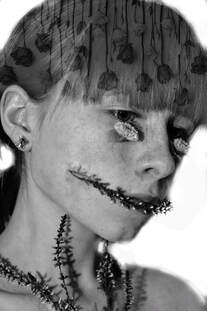
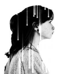
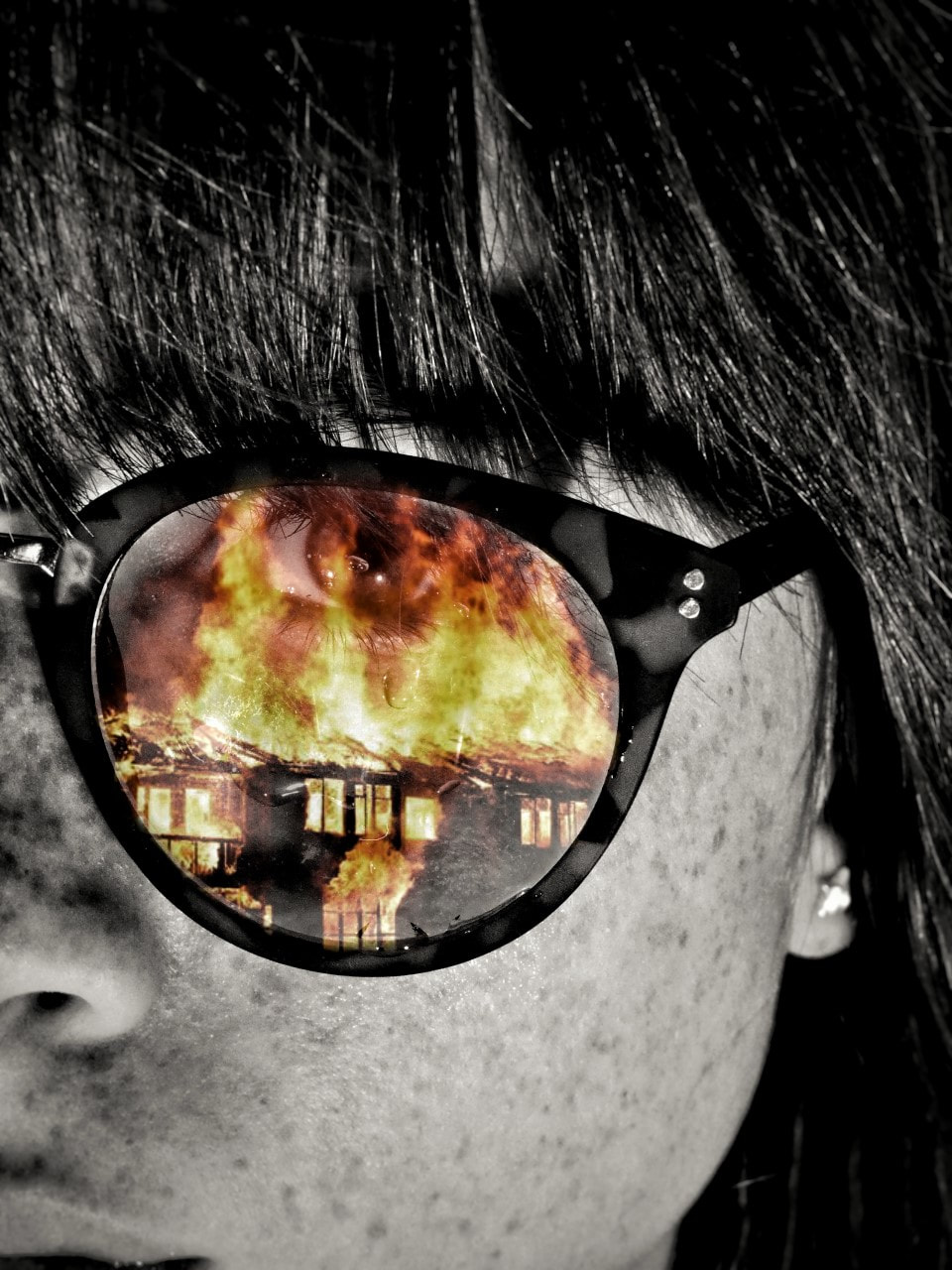
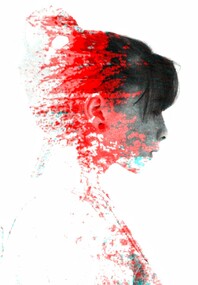
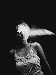
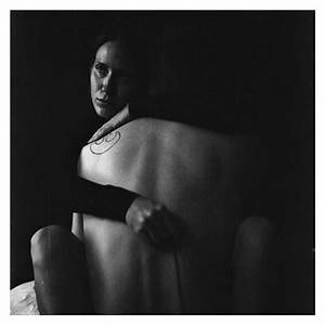
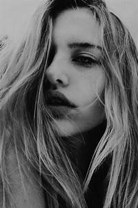
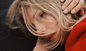
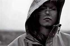
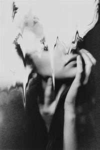
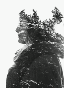
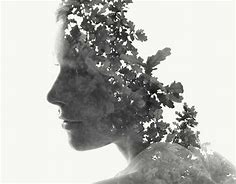
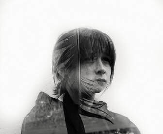
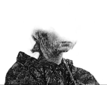
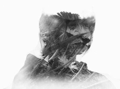
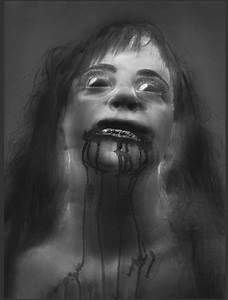
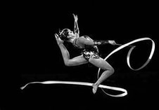
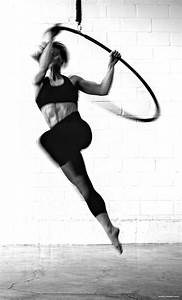
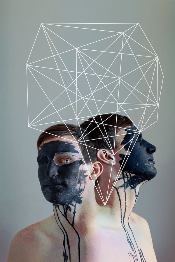
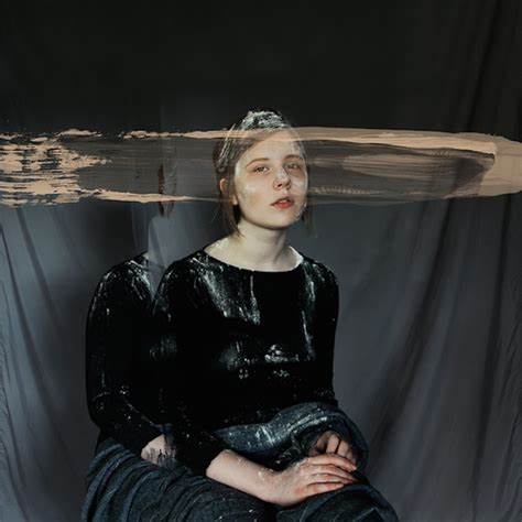
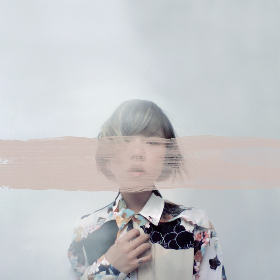
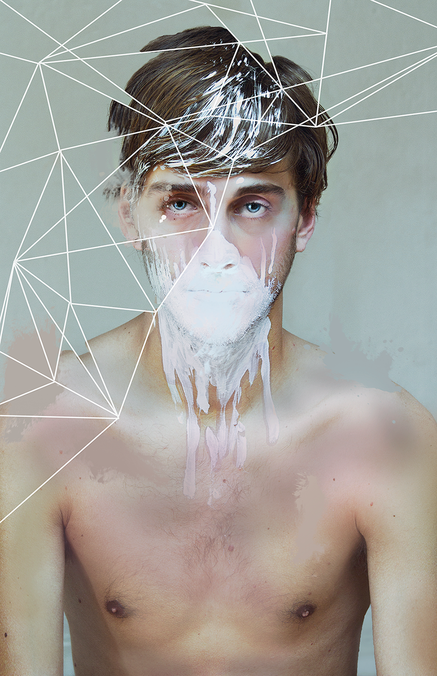
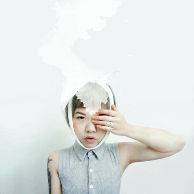
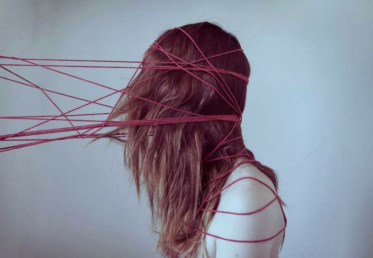
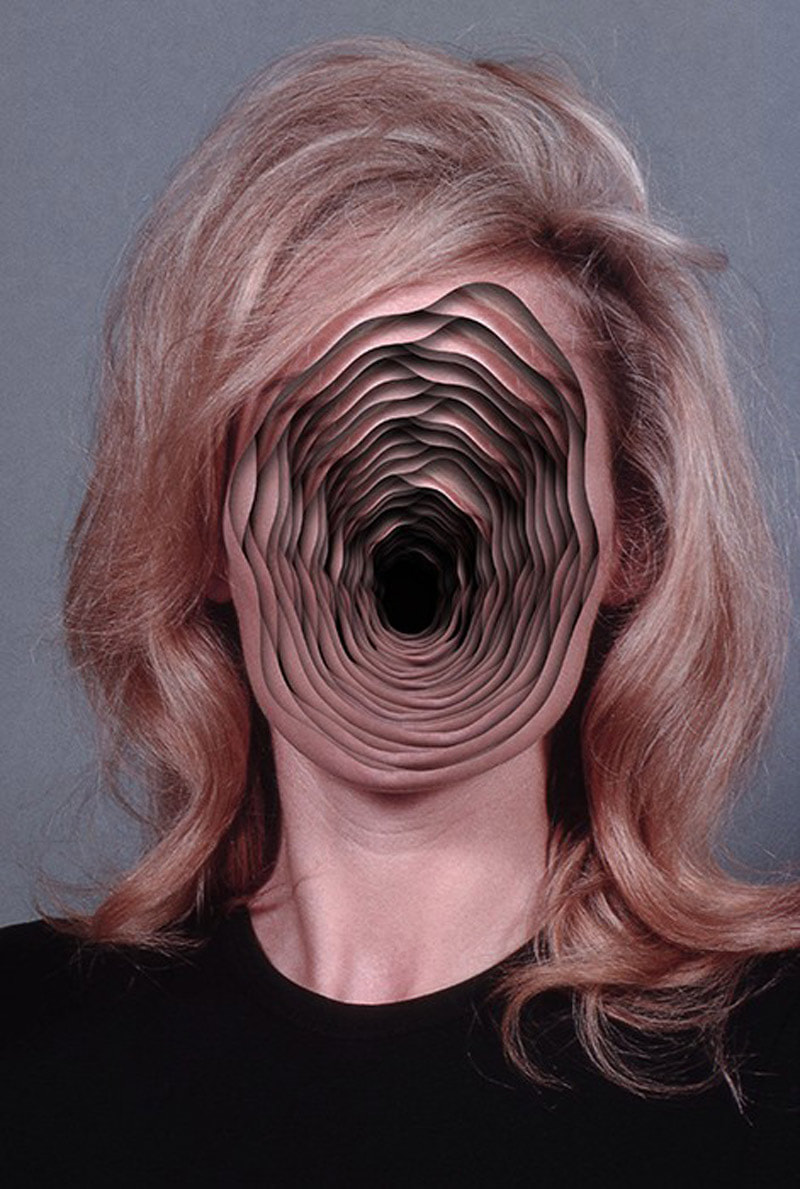
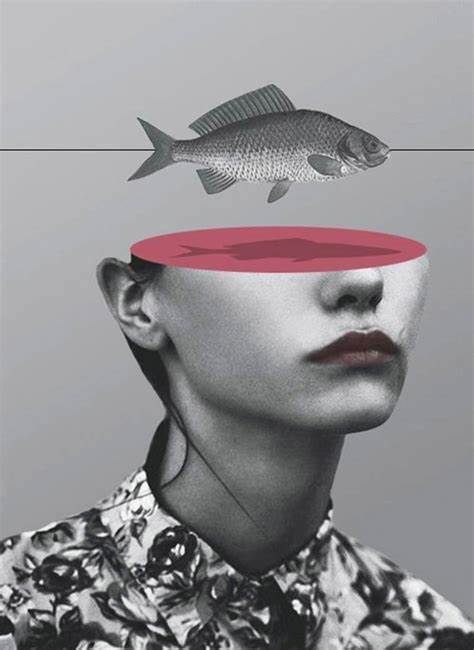
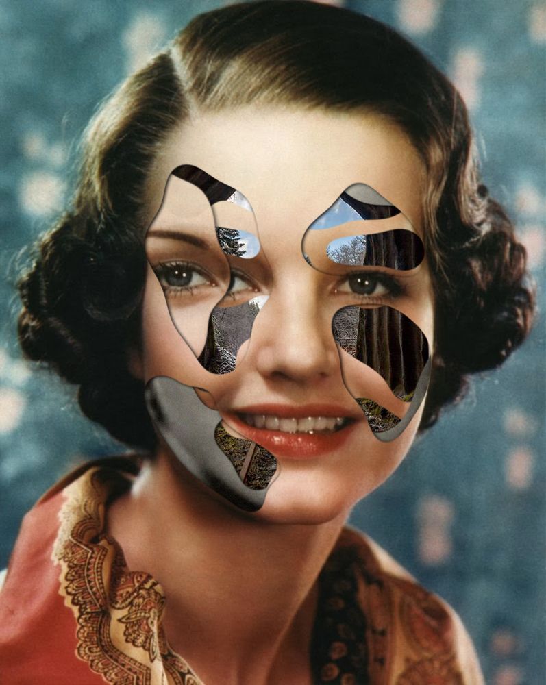
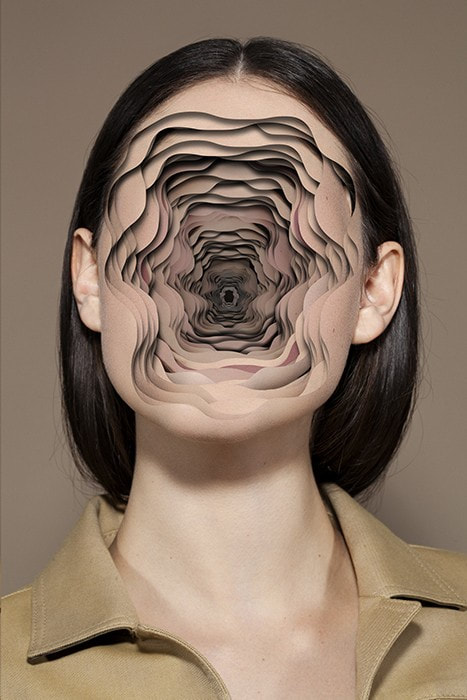
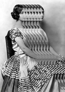
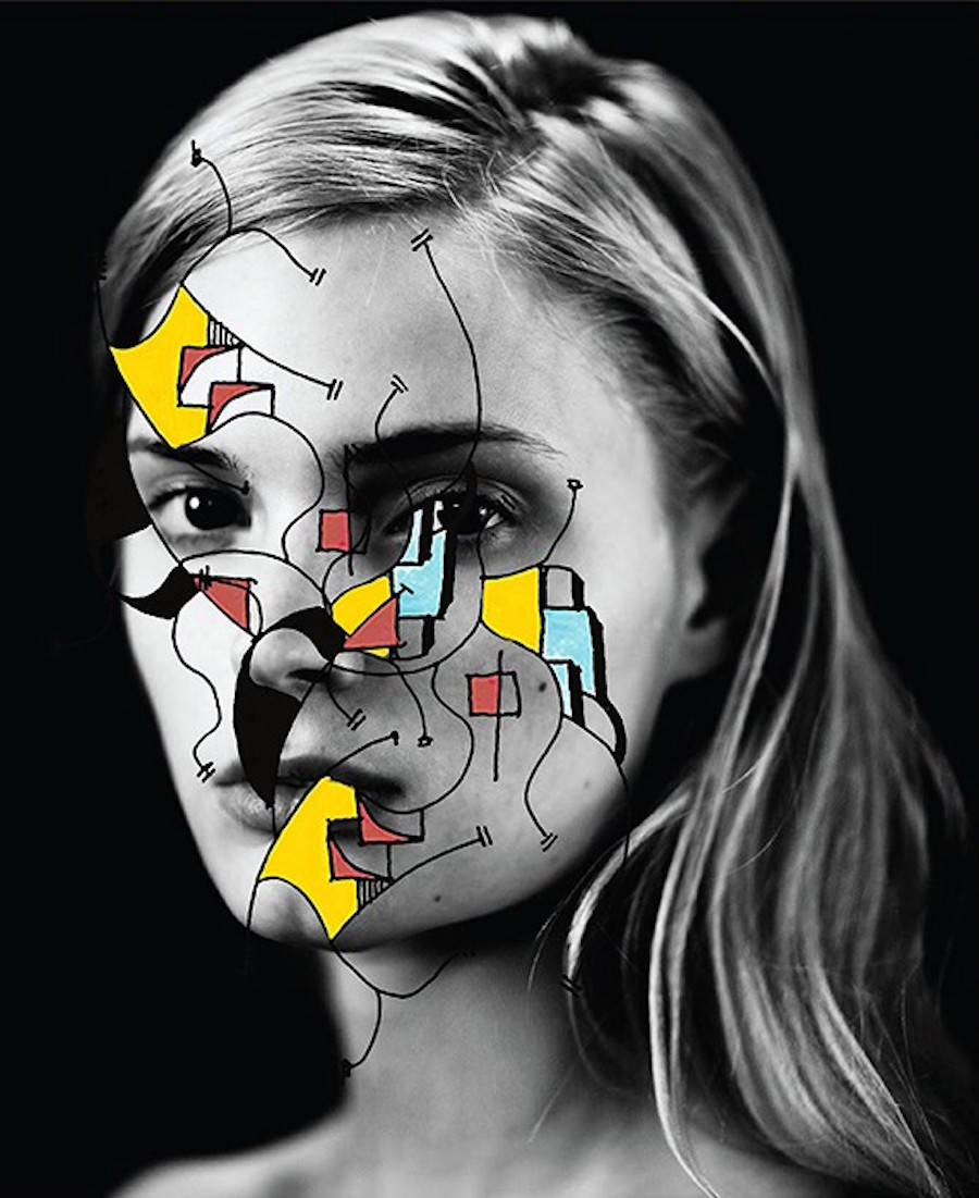
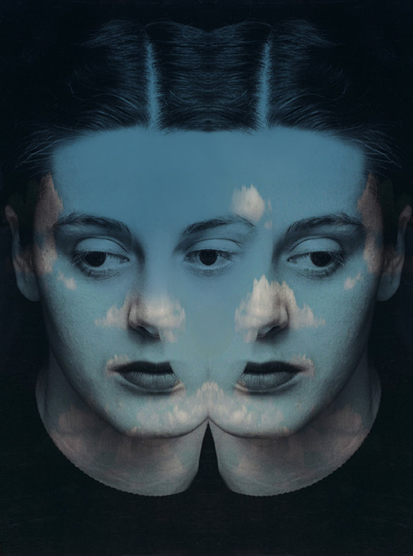
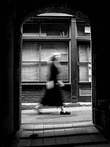
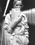
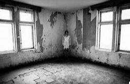
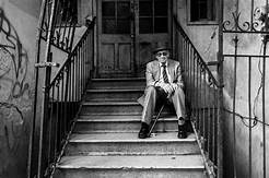
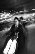
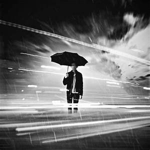
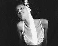
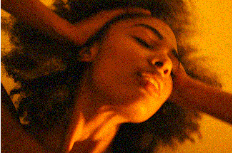
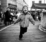
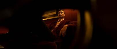
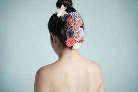
Inspirational Images: |
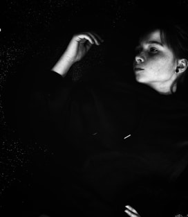
|
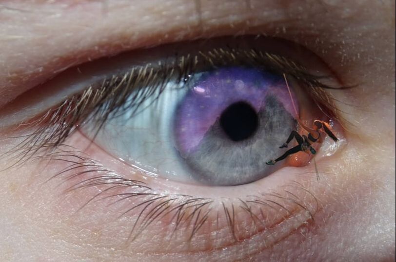
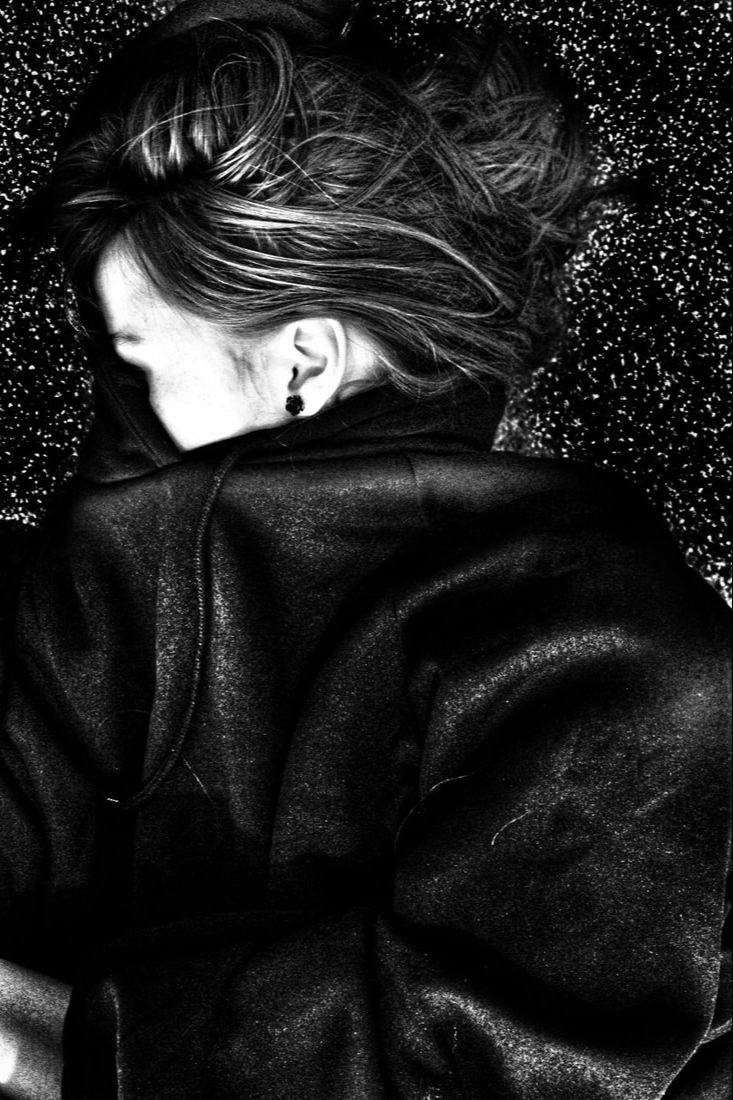
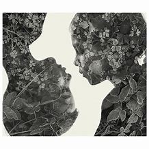
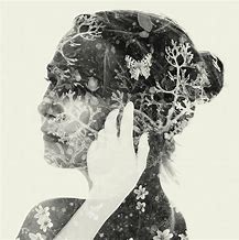
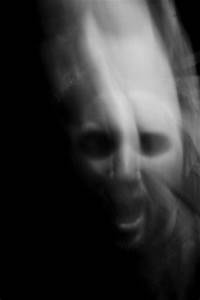
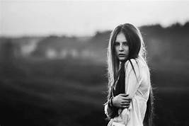
From the below images I believe the most inspirational is the double exposure photograph. It makes the onlooker wonder what she's seen, it gives us an insight into her mind. The model looks emotionless whilst there is much going on in her head.
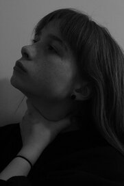
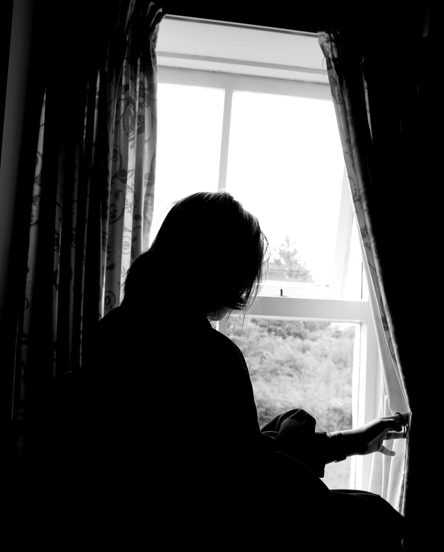
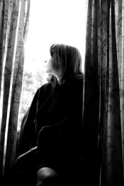
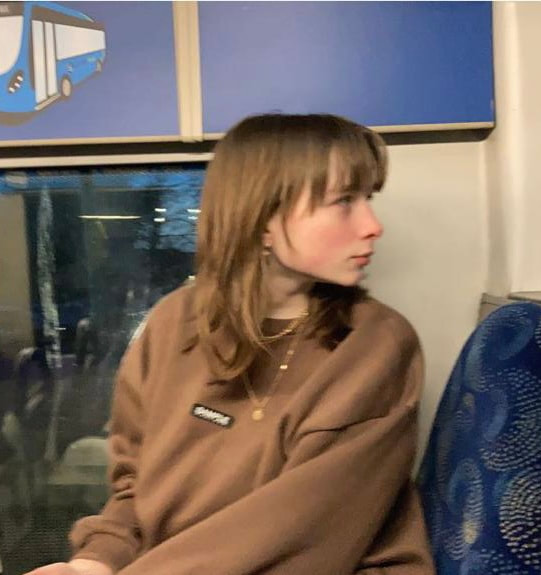
Identity to me:
|
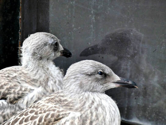
I took this photo in Blackpool during the coronavirus pandemic in 2020; I thought it reflected everyone's mood. The seagull on the left appears to be sleep deprived and looking like it just got out of its nest- the marking under its eyes acting as eyebags and the wind causing its feathers to ruffle. The bird stares at itself in the dirty window- which would have been cleaned if not for the lack of costumers.
The other seagull, on the right, has less obvious eyebags and its feathers are neatly brushed back; though we cannot see further, we guess the mirror continues and that the bird is not as interested in its appearance as much as the other, but the curiosity still remains. To me, the animal on the right reflects our identities in March 2020 and the one on the left shows us almost a year later- questioning what's happened to the normality we used to take for granted.
|
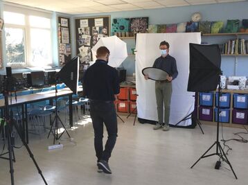
Professional Portraiture Workshop/ Collaborative shoot:
|
Firstly, we completed a knowledge organiser and watched a short video based on portraiture. I gained more experience by doing this and felt much more comfortable on the topic.
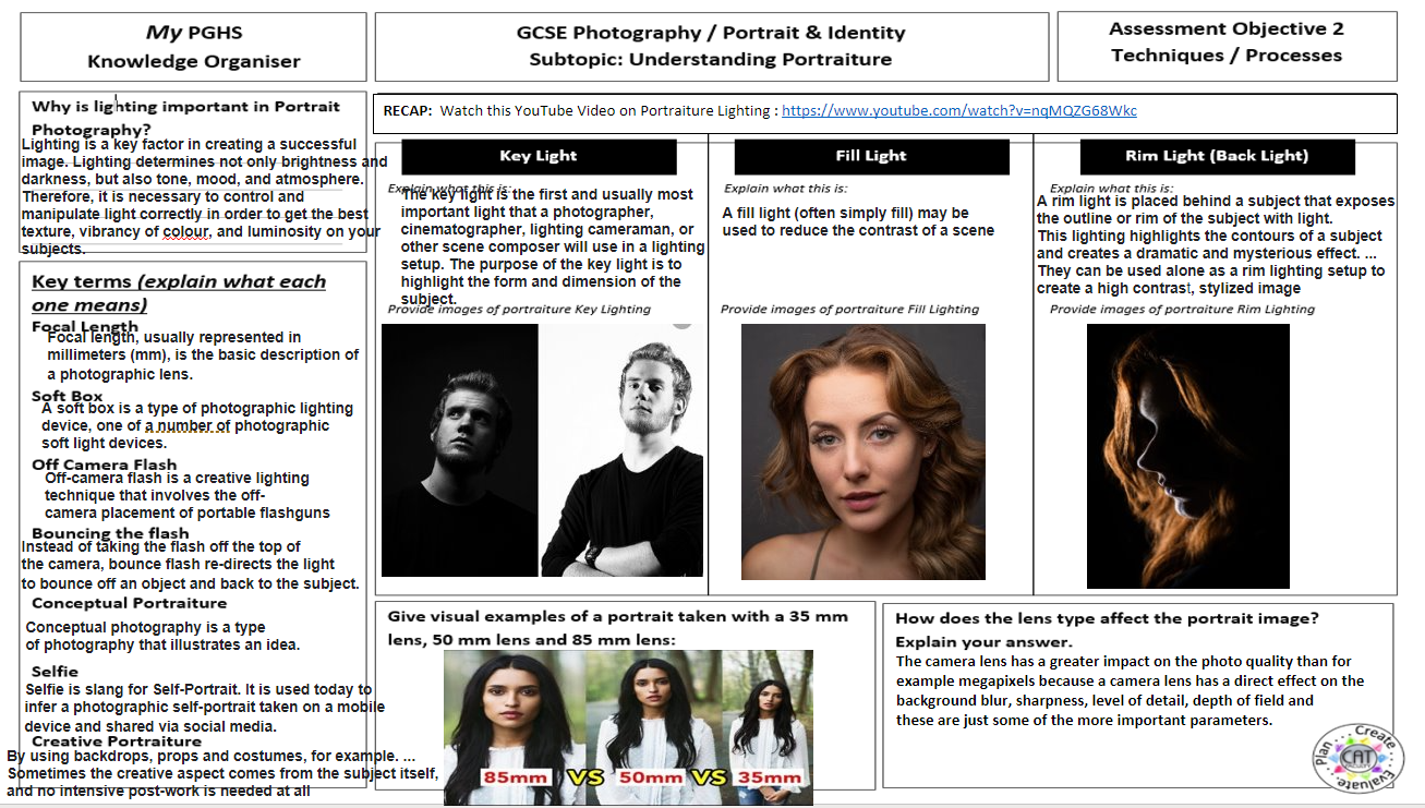
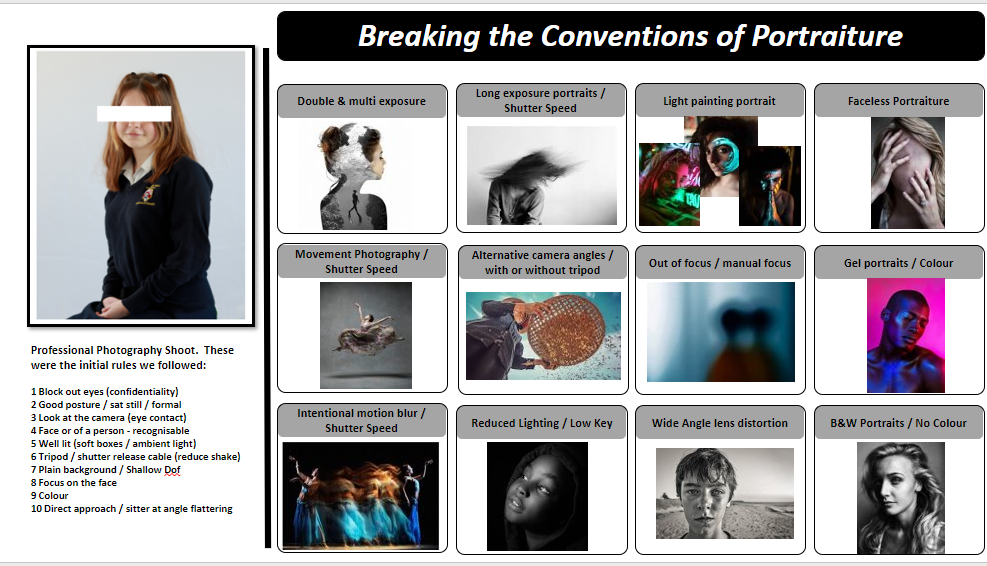
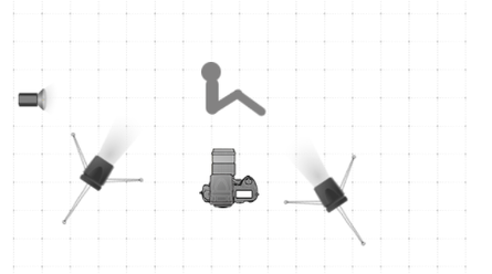
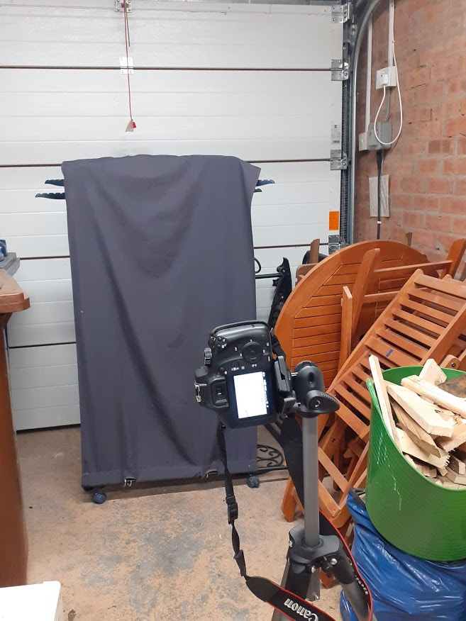
In the shoot, we photographed students. Our aim was to get professional images with good posture and correct lighting. Mr Dever was part of this as he does photography. This took place mid day to get natural lighting; a plain white material backdrop, soft boxes, a tripod and remote shutter were also used. The subjects sat on a chair with 2 soft boxes to the side/in front of them with a light reflector behind/to the side. Confidentially is extremely important. To avoid exploitation we drew a line through their eyes as it as a main feature and when downloading the images we used their initials as identification. To ensure safety, we all hand gelled and socially distanced. There were no hazards such as stray wires which we could trip over. This ensures our protection as well as the equipments. I gained a broader understanding of how portrait photography shoots are organised and what to do to get a flattering final result. |
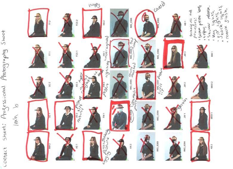
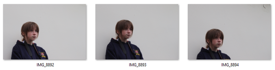
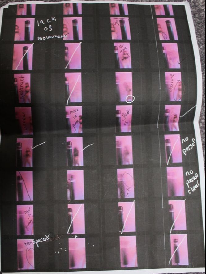
Professional Portraiture Workshop/ Contact Sheet:
Professional Portraiture Workshop/ Digital Editing:
|
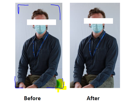
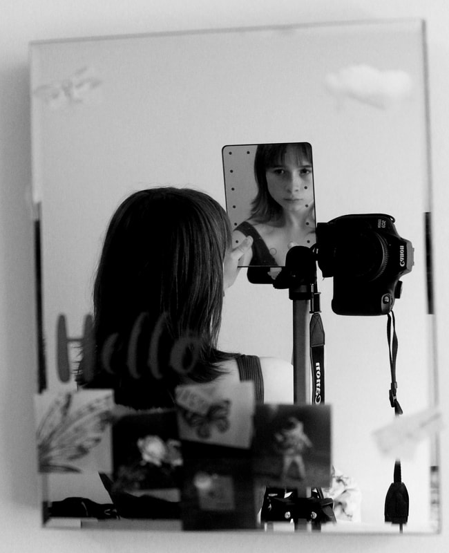
With the use of PIXLR, I cropped the image using the rule of thirds - Keeping the head around the middle top. Then, with the help of the clone tool, I tried to discard the chair. The cropping assisted in this. After this, I used to the magic wand tool to blur the background lightly. This stopped defects from the creases in the backdrop sheet. The subjects eyes are censored, this is because if the person does not want to be identified, they will not be. To identify someone, the major features are one’s chin, jaw/cheekbones, eyes, brows, nose, mouth, ear position, and hair.
|
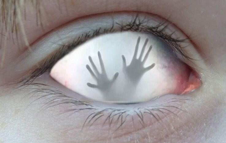
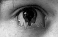
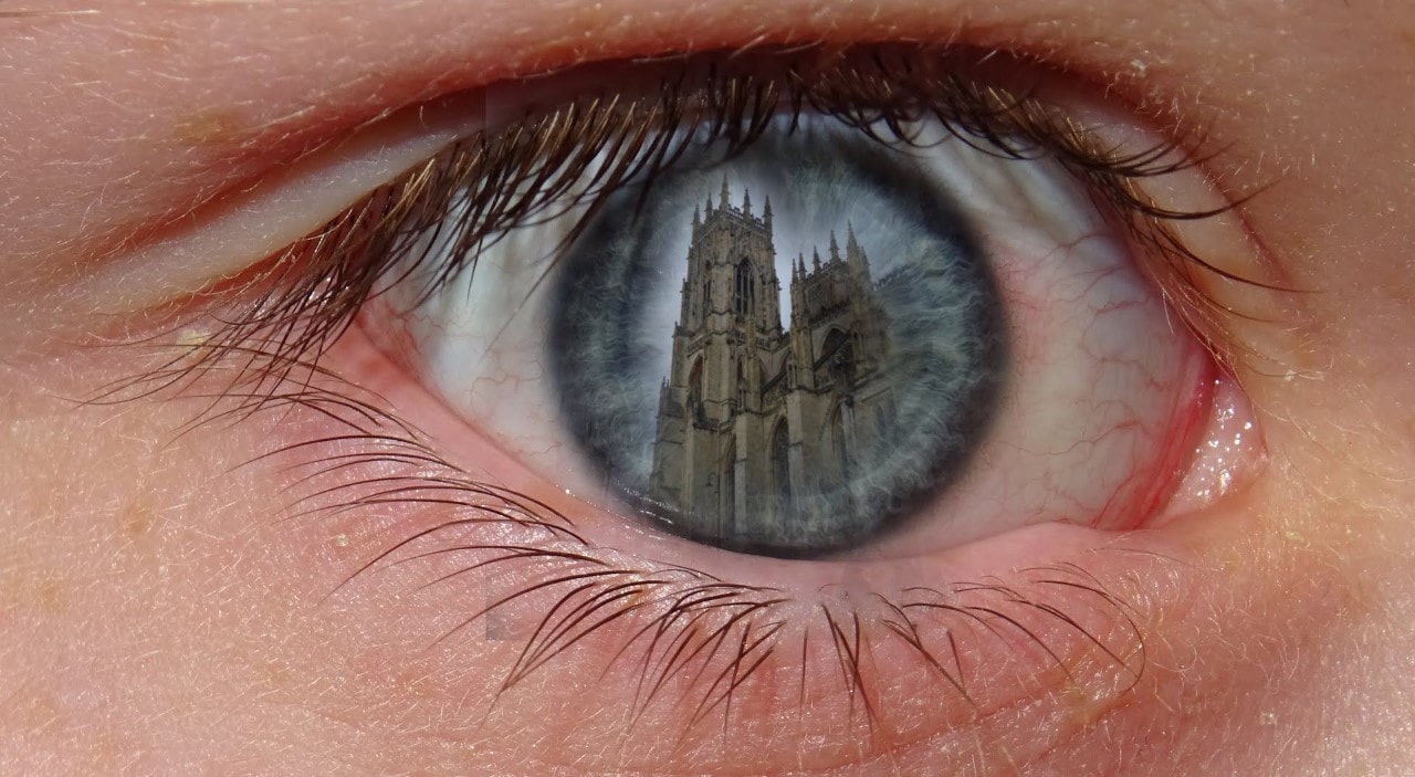
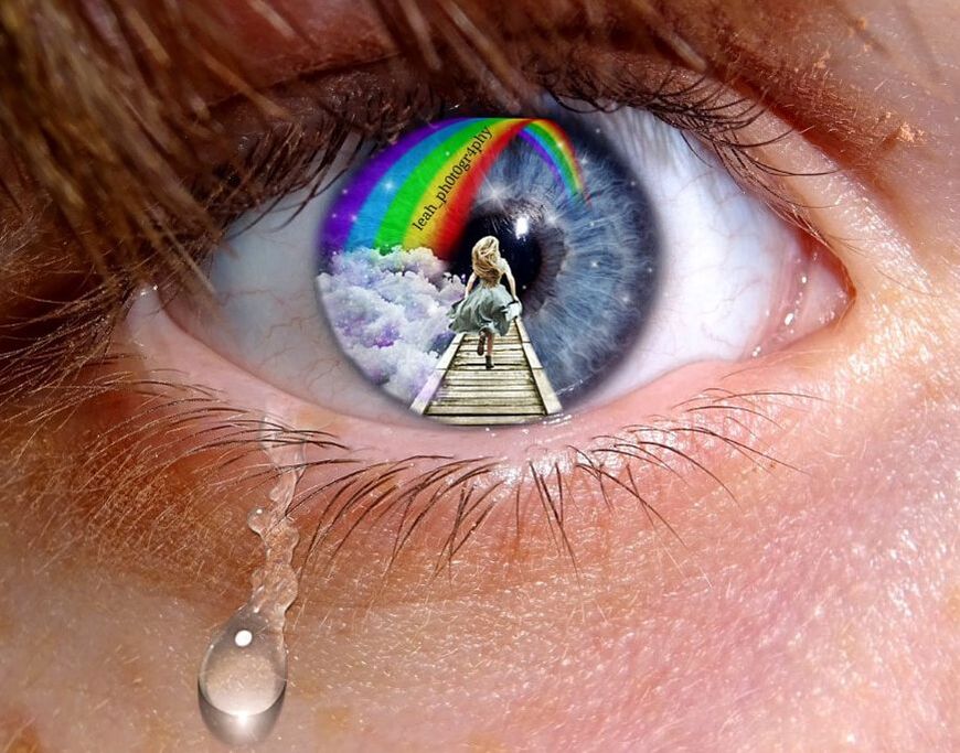
Research and investigation/ Breaking the rules:
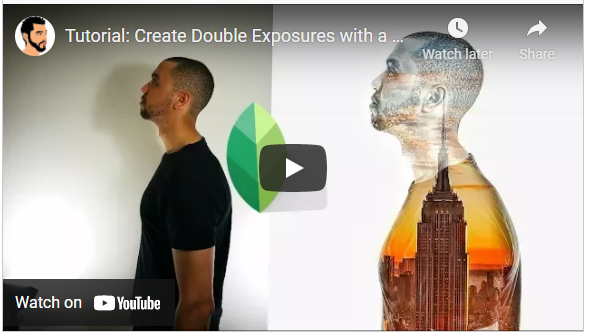
After investigating how a professional photography shoot is carried out with a more formal manner, I will look at less traditional and strict ways of portraiture; starting with double/multi exposure.
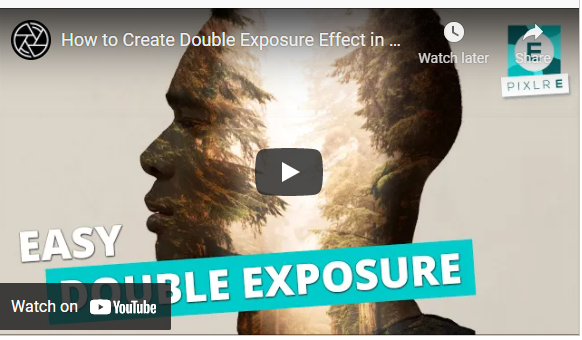
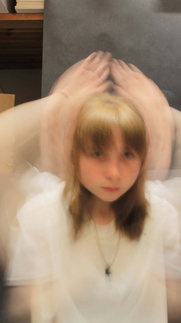
Research and Investigation/ Double & Multi Exposure:
(Tap below images for relating articles)

|
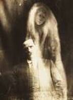
Double/Multi exposure is the idea of an original image with an additional picture layer over the top of the first- this can be done with two or more. The early double exposures appeared in the 1860's for those who wanted a more deceiving image. These are of great use to us if we want a photograph a bit more abstract than usual, such as a story within the image. Before this idea was spread, many viewers could have been led to assume magic was present within the photo, or some sort of amazing miracle. This was widely used for photographers looking to draw in potential buyers and/or onlookers.
|
|
Contemporary Double and Multi Exposures
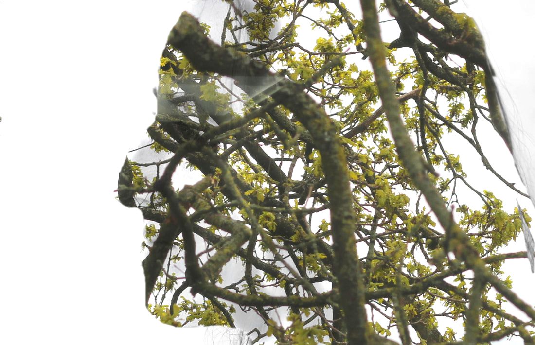
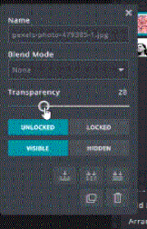
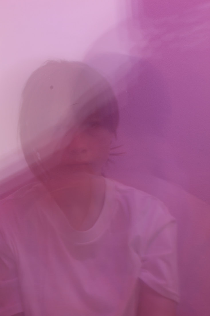
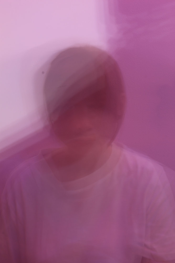
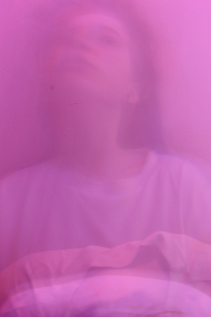
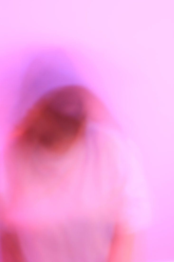
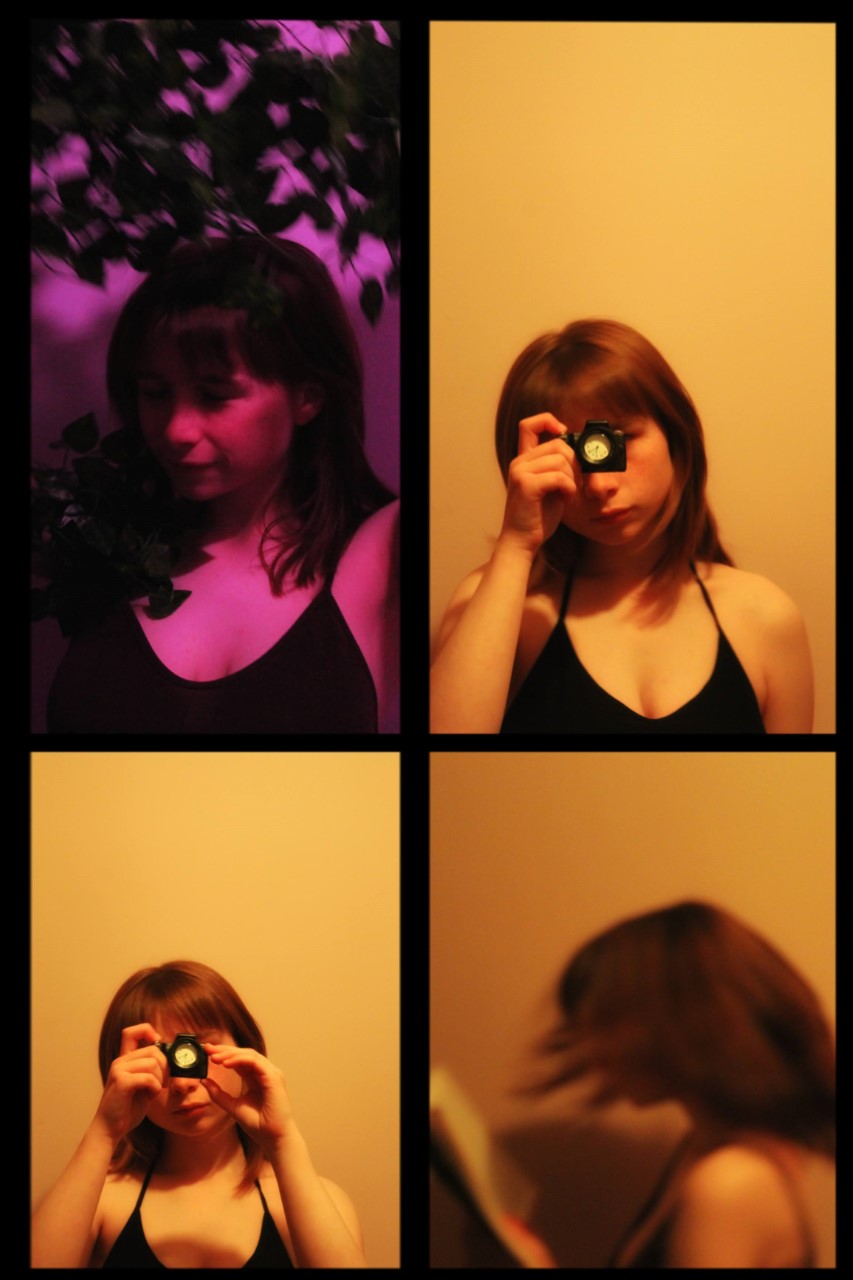
Research and Investigation/ Double & Multi Exposure/Initial Experiments:
Computer Initial Experiments/PIXLR
|
|
|
|
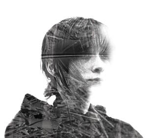
I think my first experiment went well overall, though there is much room for improvement. The editing of the double exposure seems okay (Contrast, brightness, e.c.t.) and the majority of the first layer is covered by the image of the tree. However, in the future, I would ensure the whole portraiture image is covered and edit the overlay in advance. I learnt the process of double exposure through the use of PIXLR E through this experiment, and how saturation and transparency can change the final product. |
|
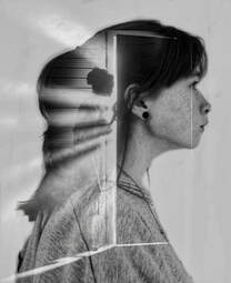
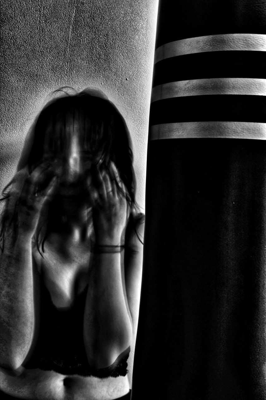
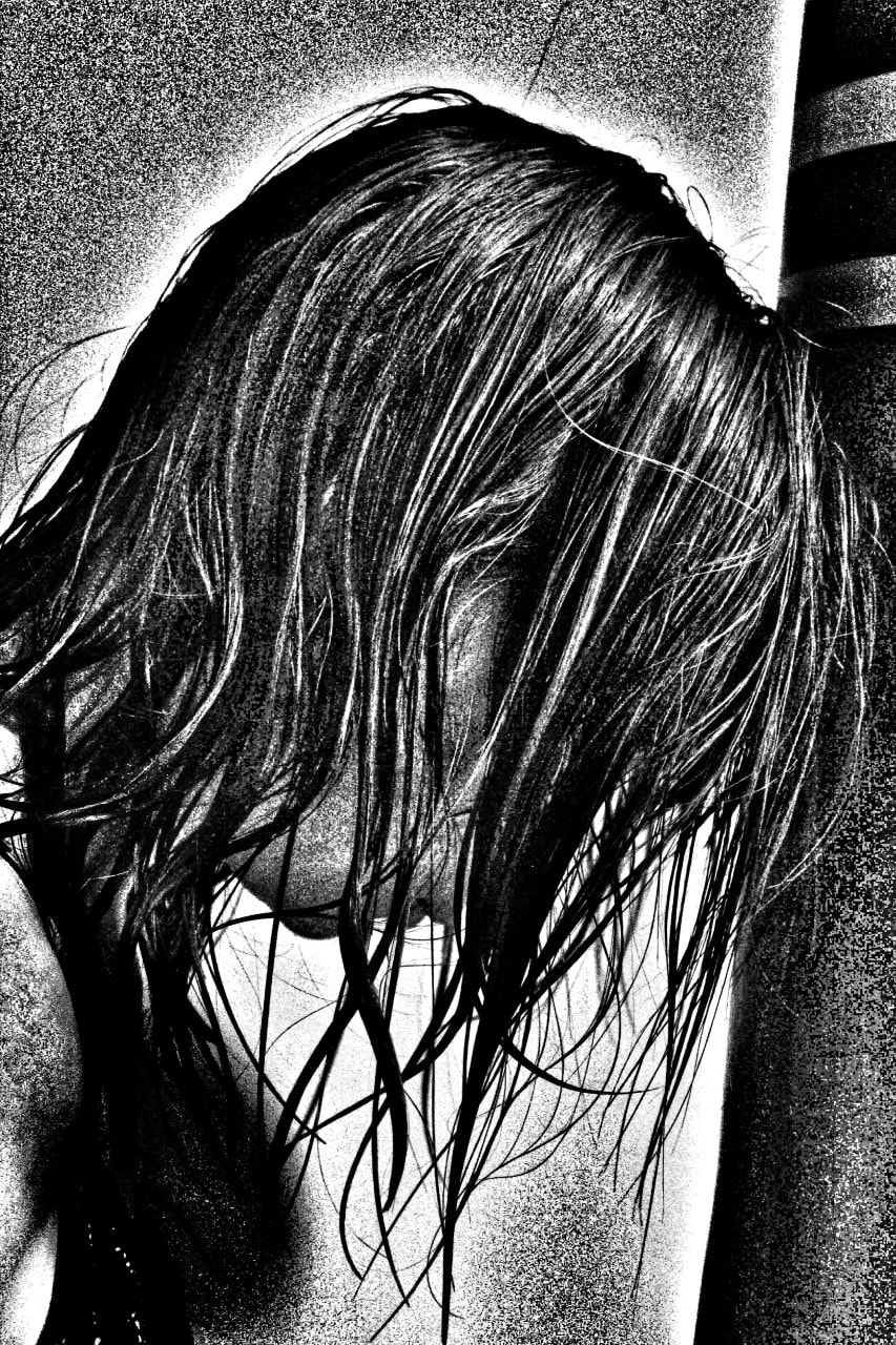
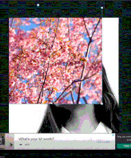
Smartphone App Initial Experiments/ Snapseed
|
The double exposure snapseed experiment went reasonably okay, though many weaknesses occurred. The strengths could include the correct use of the tools (such as exposure) and successful final edits. However, the second layer often overlaps the first in some areas which leave a messy look.
I also think I should have used different images on certain pictures as they do not combine well and negatively juxtapose regularly. I learnt how to merge two images on snapseed to create different affects; learning skills along the way such as how to control and digitally manipulate an image to high standards.
|
|
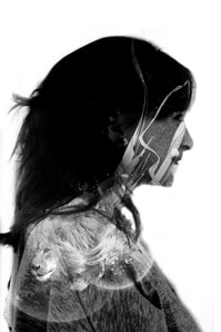
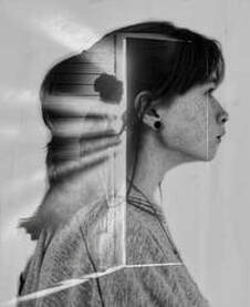
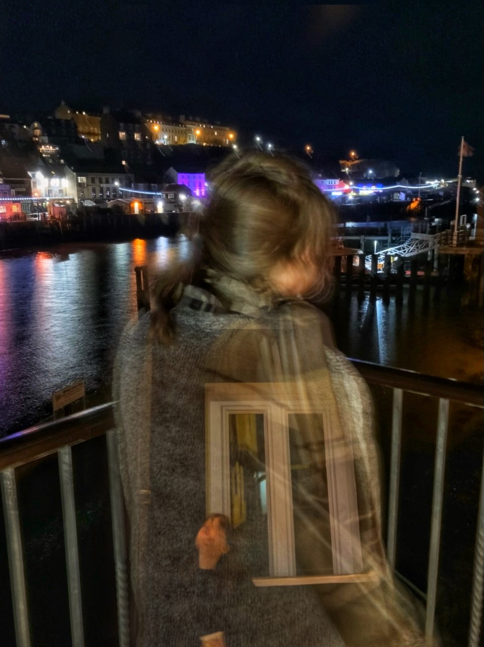
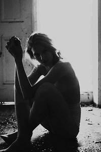
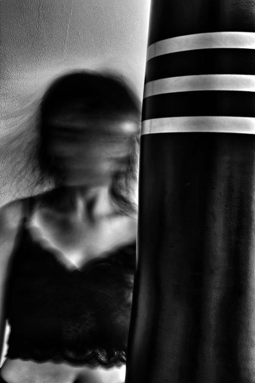
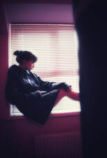
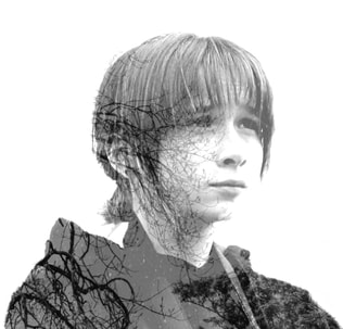
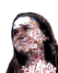
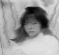
This photograph is a my favourite from the snapseed images. I like the idea conveyed through the image, as if someone looking inside another's mind- seeing their memories and logic. This is something completely unachievable in the real world, but so simple in photography; to understand the phycology behind someone and the way they think.
The contrast between the hair and background also makes the second layer of double exposure stand out- the darker hair juxtaposing the light with emits from the door- allowing our eyes to be drawn to multiple places at once. If I was to emulate this image again I would change the models hair to be the same as the woman's in the picture- as if giving a face to the silhoutte. |
Double Exposure/Second Attempt
|
|
|
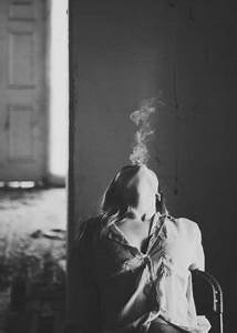
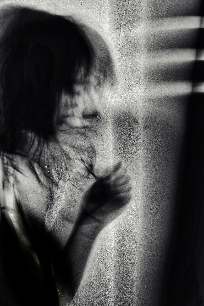
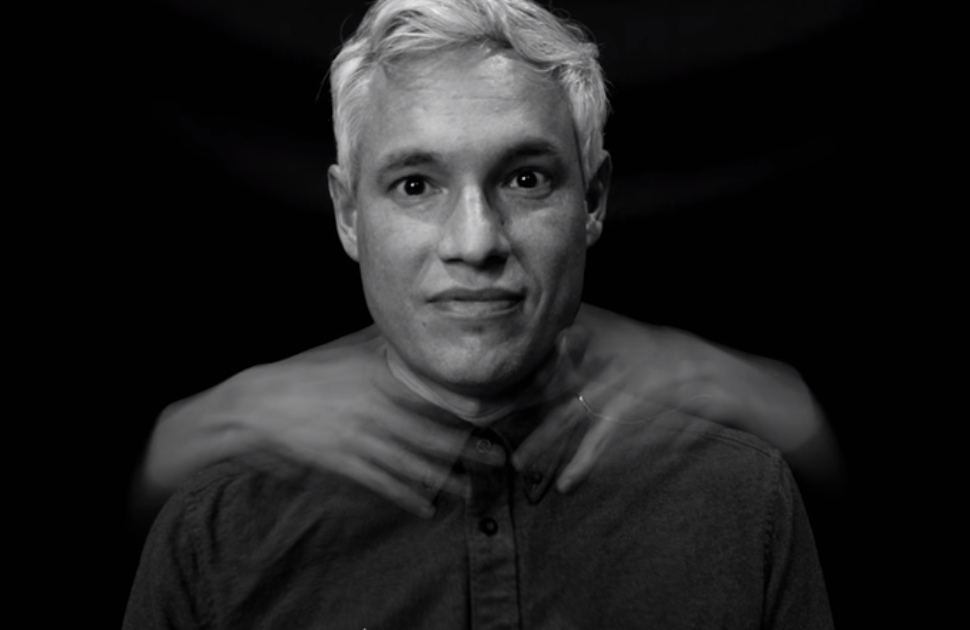
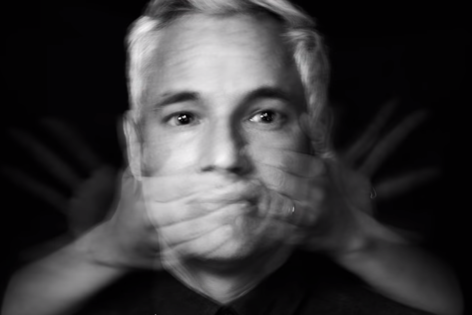
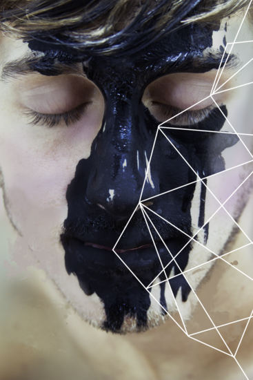
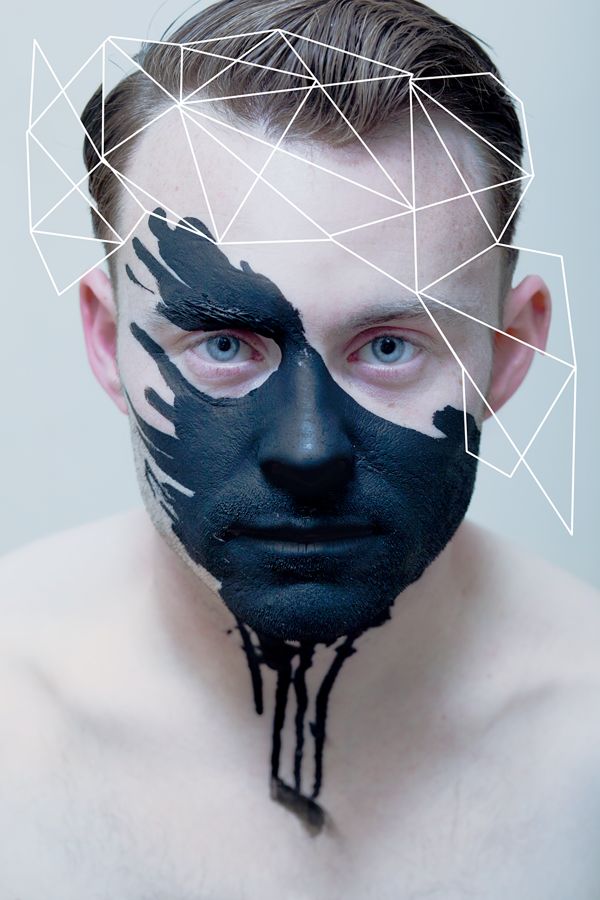
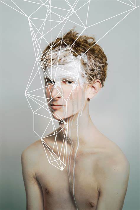
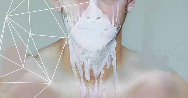
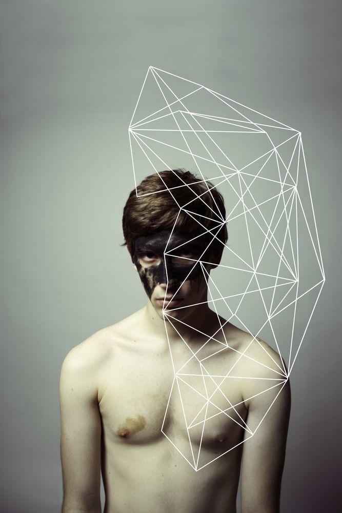
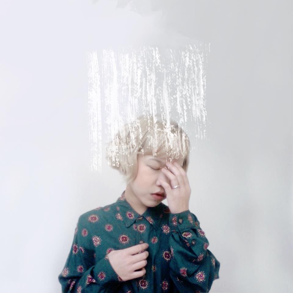
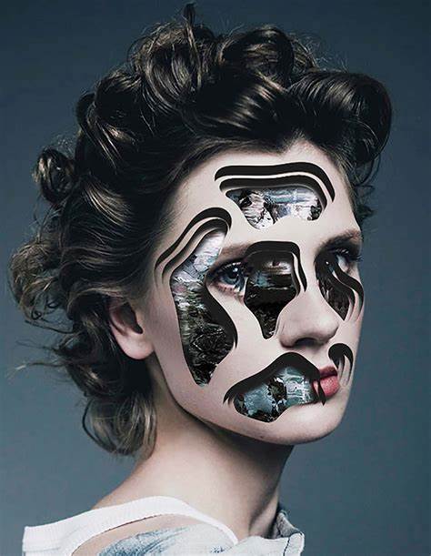
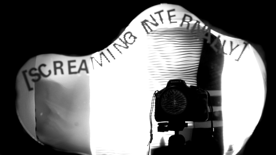
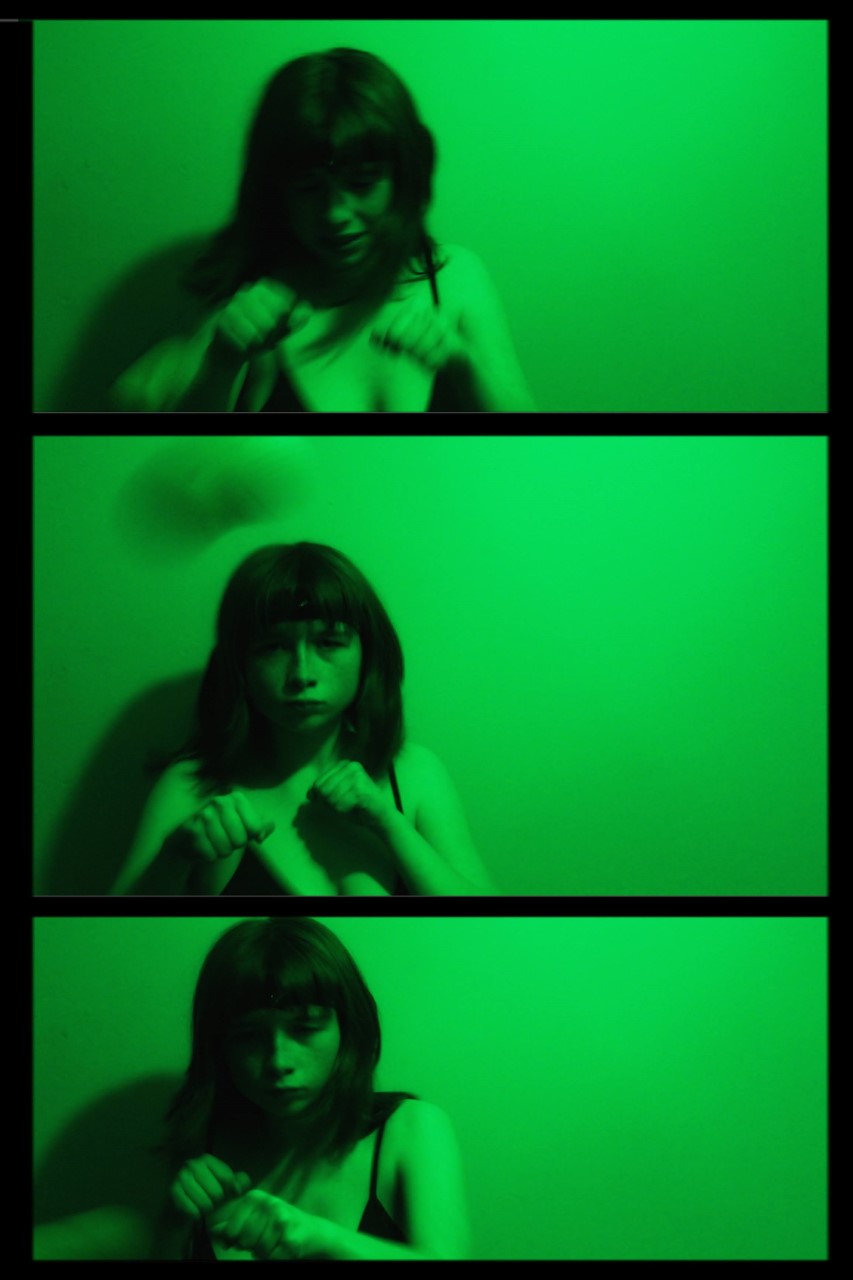
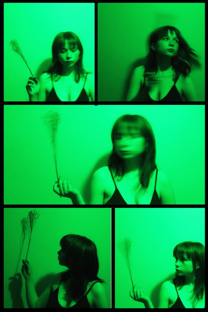
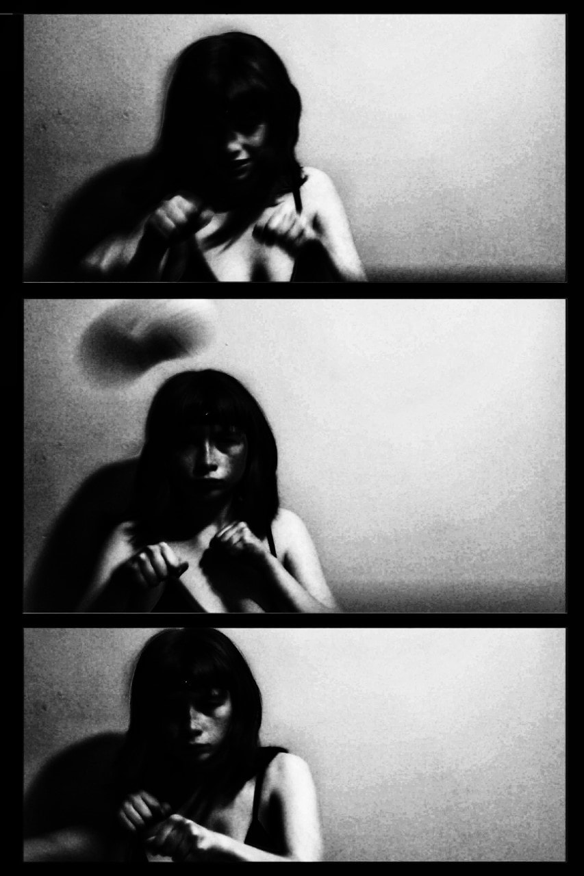
Artist Investigation / Jenny Woods:
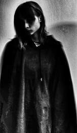
I have chosen Jenny Wood's photography to investigate as from first glance her work caught my immediate attention. I particularly admire her monochromatic style in her more dramatic photographs; I believe the rather plain colours contrast to the inner emotions and outer expressions of the model- truly moving. Some of the images have been edited with a layer atop, as if the person isn't fully present in mind and physically, yet again manipulating the picture to capture inner thoughts.
Wood's brighter illustration's are few, but even those convey spiritual distance; once more causing the viewer to wonder what's happening inside their head. Upon further search I noticed the photographer was self-taught, only making these art pieces more impressive. Apparently, her work is supposed to reflect "the turmoil of a small town girl fighting to make it in the city." which allows us to ponder her upbringing and how she got to where she is now. This would also let us create a conclusion on why the model's are often younger females.
The girl's often appear distressed, not only mirroring the artist's feelings during her climb to become a photographer, but also that of the pressure society can put on us. The specimen's firstly appear almost emotionless until we notice the setting- mysterious, distant and often under-exposed. It creates an uncertain, tense atmosphere.
The teenager often uses digital manipulation on her computer to result in such extraordinary images; regularly using the theme mixed with colours to her advantage. She prefers to use gloomier colours to set the tone- which, in my opinion, is a better technique than using brighter and bolder colours.
(Tap below images for articles)
|
|
|
|
I honestly can’t describe my work. When I look at it, all I see is schizophrenia. Half the time, I don’t know how I even got to that point when editing; it’s almost like I’m not in my right frame of mind.
Most of the time, I find myself shooting in abandoned homes or wild, overgrown fields. I find beauty in things that normal people would find ugly.
Get angry and make art. Never stop creating. Never take breaks. Create til your fingers aren’t capable of creating, and then find a new way to keep creating. Strive to create something that is truly yours, and don’t let anyone take it away
I want to see their mind, their soul, their heart.
Shoot plan/Jenny Woods:
|
|
This shoot is inspired by Jenny Woods because her photography is truly motivating. It will take place either in an outside environment with a possible abandoned feel or inside with controlled lighting and floor boards (preferably wooden with an old tint) as this is seen mostly amongst her work. Props such as dirt/black paint (or makeup) a tripod (for image stabilisation) and I may use additional props which I believe fit within the theme- an almost personal, yet relatable, touch- whilst trying to keep it simple. Wood's images capture a moment, looking unplanned, so I would like to attempt to emulate the same affect where possible. The lighting used in her inspirational images often fits the low-key category. As for artificial lights, I think front and maybe rim lighting will work well, not too dramatic nor too 'basic'. I'd prefer to avoid backlighting where possible.
I intend to use the Canon 4000D DSLR to keep the photographs high quality, which is easier for digital manipulation. The settings will differ as images develop but at the start I think a shutter speed of 1/60, a maximum ISO of 400 and an aperture ranging between f/1.4 and f/1.8 as to achieve a shallow depth of field. As mentioned, settings will change throughout the shoot to hopefully receive better results.
Finally, editing techniques such as contrast, saturation, curves and others will be used via PIXLR E and snapseed, possibly using lightroom. Monochrome will be a key theme throughout the editing of these images, depending on the particular image and what would look most professional.
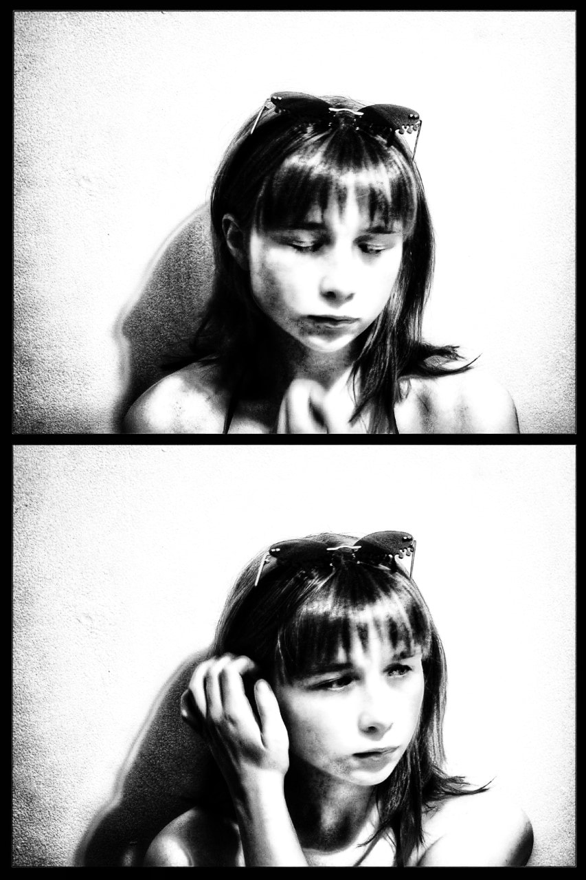
Research and Investigation/Unedited Images/Jenny Woods:
|
|
|
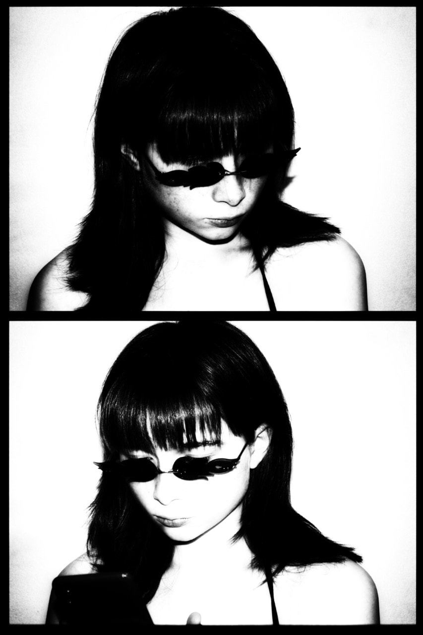
Research and Investigation / Best Edits /Jenny Woods:
|
|
|
|
Research and Investigation / Best Image Jenny Woods:

|
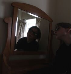
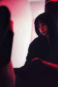
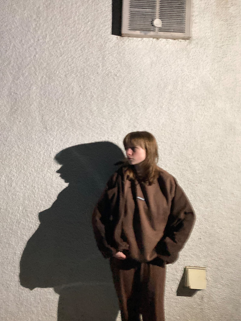
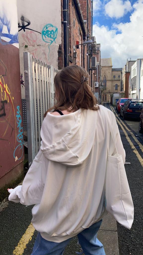
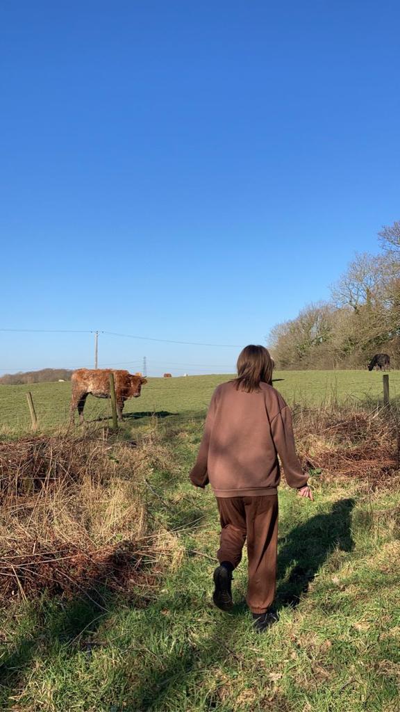
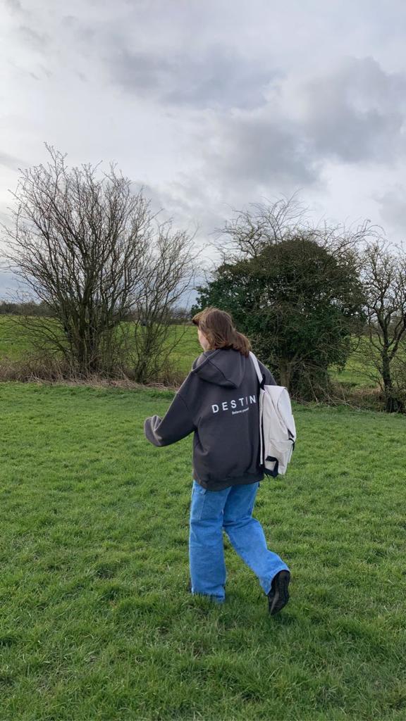
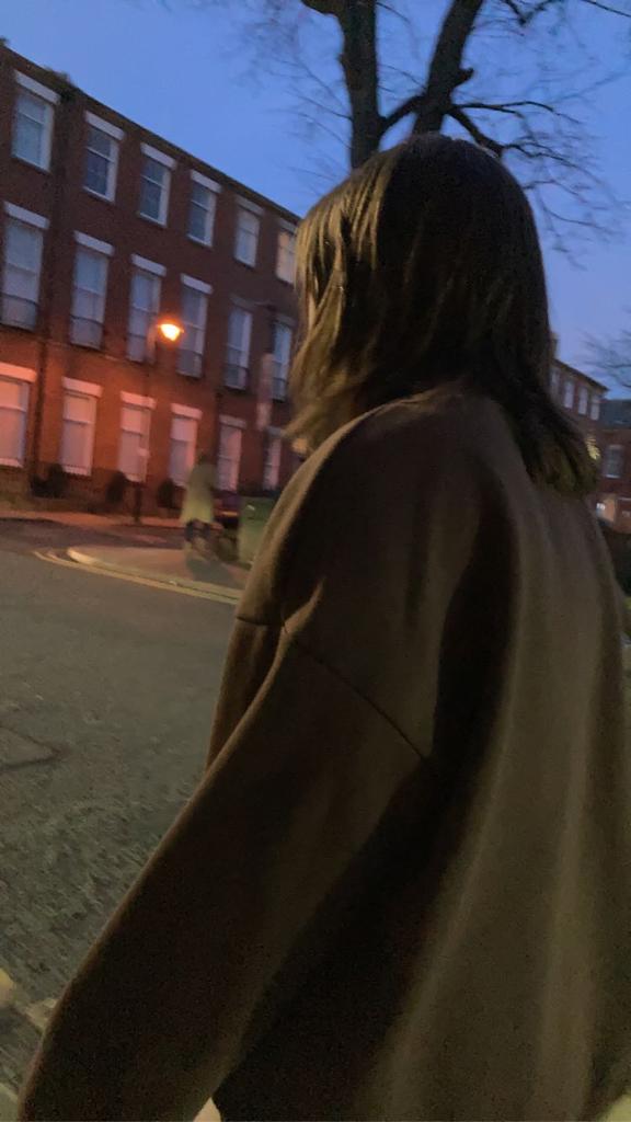
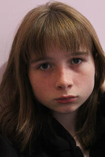
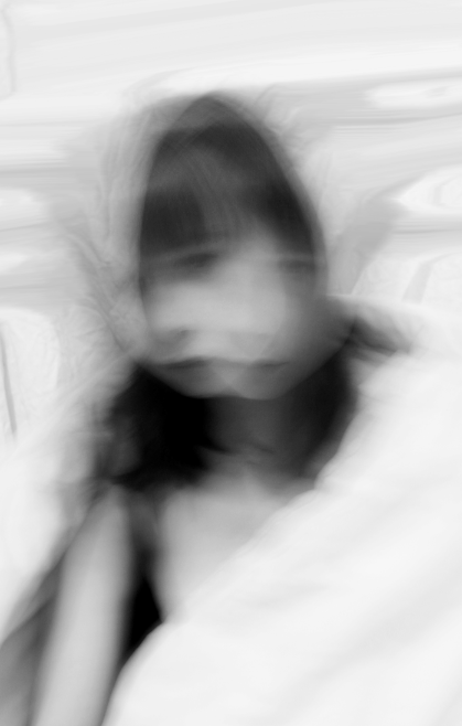
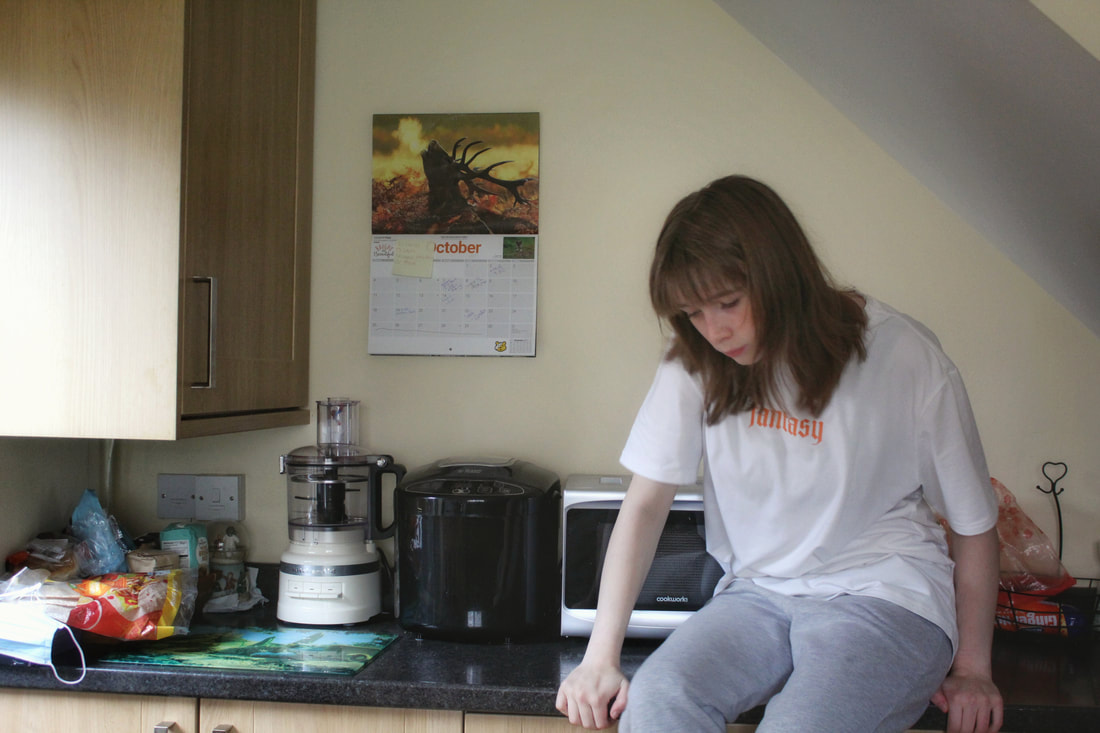
Identity is portrayed through this self-portrait by the oversized clothing which reflects my style, a part of me which changes how others perceive and judge me. Though little expression is shown, the darkness under my eyes and the unkept fringe may suggest a lack of energy and, possibly, organisation. The image was not photographed with an intent to convey my personality, hence the shortage of objects which could give clues.
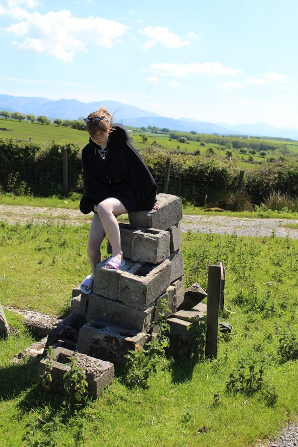
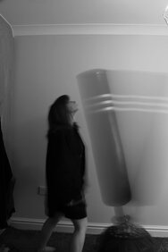
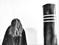
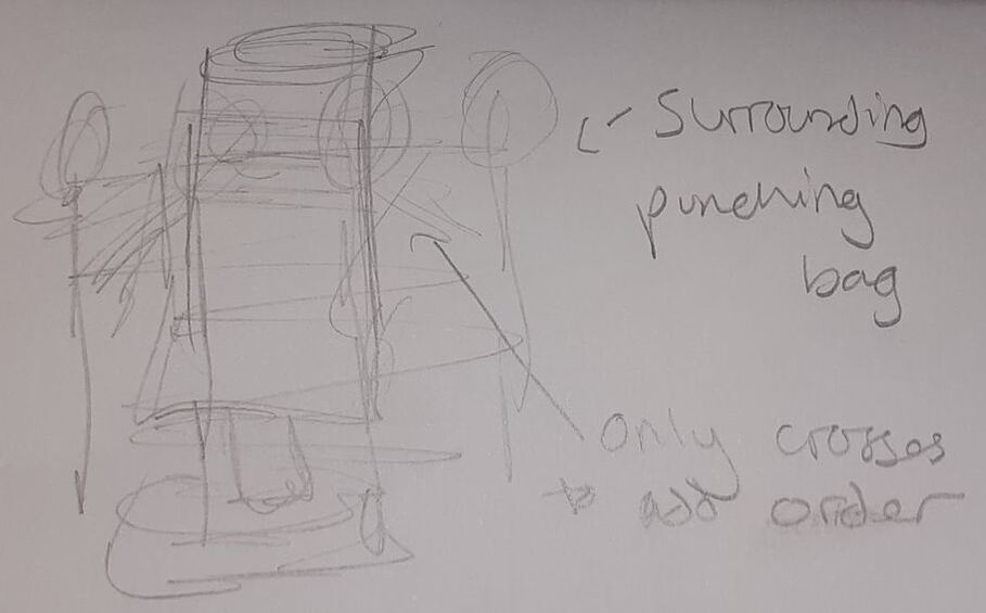
My other images give hints which suggest character traits; such as the punching bag in a bedroom (showing a tendency to box) , the country side (implying a preference for nature) or colours (insinuating likes and dislikes). |
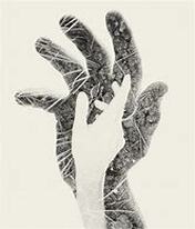
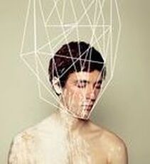
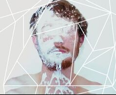
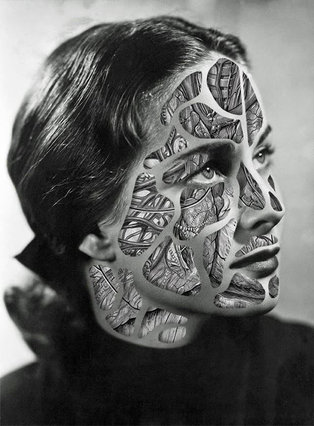
Artist Investigation / Christoffer Relander:
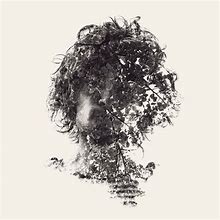
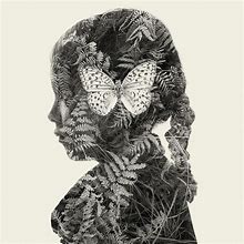

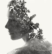
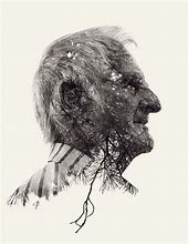
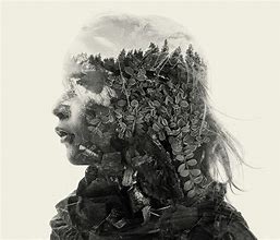
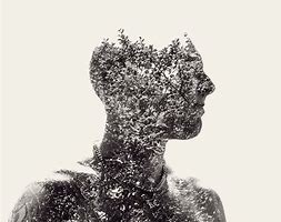
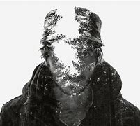
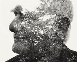
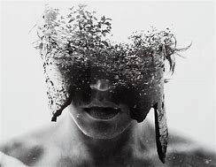
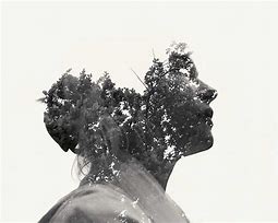
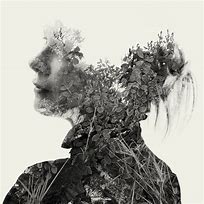
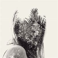
I chose to emulate the work of Christoffer Relander as his work is truly inspiring; the techniques he uses includes experimental digital composites which is simply editing images whilst being uncertain of the outcome- it could be an award-winning edit or one for the bin, to be seen by millions or to be seen by no-one ever again. Though some of the results can be jaw-dropping, when it doesn't go to plan it can leave many frustrated and annoyed.
Relander tends to prefer genres such as portraiture, still life and nature with modifications like double/multi-exposure. These work well and create amazing affects which emerge from otherwise rather dull and boring imagery. Often, it's hard to notice the person within the forest or the buds sprouting inside a body. The artist moves between bold and subtle changes, depending on the intended message he attempts to convey.
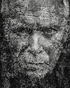
We may observe the occurring theme of more harsh pictures overlaid when the model has sharper or rougher features, and alternative softer, innocent images for perhaps a child or female. When we look at Relander's photo of a small girl with a large butterfly in the centre of her side profile, we automatically think of the child as being clean, incorrupt and small - similar to the butterfly.
However, when we see the elderly gentlemen dense in grown trees we infer the connection between the men and the old shrubs- both adult and have almost finished given what they have to give; the plant has been through all weathers and when the seasons change, their leaves grow and fall, like how the men have been 'weathered' and tainted through experience of loss and gain.
Relander tends to prefer genres such as portraiture, still life and nature with modifications like double/multi-exposure. These work well and create amazing affects which emerge from otherwise rather dull and boring imagery. Often, it's hard to notice the person within the forest or the buds sprouting inside a body. The artist moves between bold and subtle changes, depending on the intended message he attempts to convey.
We may observe the occurring theme of more harsh pictures overlaid when the model has sharper or rougher features, and alternative softer, innocent images for perhaps a child or female. When we look at Relander's photo of a small girl with a large butterfly in the centre of her side profile, we automatically think of the child as being clean, incorrupt and small - similar to the butterfly.
However, when we see the elderly gentlemen dense in grown trees we infer the connection between the men and the old shrubs- both adult and have almost finished given what they have to give; the plant has been through all weathers and when the seasons change, their leaves grow and fall, like how the men have been 'weathered' and tainted through experience of loss and gain.
Shoot plan/Christoffer Relander:
I believe to emulate my chosen artist's work at home I would have to do multiple shoots. The first shoot would be a portraiture, aiming for an angle. The lighting would have to be natural to fit in with the overlay, with little to no props. Relander's portraits are plain with detail physically manipulated inside the person, adding unnecessary distractions would only complicate the image. To keep the photographs sharp, a fast shutter speed will be used- estimated around 1/60- not too high/low that it hinders the exposure, a tripod will help.
Then, an outdoor shoot will be taken of plants, leaves, grass, flowers, trees, shrubs, small insects and possibly some sort of weather like rain. Settings such as 1/200 should be acceptable without a tripod and varying ISO's between 200 (sunny) and 400 (overcast). The aperture is free in the ranges of F16 and F8. The finals should not have blur, nor be too busy; both of these imperfections would make digital manipulation increasingly difficult. Neither of the shoots have to be done in monochrome as that can be edited.
After the shoot is finished, the images will be downloaded in high quality and the process of multi-exposure and feathering can be carried out via the use of tools like lasso, wand, masking, draw, fill and overall adjustments with levels, curves, brightness, tint and contrast. These will be done on PIXLR E to ensure familiarity.
(Tap images below for articles and videos)
|
“Reality can be beautiful, but the surreal often absorbs me. Photography to me is a way to express and stimulate my imagination. Nature is simply the world. With alternative and experimental camera techniques I am able to create artworks that otherwise only would be possible through painting or digital manipulation in an external software.” |
Editing/Double Exposure/Christoffer Relander:

|

|

|

|

|

|
I edited these images by the use of PIXLR and, more specifically; marquee select, lasso select, crop, sponge and mask. Then, for the actual images, I edited them using exposure, monochrome, desaturation, temperature & tint and highlights & shadows.
Unedited Images/Double Exposure/Christoffer Relander:
Shoot/Double Exposure/Christoffer Relander:
|
|
|
Editing Steps/ Double Exposure/Christoffer Relander:
|
Step 1: crop portrait image and apply black and white filter. Ensure clean background by increasing highlights and contrast.
Step 3: Change transparency to around 40% and use the cutout/mask tool to begin removing second layer from around face. When completed merge layers and convert to blend mode.
|
|
Step 2: Add second layer (if you have over two layers this changes from double exposure to multi exposure.)
Step 4: Use wand select to whiten areas before using draw to merge the white background and nature-patterned portrait together, gradiently.
|
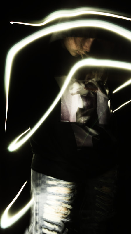
Shutter Speed Workshops / Long Exposure / Motion Blur / Light Drawing:
(Tap below images for related articles)
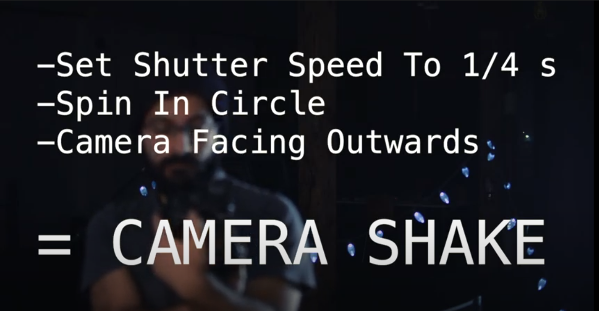
Slow Shutterspeed-
|
What is Shutter Speed and Blur in Photography? Shutter Speed, known as SS, is the amount of time the sensor is exposed to light. if anything in the frame moves whilst taking the image, it is captured as a blur (depending on speed of movement) within the image. Blur is the streaking of moving objects, used to convey a sense of speed. |
Fast Shutterspeed-
|
|
|
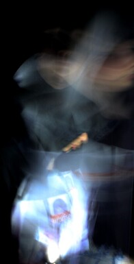
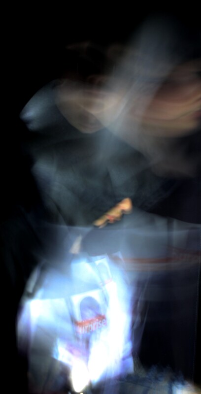
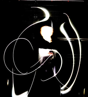
Photographic Techniques / Long Exposure:
(Tap below images for related articles)
|
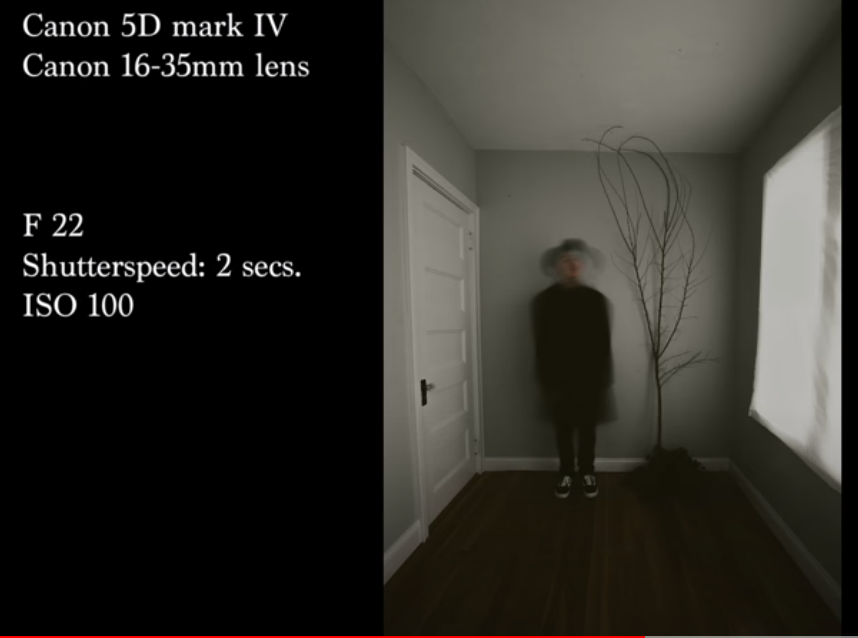
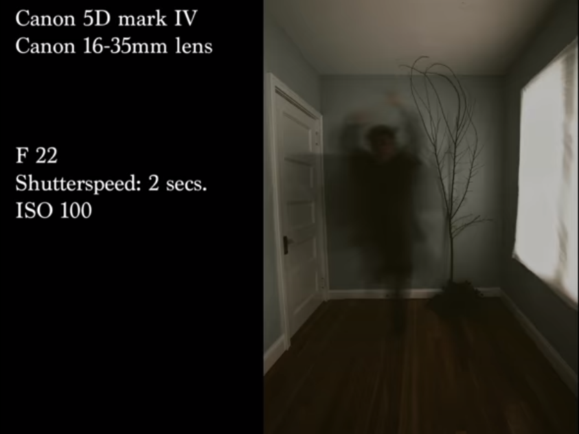
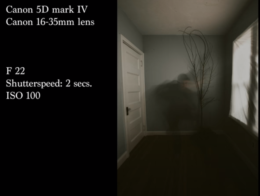
What is Long Exposure in Portrait Photography? Long exposure is a technique which needs a long duration shutter speed and has the intent on purposely blurring, smearing or obscuring the results. In portrait photography, this is often used to smudge or change the models physical appearance. To create these affects, you usually need a tripod, a long shutter speed, small ISO and large aperture. |
f/14
SS 3" ISO 64 |
f/11
SS 3" ISO 64 |
f/14
SS 3" ISO 64 |
Photographic Techniques / Long Exposure / My Experiments:
|
|
|
Photographic Techniques / Long Exposure /Edited and Best Images:
|
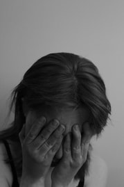
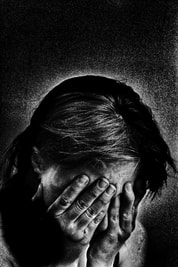
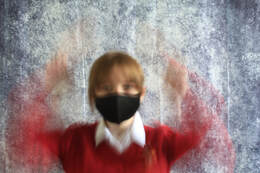
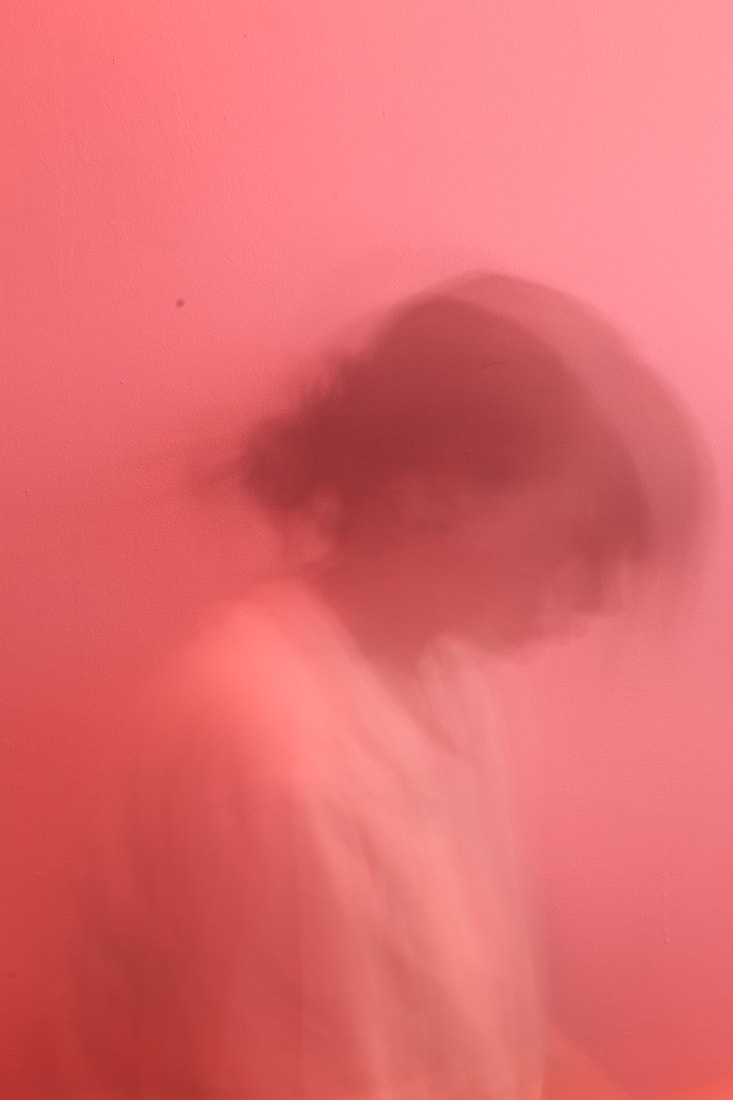
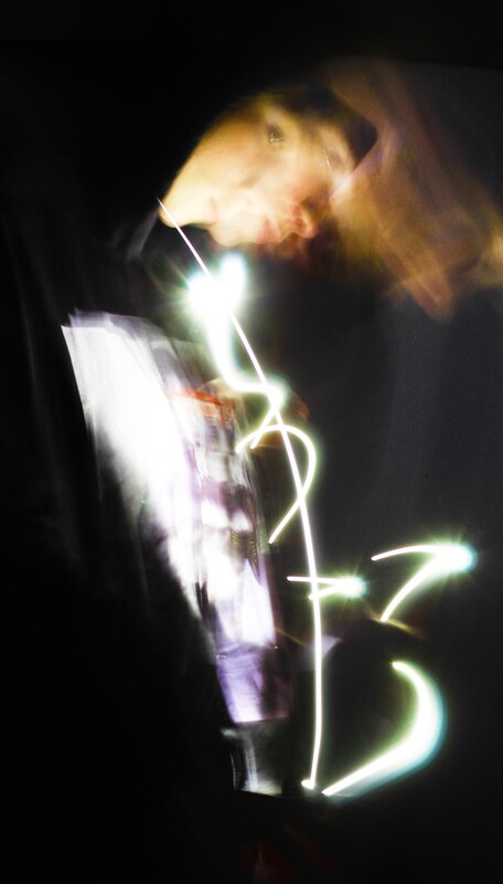
This portraiture shot should have been taken with a longer shutter speed and slower movements with a stiller face. Though this image isn't the best, it is one of the most successful from this batch. The positives in this would probably be the gradient backdrop, tones, contrast and noticeable hands under the chin. I don't believe I carried out this shoot to the best of my ability and will have another attempt.
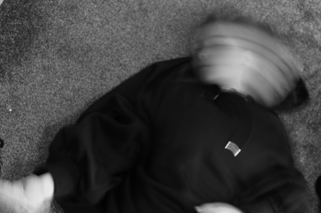
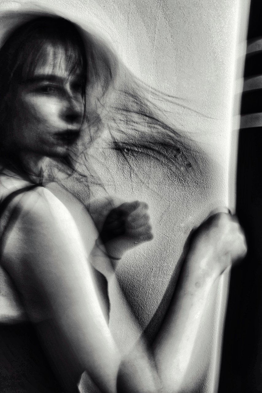
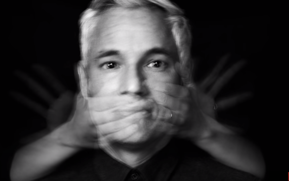
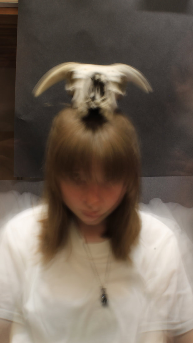
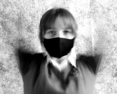
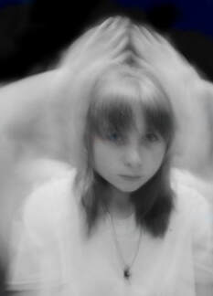
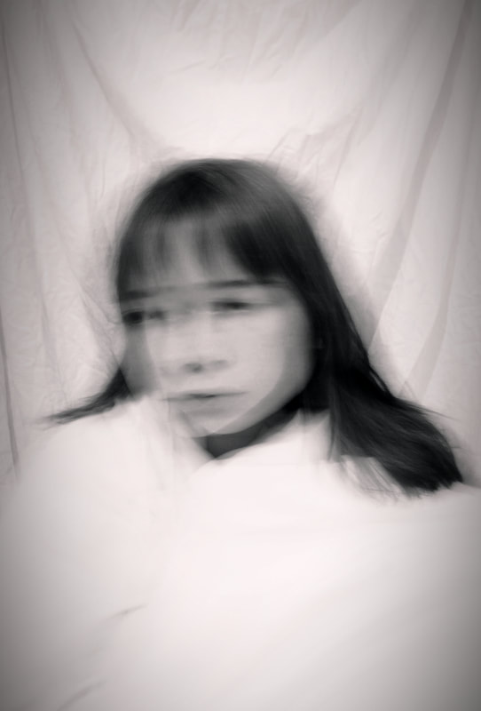
In my opinion, this is my most successful image overall; mainly due to the lack of identity which is portrayed through the disfiguration of my arms and the interference of a mask. I manipulated this photograph digitally to look as if I lost my limbs- this was done by the saturation, tone, highlights and shadows which were all largely helped in their task by the original image. When I began to edit this, I pondered on the thought of using the heal tool, or the clone setting, but neither were needed. The loss of identity, as mentioned, is also shown through the mask and, with the additional blurring of the eyes, we are unable to fully muse the possible expression- meaning you view the picture differently than others depending on how you automatically perceive it. I prefer this image opposed to others due to the darkness and skull. Though this image isn't the best representation of motion blur ad long exposure within photography, the picture itself is interesting as at first glance you are captivated.
The skull itself looks almost as if a growth, backed by the shadow atop my head- death defeating living. As we look around the picture further we automatically take in the dirty shirt; this makes us, possibly without realising, assume the skull and dirt have a connection and overall create a mental theory of what we believe. I also decided this was one of my most victorious. My evidence behind this being the successful use and emulation of intentional motion blur. When taking this image, I drifted my hands around my face for 8 seconds slowly, being careful not to move my face, which took multiple frustrating attempts; so when I ended up with this result I was pleased.
I was also happy with the tonal contrast of pale skin, a white top, black background and hair colour which seemed to help the gradient change drift more evenly. |
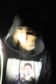
Photographic Techniques / Motion Blur:
(Tap below images for related articles)
|
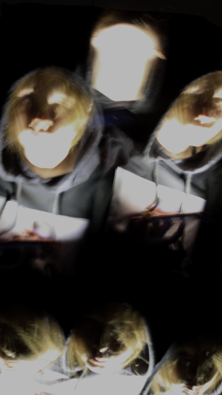
What is Motion Blur in Portrait Photography? Motion blur is the affect received when capturing a moving object with a longer shutter speed. If you track the subject at the same speed, then the subject will appear sharp in the image and the background blurry. It is a visual way to morph time into whatever you want it to be- instead of isolating a moment, you combine multiple. |
|
|
|
Photographic Techniques / Motion Blur / My Experiments:
|
|
|
Photographic Techniques / Motion Blur / Best Edited Images:
|
|
|
|
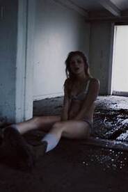
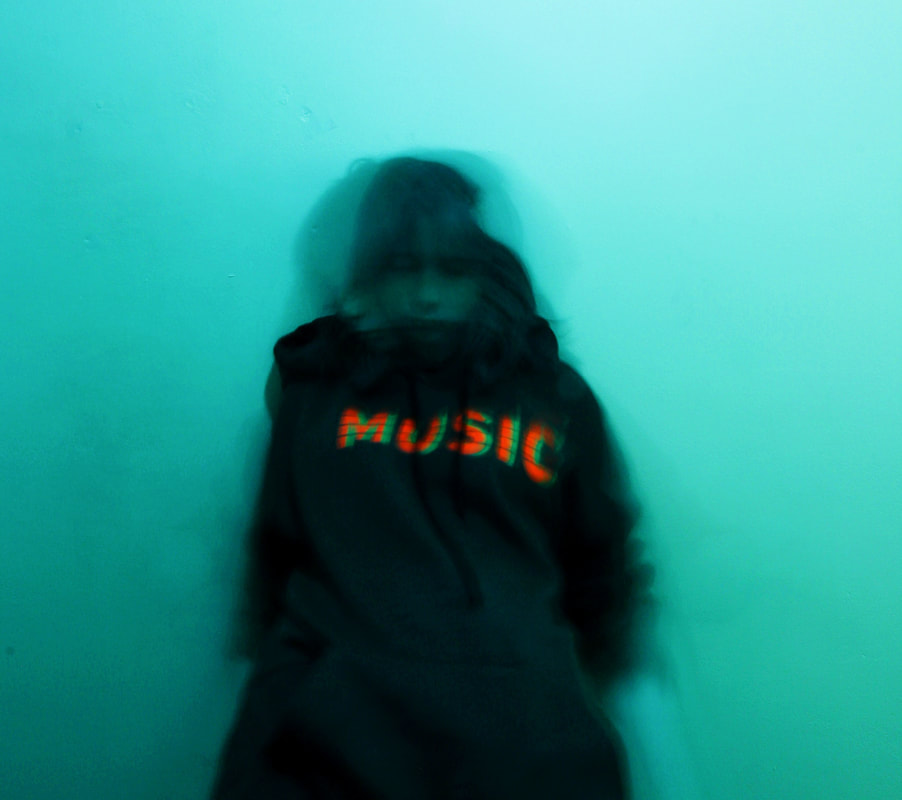
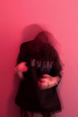
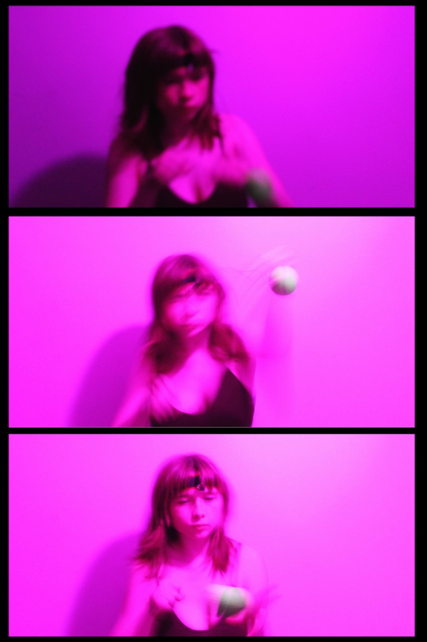
Research and Investigation / Best Image Motion Blur:
|
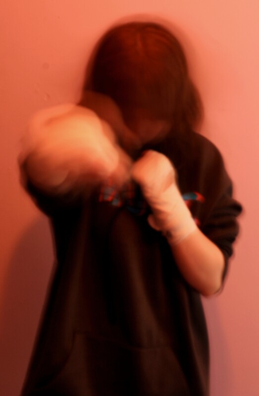
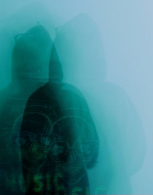
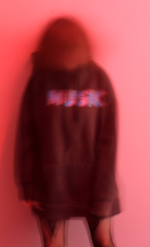
I favour this image, though I'm not particularly sure why. I like the clash between the pink background and dark clothing with white wraps. The movement of my hands cause the pose to almost seem robotic, the lack of a head disfiguring the stereo-typical image. The motion during the 4 second shutter speed changes to look like a shadow, contrasting with the bright background.
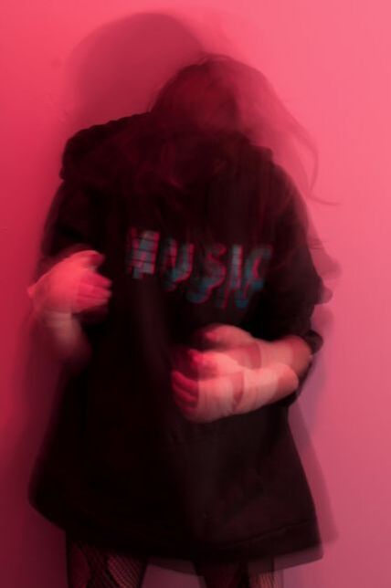
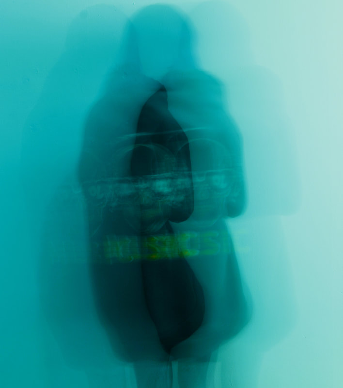
My other shoots are rather similar, but this image symbolises each of them, as if it's a combination made up of elements from previous photos. These elements include a hidden face, the photo ending above the knees, a bright backdrop colour and a 'music' hoodie with snake fishnet tights. This image portrays more of my preferences and spirit than the others- the word 'music' at the centre of the hoodie in bold showing a like for it. |
Motion Blur/Second Attempt:
|
|
|
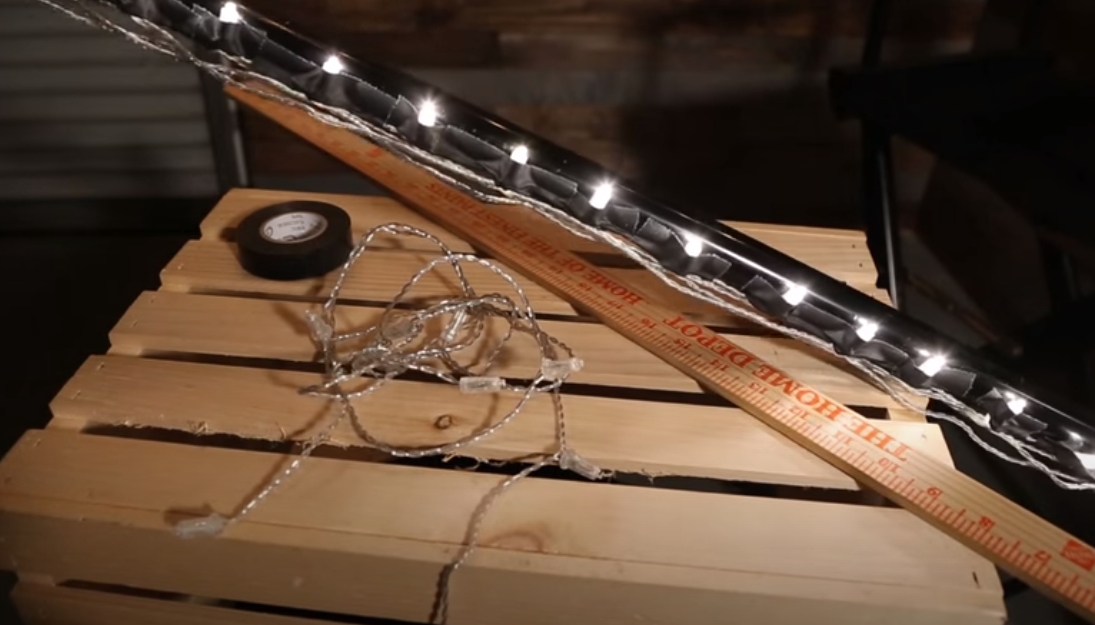
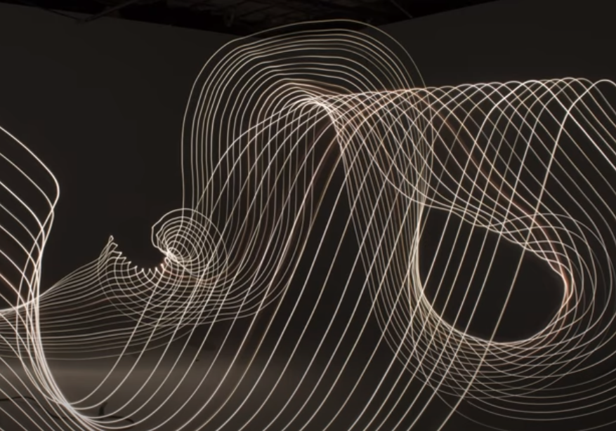
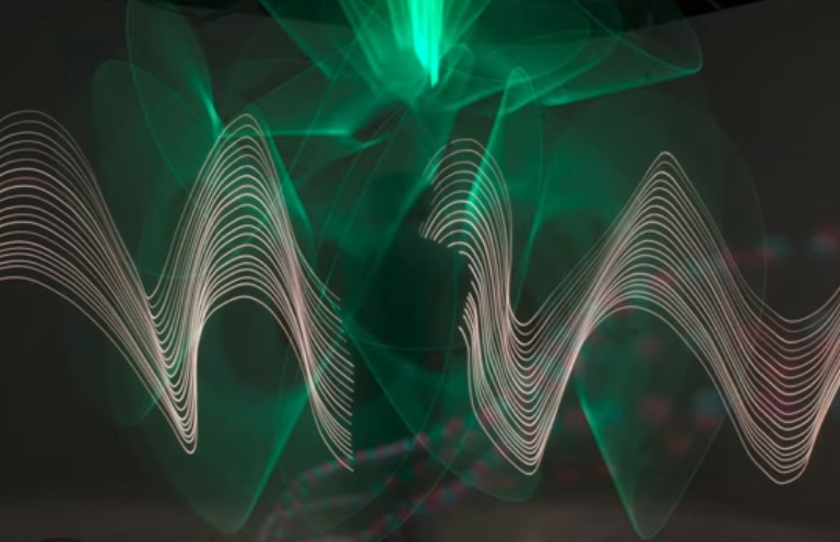
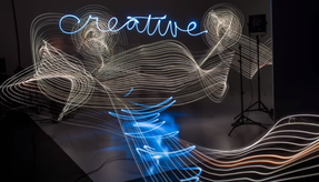
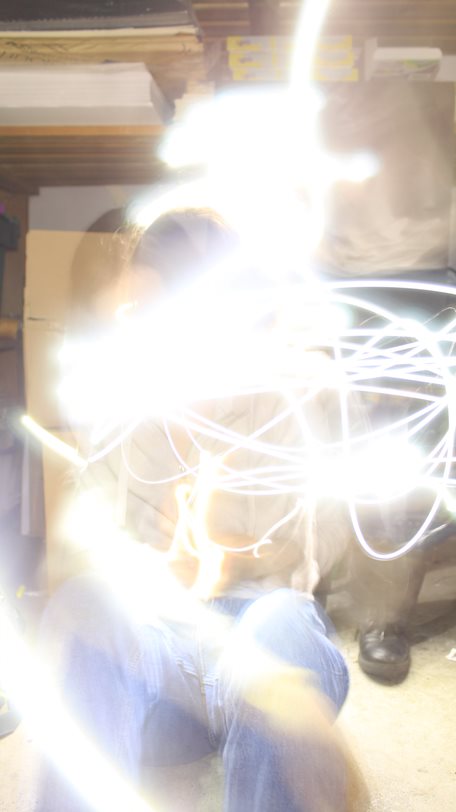
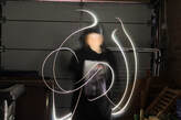
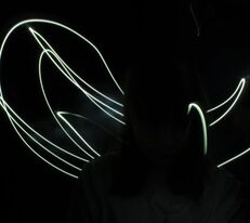
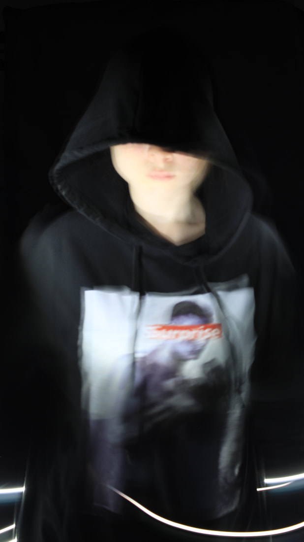
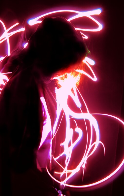
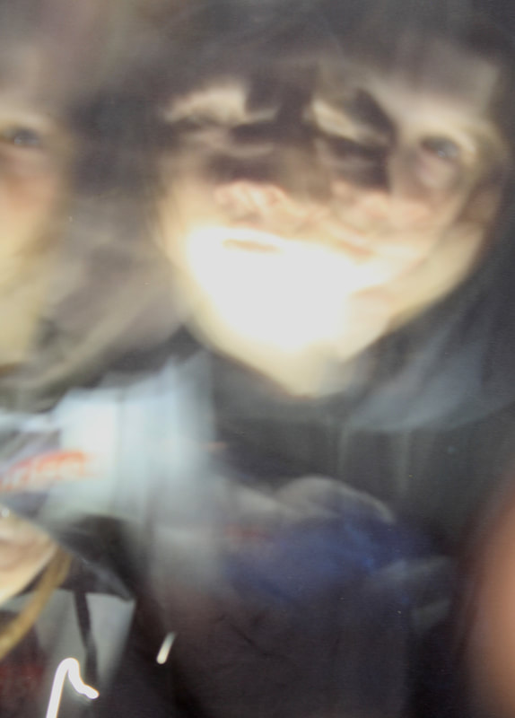
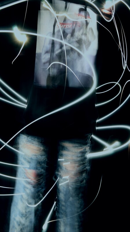
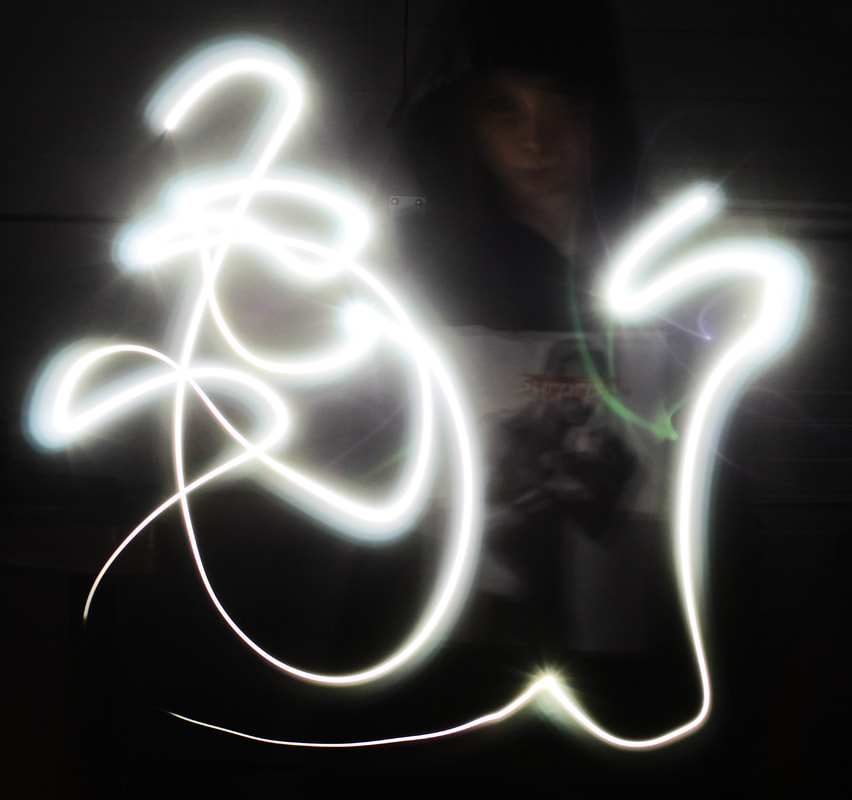
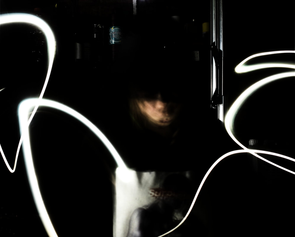
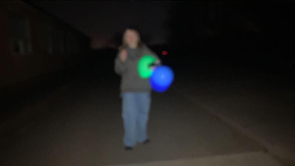
Photographic Techniques / Light Drawing:
|
What is Light Drawing in Portrait Photography? Light drawing is a photographic technique which, when mixed with the style of portraiture, can either go horribly wrong or incredibly amazing. When it goes correct, the end results are cool and truly unique- however, more often that not, that isn't the case. This is also a clear representation of art within photography. |
(Tap below images for related articles)
f/16
SS 23" ISO 100 |
f/16
SS 23" ISO 100 |
f/14
SS 25" ISO 100 |
Photographic Techniques / Light Drawing / Shoot Plan:
|
|
Photographic Techniques / Light Drawing / My Experiments:
|
|
|
|
Photographic Techniques / Light Drawing / Best Edited Images:
|
|
|

|
Research and Investigation / Best Image Light Drawing:
|
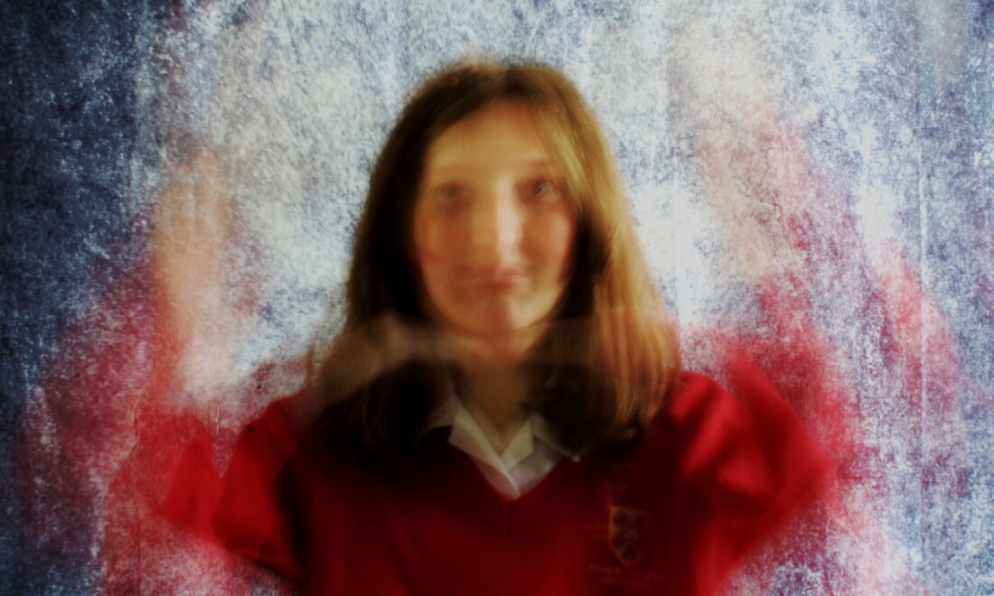
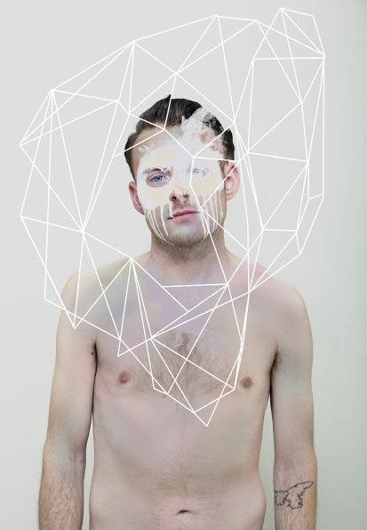
I think this image is the most successful because of the contrast between the subject and the background, despite the absence of a variety of colours. Identity is very present, yet at the same time not at all, in this portrait; the face is 'scratched' out, signifying the shortage of identity- on the other hand, the darkness juxtaposing the light could portray a more hidden disfiguration.
The original photograph could be improved if I'd blocked out all natural light sources- this self-portrait shoot was taken in a garage and the beam emitting a radiant came from a simple phone torch on the lowest level (so the surrounding glow would not highlight the bordering objects.) |
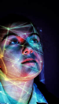
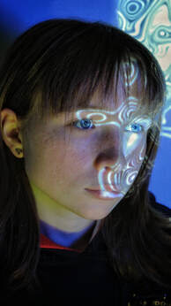
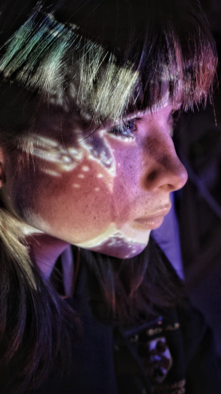
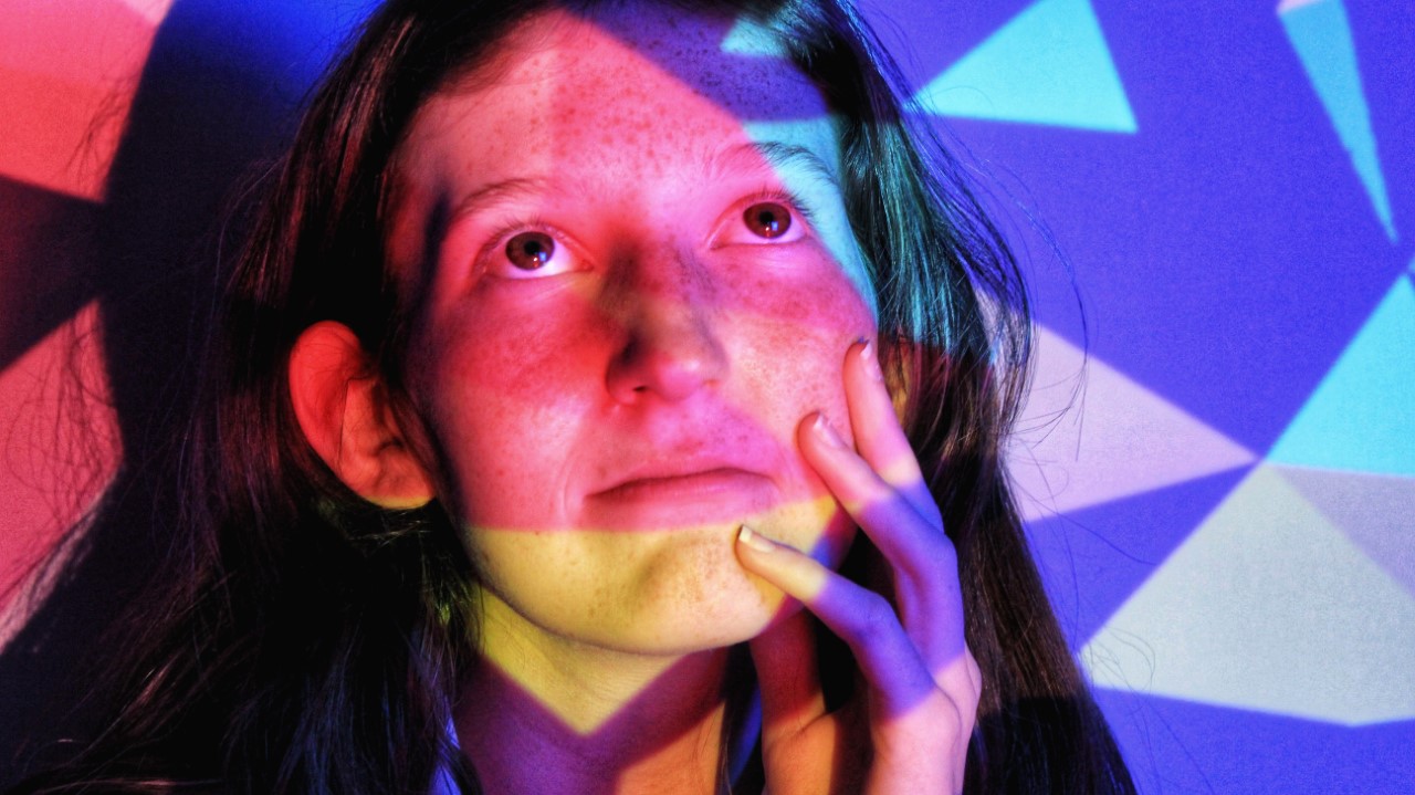
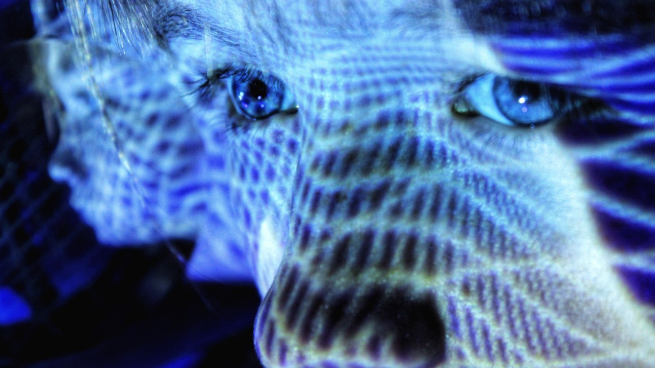
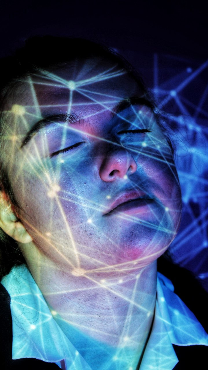
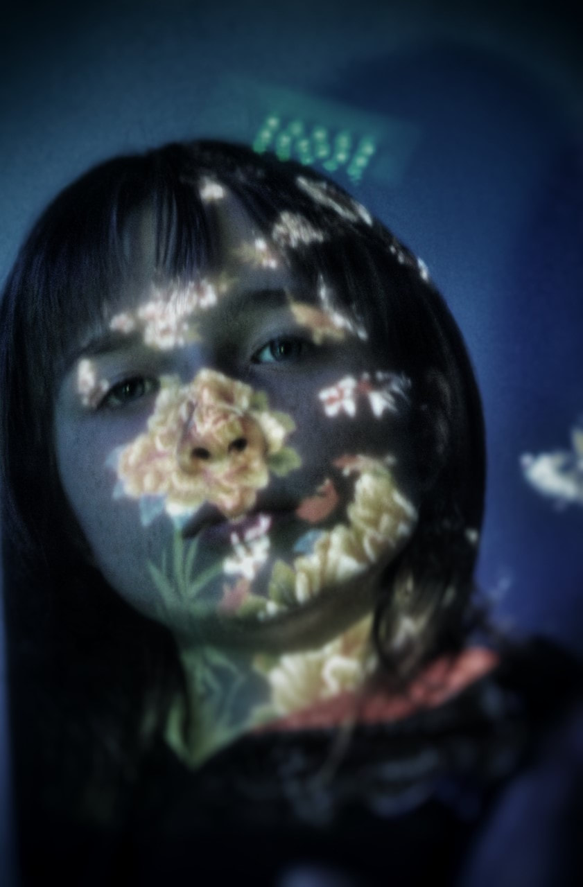
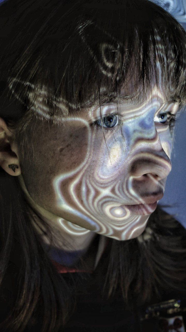
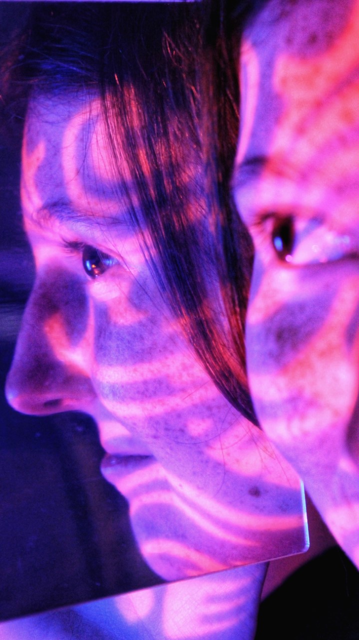
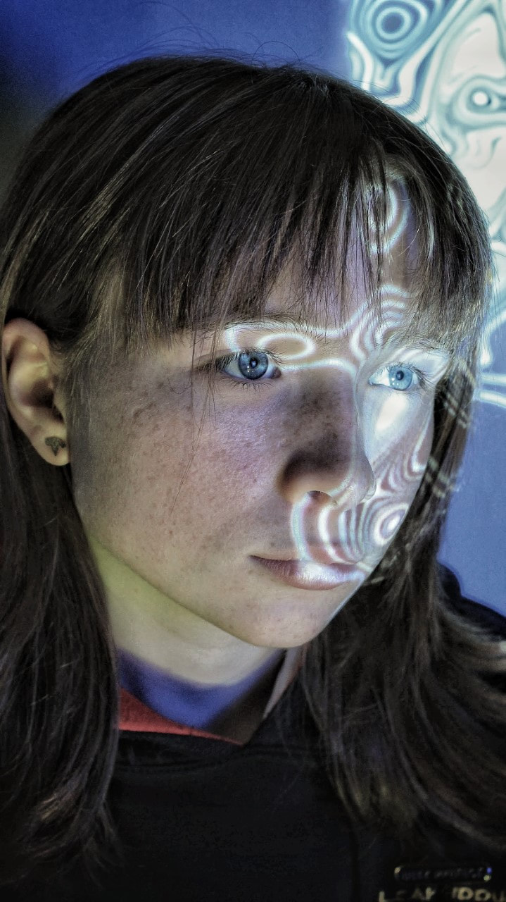
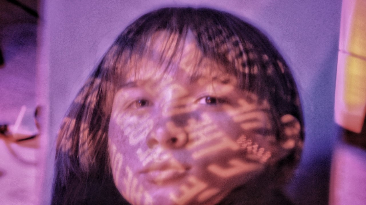
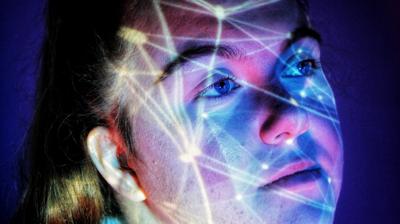
Light Projection / My Experiments:

|
|
|
|
|
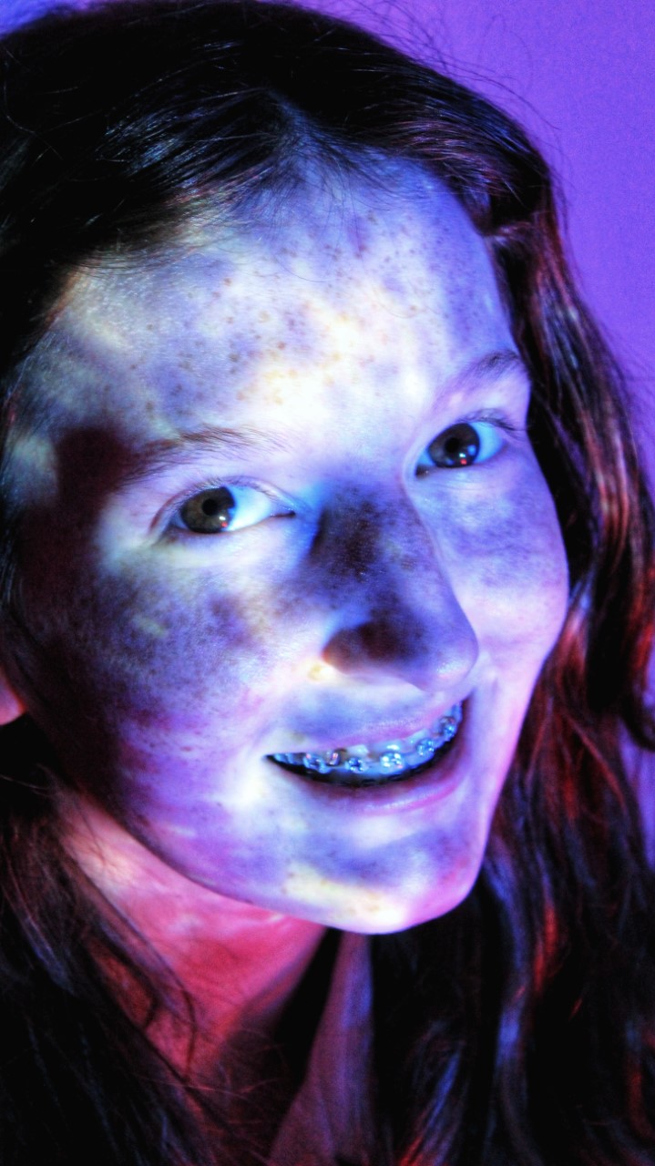
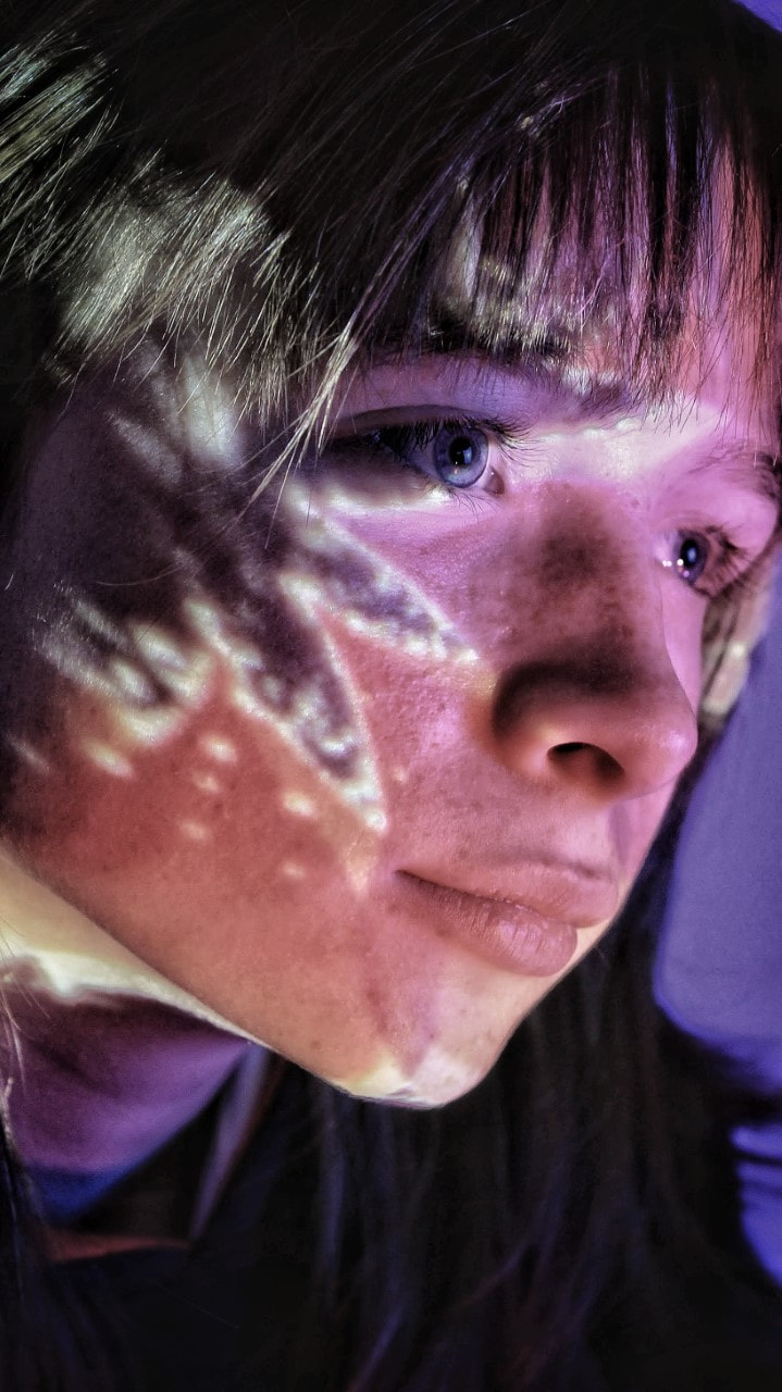
This image is my favourite due to a number of reasons. The first being the unusual flower which projects onto the person in the photos face- it laps over the eye just enough to be interesting but not too much that its blinding. Another thing I like about this image is the use of colour, the dullness contrasts with the light and vibrant colours we stereotypically associate with flowers, due to their 'innocent' atheistic. Lastly, the angle in which the photo is taken has a positive affect on the overall look- its obvious the model knows the camera is there as it appears to be close to her face; however, she ignores it. This deceives and contradicts the 'vibes' flowers emit, which was previously mentioned. Overall, its as if the flower being projected was 'dulled' due to its lack of stereotypical feminine innocence. |
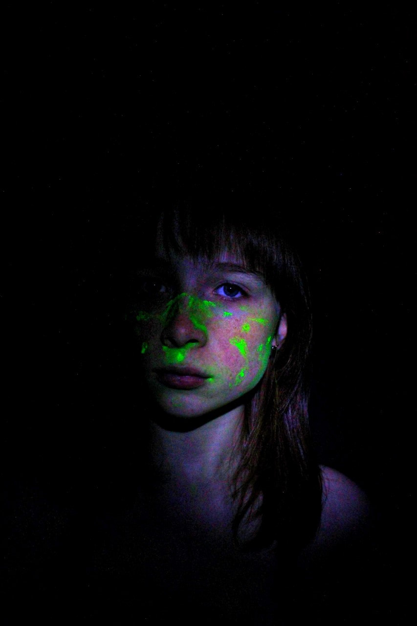
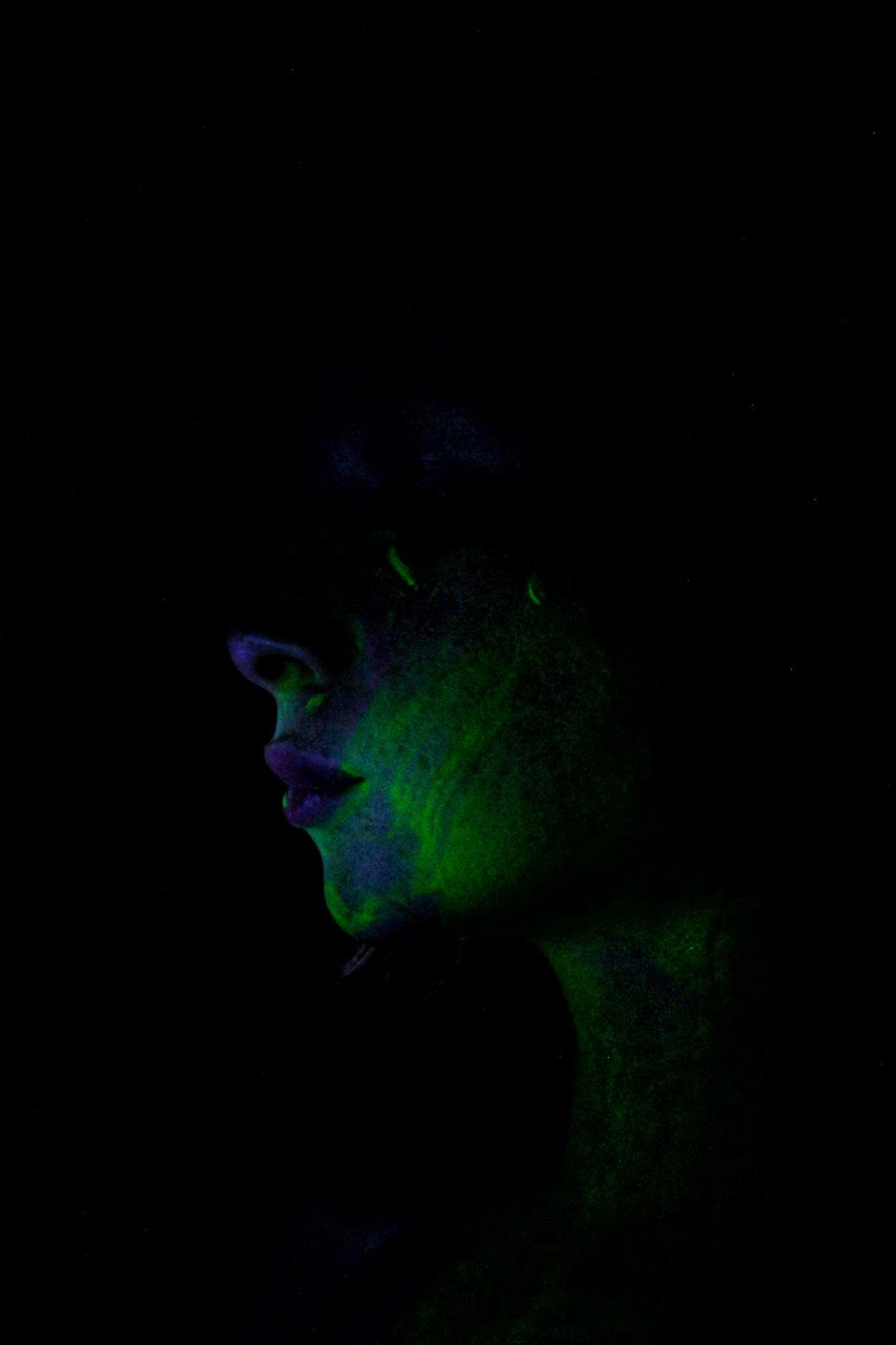
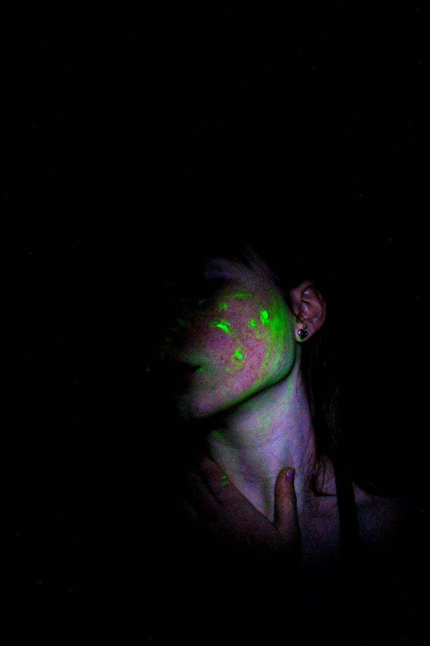
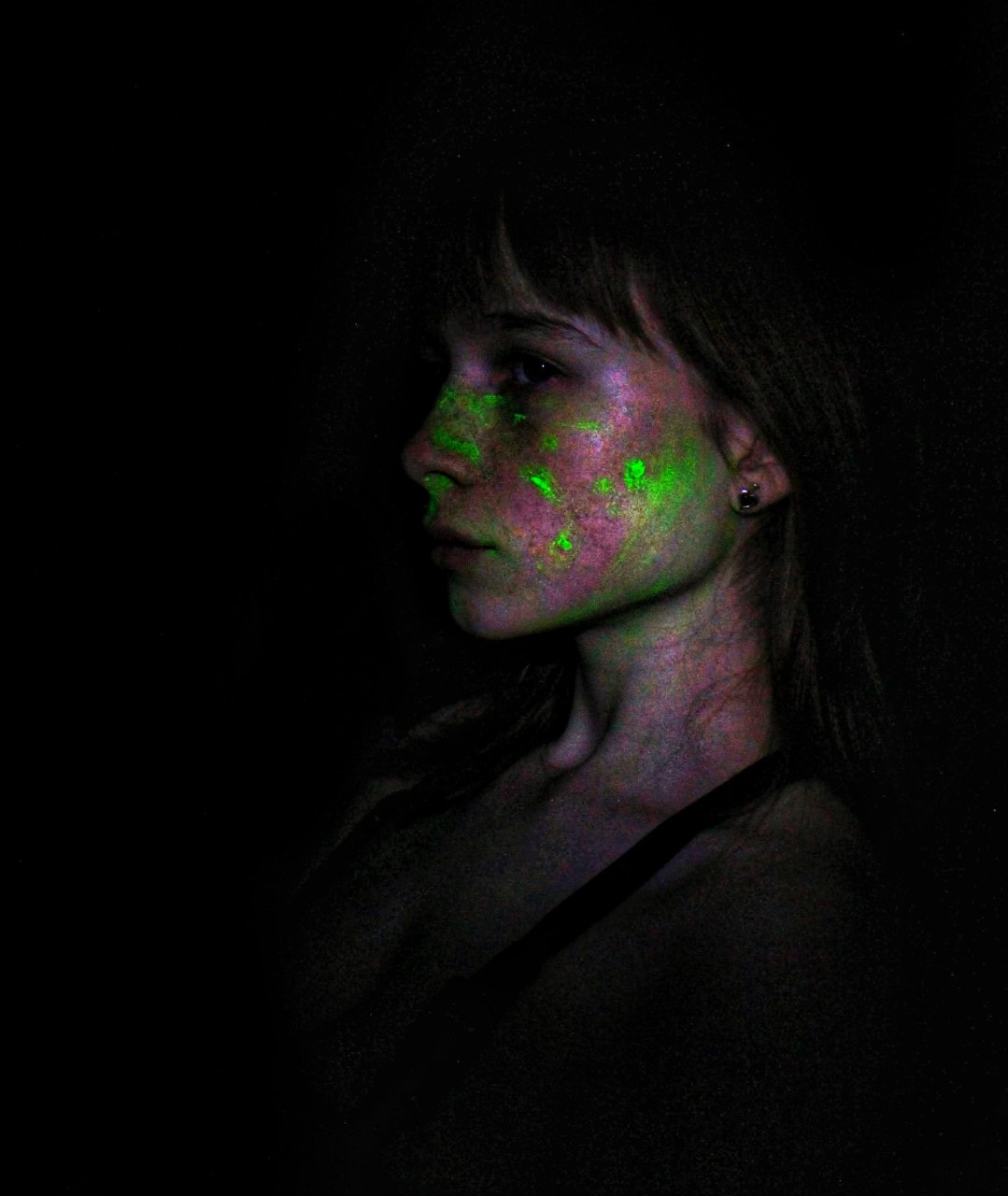
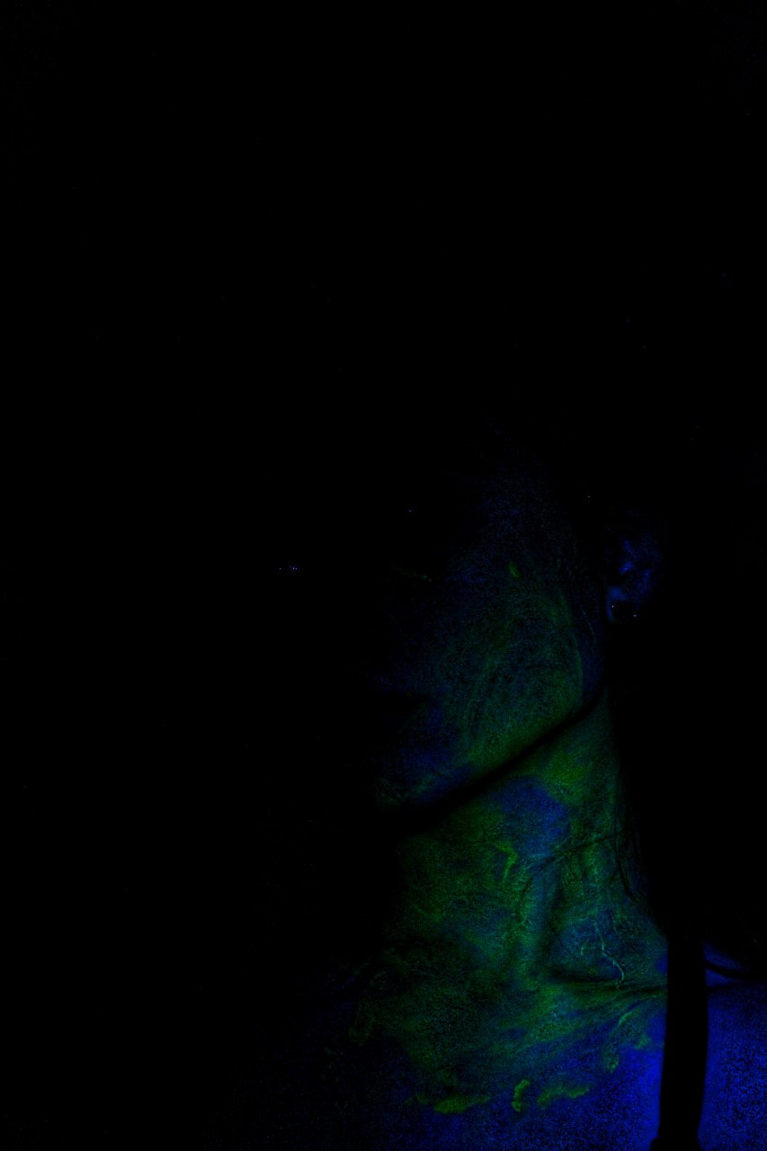
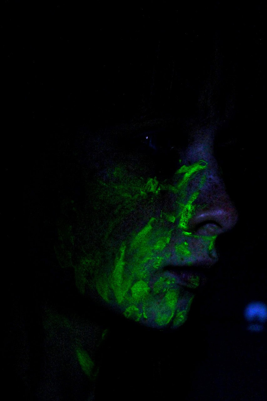
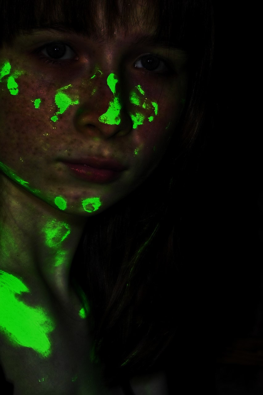
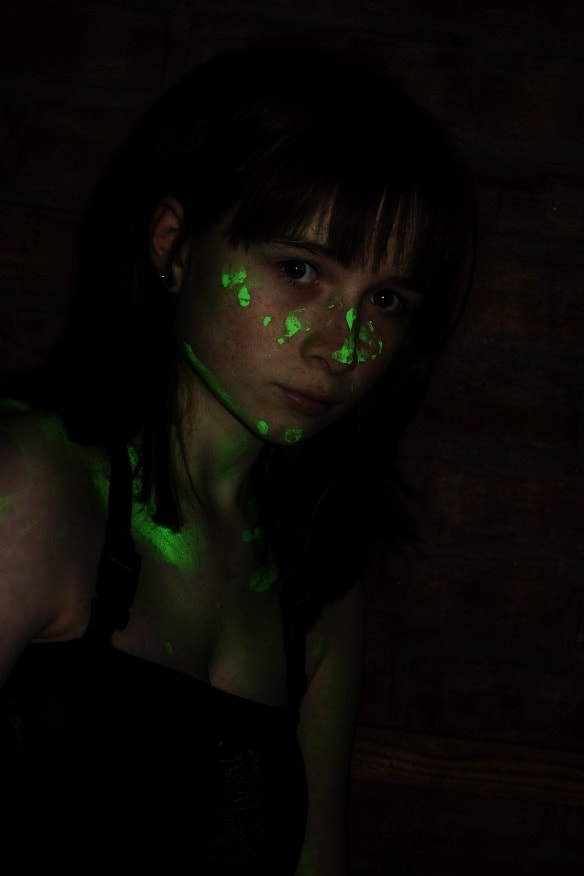
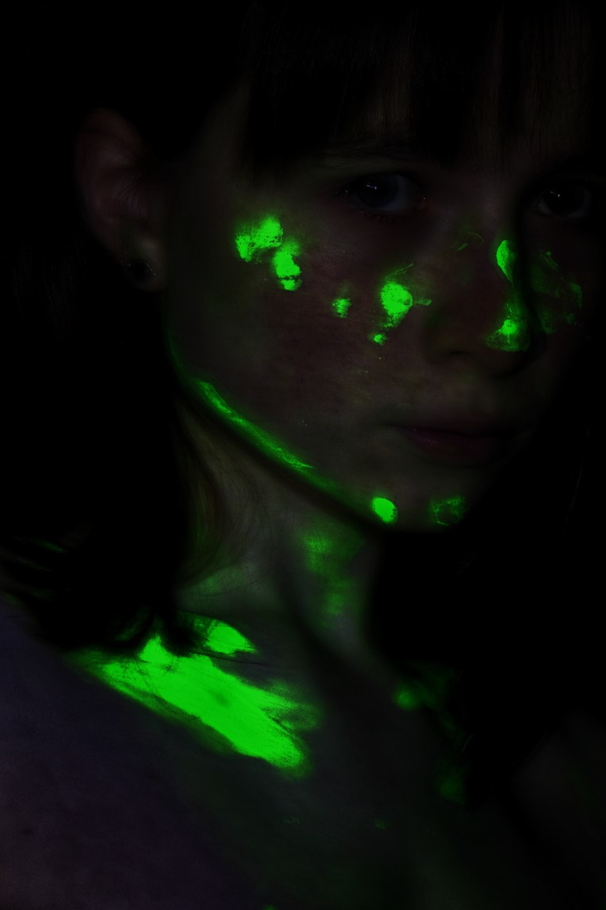
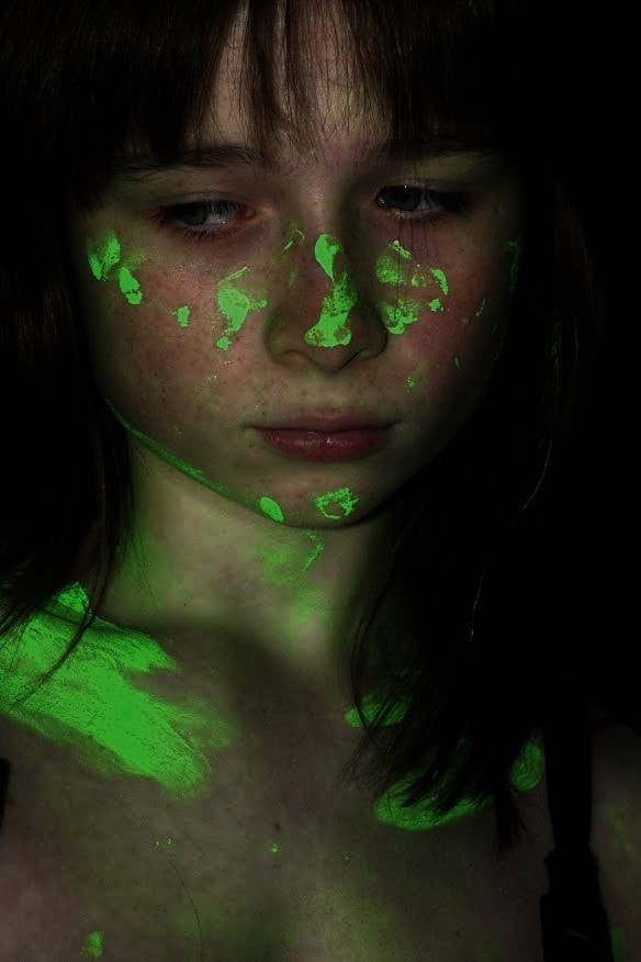
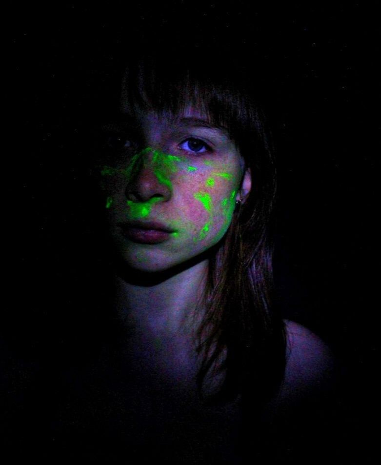
UV Glow Paint/My Experiments:
|
|
|
|
|
|
|
|
|
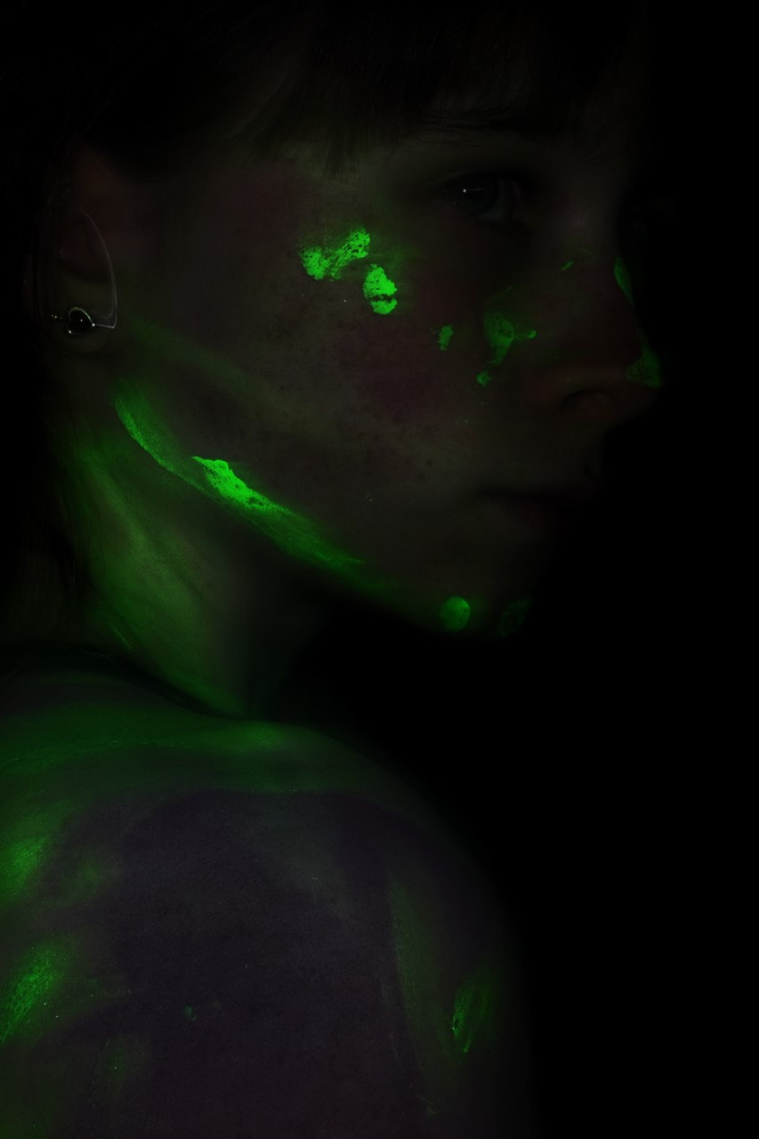
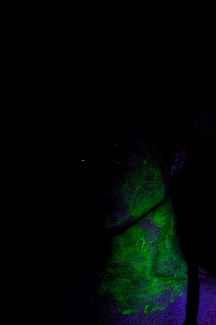
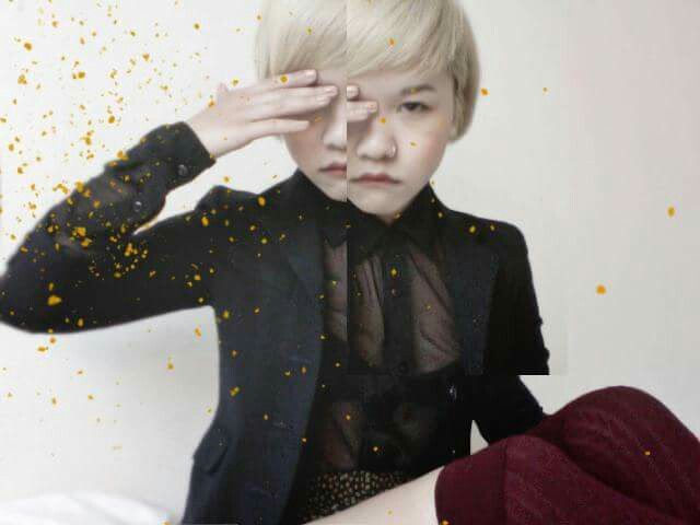
This image is one of my favourites due to multiple reasons- the main one being the vignette and darkness, which links back to Jenny Woods' work; in which she often used darker shadows to add drama and expression to her image. The other logic behind this is down to the vibrant green colour, which illustrates a physical oxymoron between the dull background and loud paint. The dull colours is further shown from the blank expression- not quiet smiling or frowning, more indifferent. We understand this is further represented from, yet again, the colours. Colourful vs colourless almost, and the lack of expression suggests the model is neither in a good mood (which would be siding with the colour and sporting a smile) or in a bad mood (which would be the colourless option, showing off a frown). |
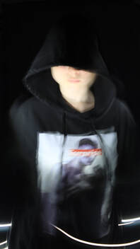
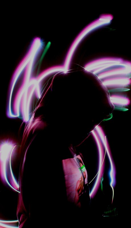
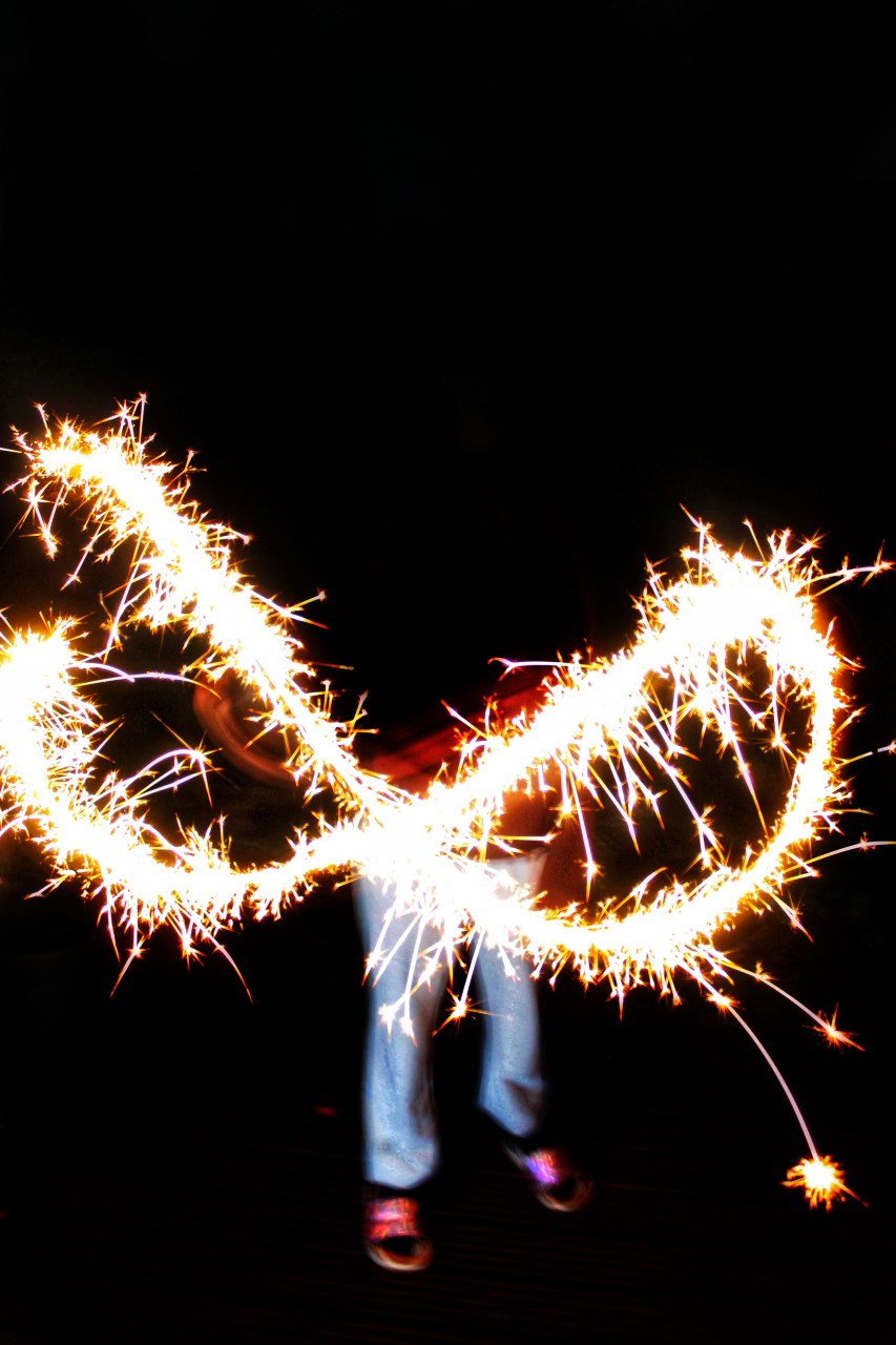
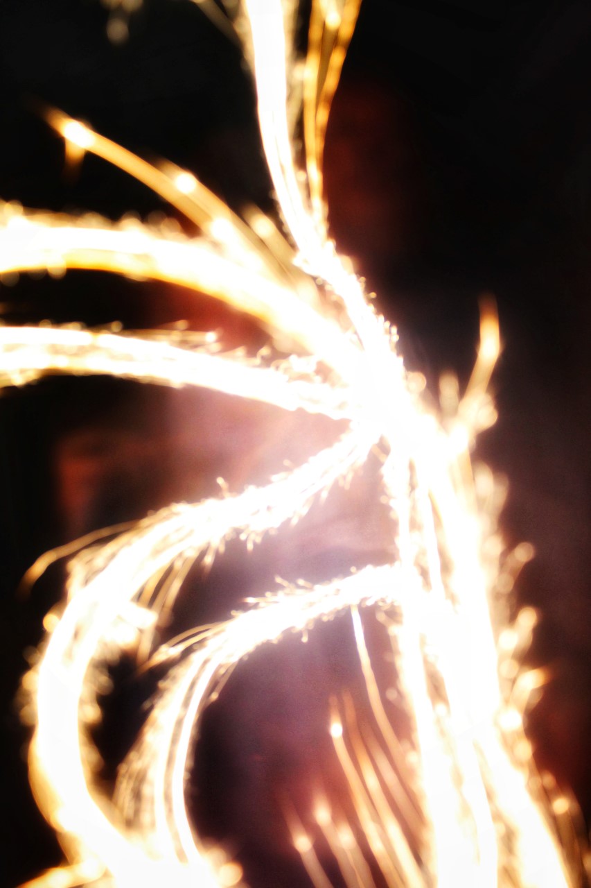
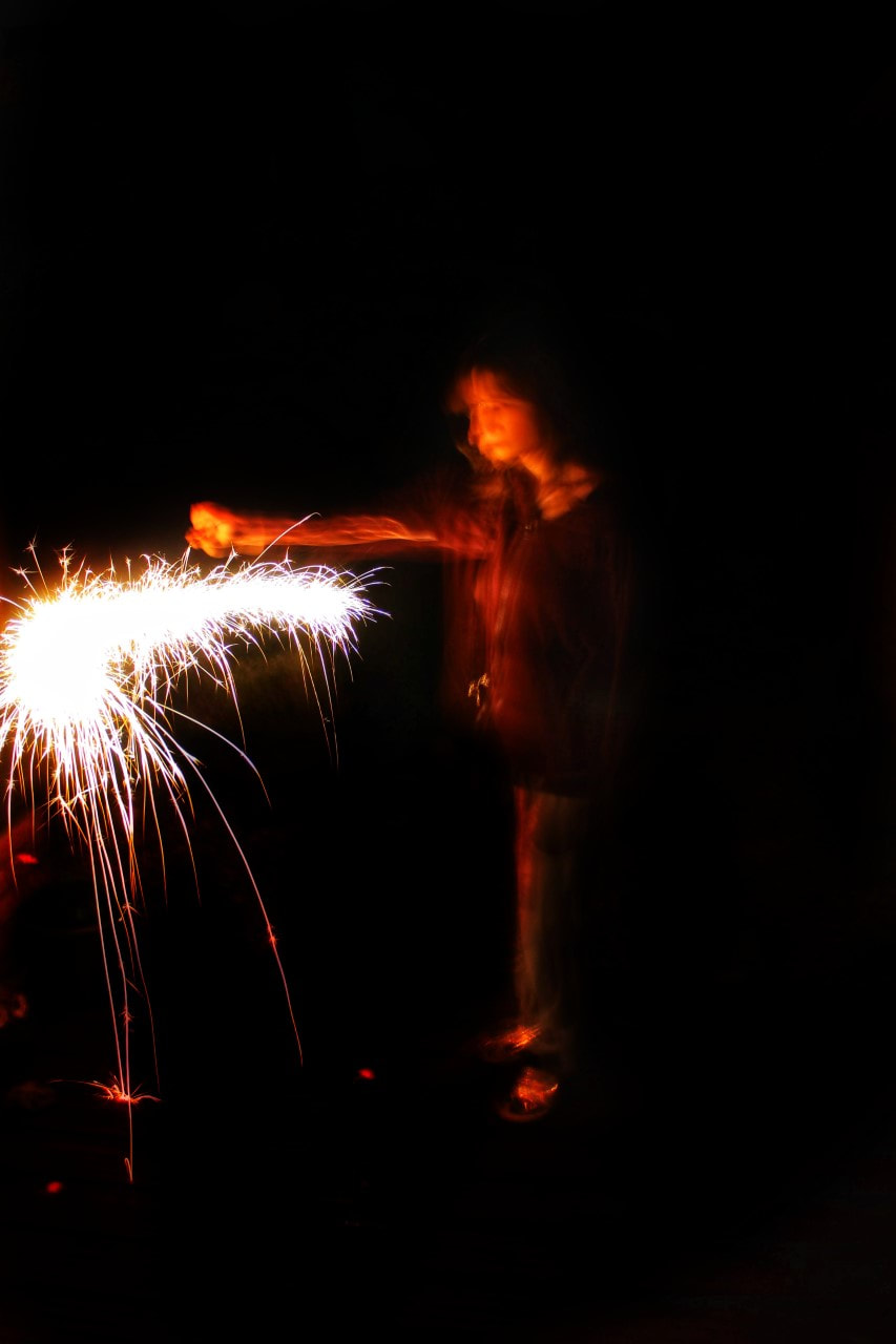
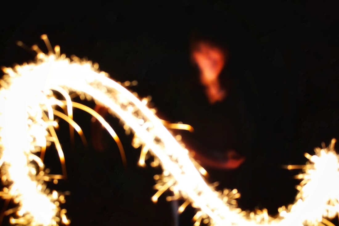
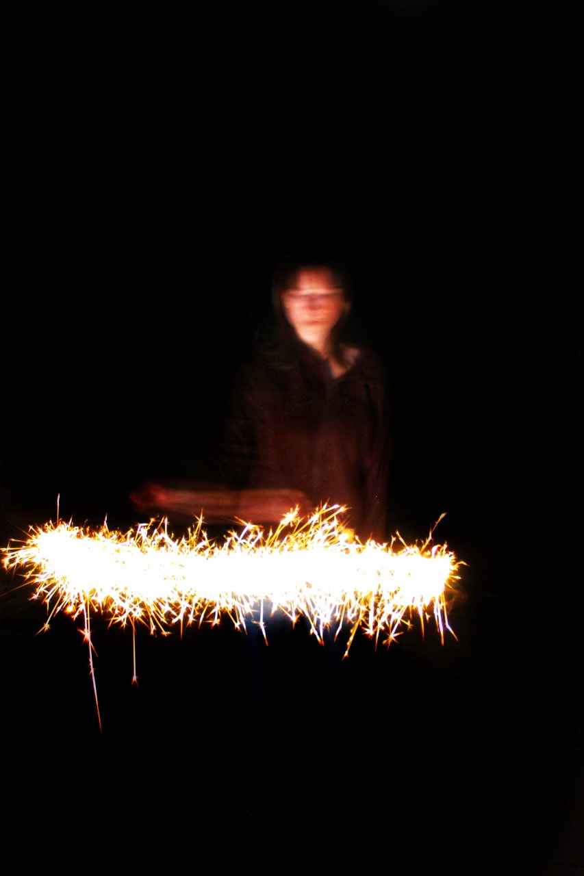
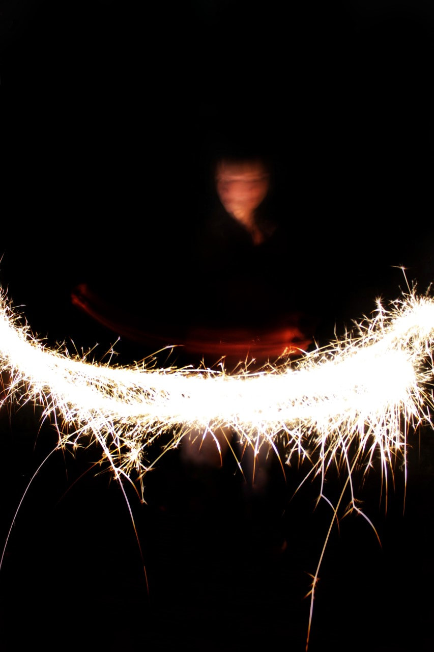
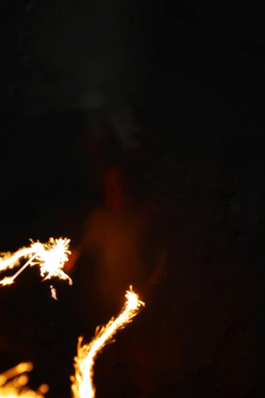
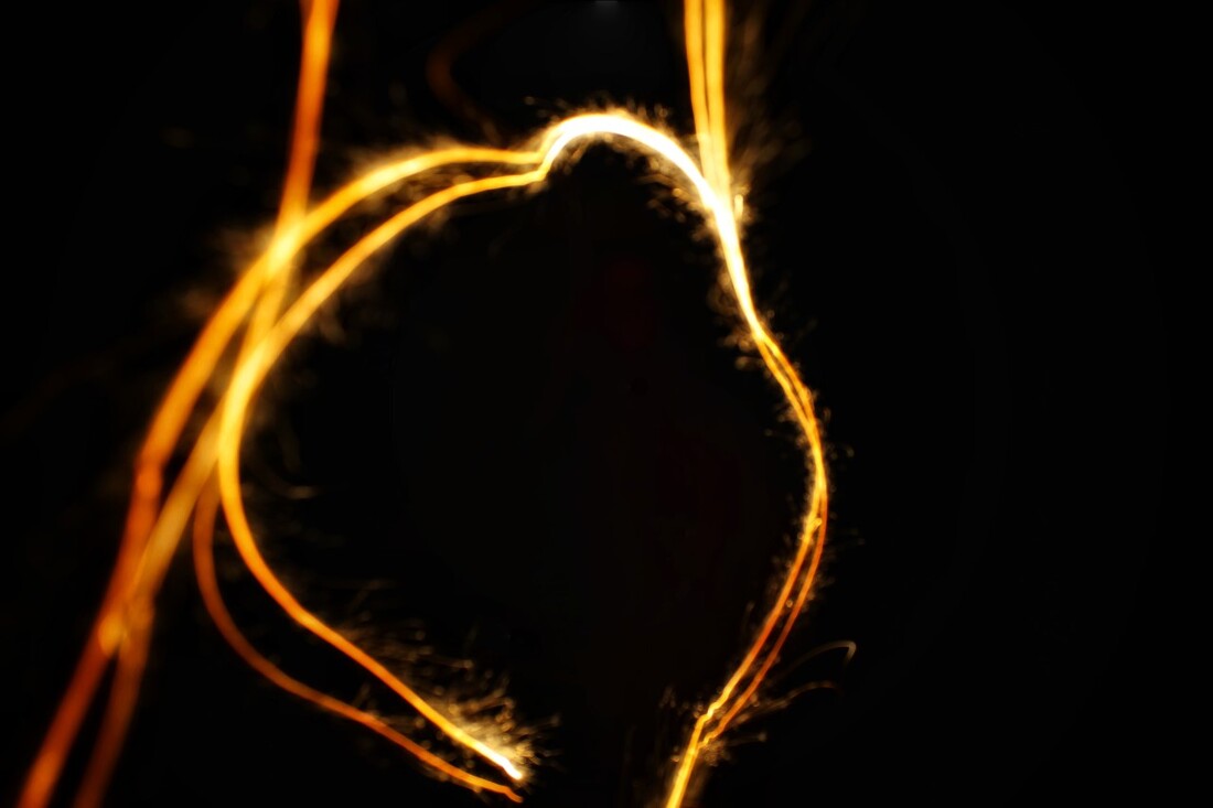
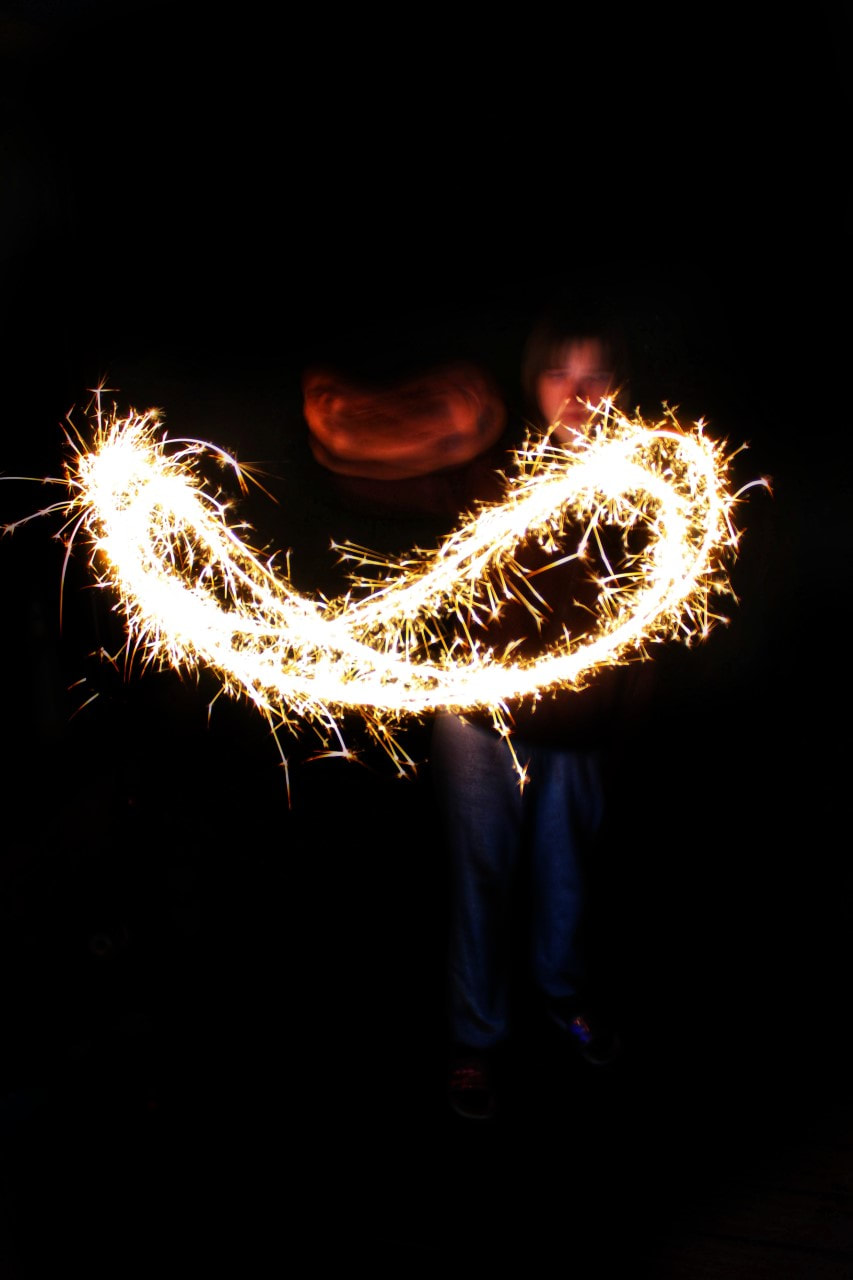
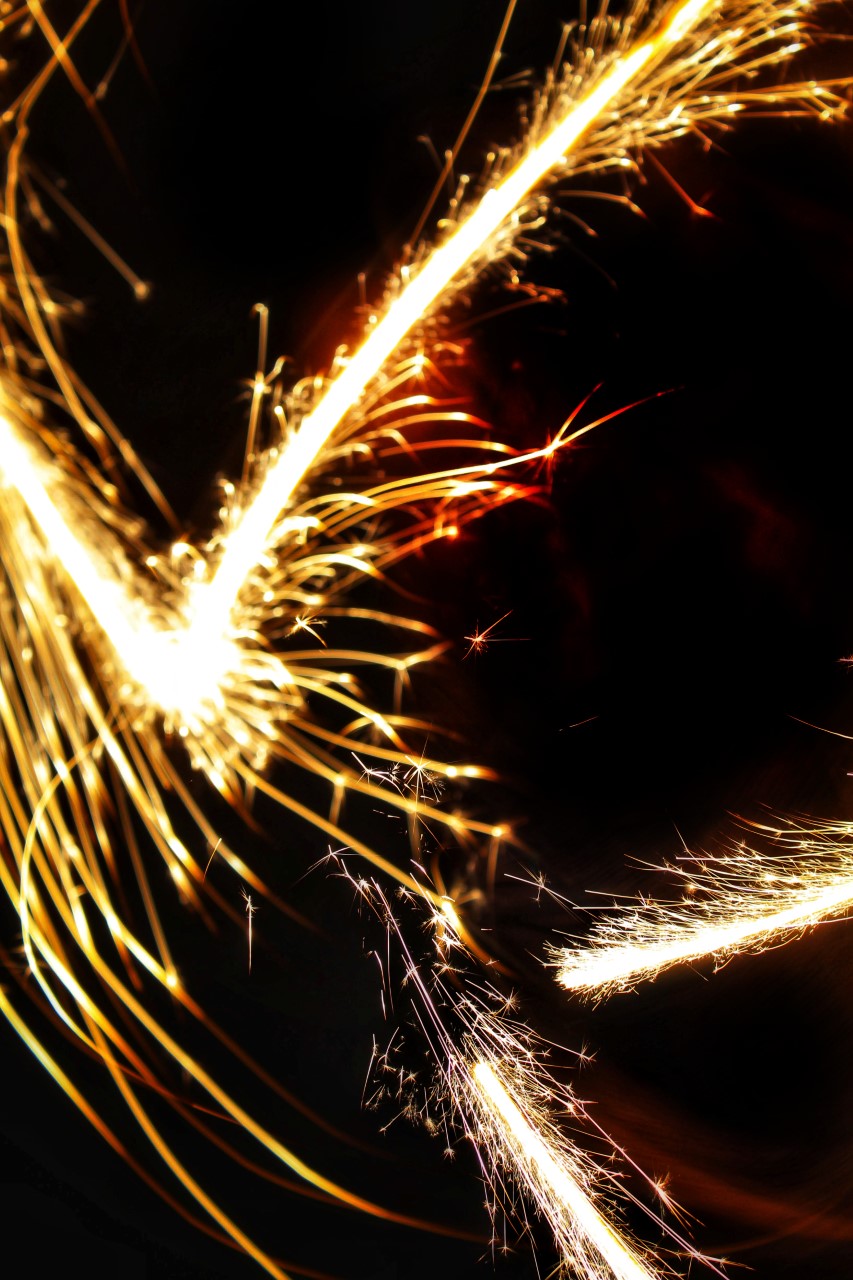
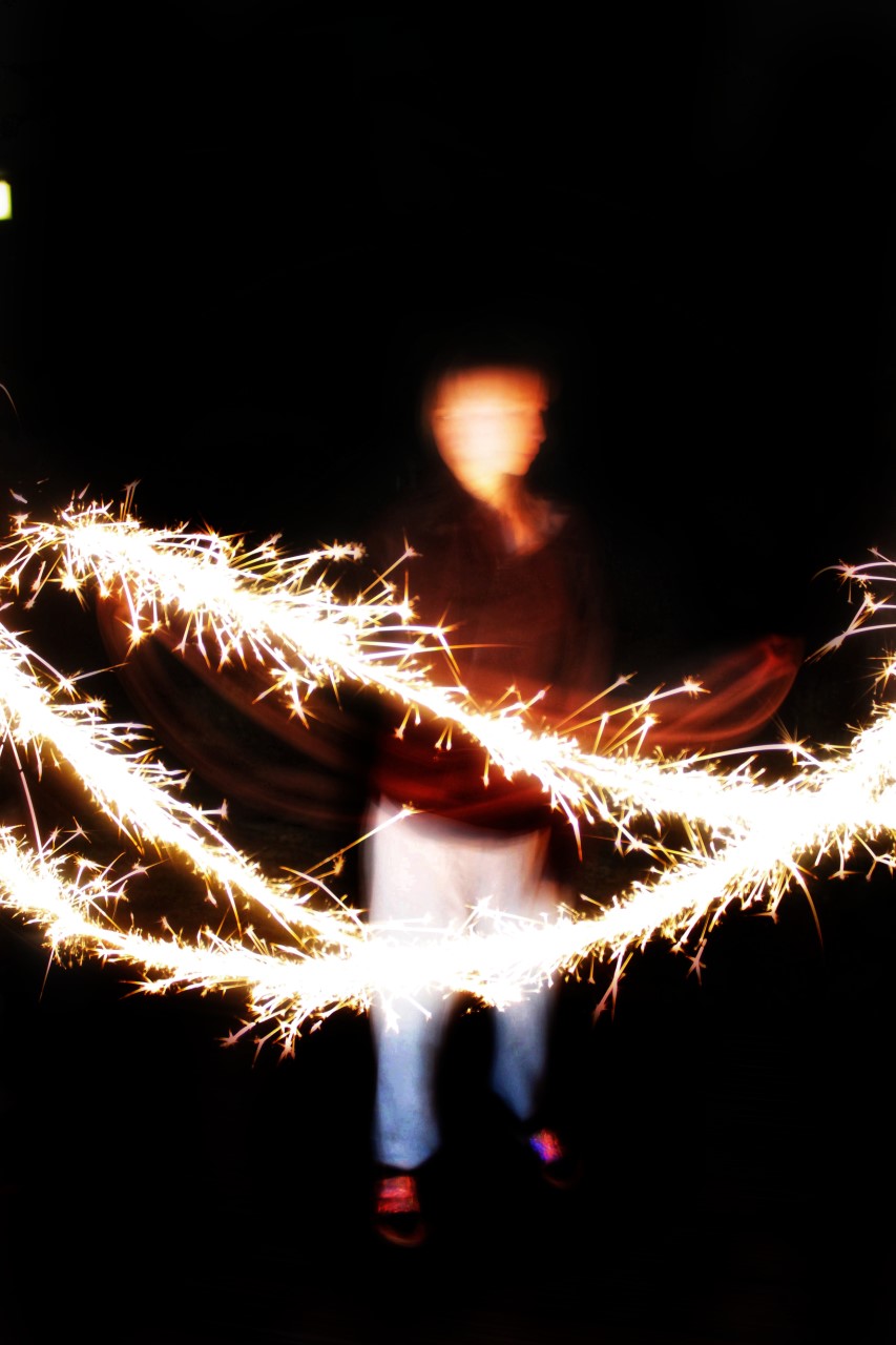
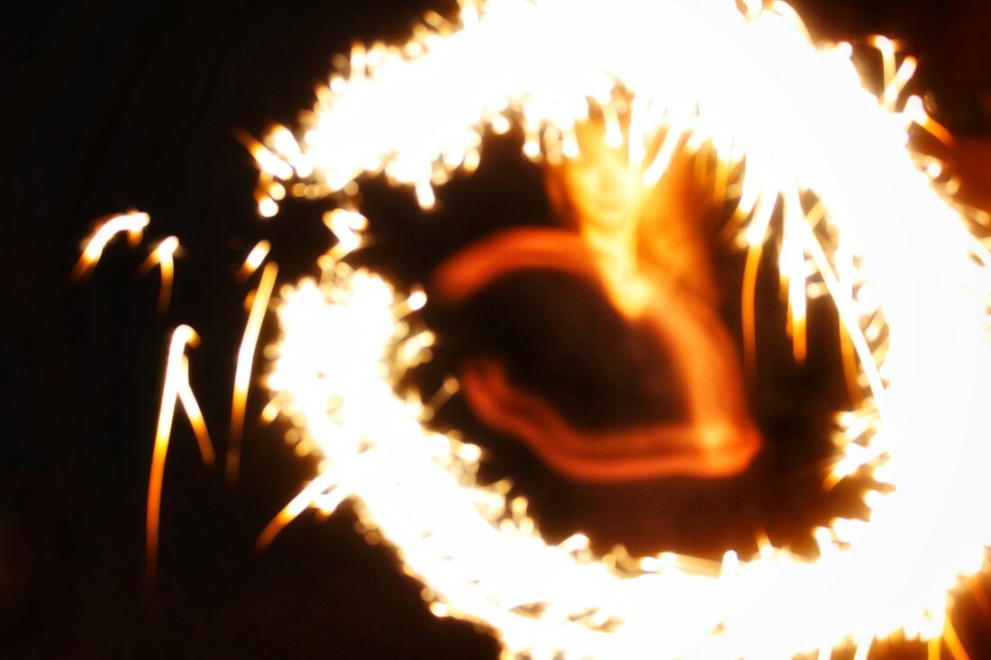
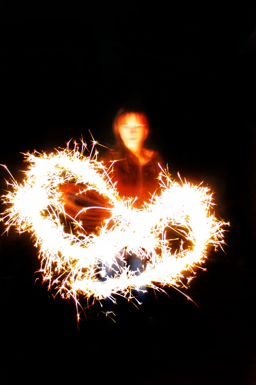
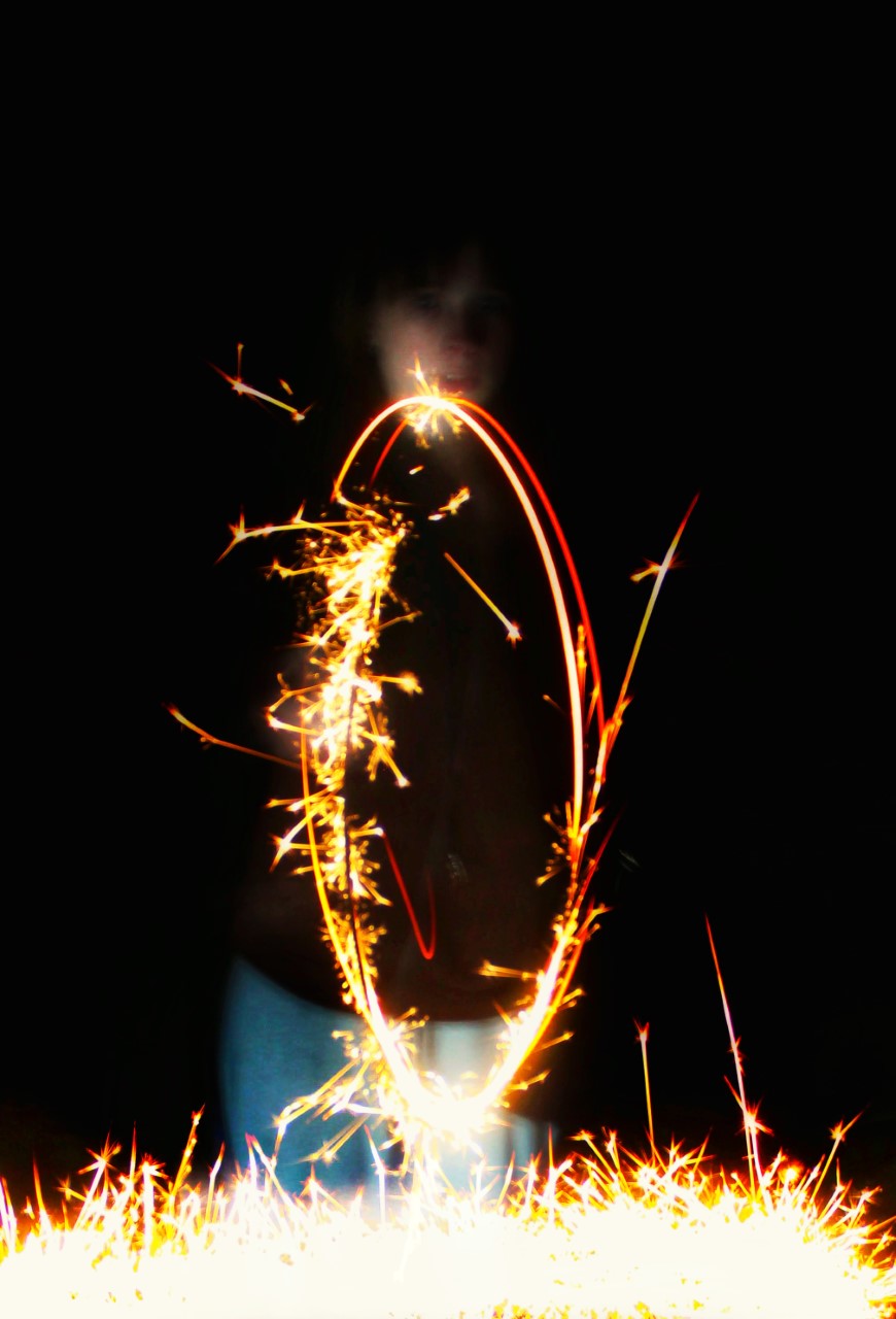
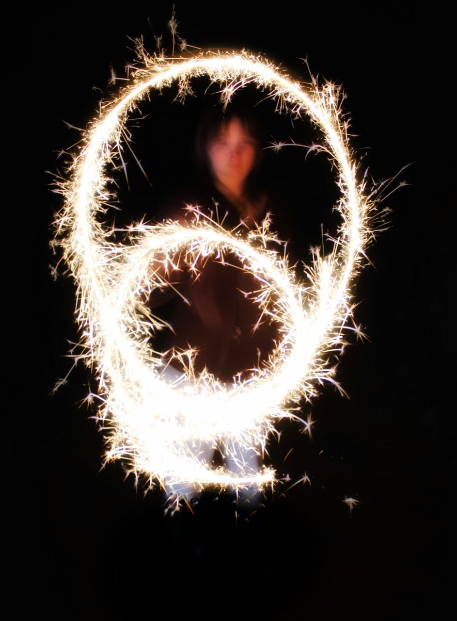
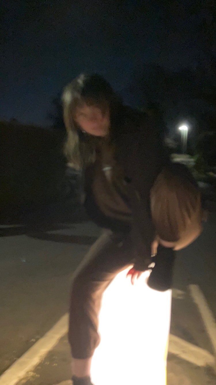
Sparklers/My Experiments:

|
|
|
|
|
|
Out of all my 'sparkler' images, this appears to be my favourite. I believe this is down to the shape in which the fire was moved- two small circles, a face blurry face appearing in-between the two, and the editing which took place after the photograph was taken. The editing mentioned includes highlighting the fire (increase highlights) and darkening the background (reduce shadows and dim exposure in that area.) as well as the manipulation from below the sparkler- my lack of legs. To do this I simply drew over it in -1.0 exposure multiple times until they were completely taken into the darkness. This may make it seem like the fire has created the model, as she only appears where the fire does and looks to be floating. |
Februry-April 2022/Unedited:
|
|
|
|
|

|
|
|
February-April 2022/High Saturation Edits:
|
|
|
This experiment shows that whilst things generally look better in the light, not all photos suit a high saturation which increases the colour and vibrancy of the image. From this I have noticed that the images which were originally darker and contain more silhouettes better suit a high saturation- in the bottom right and top middle images, the sky's attractiveness greatly increases, adding interest to the image. Overall, I am glad I did this experiment as it shows how the brightness of colour can impact the entire photograph; the saturation tool is very useful.
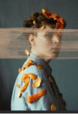
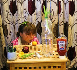
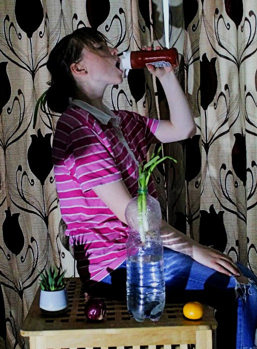
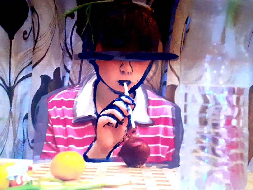
Artist Investigation/May Xiong:
I chose to emulate the work of May Xiong due to her interesting style; I like the way she involves a paint-like substance on the actual model before physically manipulating over the original image with further artistic equipment and tools. There is often a contrast between the subject (whom merges into the background discreetly) and the other main subject which is positioned to capture our attention. The initial photograph itself is also inspiring, some convey a deep meaning of identity and others the opposite.
One in particular shows a man in uniform behind a desk, expressionless and stoic with hands in a fixed position. We wonder what status the man holds and why he seems so apathetic. The clothing completely radiates his character and personality, or what we perceive it to be- firm and stable. Others, especially the up-close-and-personal ones, don't show as much individualism. Depending on the aim of the photograph, this can be a positive or negative thing.
Xiong is famous for ' creating amazingly beautiful conceptual images that revolve around portrait photography. She takes inspiration from music, art and all kinds of abstract things, people, places that intrigue her', her work also ' draws you in with its bizarre beauty and then leaves you hanging with just enough wonder that you keep asking “but why?”.
(tap images below for articles)
|
|
|
It allowed me to express myself in a way that I felt like I couldn’t through writing. I was always interested in poetry but was never good at writing and photography was a better outlet for me to explore how I viewed the world in what I knew. |
People can get tired of it or not find it inspiring at all but there is something about the weighted sky, like a heavy sheet; the atmosphere easily becomes a mood that instantly sparks new ideas for me. Perhaps it is because I’m naturally drawn to quieter, still and isolated moments which I feel like is a constant theme in my work.
But the drive for me was never the money or being another cookie cutter artist. It was about allowing myself to create work that would make people see photographs differently – to stop and soak in a series of fragmented moments that tell a story. What truly inspires me is light. The way it bends, radiates and how it fills an environment and creating a moment in which it only lasts for so long. That’s the beauty in light that inspires me always. |
|
Artist Investigation/May Xiong/Shoot Plan:
To emulate Xiong's photography I will focus heavily on lighting, facial expressions and non-edited distortion. To do this I will use random, natural and unusual props which are inspired by the orange-peel image, some form of body paint/non-permanent art, clothing which could represent me and the normal shoot equipment/props- a tripod, a canon 4000D, a form of natural lighting via a window and some sort of artificial lamp or LED.
I hope to carry out this shoot in a large room to allow the flexibility to move and re-arrange as the photographs improve and progress. I'd like to introduce some sort of fruits and vegetables as to emulate her famous orange-peel portrait image because I feel most inspired by that particular picture; however, I will edited the end photo in similar way to her other image.
I hope to carry out this shoot in a large room to allow the flexibility to move and re-arrange as the photographs improve and progress. I'd like to introduce some sort of fruits and vegetables as to emulate her famous orange-peel portrait image because I feel most inspired by that particular picture; however, I will edited the end photo in similar way to her other image.
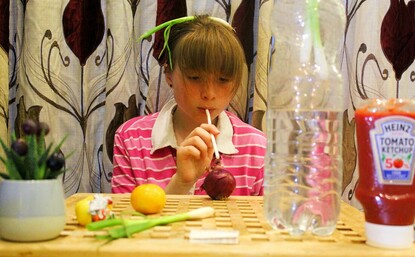
Research and Investigation/Unedited Images/May Xiong:
|
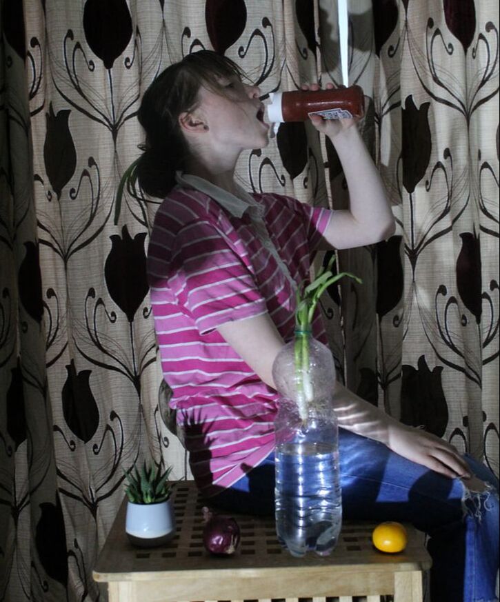
|
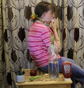
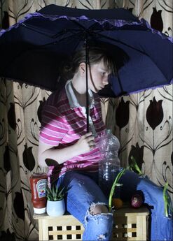
|
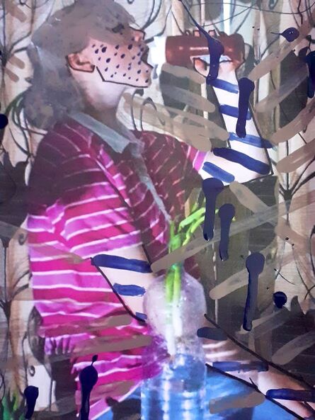
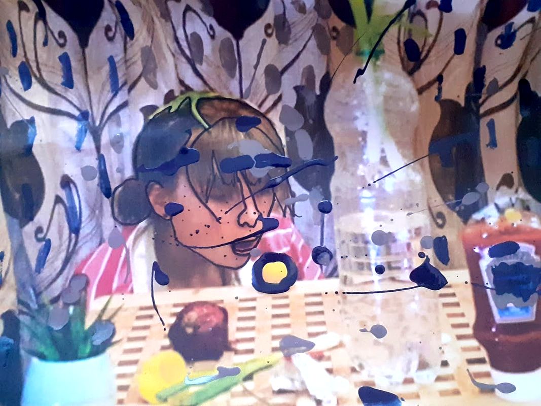
Research and Investigation/(First layer) Digitally Edited Images/May Xiong:
|
|
Research and Investigation/Hand Manipulated Images/May Xiong:
|
|
Artist Investigation/Matthieu Bourel:
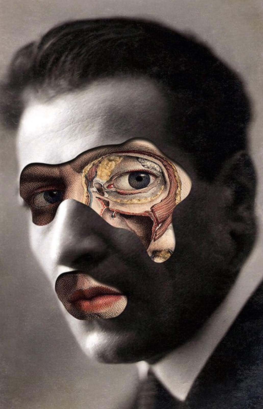
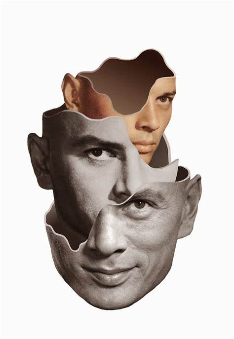
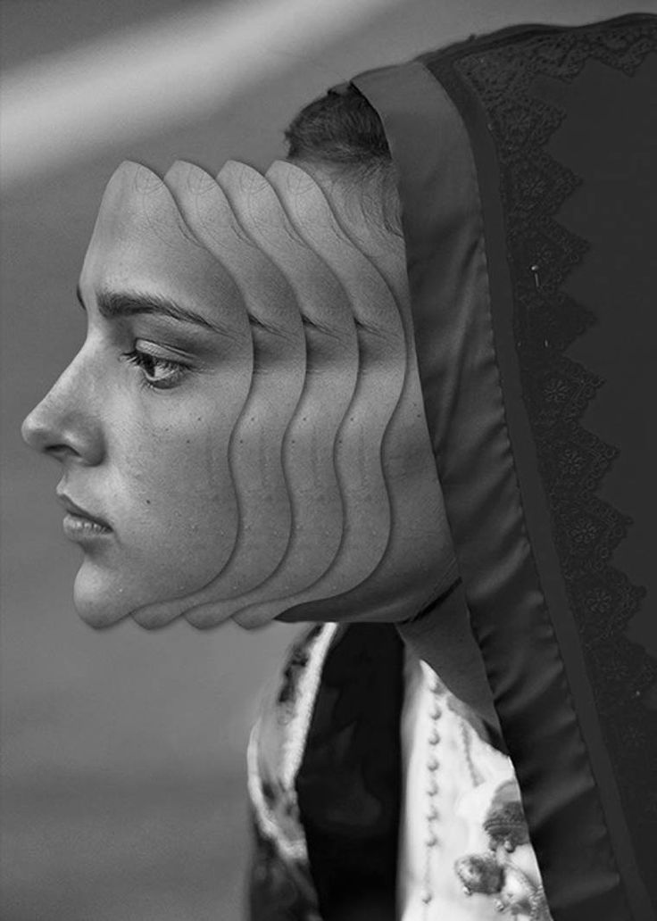
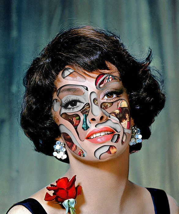
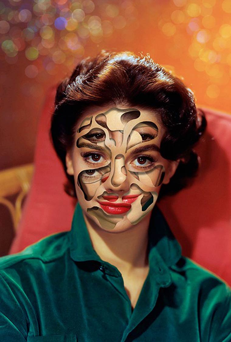
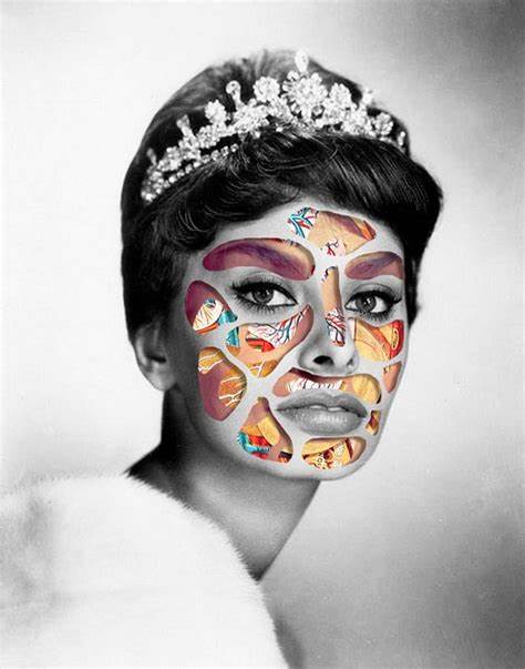
I chose Matthieu Bourel because his work is truly jaw-dropping and inspirational. He is a French mixed media collage and digital artist who breaks the stereotype of traditional edits. His work is based on surreal images and the diversions resulting from multiple visual combinations. His work often causes question, even to those in the same industry.
His images mainly consist of women, making them even more powerful. The results are always similar yet somehow totally different-rather confusing. The portraiture images seem abstract but also convey identity within- as if a look inside the models mind. For example, some edits show a physically healthy-looking face with what appears to be fruit on, which could symbolise the famous phrase 'you are what you eat.'
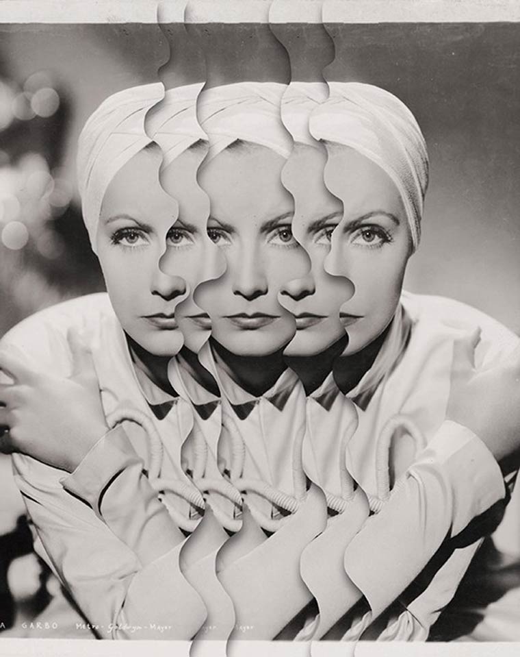
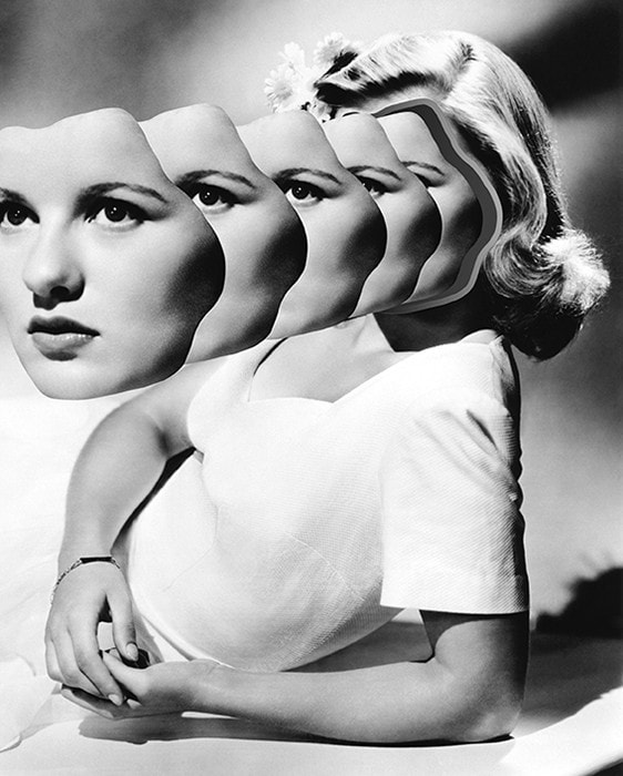
Others show the same image exposed multiple times in the same area, moving a little each time. To me, this means the feature magnified is a key clue to their individuality or emotions. On the majority of pictures where the face is not distorted, an emotionless face is displayed which might mean they aren't particularly happy at that moment- or hold indifference- which may be confusing in itself as traditionally and steryotypically you are expected to smile in photographs.
His images mainly consist of women, making them even more powerful. The results are always similar yet somehow totally different-rather confusing. The portraiture images seem abstract but also convey identity within- as if a look inside the models mind. For example, some edits show a physically healthy-looking face with what appears to be fruit on, which could symbolise the famous phrase 'you are what you eat.'
Others show the same image exposed multiple times in the same area, moving a little each time. To me, this means the feature magnified is a key clue to their individuality or emotions. On the majority of pictures where the face is not distorted, an emotionless face is displayed which might mean they aren't particularly happy at that moment- or hold indifference- which may be confusing in itself as traditionally and steryotypically you are expected to smile in photographs.
(tap images below for articles)
To make images became more and more essential to me, and I can’t stop making them since. Collage as a way of life. Cut and paste. My first rule is not to copy anyone and be myself. Second is to work every day. I need to train my eyes and feed my soul. I see so many images of all kinds in my daily research that I don’t even know which influence prevails in my work. All of them together, probably. Inputs help to change and progress – the benefit of the Internet. |
‘What you’re supposed to do’ and ‘what people expect you to do’ are cages. 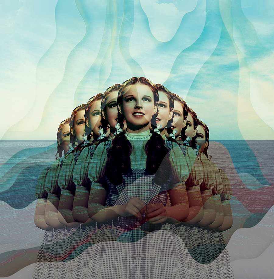
|
I try to ask questions with my work, and I get sometimes answers from the work or the words of others. I work mostly by instinct and let myself go to digest the mood and feelings, good or bad. It can start from a word, a sentence, a painting, a colour. Anything. guess this work on identity is linked to this. Life and death. A lack of identity to express them all, and that the viewer can identify himself with their own background and personal history. |
Artist Investigation/Matthieu Bourel/Shoot Plan:
To emulate Bourel's work I will do two shoots. One will consist of headshots with no backlight and the other full-body with only natural lighting. The first will be located in a room with controlled lighting (most likely my bedroom) at noon and the second somewhere in the country. The latter shall probably be done around Hause, and to allow my own personal touch, sometime at sunset.
Once taken, I will manipulate the images by hand in the style of Bourel- this would include printing off another image multiple times before cutting it out and layering it over the portrait. I think this may be one of the hardest shoots currently due to a number of factors-especially lighting, location and editing- all of which play a large roll in the end image. I think the earlier pictures (headshots) will be shot in monochrome with the editing in colour as I believe this will give it the best affect.
Once taken, I will manipulate the images by hand in the style of Bourel- this would include printing off another image multiple times before cutting it out and layering it over the portrait. I think this may be one of the hardest shoots currently due to a number of factors-especially lighting, location and editing- all of which play a large roll in the end image. I think the earlier pictures (headshots) will be shot in monochrome with the editing in colour as I believe this will give it the best affect.
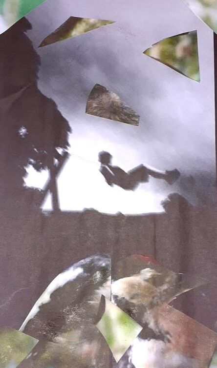
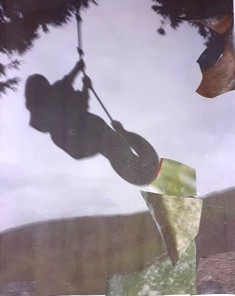
Research and Investigation/Unedited Images/Matthieu Bourel:
|
|
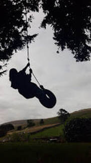
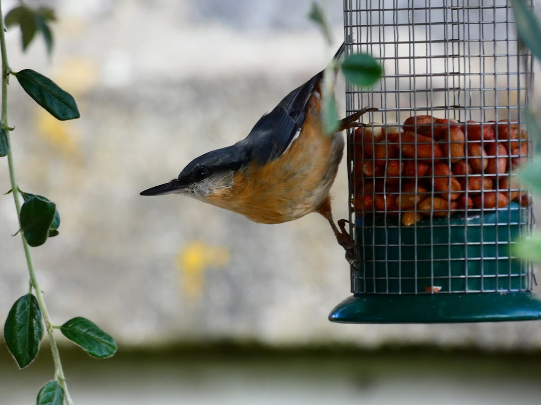
|
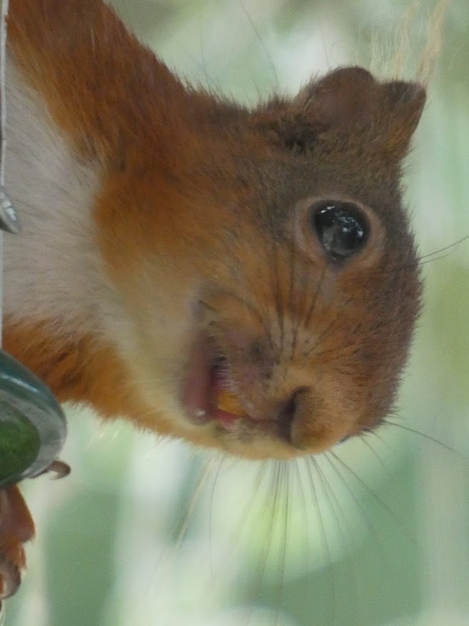
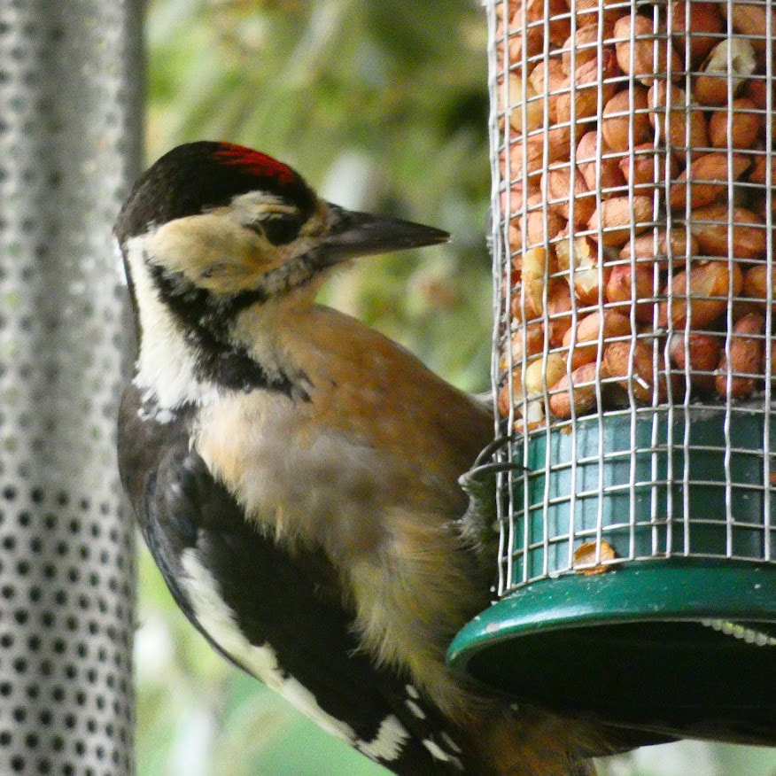
|
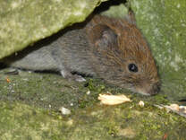
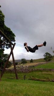
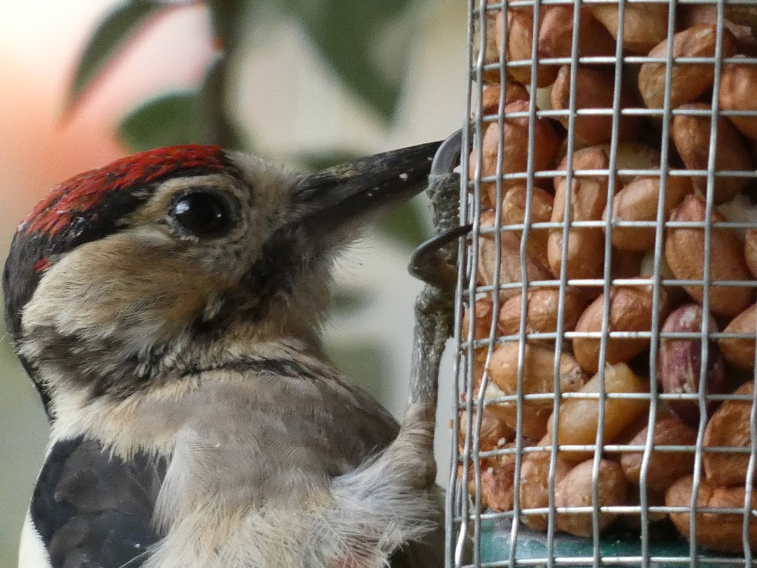
These images were taken from a holiday cottage on a farm near Hawse. The tire swing and traditional park swing allowed nicely-formed silhouettes, whilst the local red squirrels, woodpeckers, field mice and nut crackers appeared clear- the frequent visitors often stopped in various locations, opposite the lounge door. I'm rather happy with the photos of wildlife as they seem clear and vibrant, despite the lack of editing.
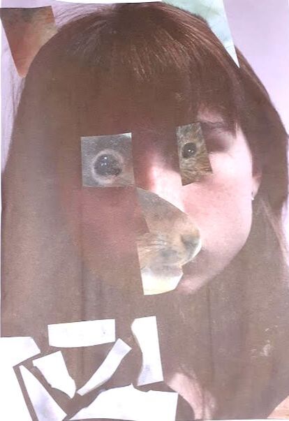
Research and Investigation/Hand Manipulated Images/Matthieu Bourel:
|
From this experiment I have realised hand manipulation is not my preferred editing technique. If I were to do this shoot again I would use a different style.
|
|
Composition Design 1:
(Tap below images for related articles)
|
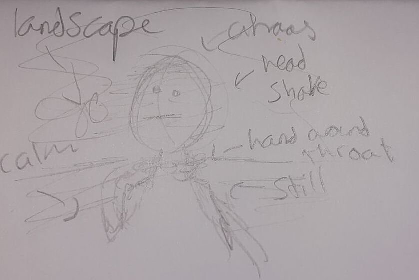
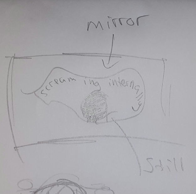
What is the aim of this shoot?
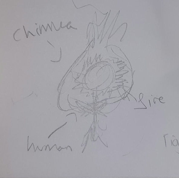
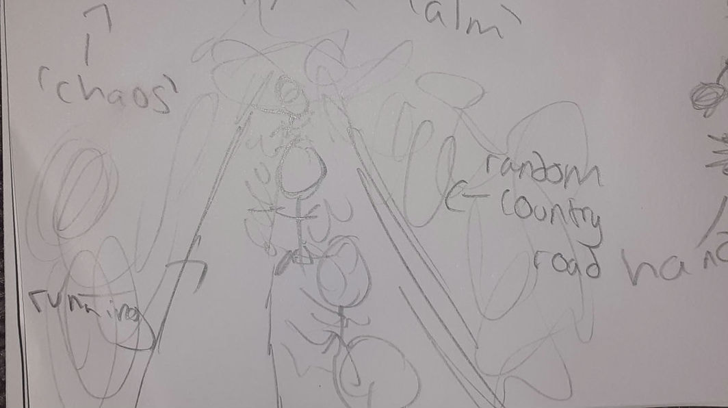
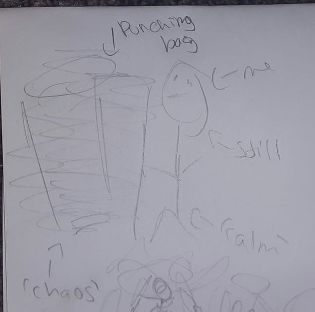
My aim for this shoot is to create images portraying some sense of calmness with chaos. I'd like to betray more negative feelings- specifically isolation, vulnerability, guilt, frustration, aggressiveness and a lack of power. |
“The man with no imagination has no wings.” “Character, like a photograph, develops in darkness." |
|
This shoot will be inspired by Jenny Woods, but a mixture of motion blur, long exposure and light drawing. I chose Jenny Woods in particular as all her work appears to have a story behind- I want my images to create the same questioning to others like hers did to me. This would express identity, its as if you're giving them a glance into your life but making them assume the rest.
|
|
Once the shoot is complete, I will digitally edit and manipulate multiple chosen images. To do this I will use PIXLR E, changing the photographs to fit in with the theme; this will mainly consist of using the black and white or sepia filter, along with other small tools like dodgy and burn, e.c.t.
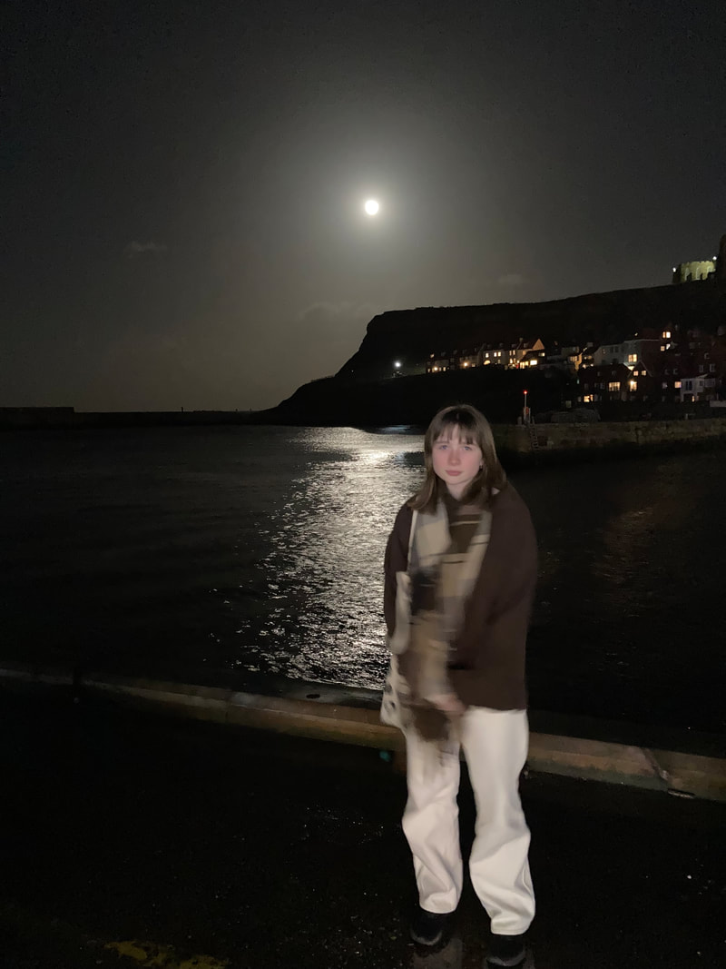
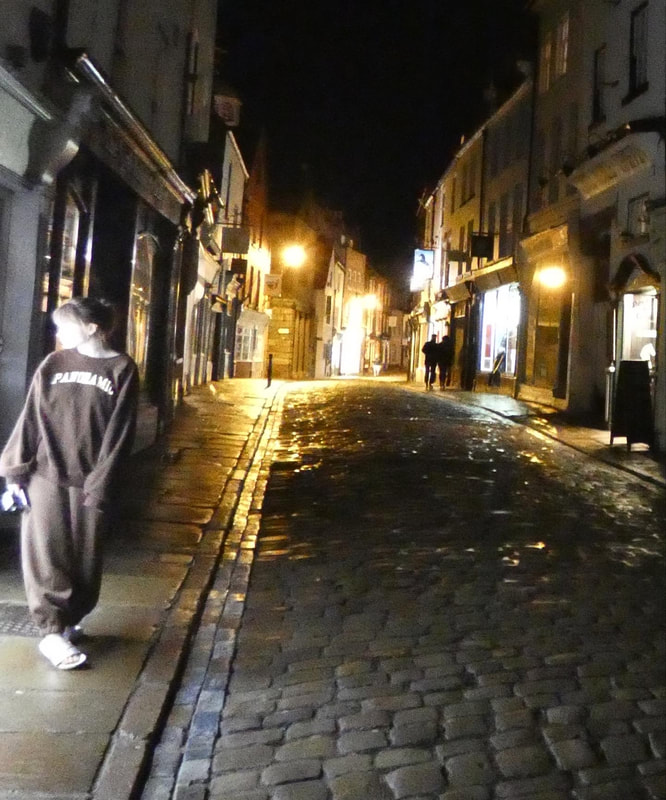
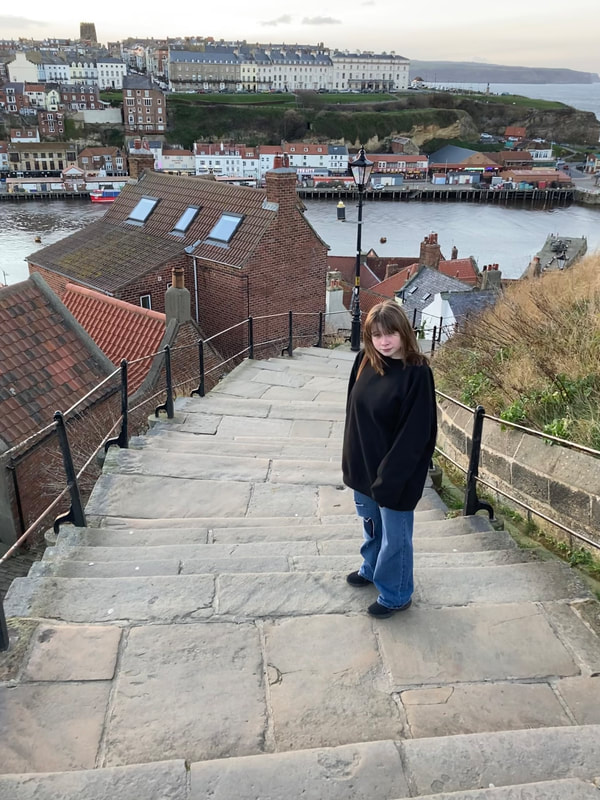
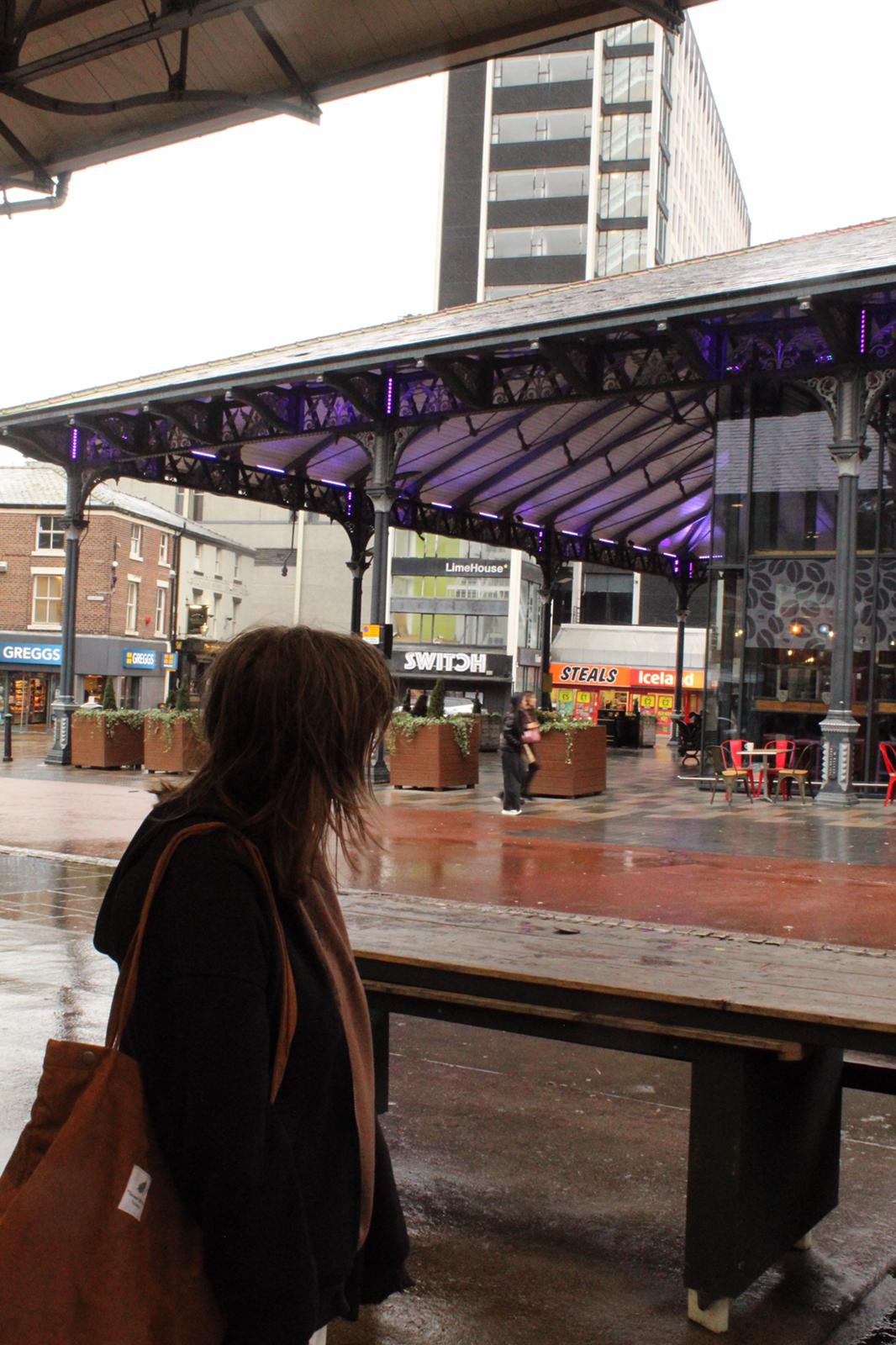
Along with portraiture, I would also like to demonstrate elements of a number of different photography styles, including landscape, architecture, fashion, street, abstract, black and white, candid, adventure, lowkey and kinetic. I picture the outcomes to be something similar to these:
|
|
|
|
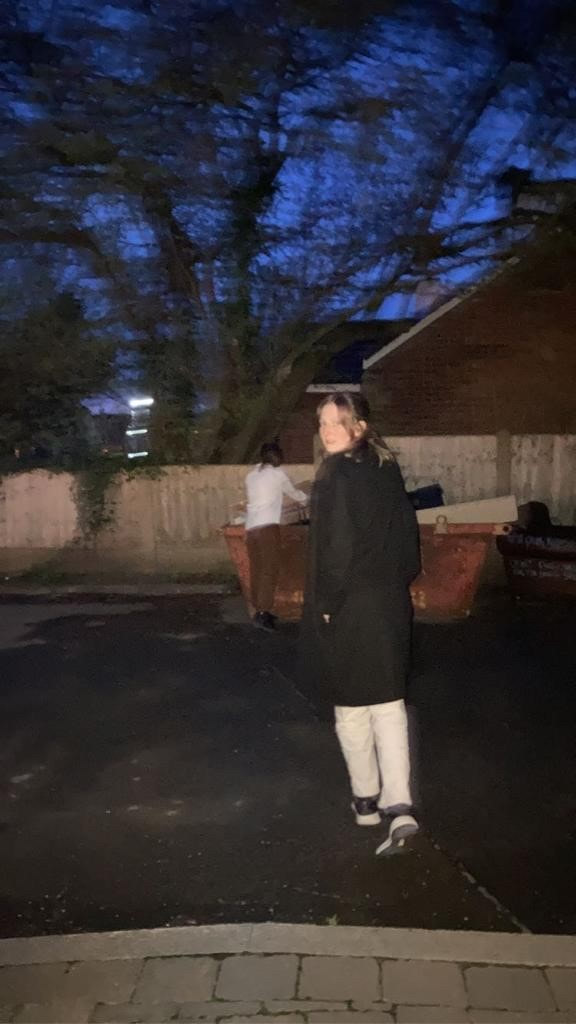
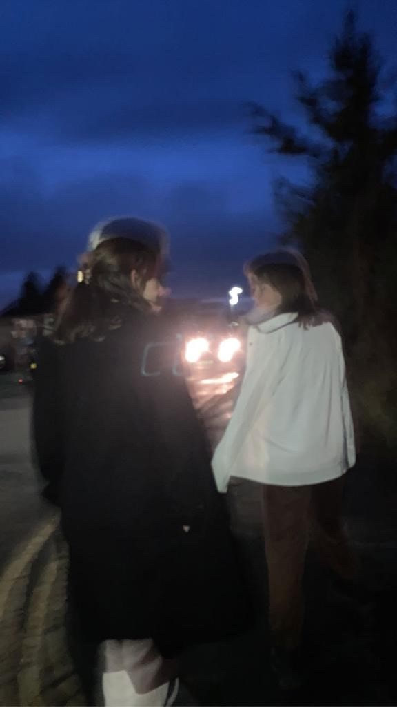
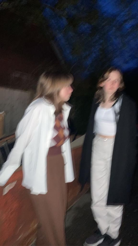
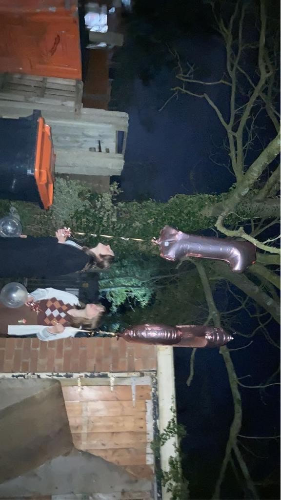
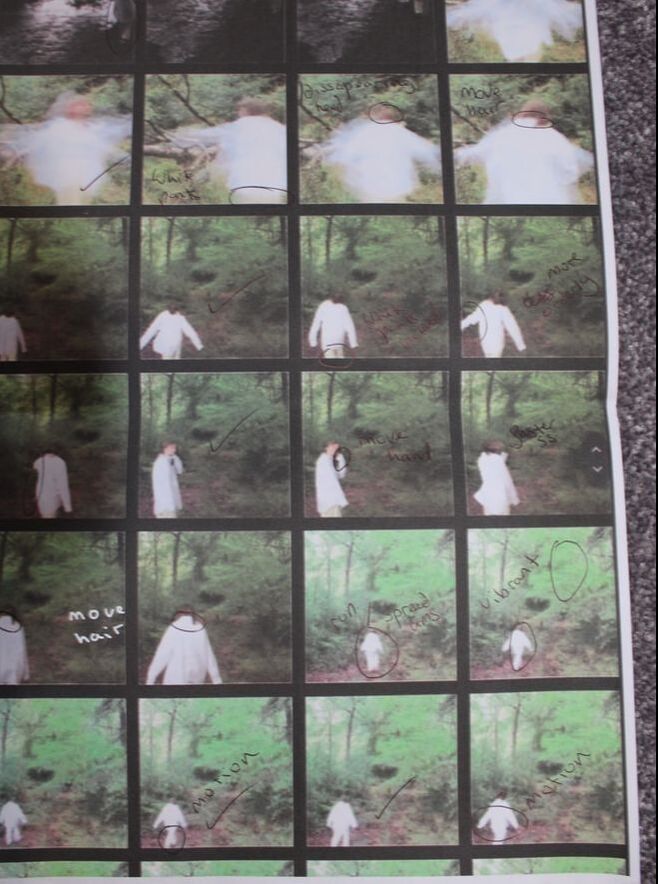
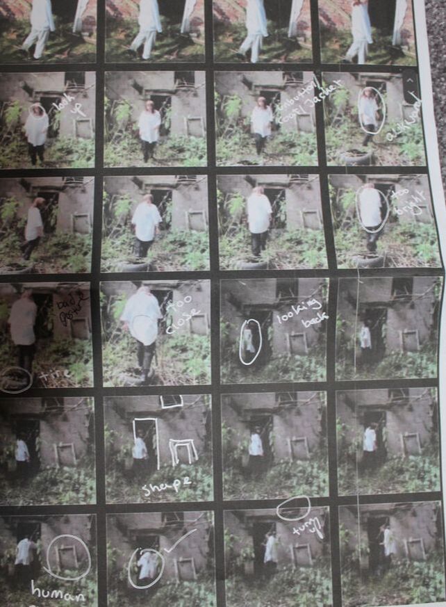
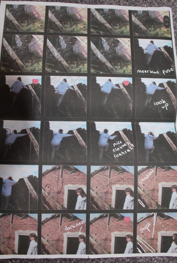
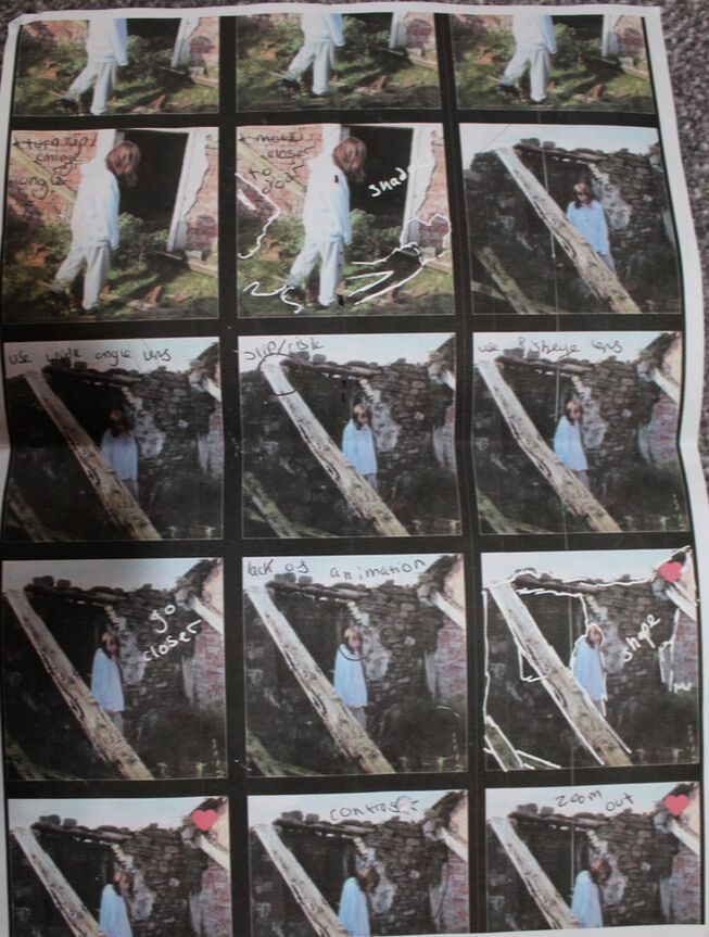
Contact Sheet:
|
|
|
Digitally Edited:

|
|


|

|
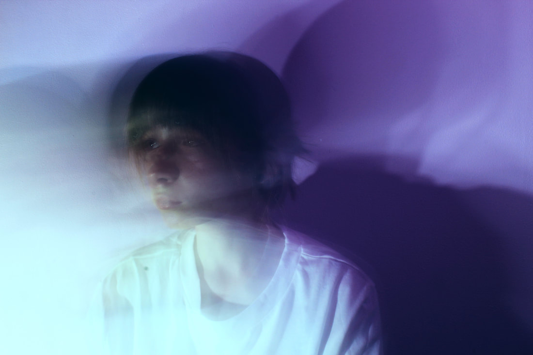
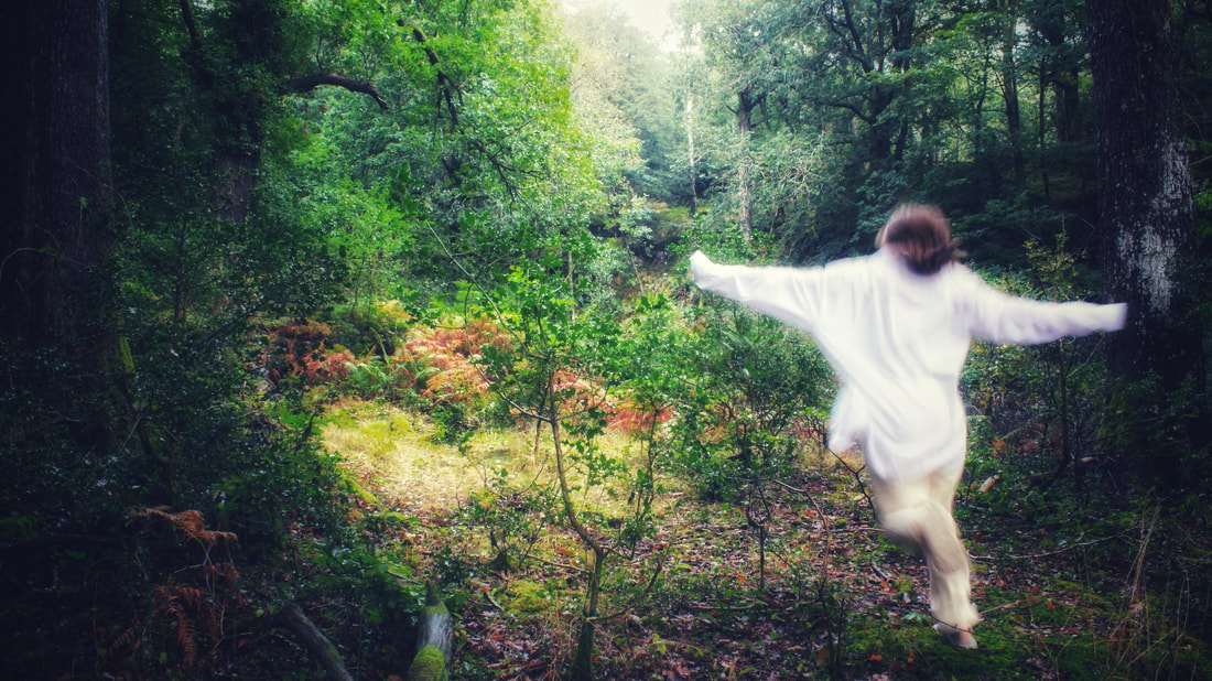
Best Edited Images and Evaluations:
|
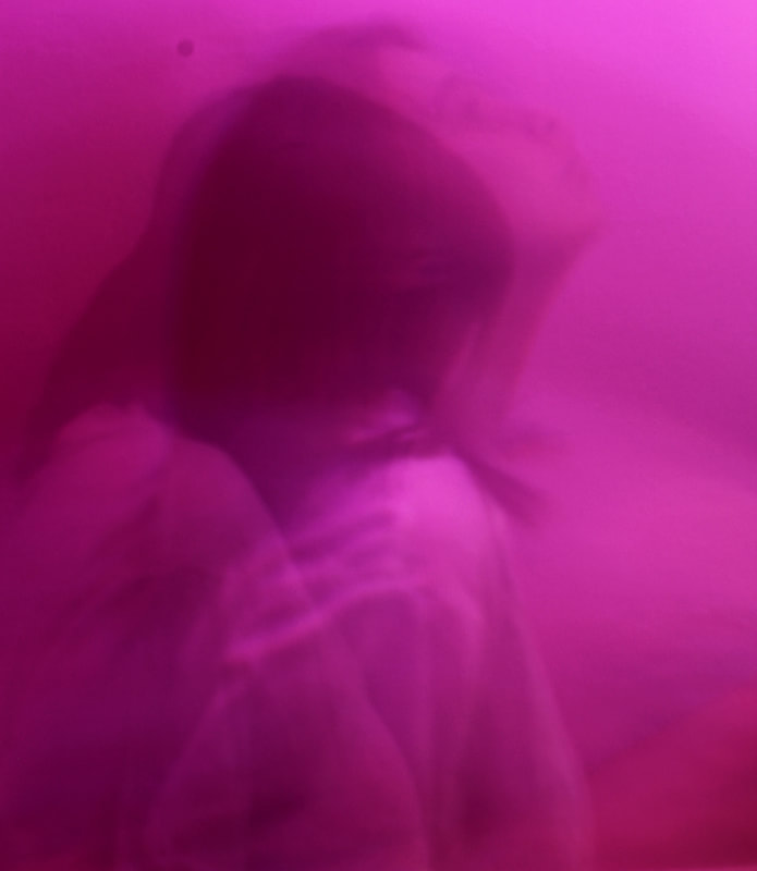
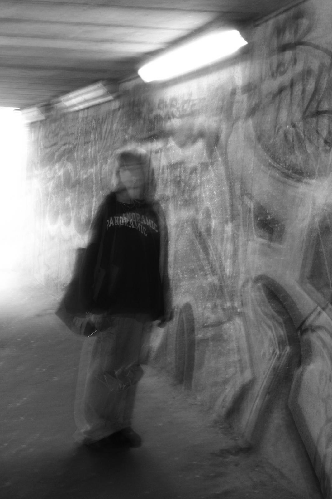
I think this image is the best because, at first, it might confuse the viewer due to its distortion. The outline of my side profile is present, standing out against the blurry hair. The silhouette goes from dark (right) to light (left) which, consequently, adds a grain affect. The slightly smudged face conveys the theme of identity, almost as if they're two-faced. This is very similar to what I imagined it to be, a mix of confusion and order.
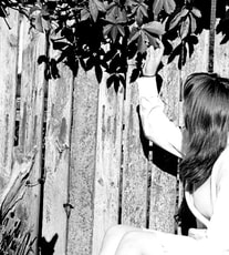
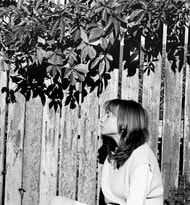
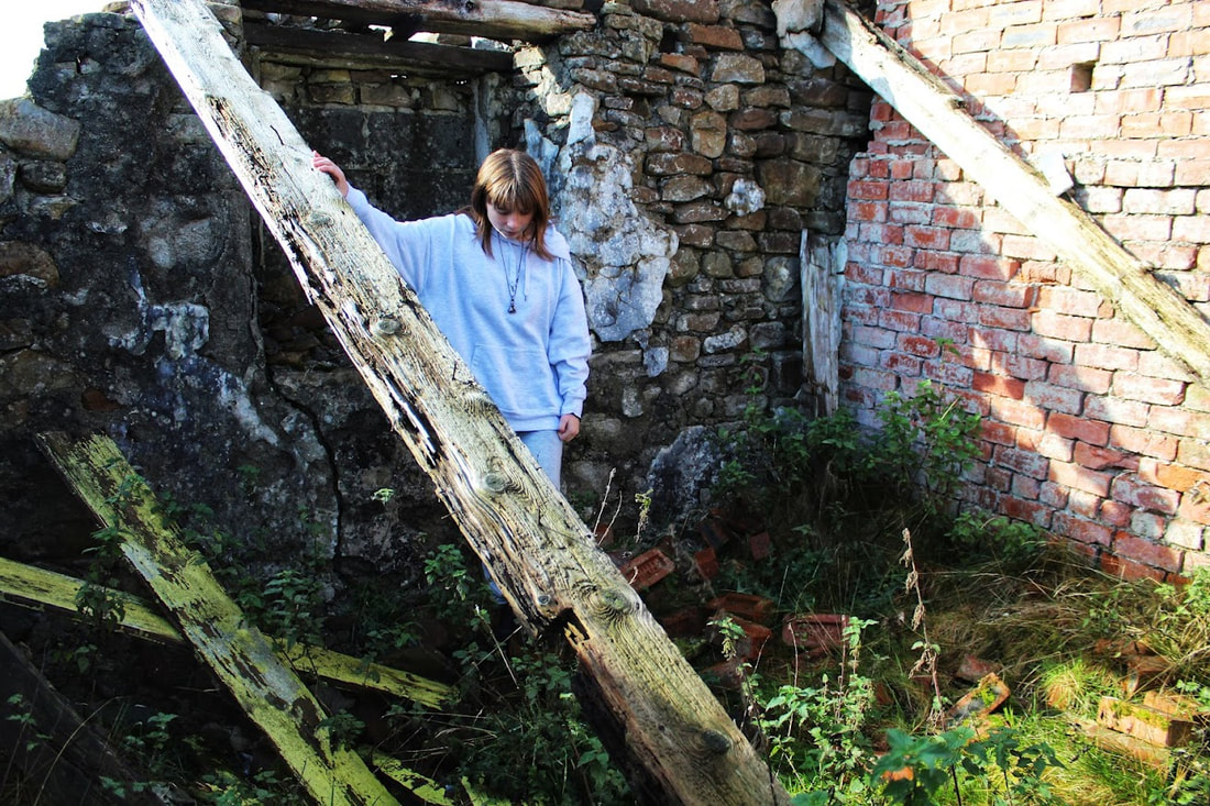
I don't necessarily like this image, nor do I completely dislike it. The shadows create a nice juxtaposition against the old wood and pale clothing. The rotting wood provides either negative or positive space, depending on your interest. To me, it creates positive space, as the contrast between the youth picking a newly-sprouted leaf and old, rotting fence might hold the viewers attention.
|
|
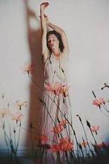
Originally, I didn't prefer this image; however, as I digitally edited it, it quickly became a favourite. I think, the reason behind my early distain was due to the lack of originality, and tired appearance. As I began to manipulate the photo, I realised the lifeless and uneventful atmosphere of the photo could be used to my advantage.
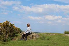
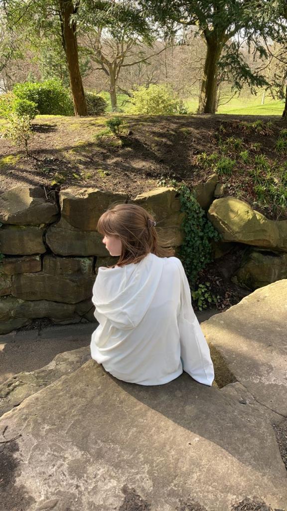
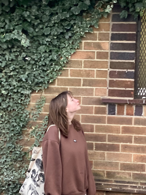
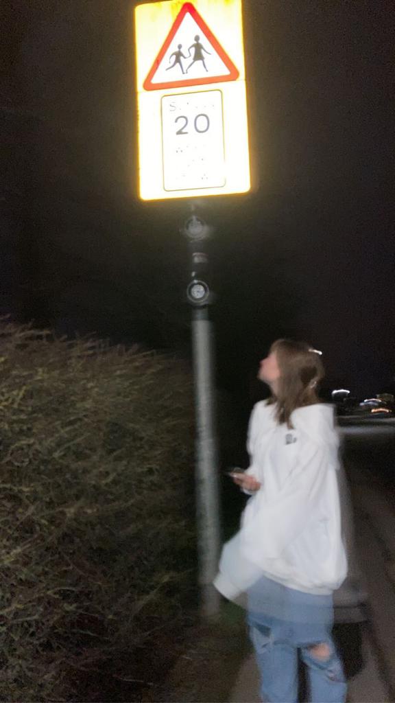
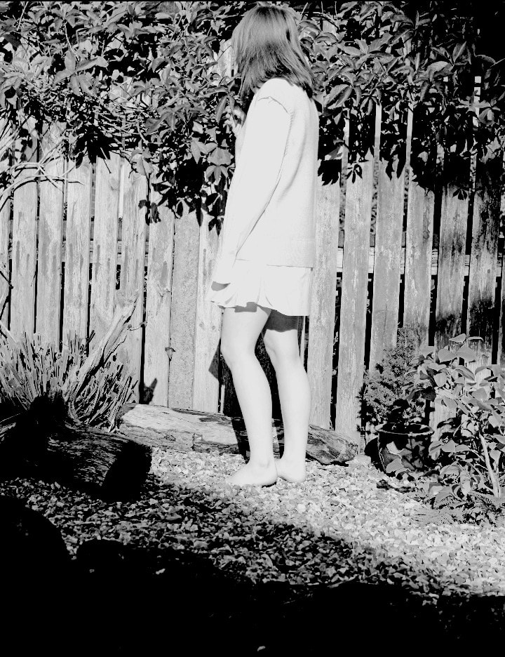
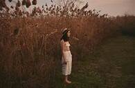
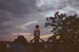
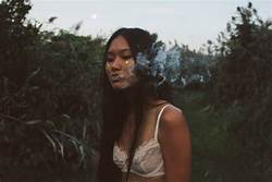
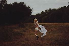
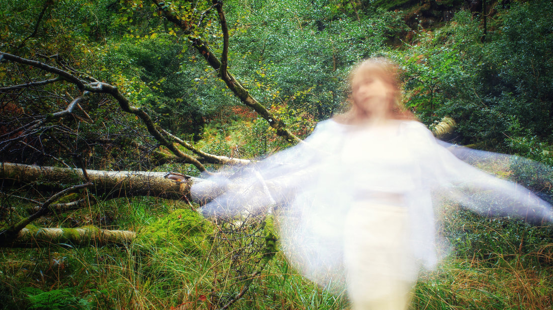
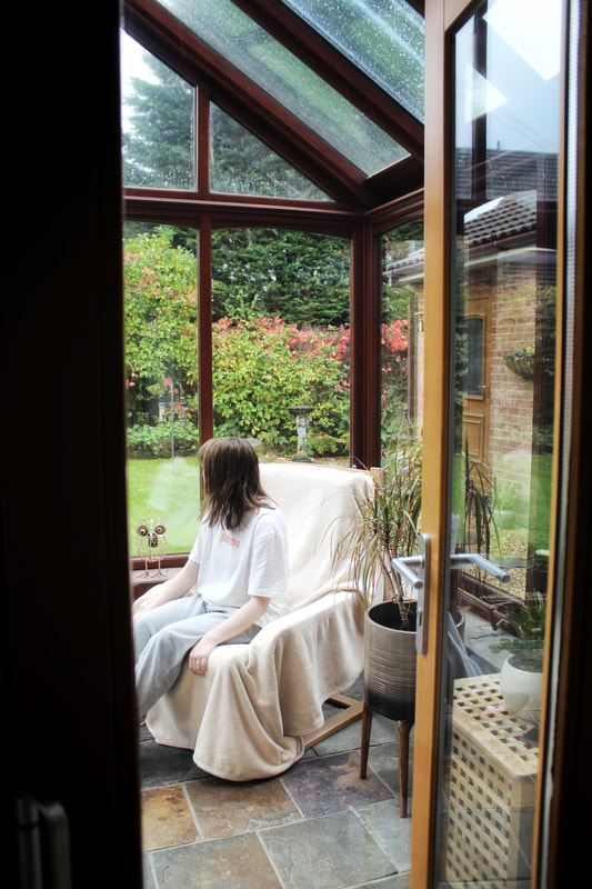
Out of all 6 best images, this is probably my least favourite- it's rather cliche, that kind of 'girl wearing white in nature looking up to the sun' vibe. On the other hand, this could be useful; it would bring some sort of familiarity to the onlooker, making them asses the photograph in more detail.
|
|
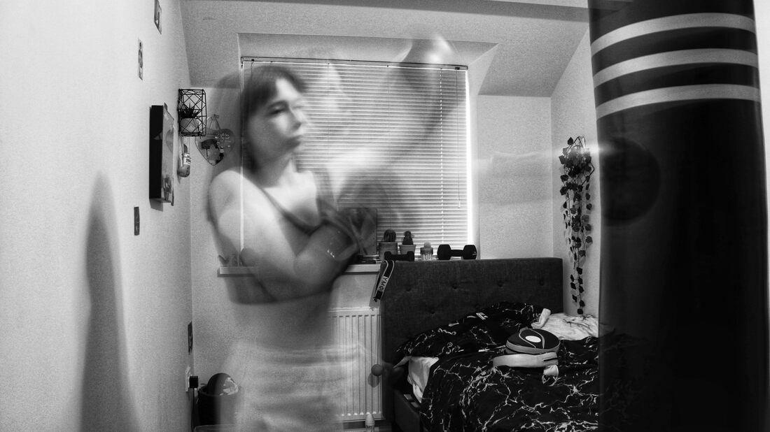
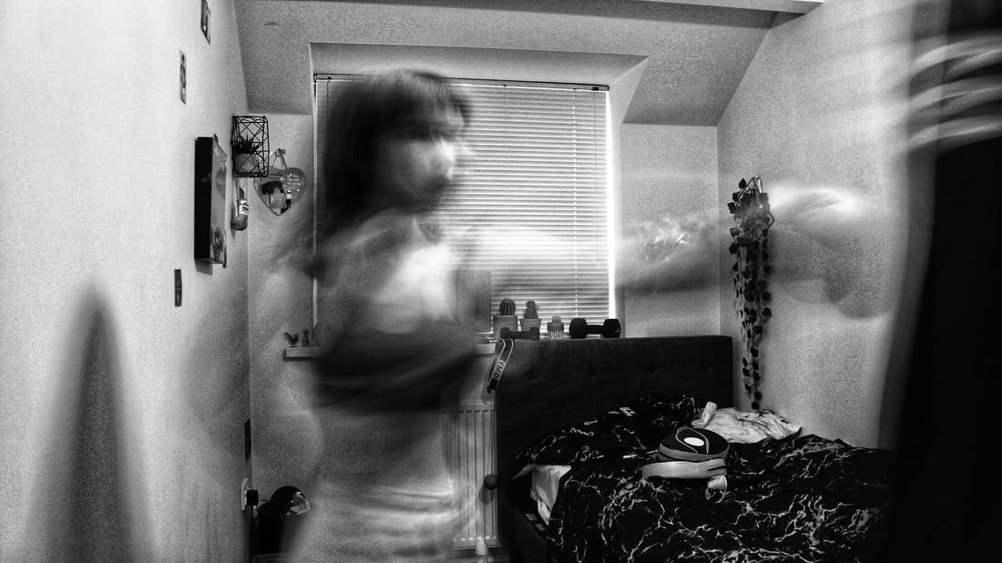
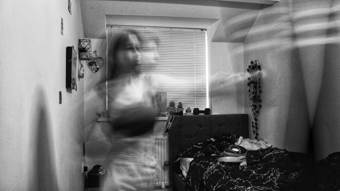
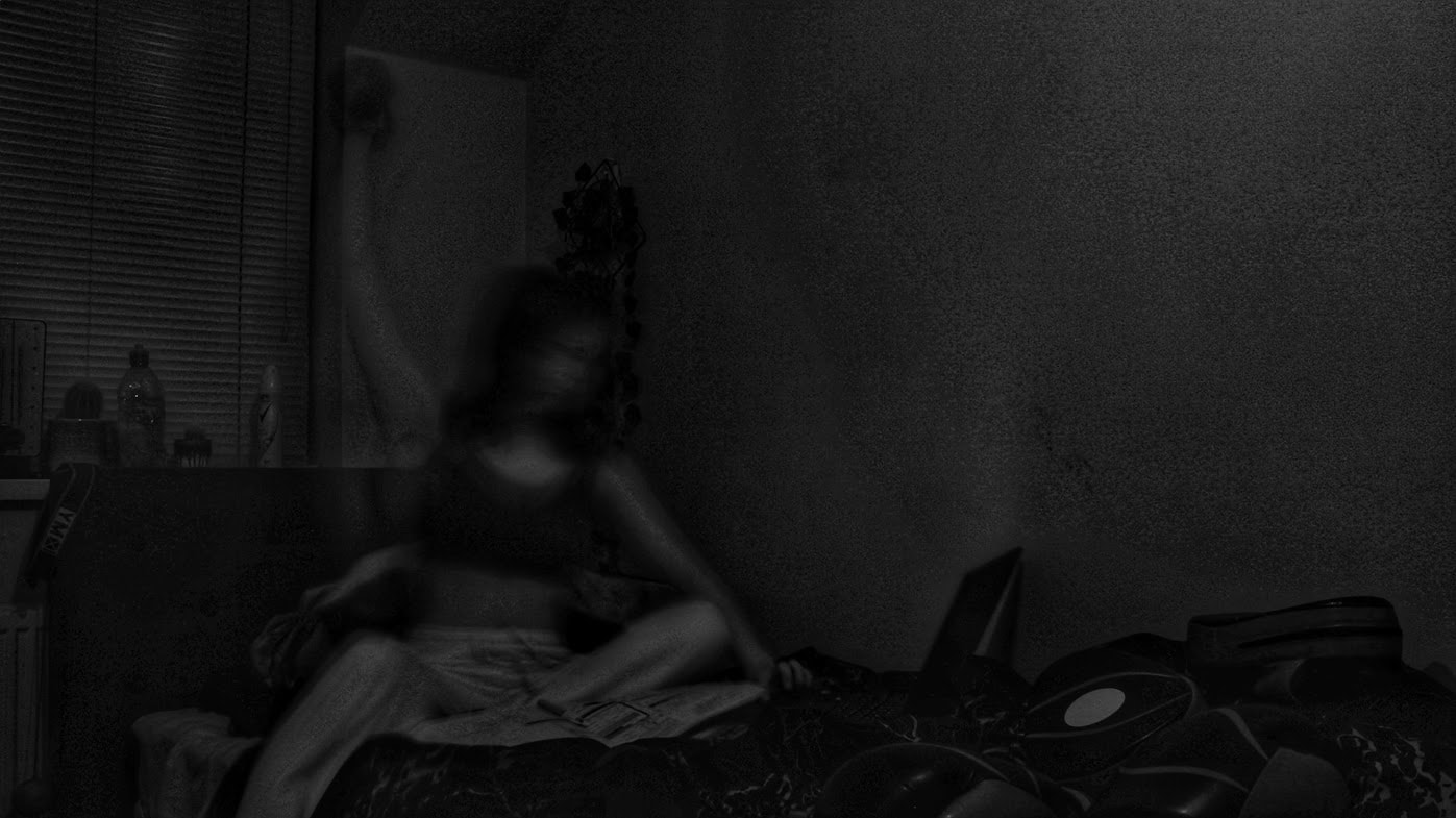
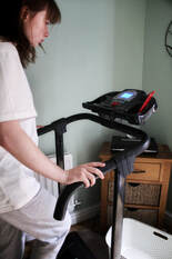
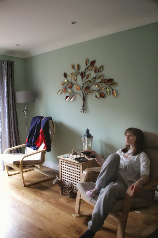
This is probably my joint second favourite image of the shoot, simply because its something familiar to me and, considering the shutter speed was set to one second, shows how fast you must move during sport- boxing in particular. Upon being inspected closely, you notice the location appears to be a bedroom, with plants, dumbells, pictures and boxing equipment jotted all over; each thing noticed giving away a small amount more towards the owners identity. This especially represents frustration and aggression, mentioned in my shoot plan.
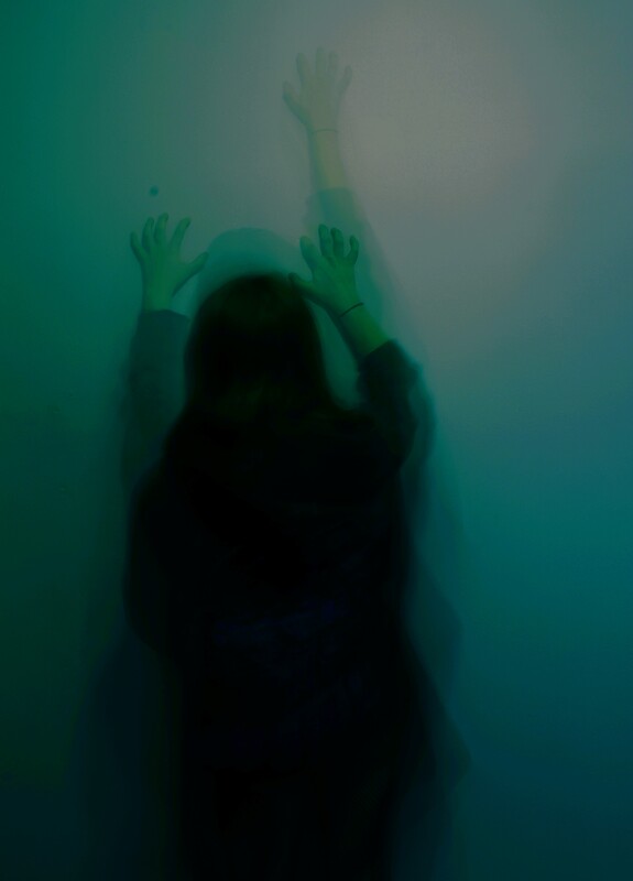
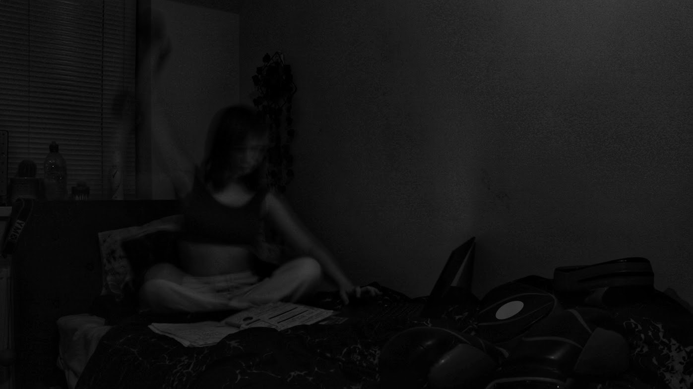
This, as you've probably guessed, is my joint second favourite image- for reasons very similar. Jenny Woods photos are very realistic, often relatable, so I wanted mine to be as well. Though its too dark to make out some parts of the image, it shows a teenager sat on her bed at night- laptop and book in front of her, boxing gloves and pads at the end of her bed, water bottle behind and dumbells towards the side as she attempts to multitask. This represents guilt and a lack of power. Guilt as she knows she should have done the homework a while ago, and lack of power because there's nothing that can be done about it anymore. This is most likely a relatable feeling to teenagers and adults.
|
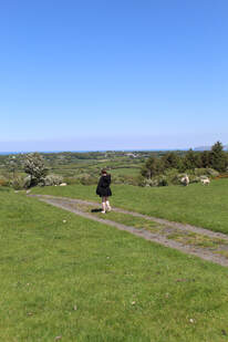
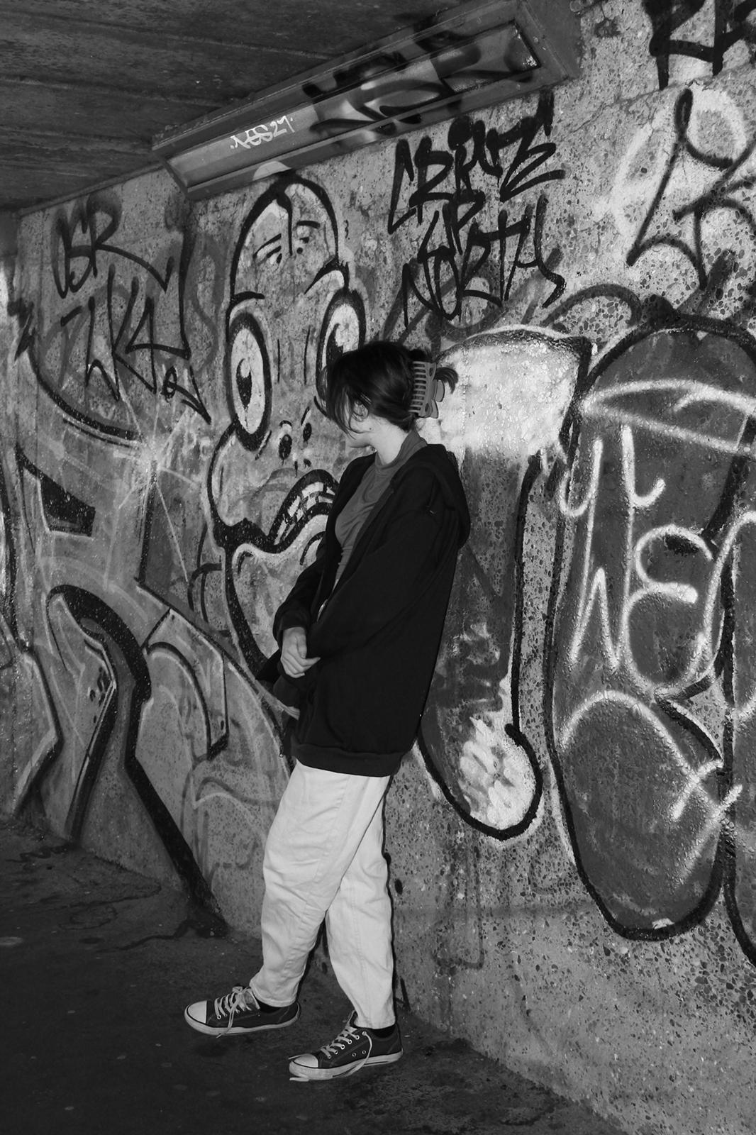
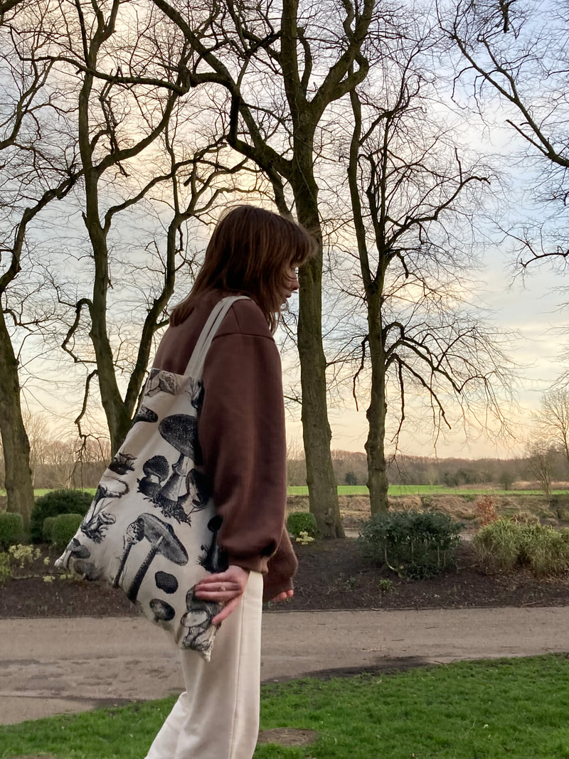
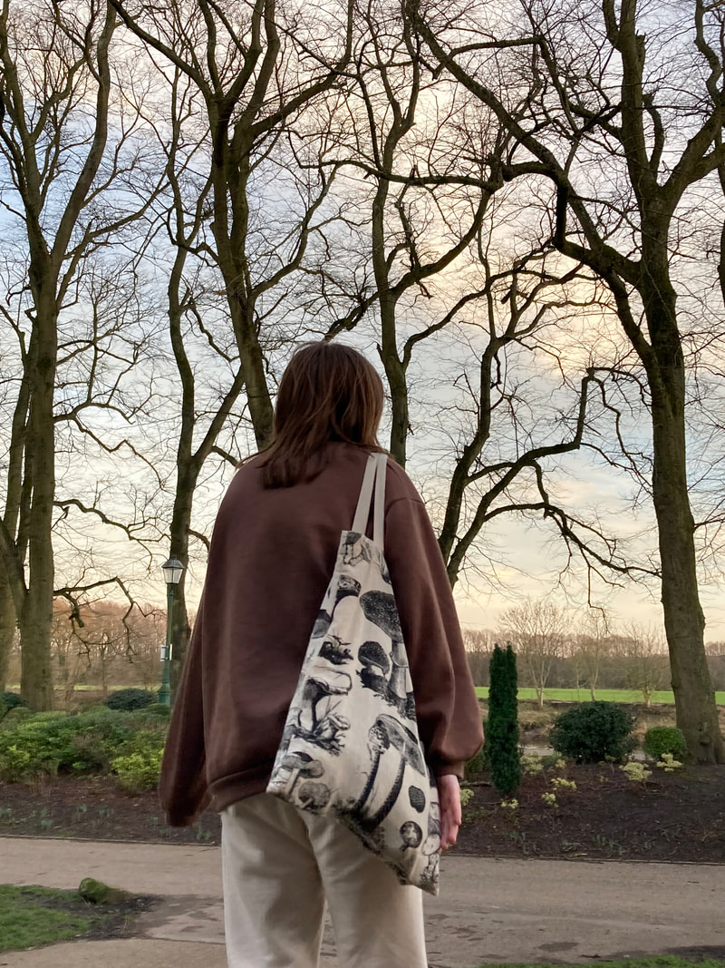
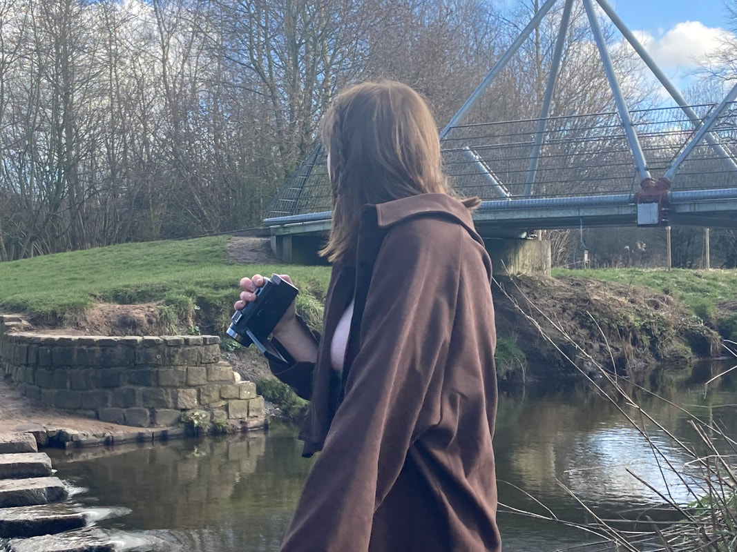
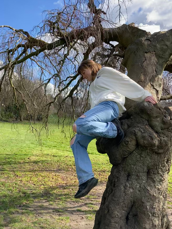
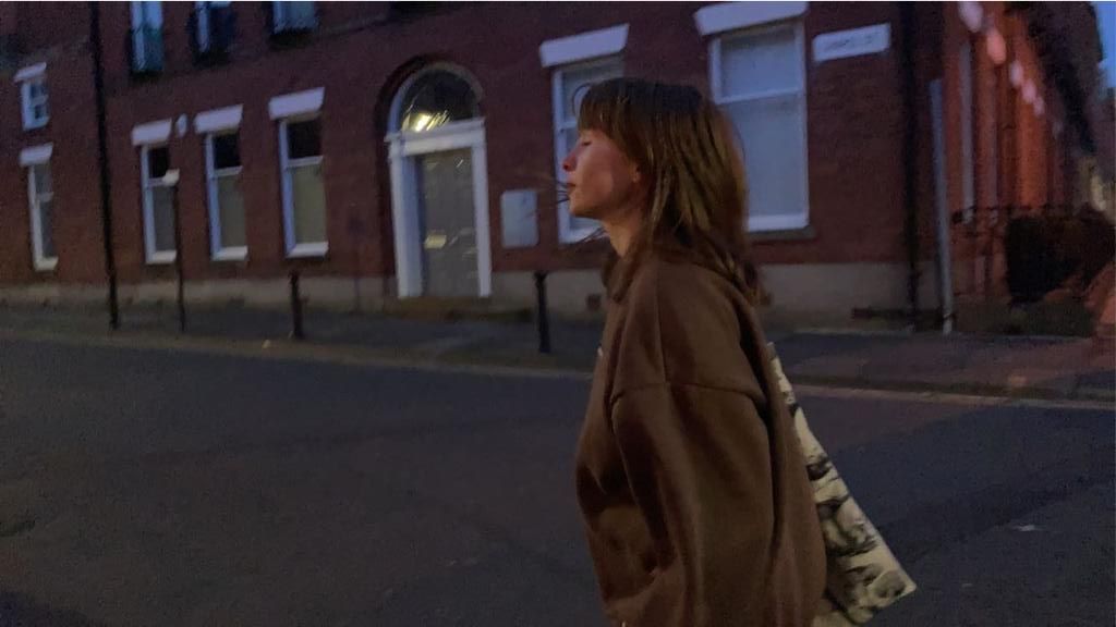
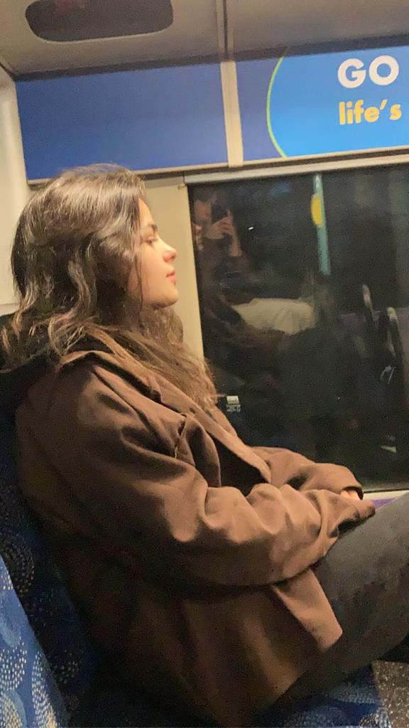
Composition Design 2:
|
(Tap below images for related articles)
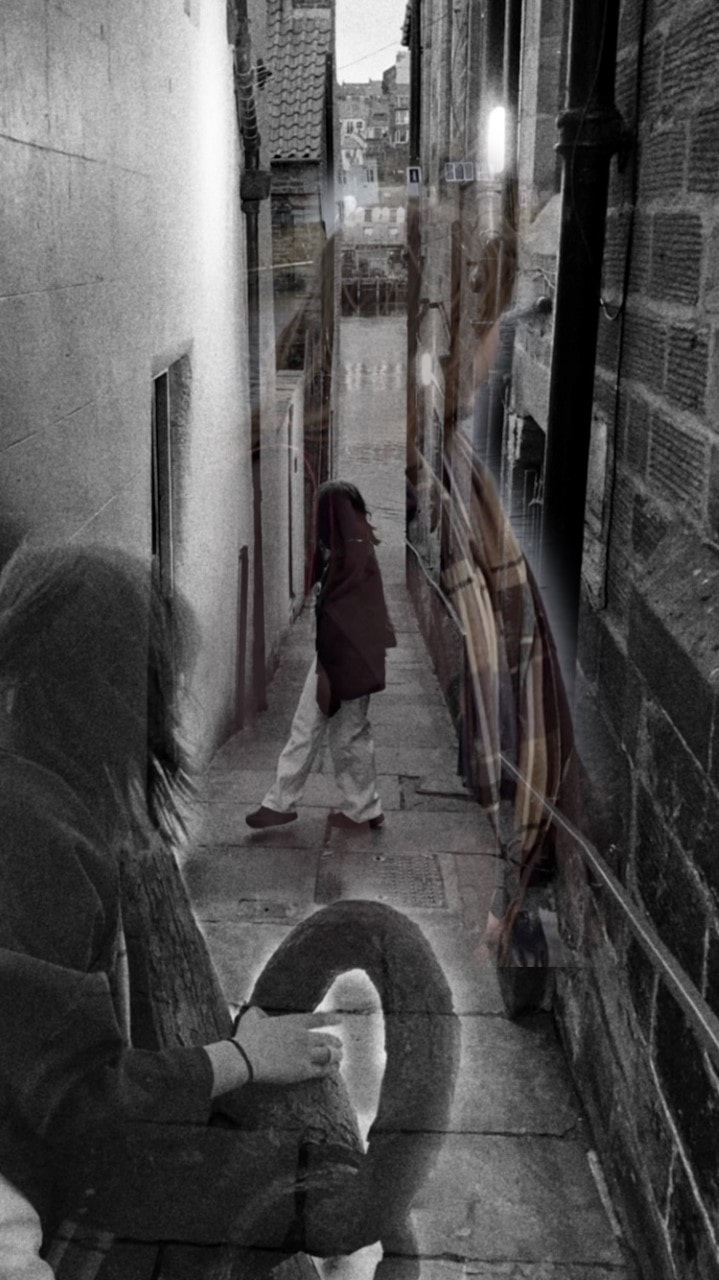
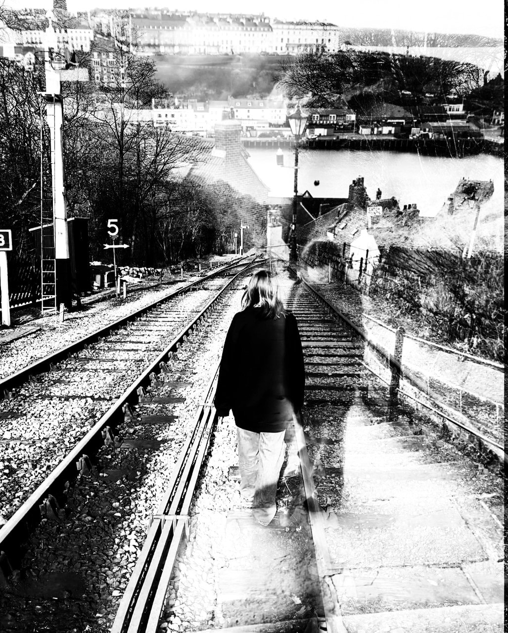
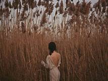
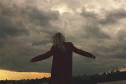
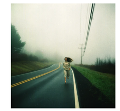
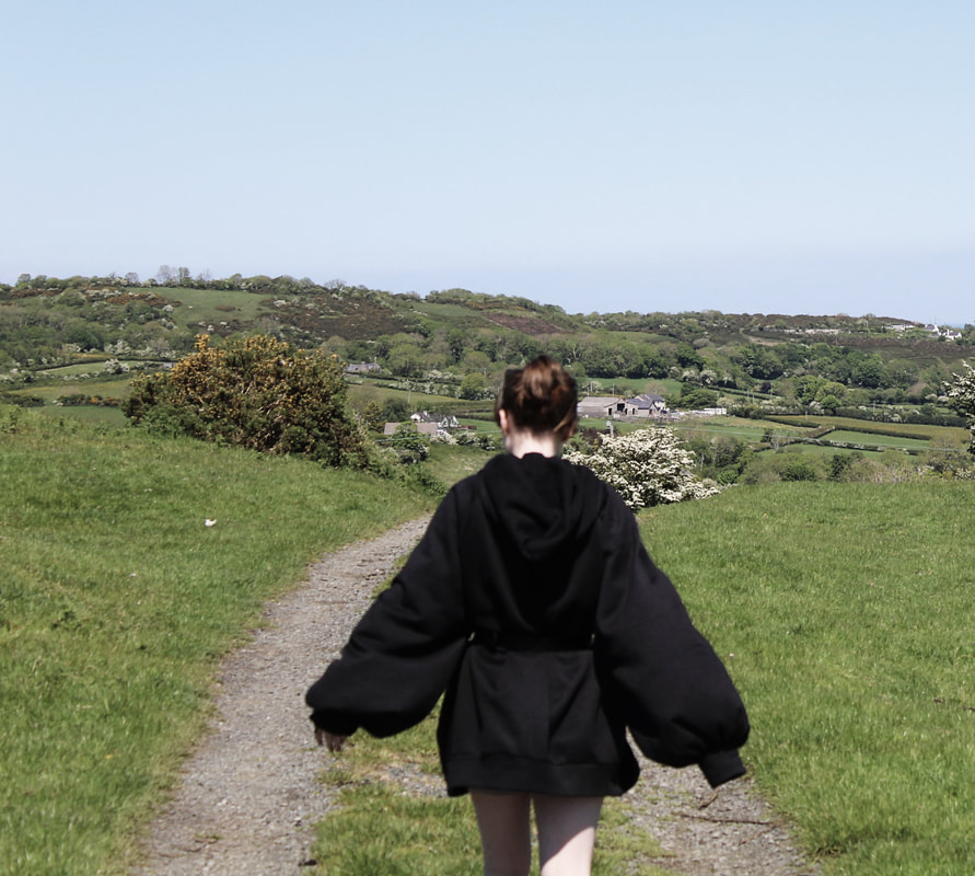
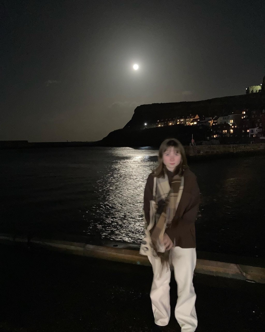
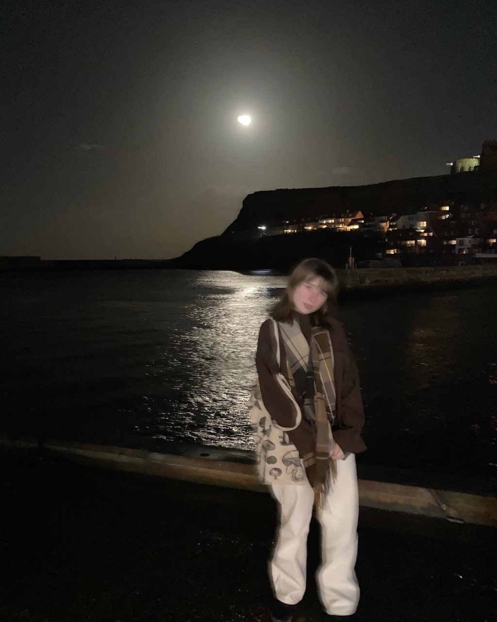
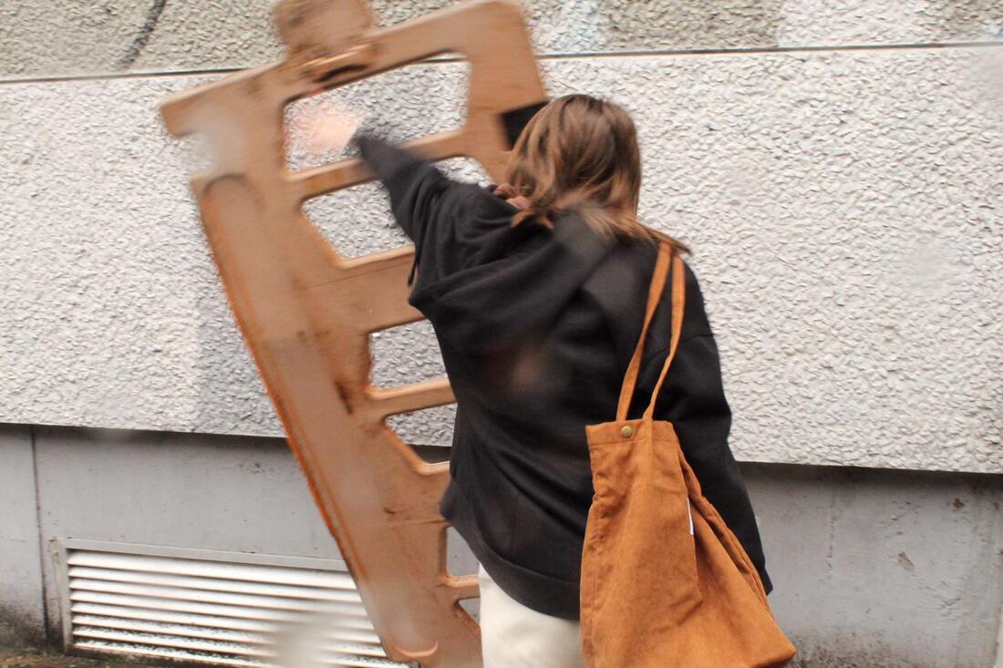
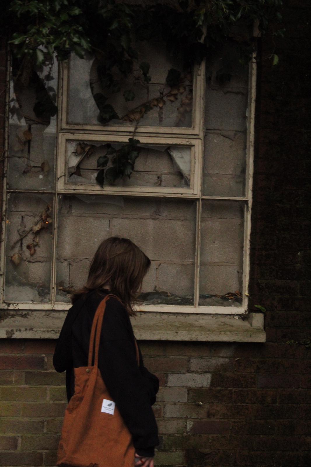
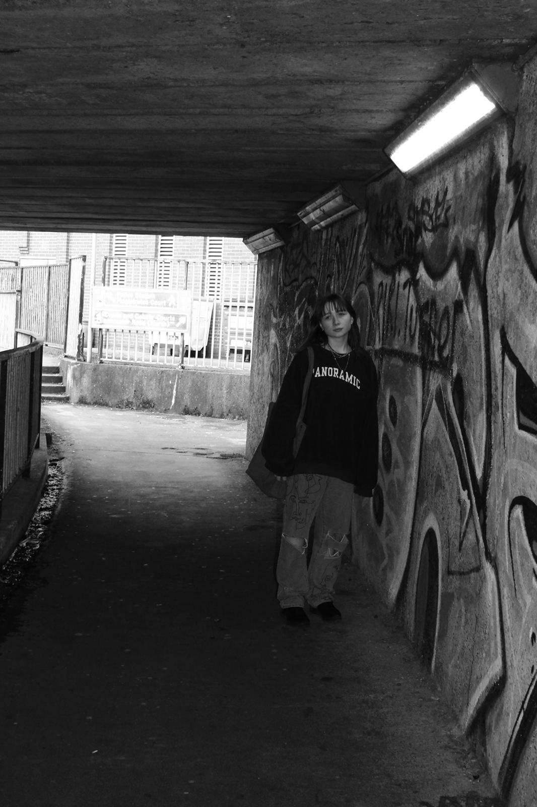
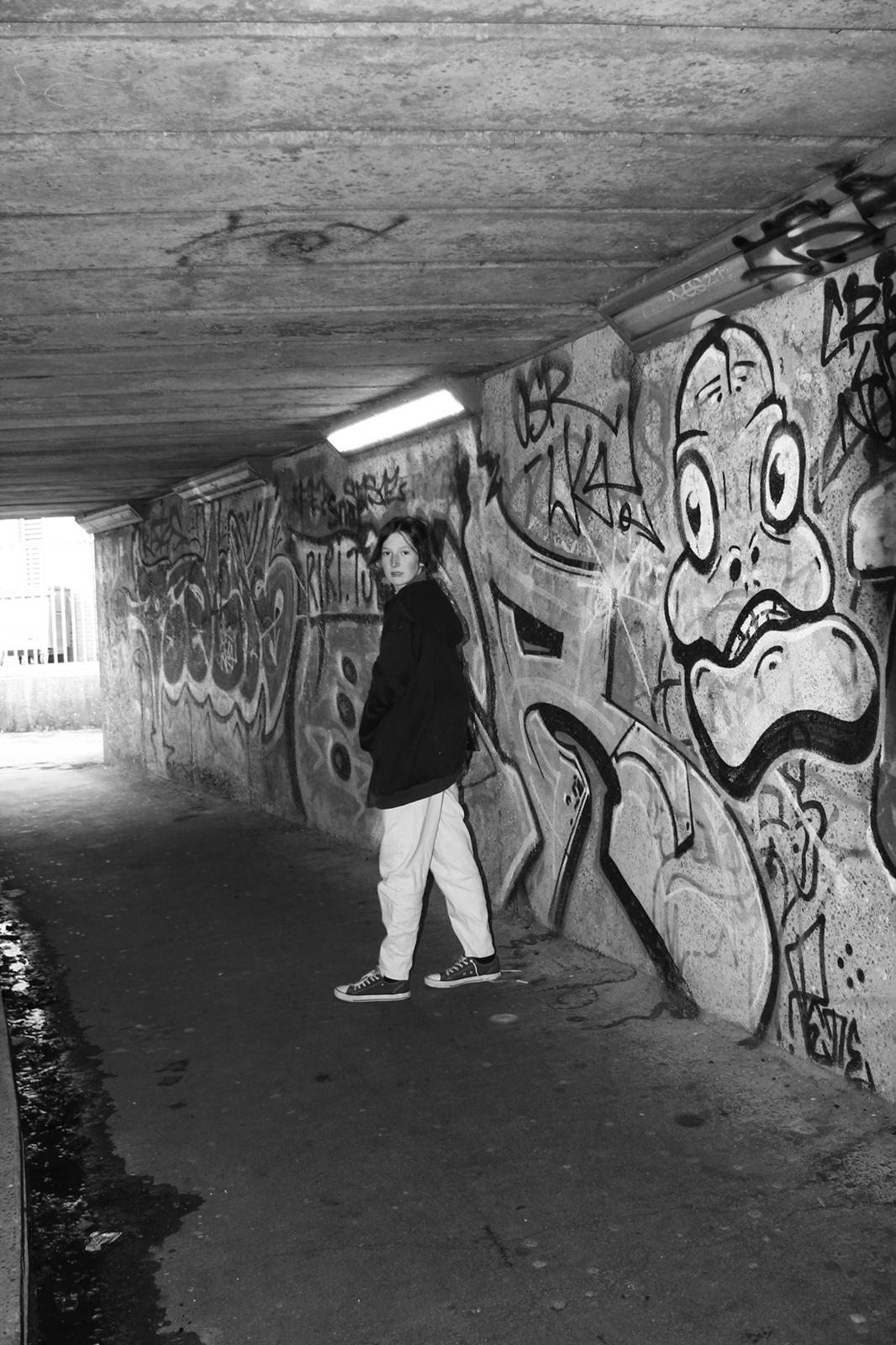
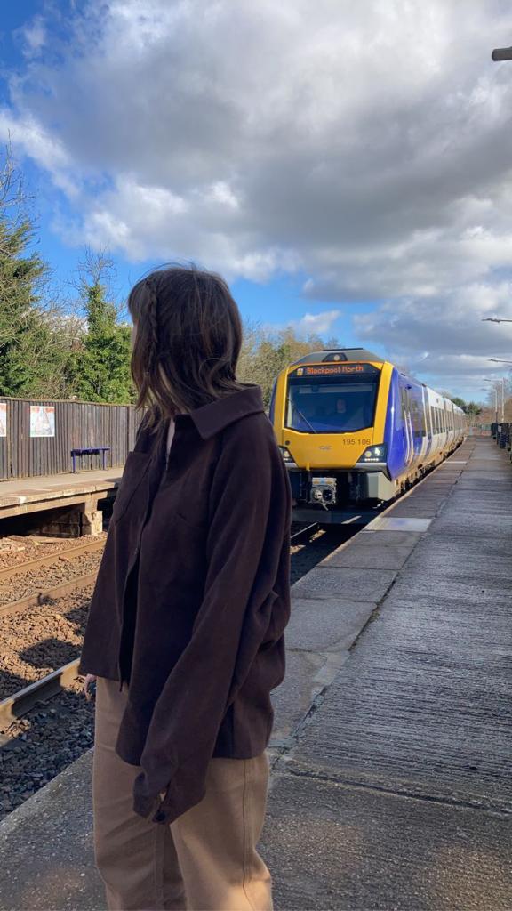
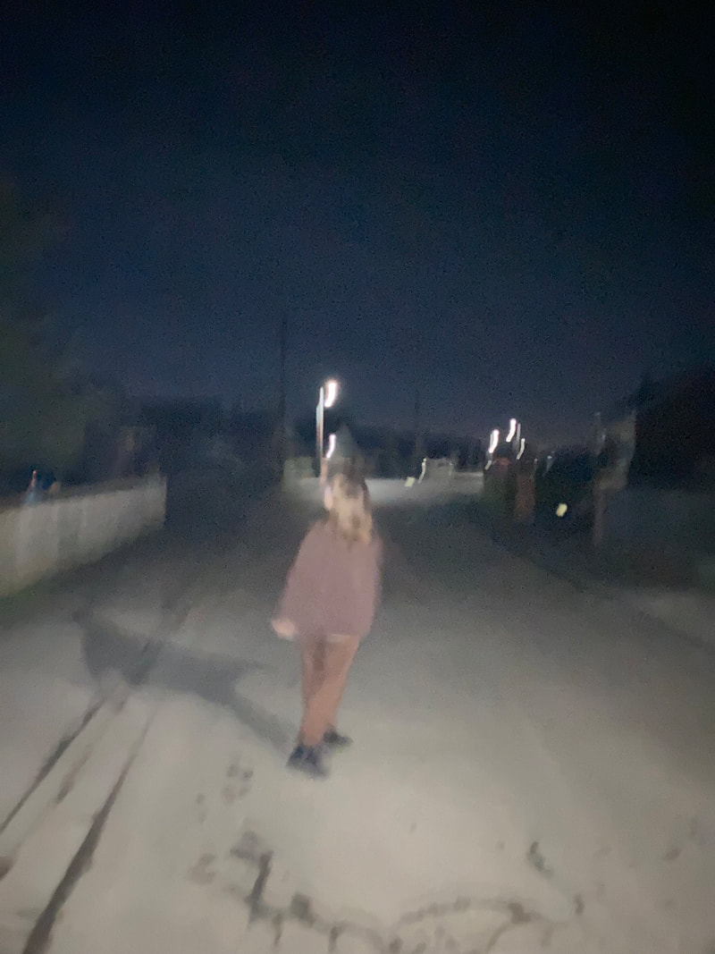
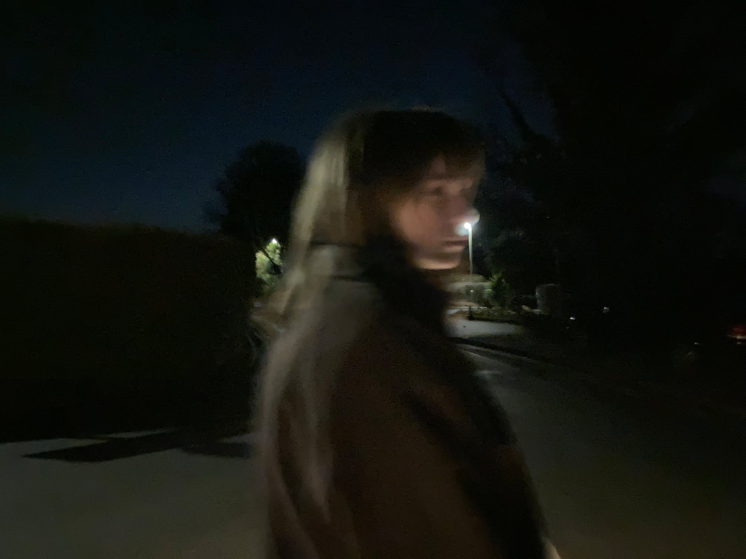
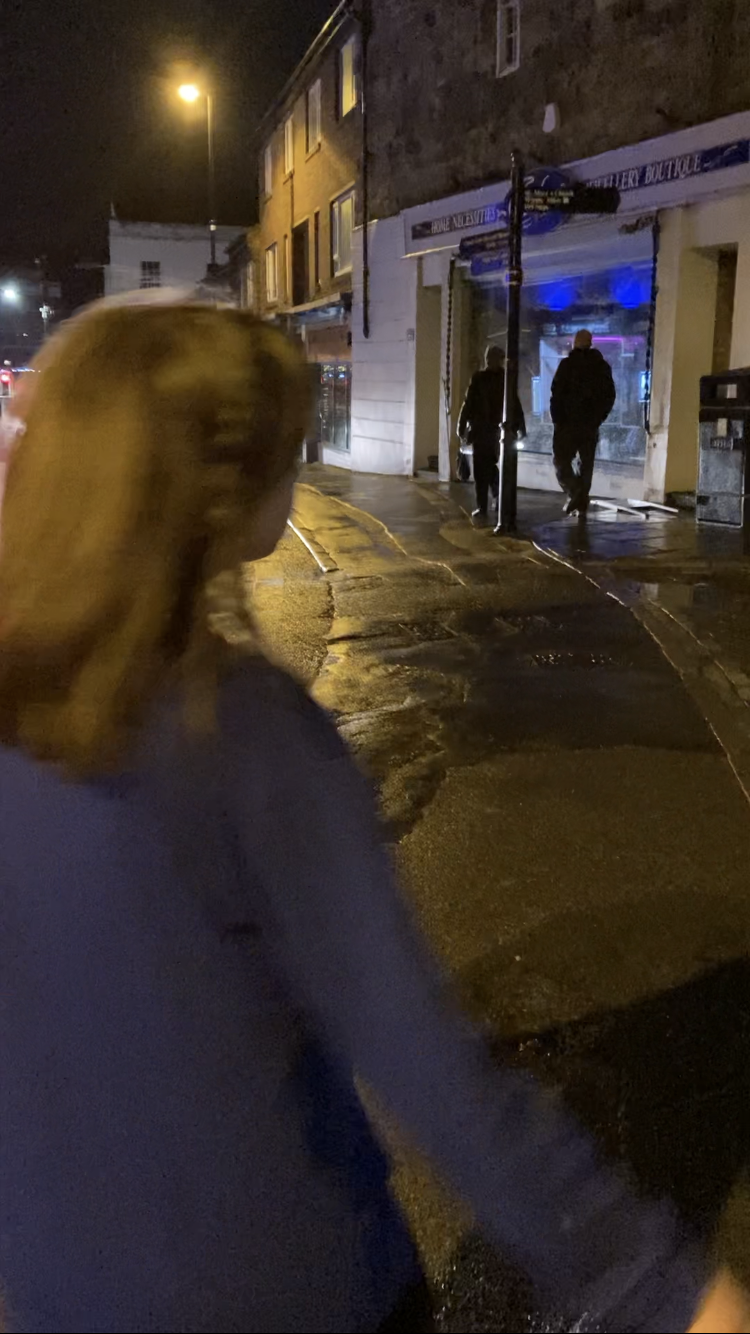
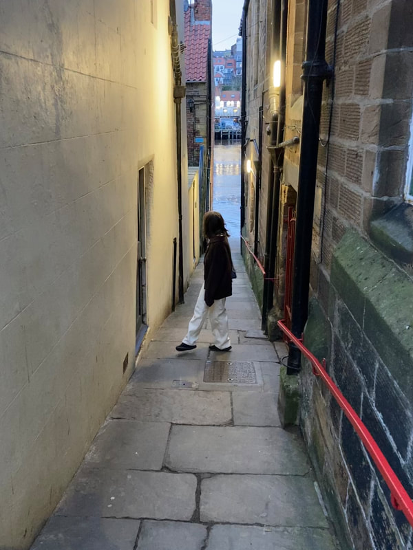
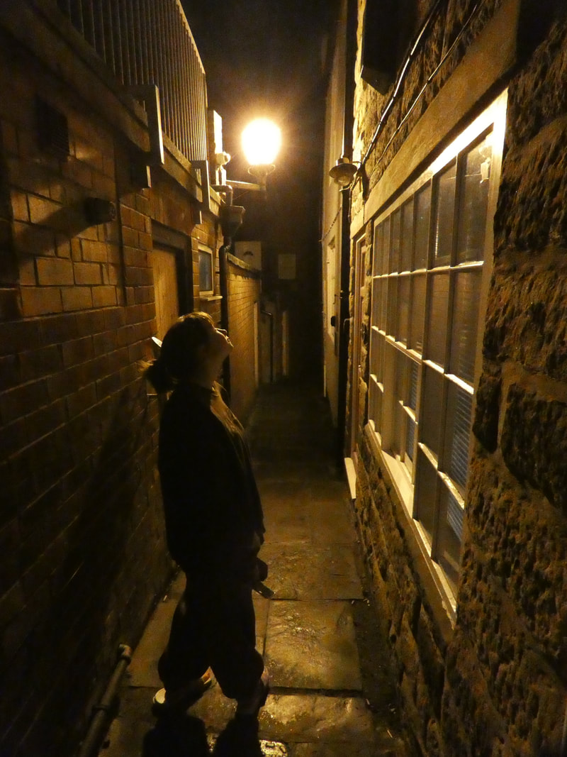
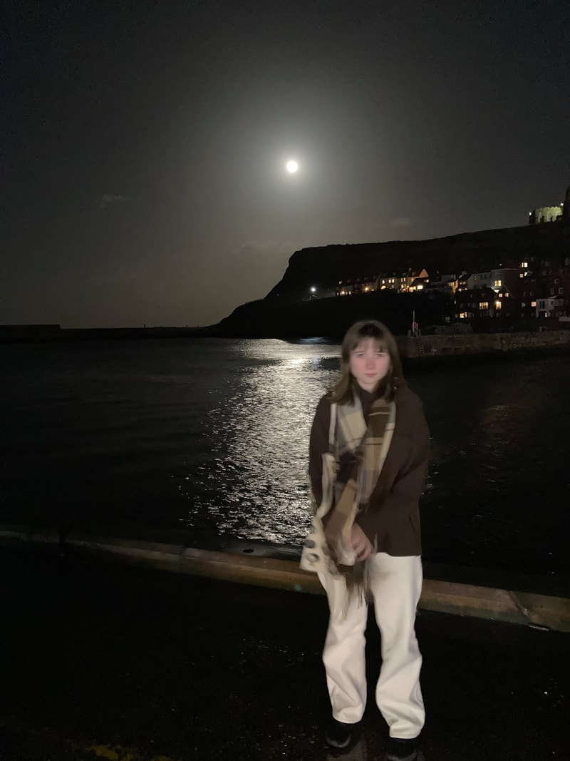
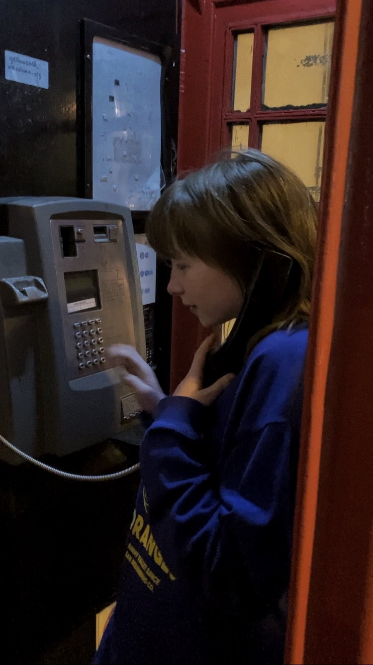
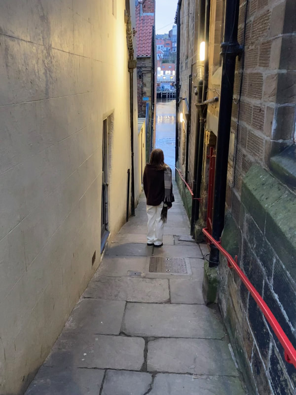
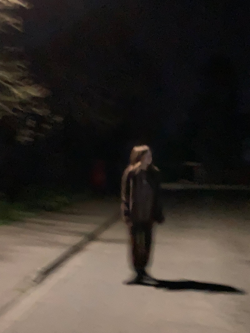
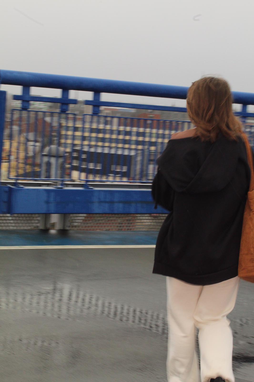
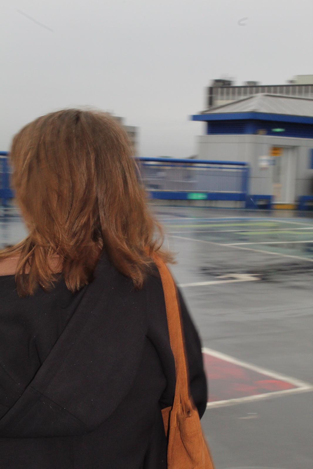
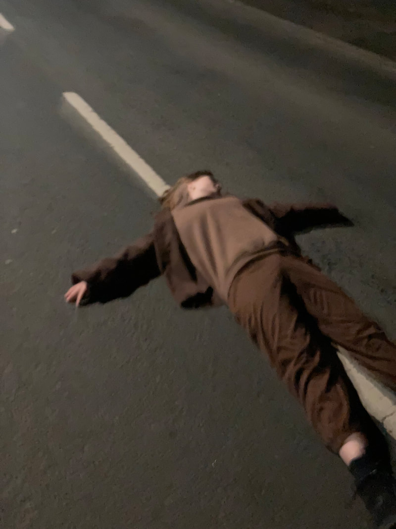
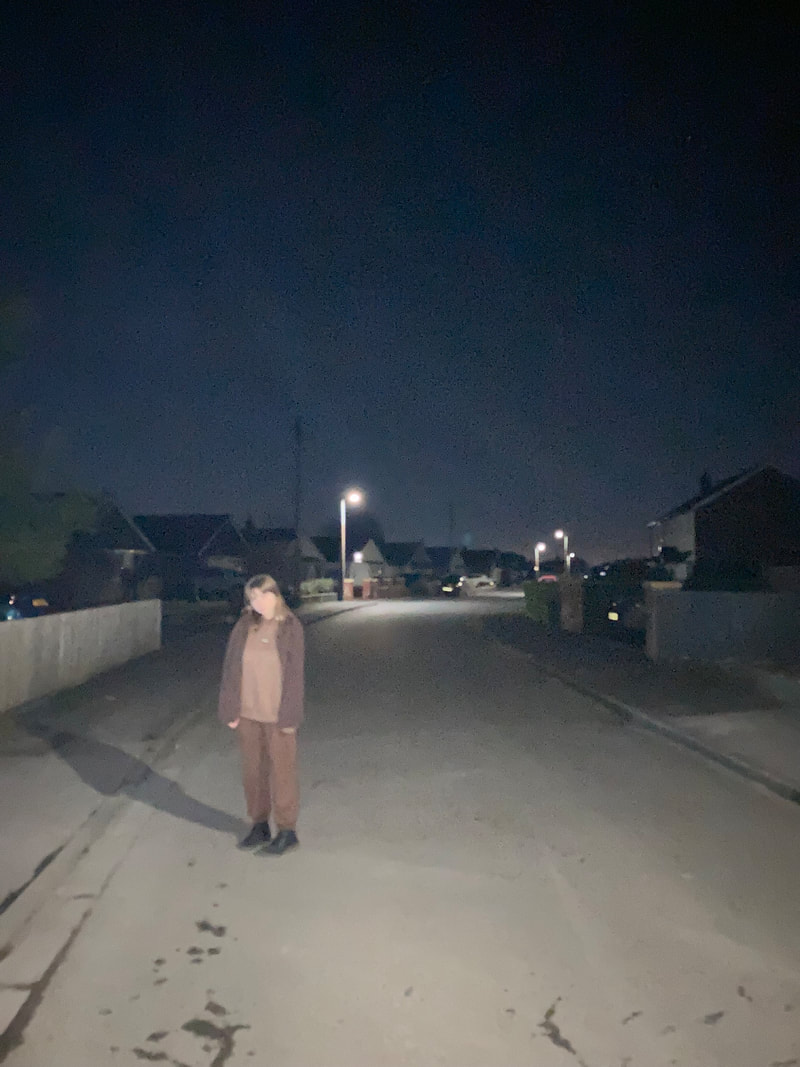
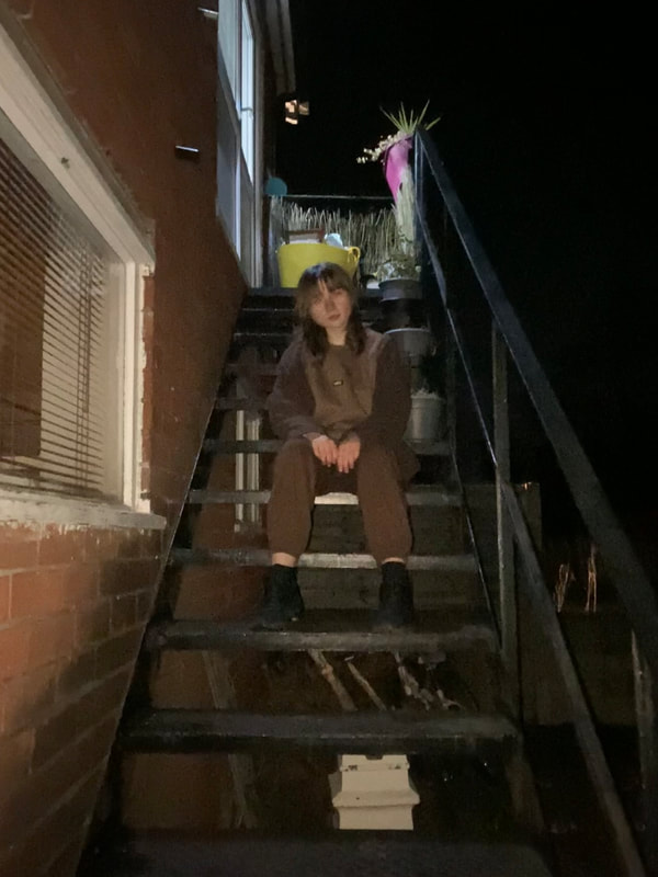
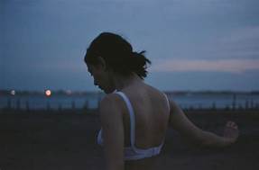
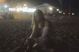
For this shoot, I'd like to continue with Jenny Woods, but focus on some of her different images. At the end of the shoot, I aim to have multiple images of identities representing freedom and happiness within your own company. I'd like an atmosphere of independence, self-isolation, solitude, abandonment, separation and space. I'm also aiming to convey emotions such as loneliness (which is often seen as a negative thing) and social exclusion. Instead of long exposure, I'd like to work with faster shutterspeeds instead.
|
|
|
I know supposedly I'm lonely now 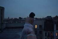
|
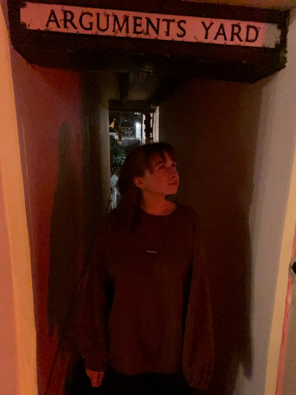
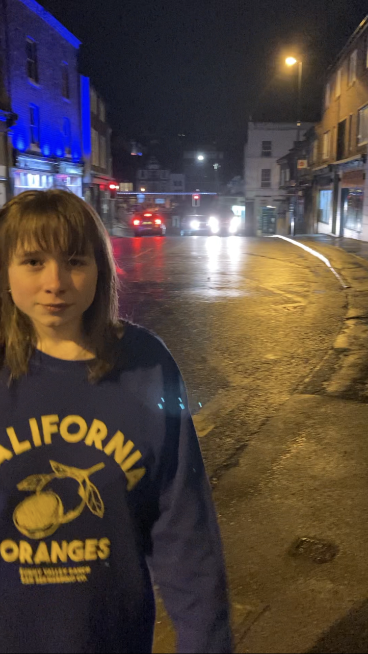
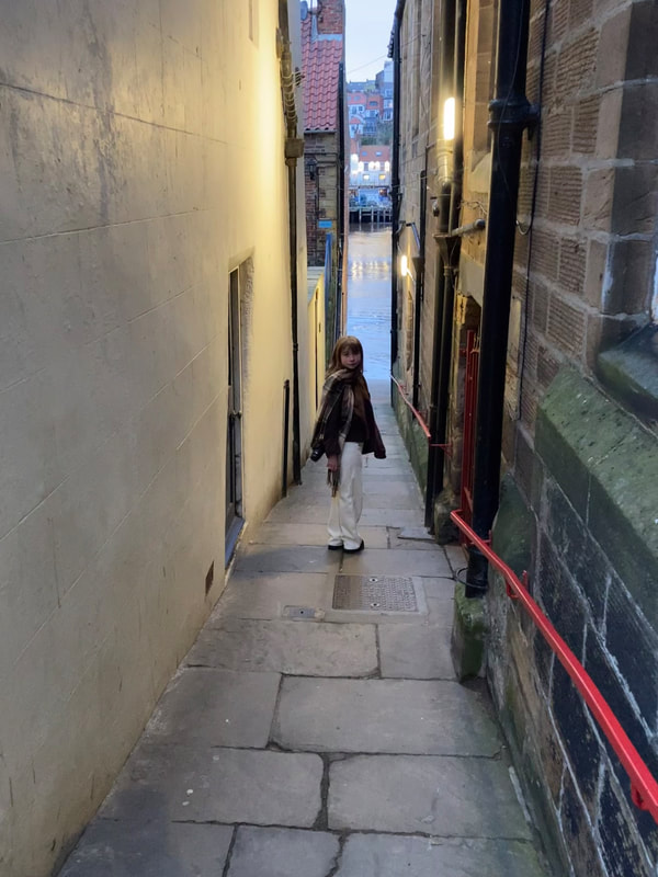
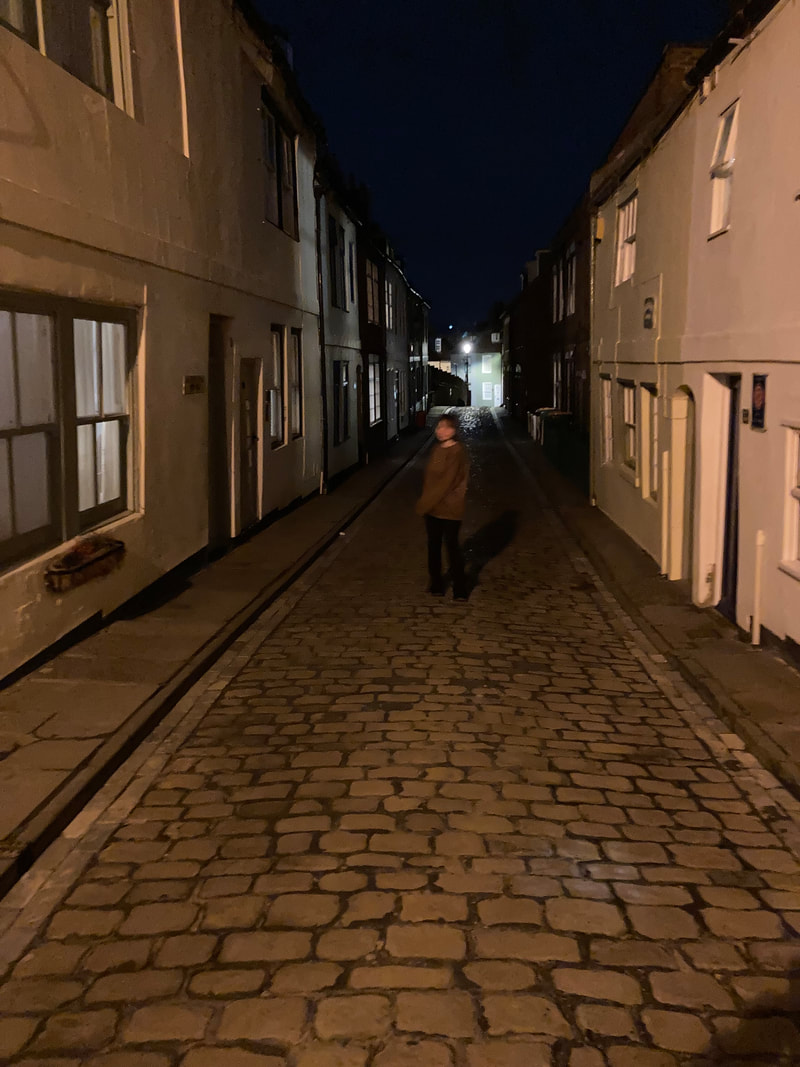
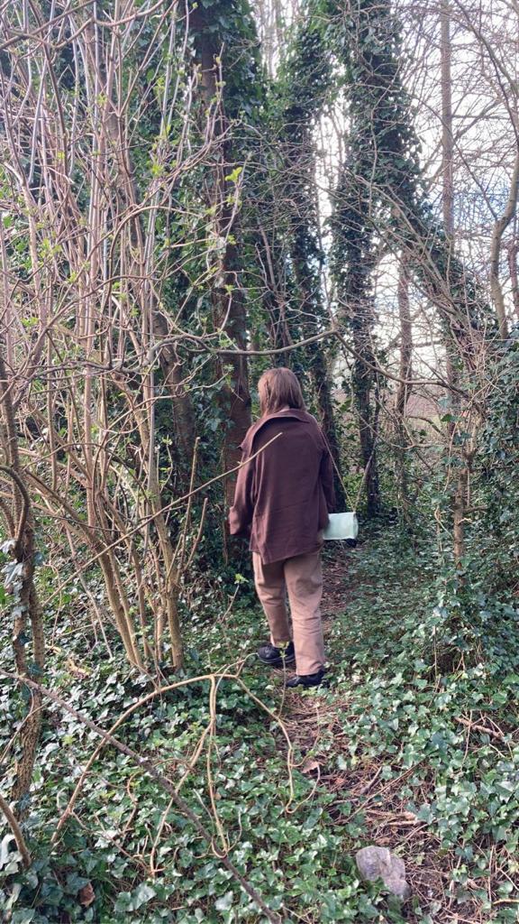
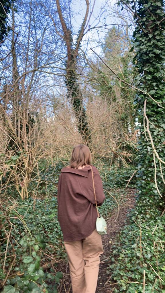
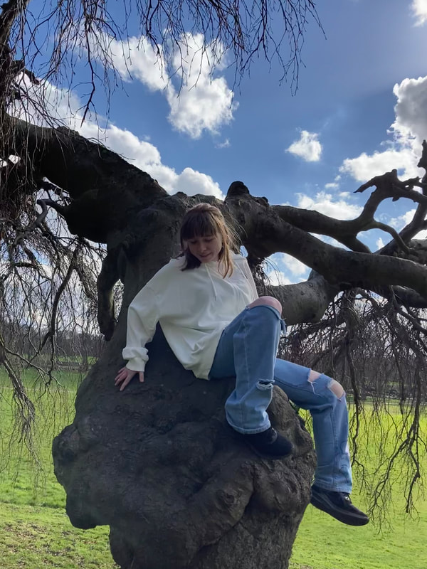
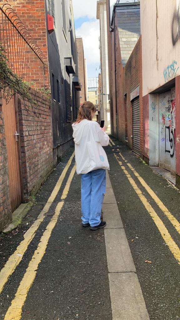
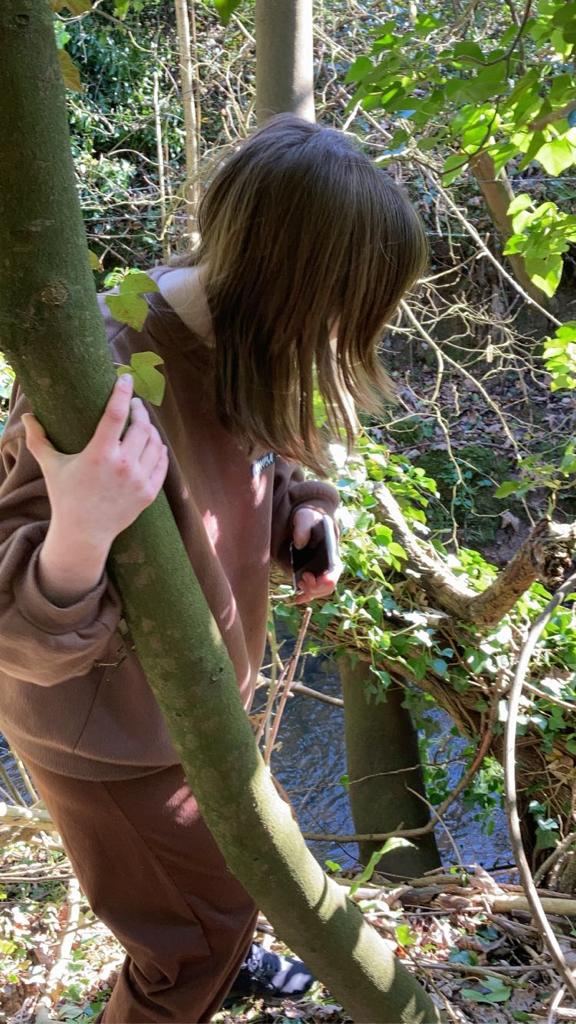
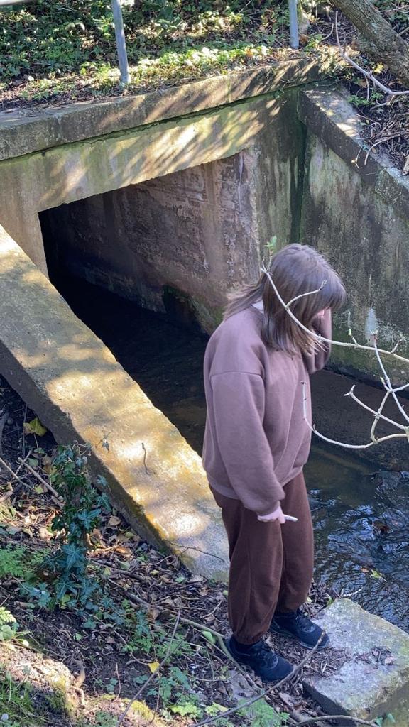
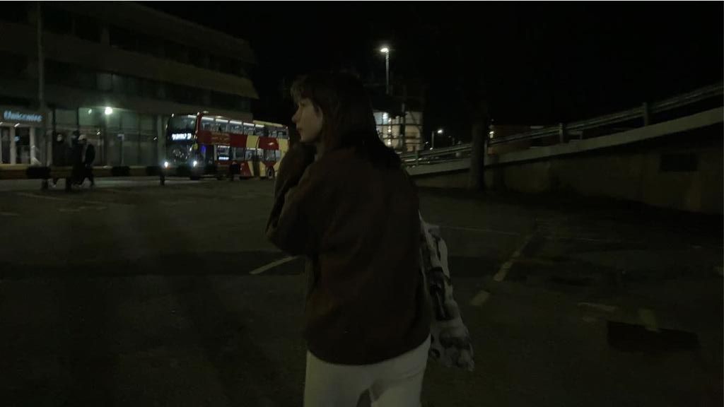
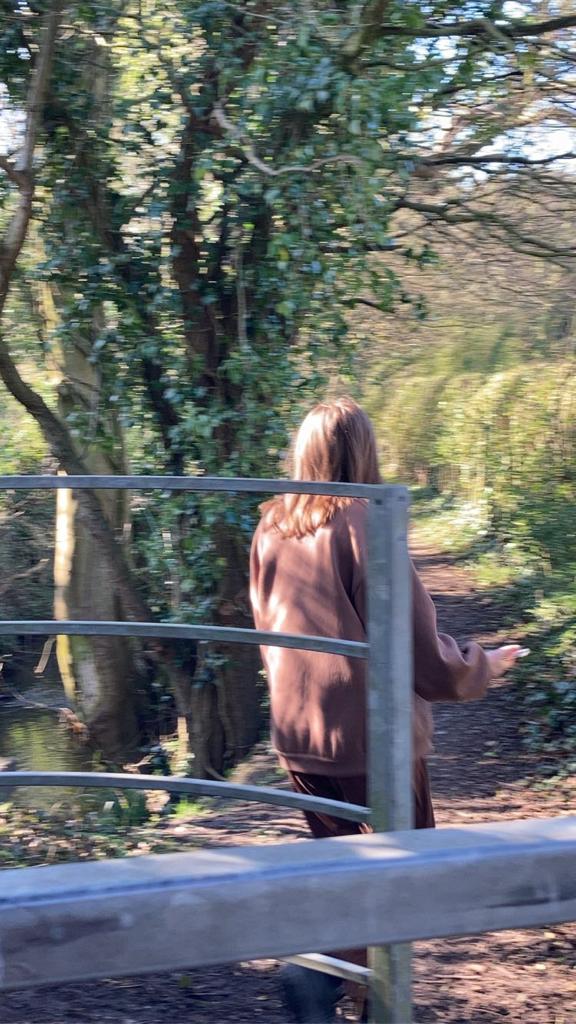
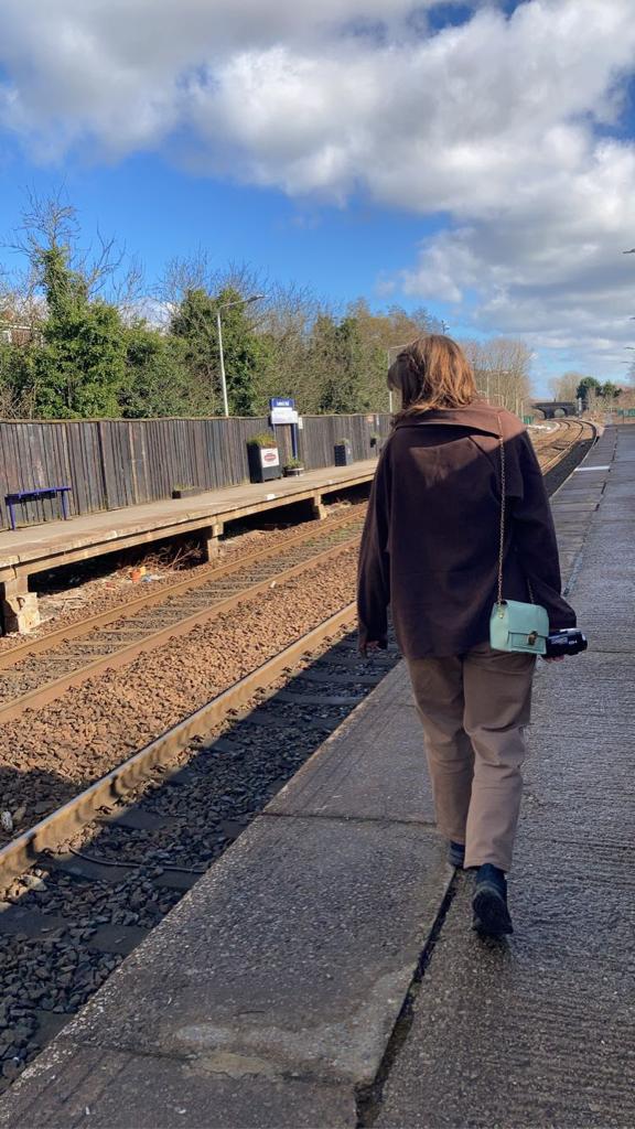
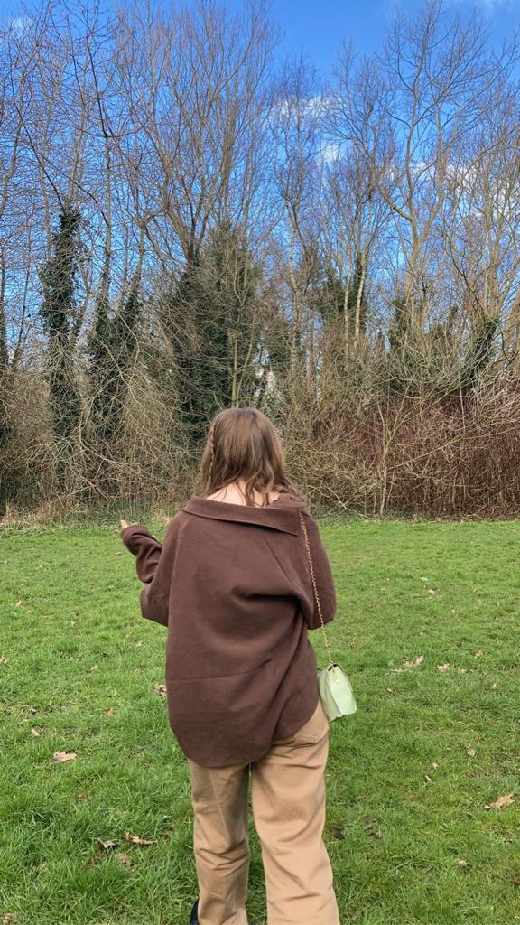
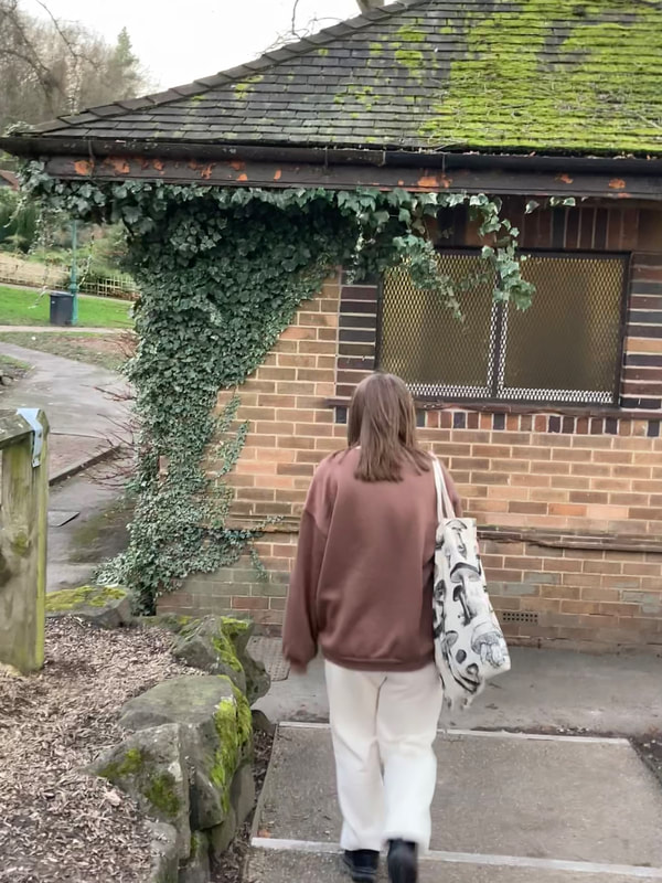
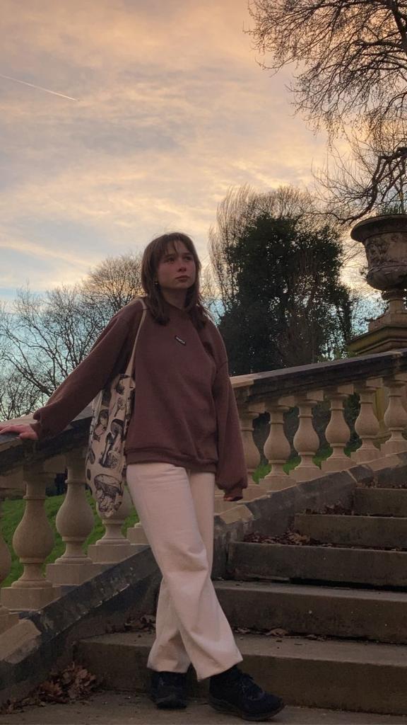
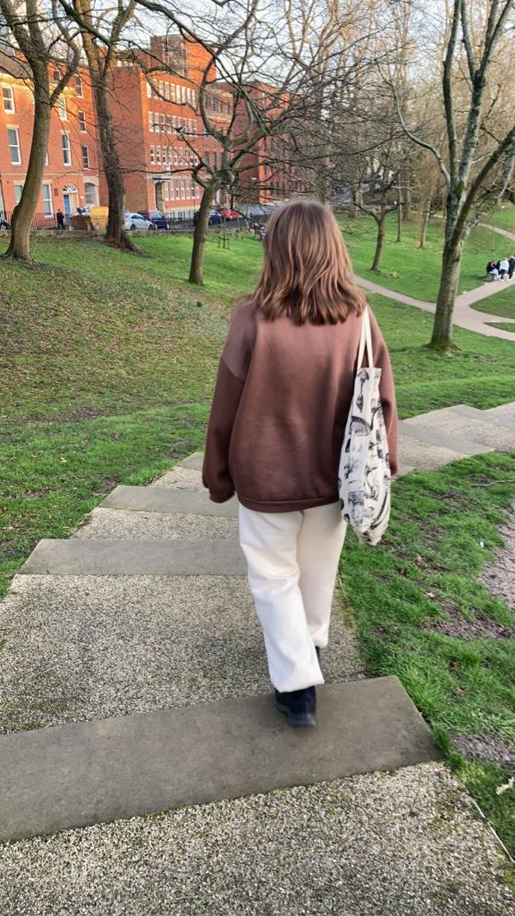
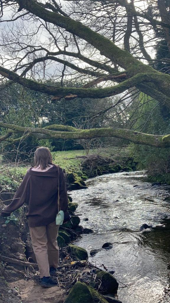
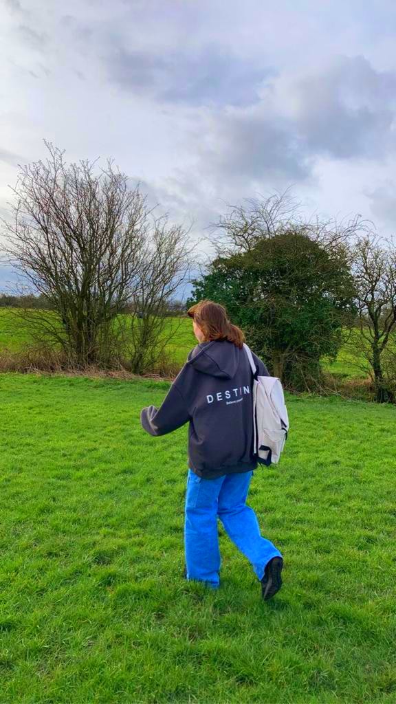
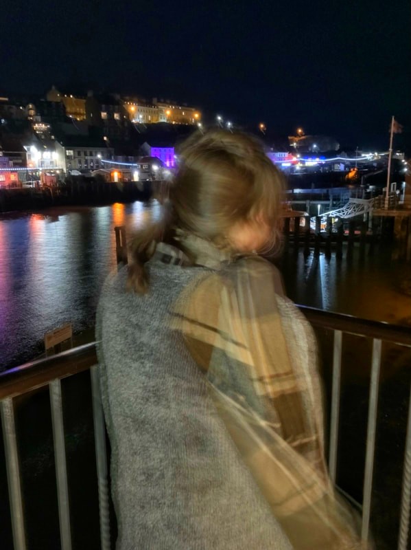
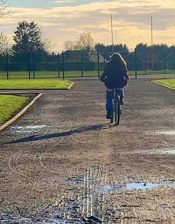
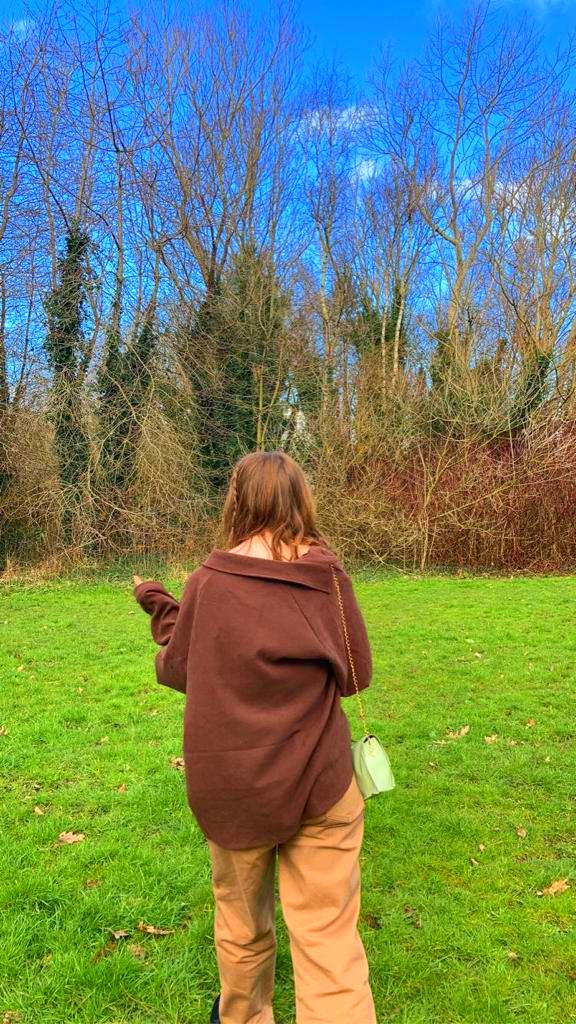
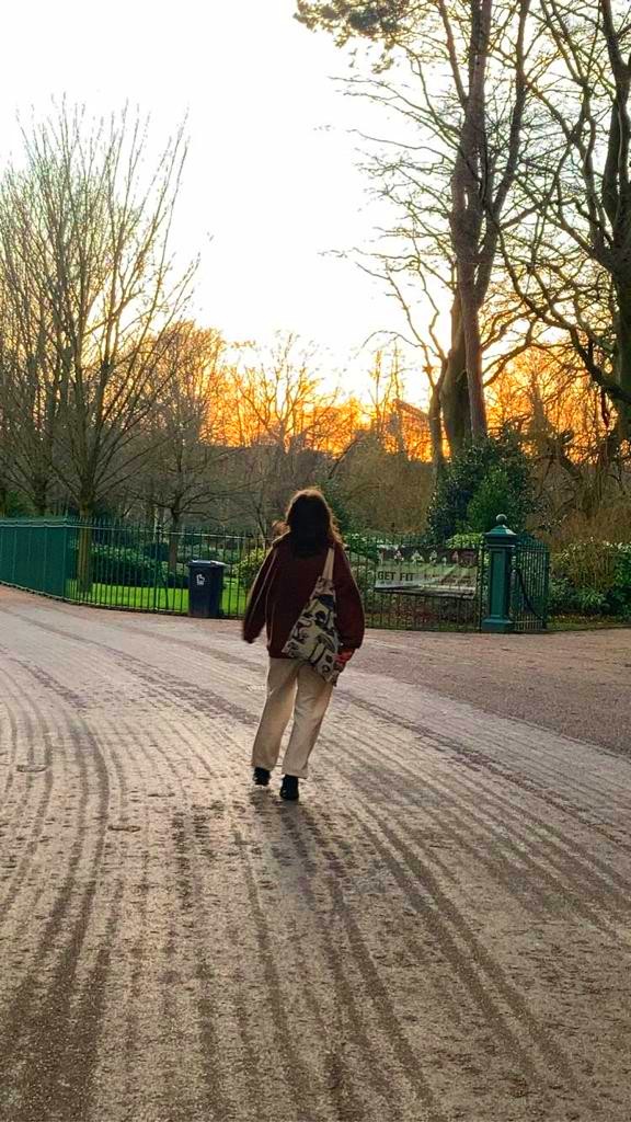
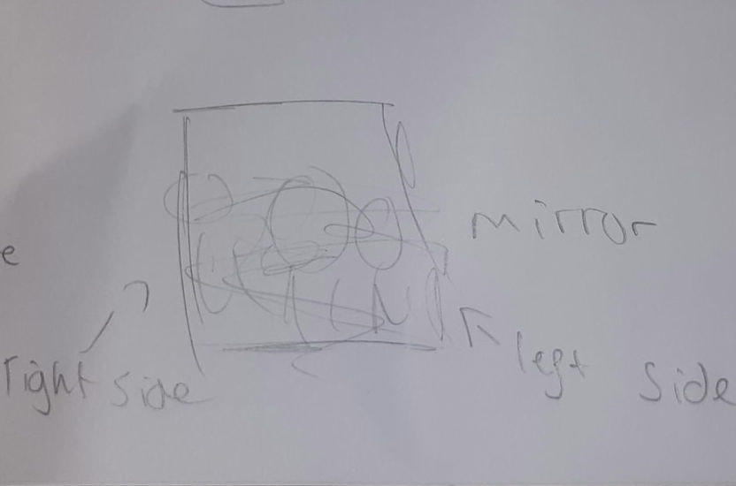
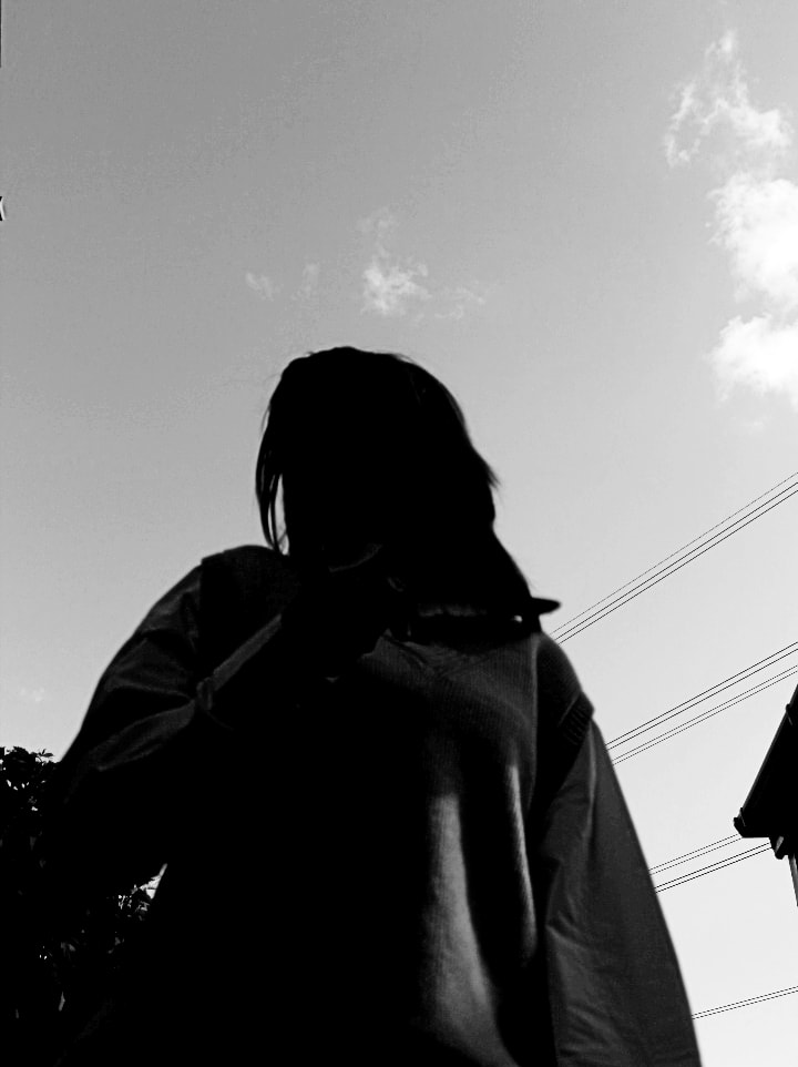
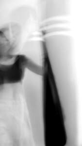
To carry out this shoot, I'll most likely locate an isolated ally, a large field, the forest and some sort of secluded hallway. The women in the images are often pictured wearing white, most likely to stand out or blend in, so I will hopefully do something similar- this would also contrast against the darker clothing worn in my last shoot to convey negative emotions. However, I may use black to go against its stereotypical reputation with depression and sadness. I hope for the location and clothing to capture more about the identity of the person in the photograph, more than the actual model. The majority of the images taken will be featureless, using the clothing or props to remain faceless, or turning around so only the side profile or back is visible.
The settings I intend to use/begin with the Aperture Priority mode, a large DOF and quick shutter speed; exact information will be decided dependent on the weather. Once taken I will digitally and physically edit the images- using a variety of different techniques such as sewing, scratching, staining and ink.
The settings I intend to use/begin with the Aperture Priority mode, a large DOF and quick shutter speed; exact information will be decided dependent on the weather. Once taken I will digitally and physically edit the images- using a variety of different techniques such as sewing, scratching, staining and ink.
Contact Sheet 35+ Images:
|
|
Best Edits:
DIGITAL:
|
|
|
|
PHYSICAL:
|
|
|
Edited Images DIGITAL/PHYSICAL and evaluations:


|
Despite the longer shutter speed- which is different than previously mentioned- this image is certainly a favourite. The 1" ss allows the viewers attention to be drawn to the movement of the model to before landing on the fallen down, stationary tree behind. This might appear as if the person in the image is to blame, backed up by the unstoppable swirling, letting out energy in the form of destruction.
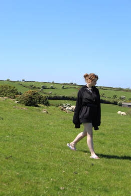
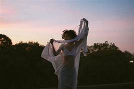
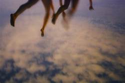
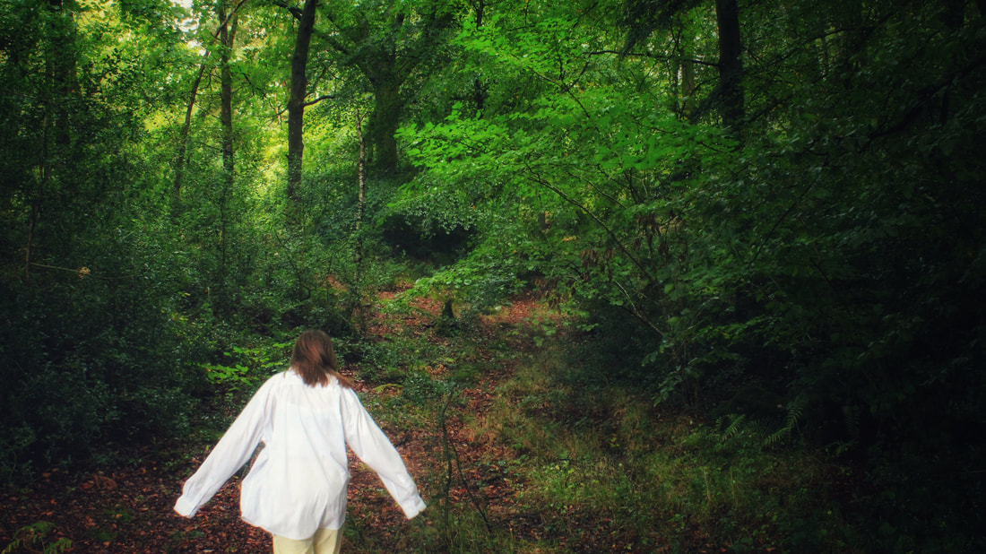
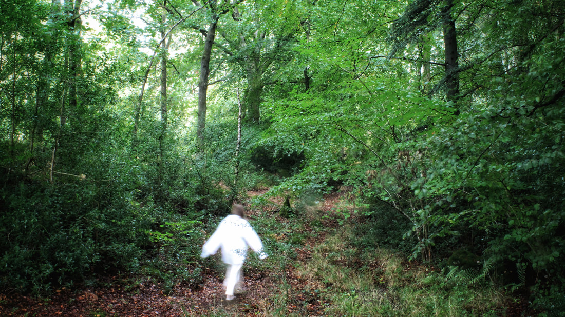
This is also one of my images of choice; the use of vignette surrounding her, slowly creeping up and closing in creating a dream-like photography, further betrayed by the animated skipping. The light clothing creates an aura of purity and innocence- almost like the beginning of IT before George watches his boat go down the drain. It's as if waiting for something to taint the innocence.
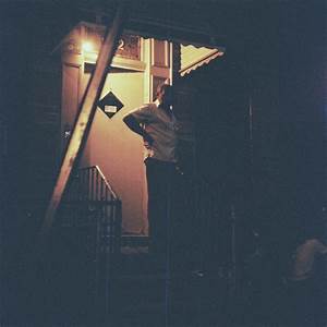
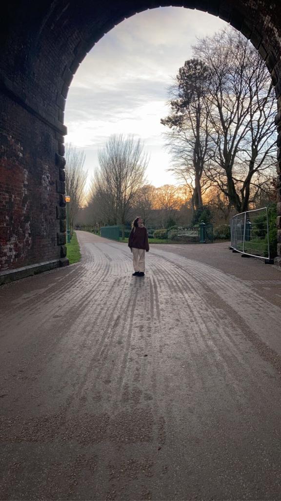
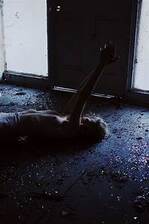
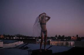
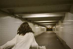
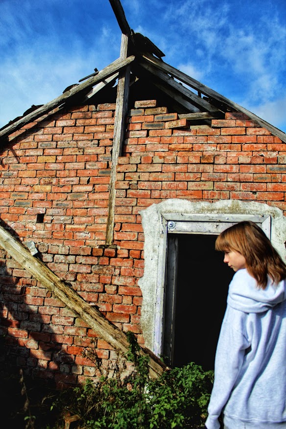
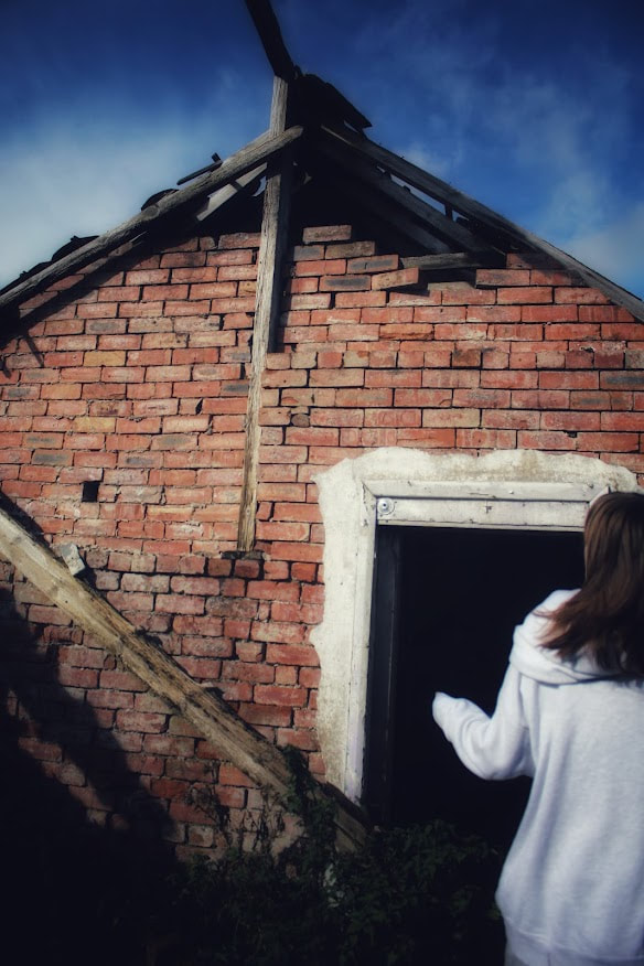
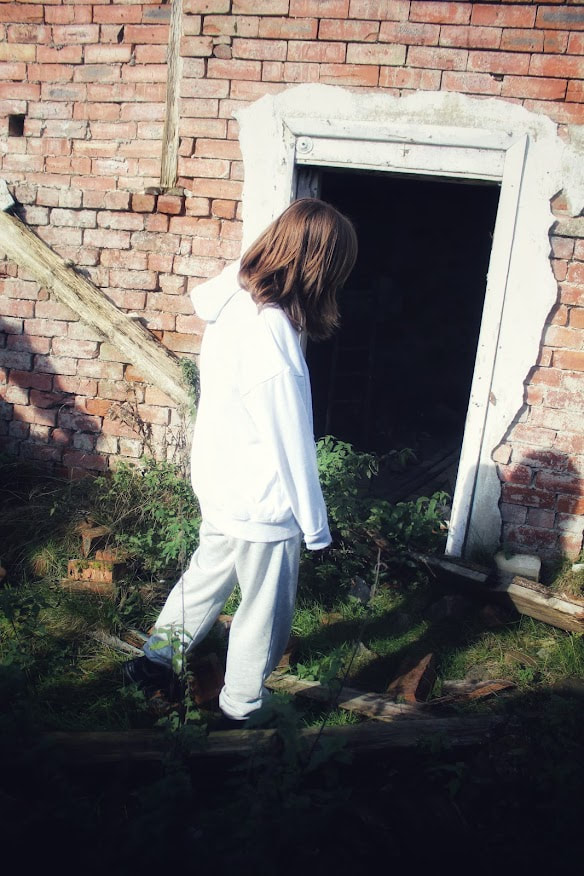
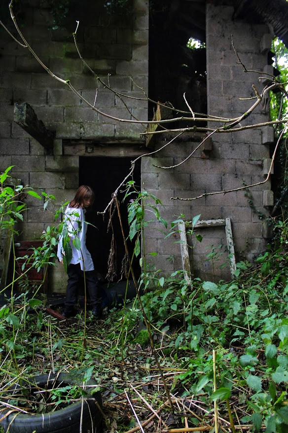
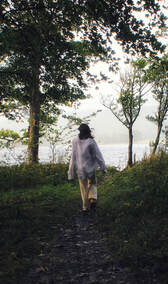
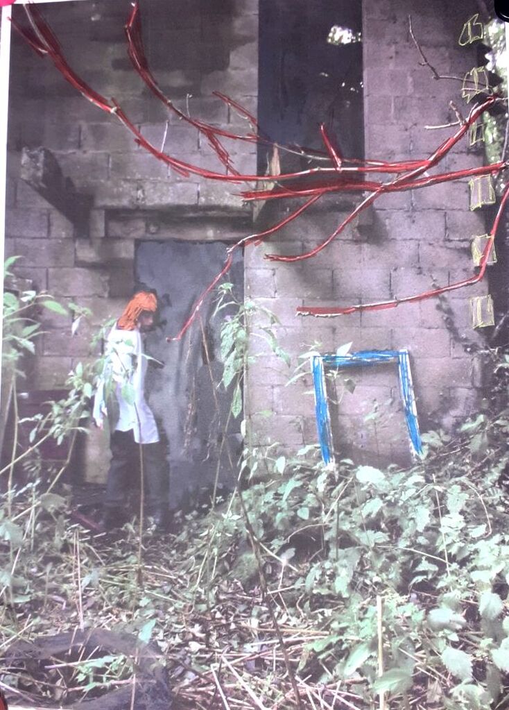
I largely favour this photograph. I like how the trampled down path and old tire leads to a dark, abandoned building; portraying the idea there is very little life in the surrounding area. The figure clad in white and black leans into the doorway, balancing on a rotting pillar and neighbouring an old, also rotting, window frame which is the only indicator of previous human life. The branch which breaks the borders of the image look as if they're almost pushing the girl, urging her into the isolated premises. This may push the onlooker to wonder what would happen if the girl entered and what lies around the inside.
The model appears to be stationed in the shade, away from the sunlight which often draws people out of their homes. The deserted, old pub which serves as a health and safety hazard puts the girl in danger, though she appears to be comfortable. This is a juxtaposition, as the lack of pathetic fallacy contrasts the risk.
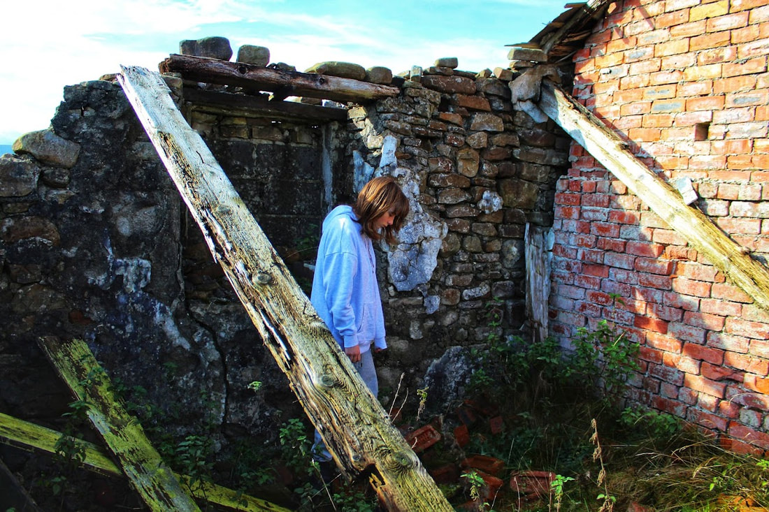
This is probably one of my favourite images from the entire shoot, as the desired affect was achieved. This links back to my previous composition in which I noted I'd like to show calm amongst chaos- the falling and wobbling bricks above show this. The way in which the makeshift wooden pillars are positioned adds shape and structure the image whilst leading your eyes to the loose bricks atop the studier ones.
If I was to do the shoot again, I would angle the camera to show the river which flows to the side of the building- this would show the path in the premises and give an idea to the natural environment in which the rural shooting pub is located. However, I was limited on time and concerned about the numerous spiders which made their web on my tripod and shoes. |
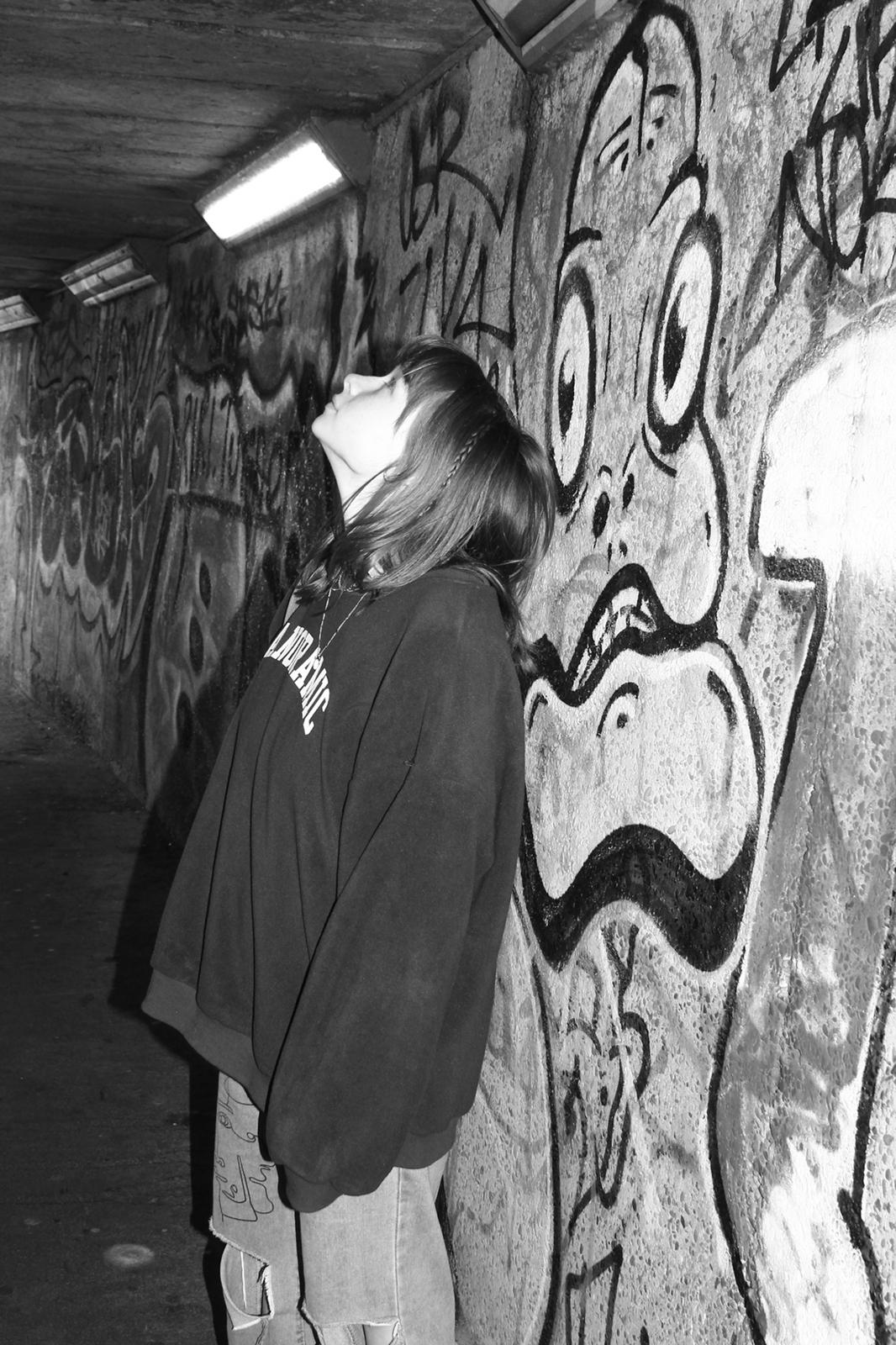
Composition Design 3:
|
(Tap below images for related articles)
For my last composition in Portraiture and Identity, I intend to continue using Jenny Wood's work as inspiration- this time, however, I plan to convey more positive emotions and re-introduce another artist whom I studied over the summer- May Xiong. Despite the lack of positivity in Xiong's work, I believe she will add colour and new features to composition 3.
Inspired by the photographers quote (on the right) I intend to 'go back to basics' when doing this shoot. This means I aim for simplicity, nothing complicated yet nothing too bland.
|
“Do not despise your inner world. That is the first and most general piece of advice I would offer. Our society is very outward-looking, very taken up with the latest new object, the latest piece of gossip, the latest opportunity for self-assertion and status.
|
As mentioned earlier, I hope to achieve a sense of plainness yet happiness. Particularly, I find the photo booth style interesting, its something engaging yet accessible. To emulate this, I will take multiple photos before editing them and printing them off, physically editing them into a collage. When editing, I might use Xiong's style after sticking them into a mixed media- this would mean drawing and painting over them, as if finding a photo which was previously long lost. To do this I will use a tripod, canon 4000D and props such as a book, cacti's, flowers, sunglasses and other objects which are either something you find in a photo booth or which were more common in the 'early days.'
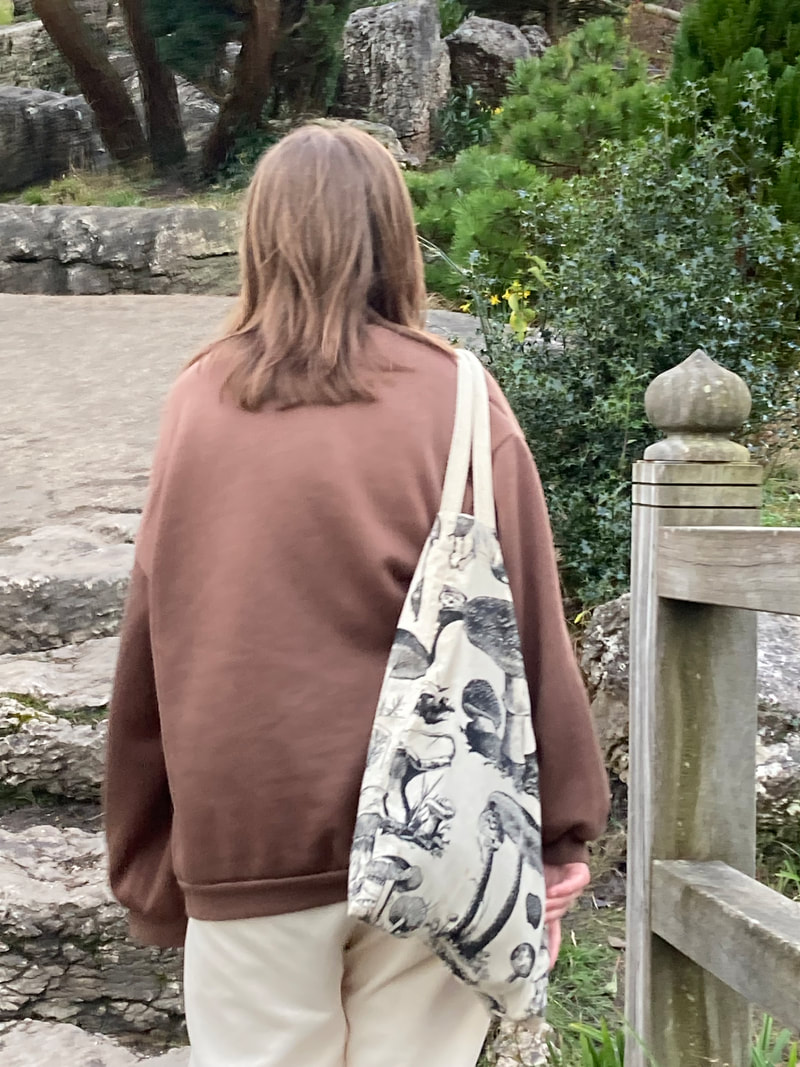
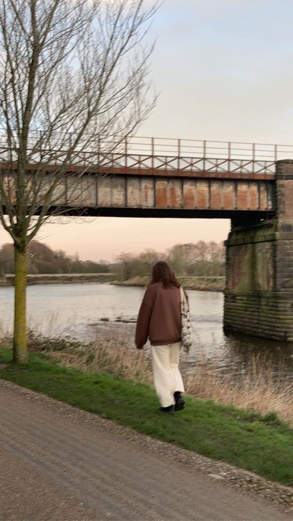
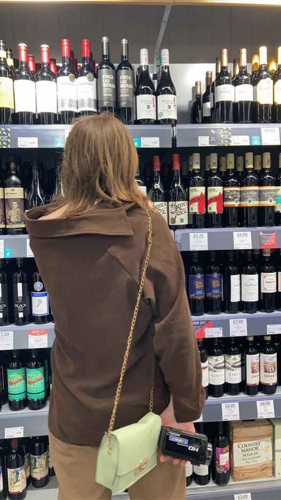
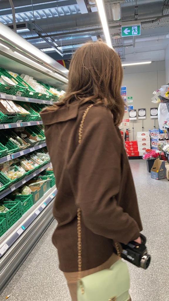
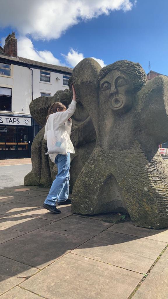
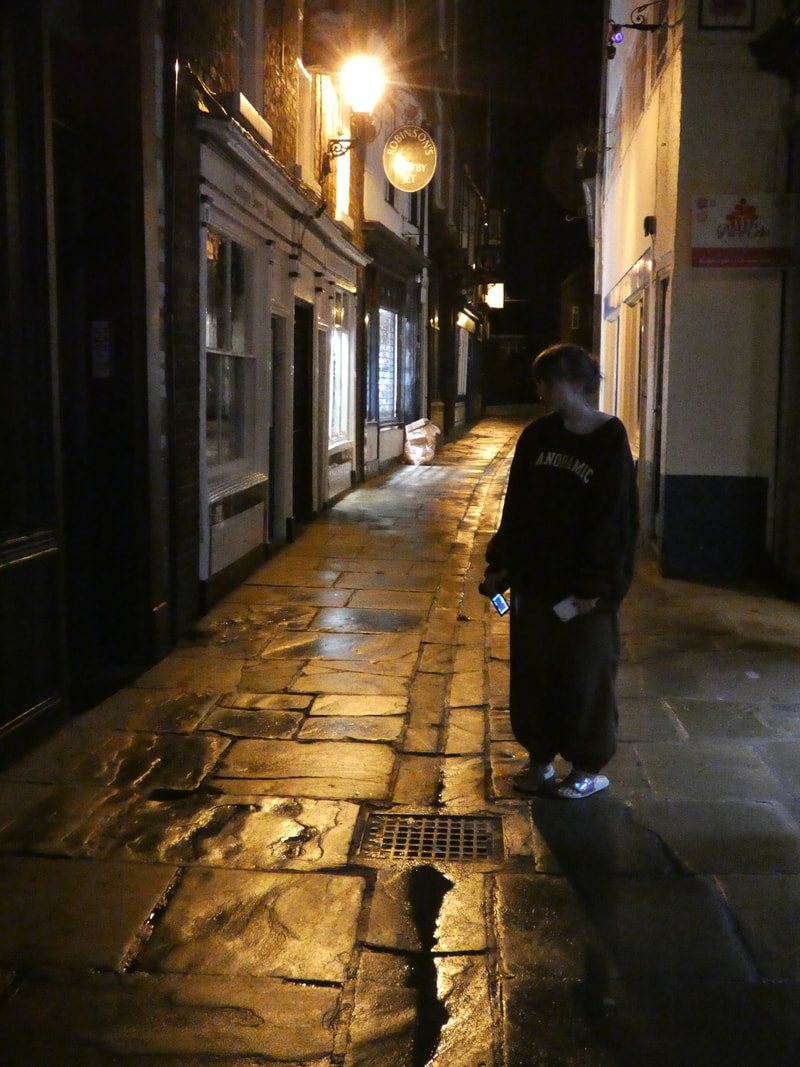
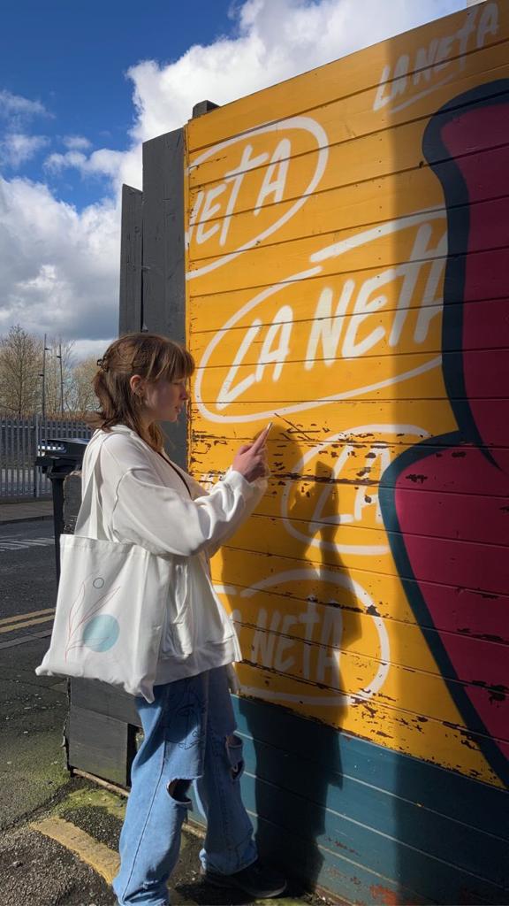
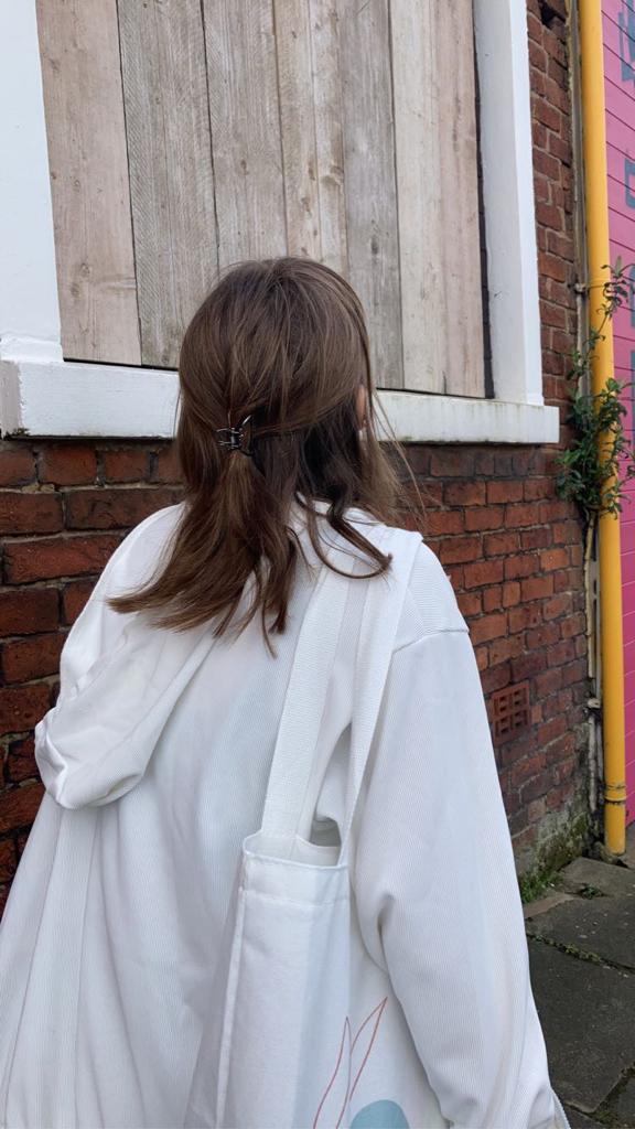
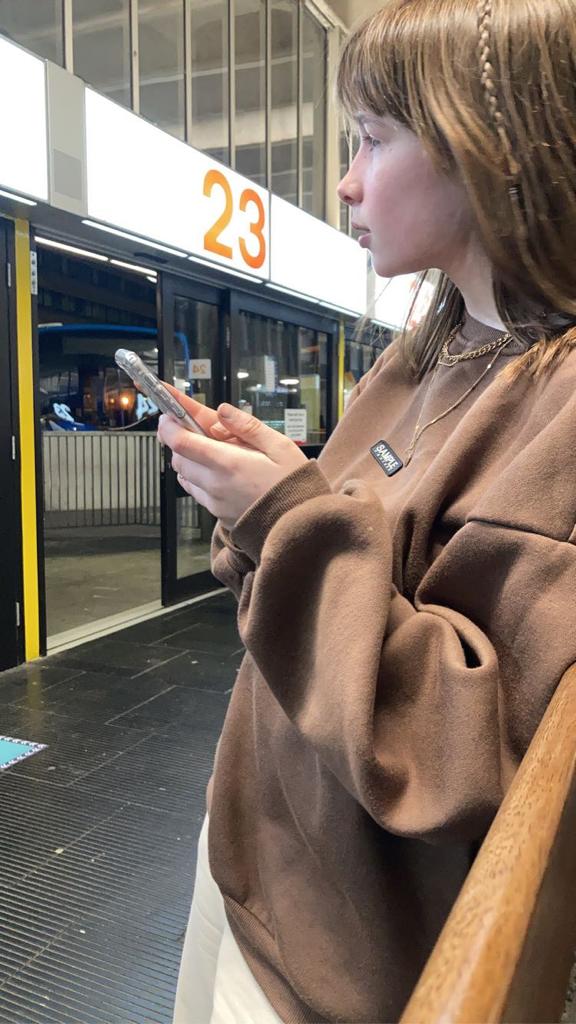
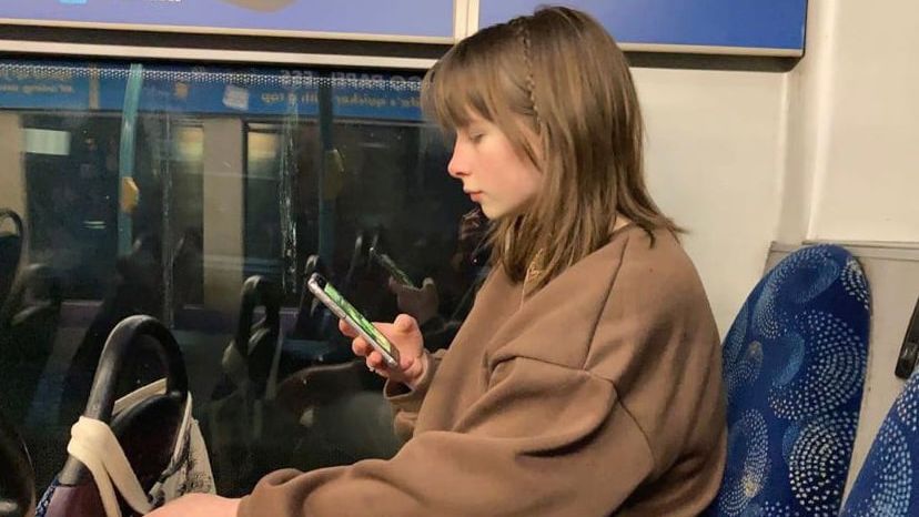
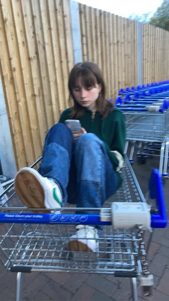
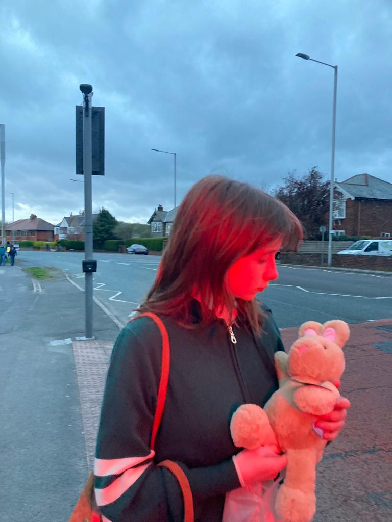
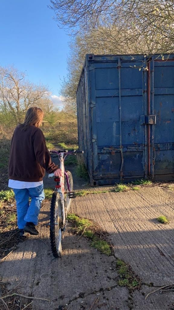
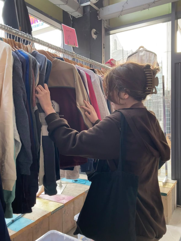
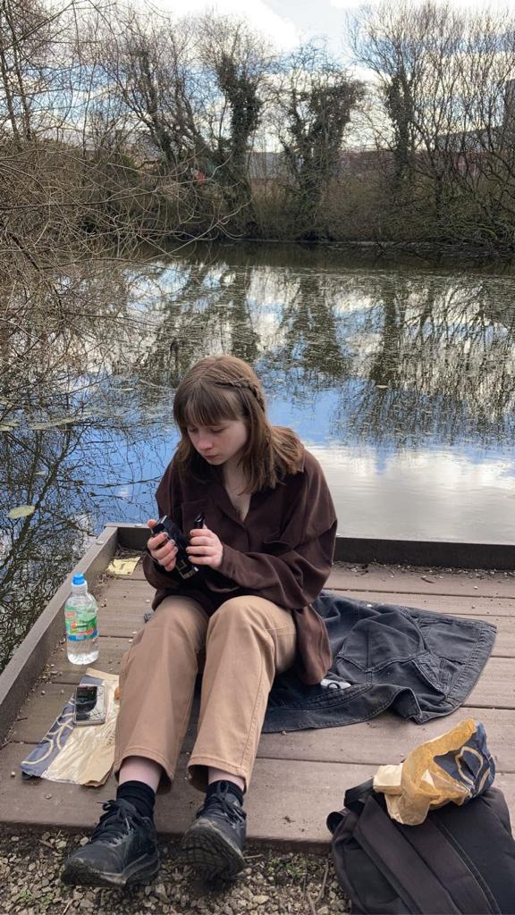
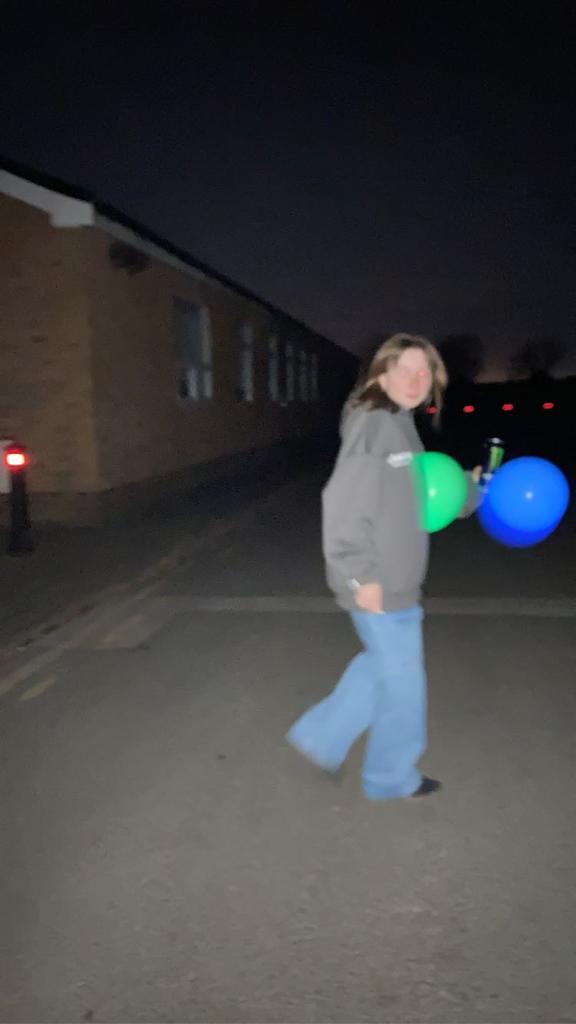
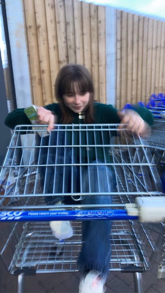
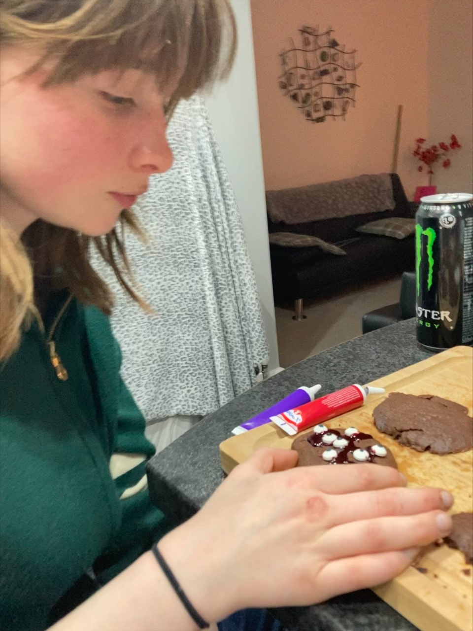
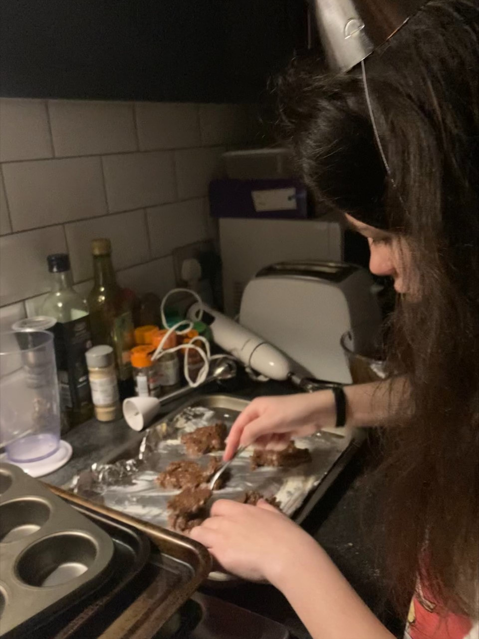
Apart from the photo booth idea, I also plan to create more candid photographs. This includes images of random day to day activities such as eating, working, texting, walking, talking, e.c.t. This will most likely be done at the weekend as that is the time period in which I will have access to my camera the most.
Apart from the photo booth idea, I also plan to create more candid photographs. This includes images of random day to day activities such as eating, working, texting, walking, talking, e.c.t. This will most likely be done at the weekend as that is the time period in which I will have access to my camera the most.
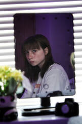
Best Edits/CANDID:
|
|

|
|
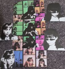
Best Edits/PHOTOBOOTH:
DIGITAL:
|
|
|
|
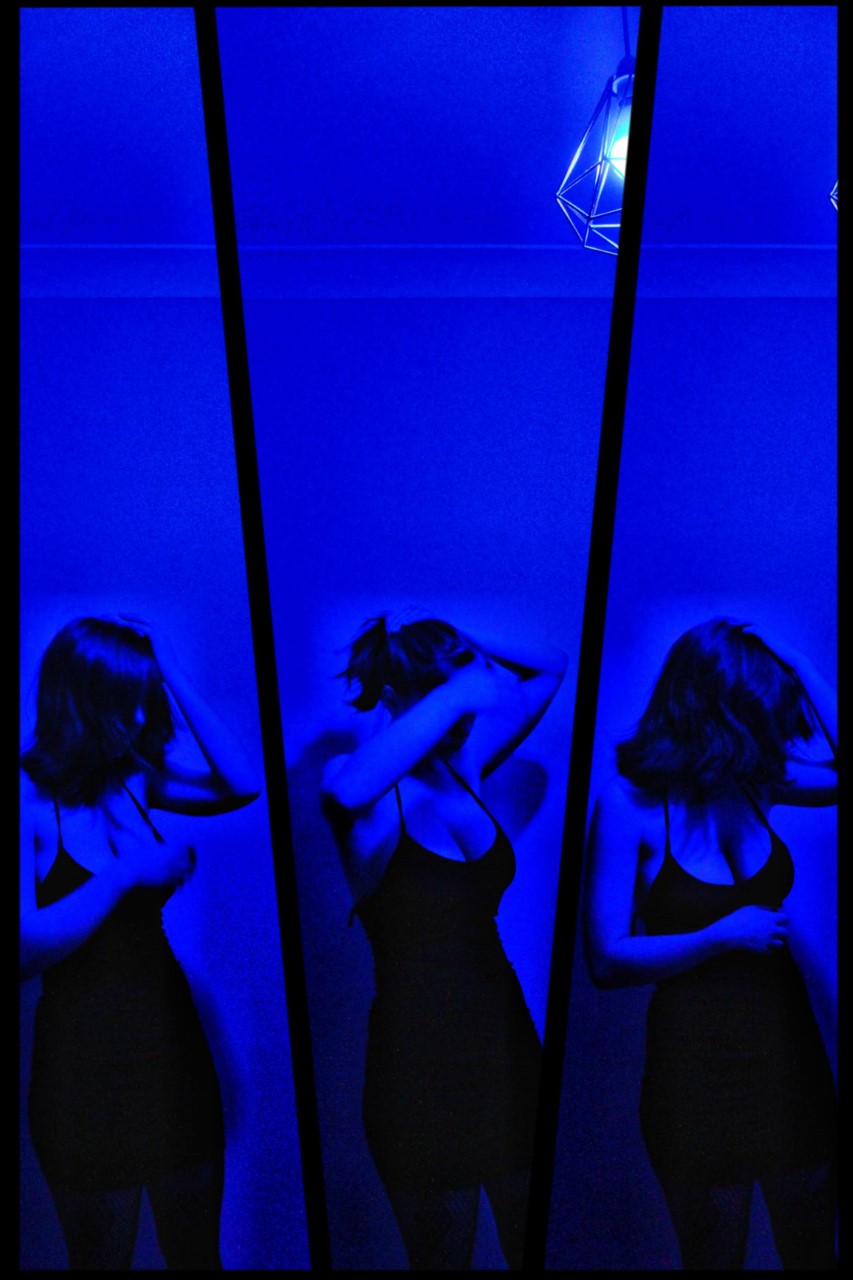
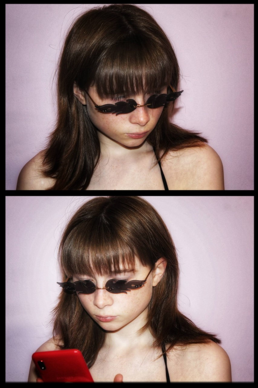
|
PHYSICAL:
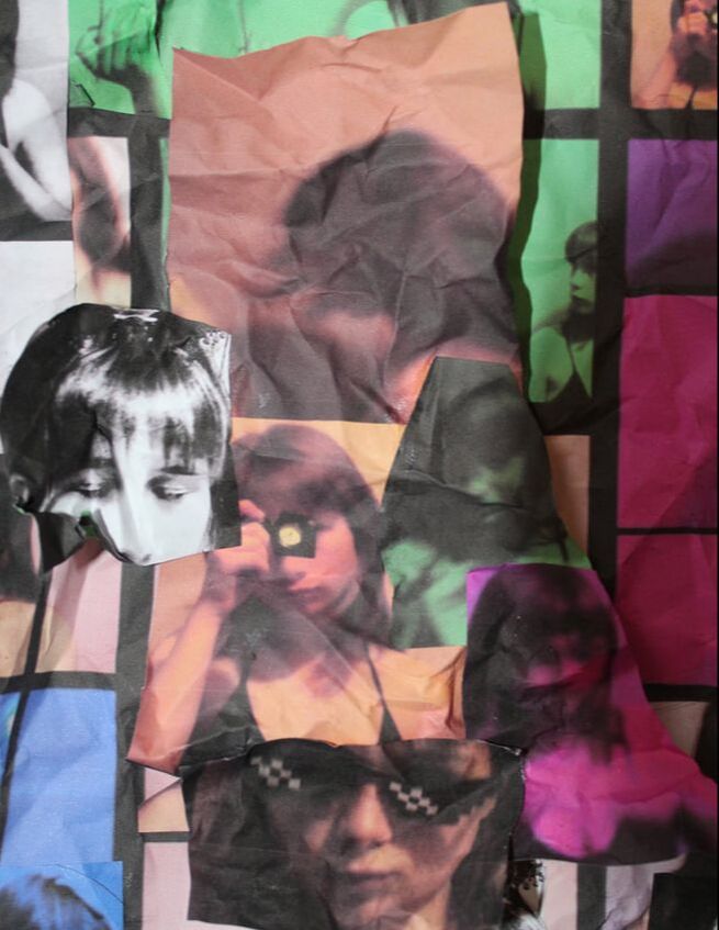
|
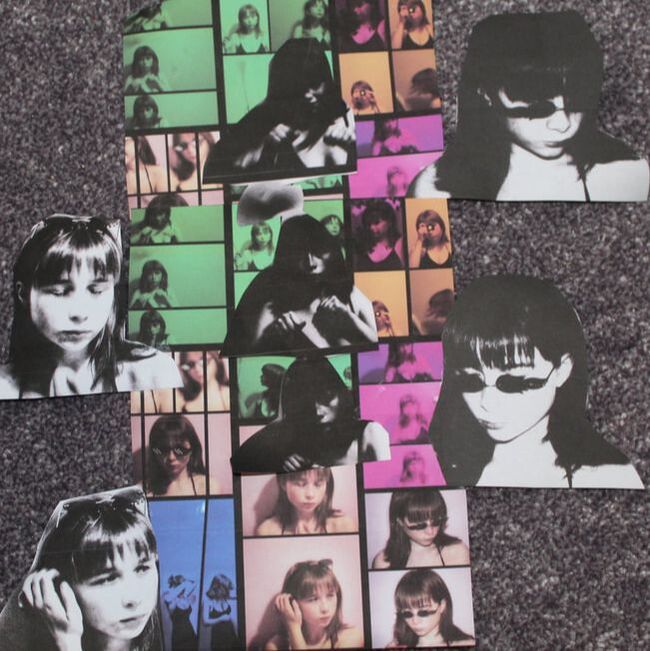
|

|
Edited Images DIGITAL/PHYSICAL and evaluations:
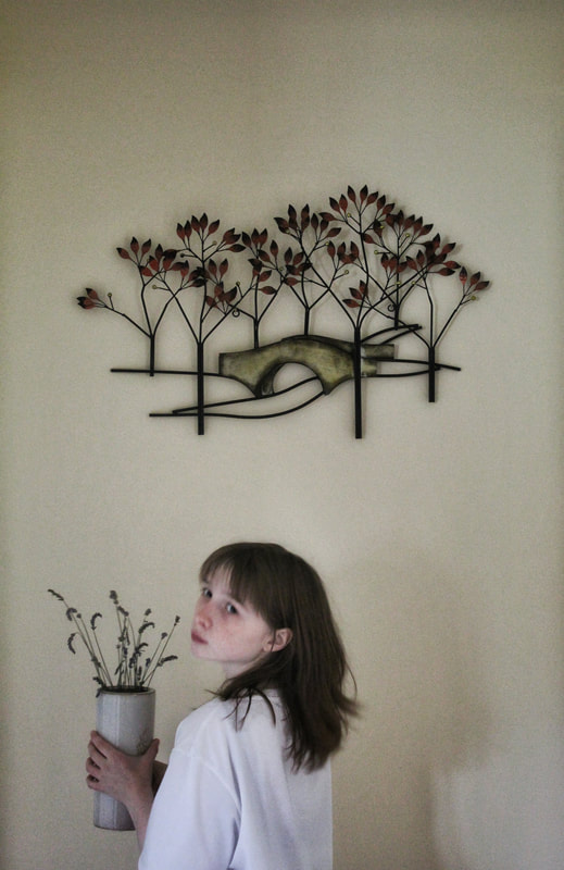
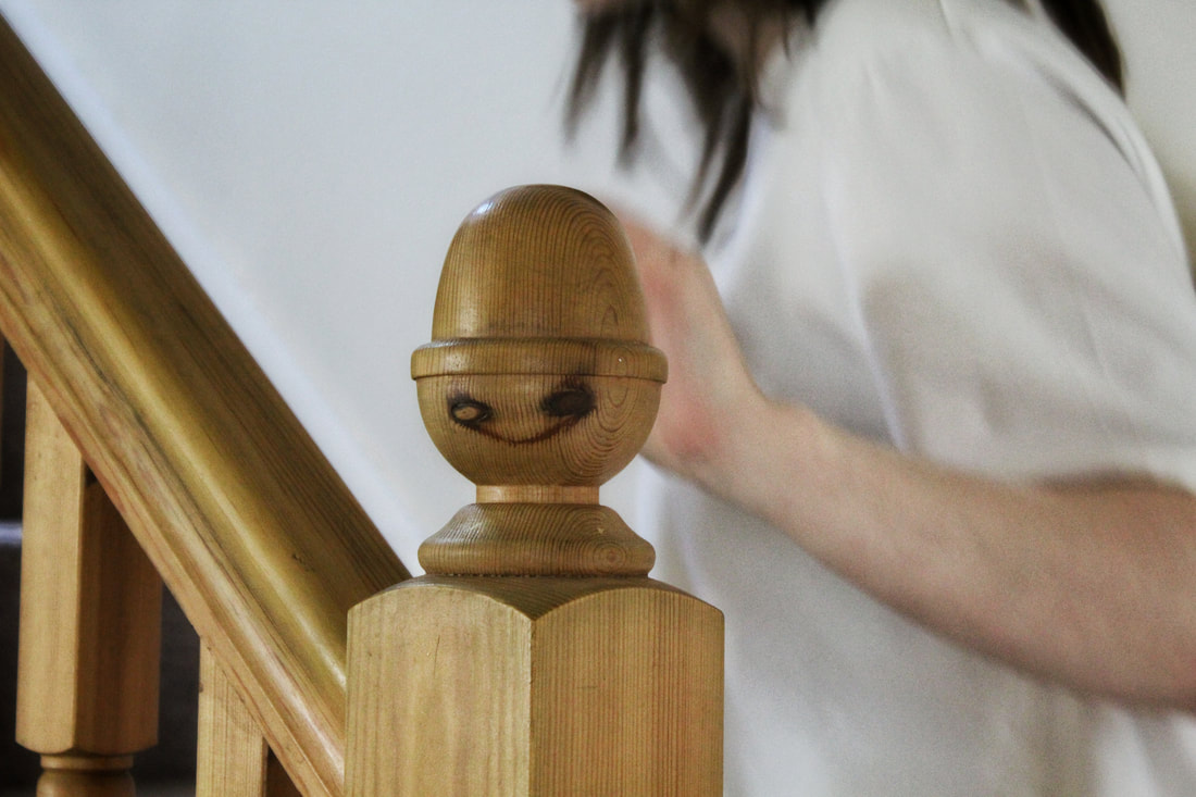
|
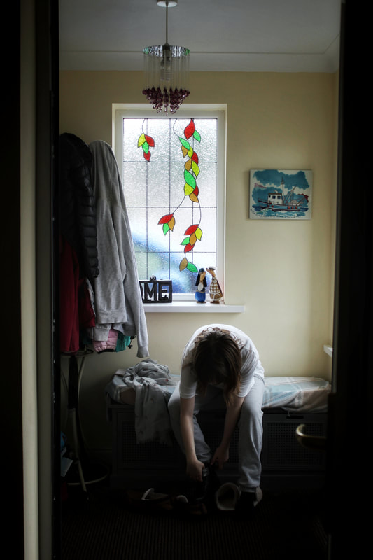
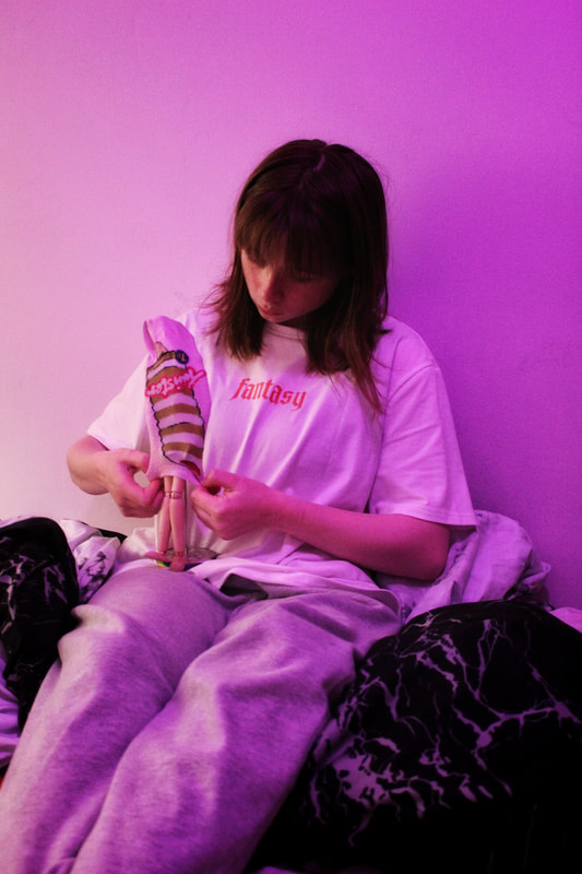
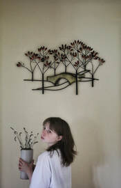
This image from my candid shoot appears to be one of my favourites. The viewpoint of the camera causes the viewer to assume the girl is stood up, holding a vase as she looks behind her in a large room/hallway; however, she is actually knelt down in a small space between two doors, attempting to deceive the onlooker.
I find the similar shades of brown in her hair and on the autumn leaves compatible, only rivalled by the lighter shades of cream and white represented by the colour of the wall, vase and t-shirt, all of which conveying the idea of purity. The idea of the easily-stained colours could present the idea that the model does not often leave the house (meaning the pale colours aren't tainted easily), further shown by the natural landscape above and, though not visible, also exhibited by the words 'fantasy' sprawled across the clothing. I believe the colours match well- the light colours of white, orange and yellow compliment the darker colours of brown and black. The miniature camera clock under the mirror serves as a nice prop, filling in what was previously negative space.
If I take this shoot again, I plan to be at an angle so the words across my clothing is legible; further adding to the vibrancy with contrasts against the lack of expression presented on the girls face. Despite my lack of artistic/creative skills this image seems to be one of my favourites from all my physically manipulated attempts; this mainly due to the monochrome images which I placed towards the side and in the middle of the other vibrant images. The black and white photographs contrast against the collage which is a mixture of different colours.
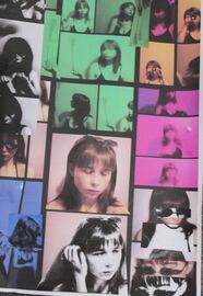
This also happens to be one of my proffered images, simply due to the small changes and edits which took place- these include gluing the same image, but larger, over itself and adding different shades around an image; at first, these are almost unnoticeable, until you look into the detail of the picture. I believe this makes for a more interesting photocollage.
If I was to take this shoot and edit again, I would most likely take more images in monochrome and stick the colourful images on top of the more bland ones- this would allow the physical edit to appear more bold, which would capture the viewers attention much quicker. |
Evaluation/ Portraiture and Identity:
From this project I have developed many skills and gained better understanding of different techniques. Some of the skills I have improved include digital editing, physical editing, using colour to manipulate an image, the use of angle and better control over a tripod; I believe these skills will be very useful, especially in the next project, as angles and colour will be able to enhance photographs of urban environments dramatically- resulting in much more interesting images. The techniques I have been able to use include a wide variety, specifically I think I have best used shutter speed to develop motion blur and light drawing images.
Throughout portraiture and identity I have researched many artists to broaden my knowledge. Jenny Woods, Christoffer Relander, May Xiong and Matthieu Bourel are those who I chose to look into. By researching and emulating them and their work I have gathered a wider range of understanding which influenced my images.
Originally, I googled Jenny Woods as her work immediately caught my attention with its dark colours and strange meanings- from her I learnt how to use tone, colour and contrast to my advantage. This was evident when I created my own similar images at home and on holiday. In Woods' photography it was obvious she often had the help of a tripod and planned in advance, this also helped me with future shoots. Her work helped me explore portraiture and identity through the depth behind just the physical image which other artists often do not include or ignore.
Next, I researched Christoffer Relander who works with silhouettes of people and plants/trees from nature, pulling them both together by double and multi-exposure. Initially, I was inspired by his unusual techniques which go beyond what most artists attempt- he uses lines, shape, form and pattern in a way which is simply unique. My pastiches showed these elements which I attempted to portray. The results are largely manipulated by digital editing, I found this to be a valuable skill in the future. His work allowed me to understand portraiture and identity in a different way to Jenny Woods- whilst hers conveyed deep, upset emotions his represents serenity and calmness.
After this, I investigated May Xiong who uses physical editing in the form of paint and ink. This was very useful for my next artist, Matthieu Bourel, who also physically edits his images. On top of this, I also gained a better understanding of line, shape and colour from this artist much more than others, as these elements largely influence her work. Additionally, her work taught me that forms of abstract subjects and objects within in an image can work to its advantage; I believe this was evident when I tried to recreate her work over the summer with the use of fruits and objects not often seen together. Overall, her work meant I could appreciate the portraiture and identity theme to a much bigger extent, teaching me what other artists did not.
Lastly, I explored Matthieu Bourel's photography which, much like Jenny Woods', stood out in my vision as one of the best. I learnt how to use elements to my advantage (colour, texture and movement.) much like I did with May Xiong's- the two are very similar. I think movement was most well emulated when I created my own versions of his work. His work largely reminds me of the well-known phrase 'you are what you eat.' Bourel's work clearly links to portraiture and identity through his use of overlaying subjects on top of the model's face.
I believe my most successful outcome was the images from my Jenny Woods' shoot. The rule of thirds is well presented throughout my final results which creates a nice framing affect. Though not all of the images were monochrome, all of them did appear dull- this created a nice contrast between the light and dark tones which are also shown in Woods' work. The editing which took place was purely digital and hopefully very similar to Woods' process. I attempted to emulate her use of space in my own work (in that particular shoot and throughout others) which allowed the images to be interesting without clutter. My use of shutter speed allowed some specific images to receive a trail and almost distorted, which I believe worked in my favour. Overall, the shoot was well-planned and I was very pleased with the results.
However, there are many areas for improvement. Personally, I would like to improve my contact sheets and add more detail, improve my physical editing skills, avoid talking about irrelevant things too much and increase creativity which appears to be lacking in some shoots. I believe once I have improved these skills my images and overall portfolio will become better.
