PERSONAL PROJECTS: ABSTRACT NATURE

UNDERSTANDING ABSTRACTION
Abstraction means something which is not classed as 'normal' ; It can be something quite confusing to understand. Abstraction may be classed as abnormal due to the fact its focusing more on a certain element (this could be colour, tone, texture, e.c.t). The element which is being focused on could be repeated, or have something which is in complete contrast. Abstract art depicts something which isn't seen normally. Abstract is all about seeing something from a different perspective than usual, finding shapes and lines in the most common, ordinarry objects.
UNDERSTANDING ELEMENTS AND PRINCIPLES OF DESIGN:
In total there are 7 Elements of Photography (line, shape, colour, tone, texture, space, form) and 7 key Principles of Design (balance, emphasis, movement, pattern, repetition, proportion, rhythm, variety and unity) . Line is the straight or curviness of something, shape is in which the subject is made, colour is the shade of the object, tone is the shade of the colour, texture is what the it looks like it would feels like, space is the area, and form is the structure; balance is how the subject is staying still/what is is on, emphasis is the main part, what is being focused on. Movement is the motion, pattern is the design, repetition is if an aspect is being repeated, proportion is an amount, rhythm is similar to pattern, variety is an extent range of something and unity is the way in which something works with others. Usually the artist will make one area stand out by contrasting it with other areas. The area could be different in size, colour, texture, shape' - I have mainly focused on Texture.
INVESTIGATION OF ELEMENTS / PHOTOGRAPHY SHOOT (Line/Pattern/Texture/Tone/Shape)

|
Line can be used in many ways, such as leading the viewers eye somewhere, or simply to show reputation. Its rather easy to use line in photography as they are everywhere; even if you cannot see them at first. For example, if you increase the shutter speed, you may see lines from the clouds in the sky or from the waves in the sea which are only noticeable after some time. They can significantly increase the impact of images, enticing the audience, and keeping them focused purely on the photo.
|

|
Shape's can help deceive the viewer, especially if the photographer attempts to change the lighting into something almost unnatural. The bottom left image in my photocollage gives of the look of a shell, though on closer inspection is actually a staircase: I believe this was done by the use of shape.
Shapes are also used when drawing, as if a base to grow from and develop. |

|
In the words of google, 'texture is visible details which describe how something physically feels.' This is also something you will always see as texture is all around us, from the fabric you're wearing to the material of the house you live in.
Technically, without material nothing would exist- this means texture is highly common to us, decreasing the chances of us truly noticing and appreciating it. |

|
Space in photography is also something used to almost manipulate or confuse those who see it. Product photographers are most likely to use lots of space, or little space; depending on whether they want their product to appear small or large. Everything is different from smaller or larger distances- take the world for example. Astronauts have captures images of the world which make it look like a small ball, when in reality it's almost 200 million square miles.
|

|
Repetition, something so simple though it portrays amazing patterns. It's seen almost everywhere, whether its the similar leaves on the trees, or the neatly arranged tiles on houses. It's even present in the worlds we vocalise- though we often don't notice, making it something done unconsciously. Naturally; as seen on animals fur and skin.
|
Contact Sheet/Abstract Photography/Experiment 1:

Unedited Images/Abstract Photography/Experiment 1:


For this shoot I used the settings 'monochrome', 'dynamic monochrome' and 'rough monochrome', with an aperture of F2.8, ISO of 1600 and shutter speed 1/60. I took these images in my kitchen as it was raining outside, though the blinds were up to let natural light in. I mainly used macro with the viewpoints consisting of birds-eye view and ground level. I believe I gained a better understanding of how colour greatly affects a photograph.
Edited Images/Abstract Photography/Experiment 1:

|
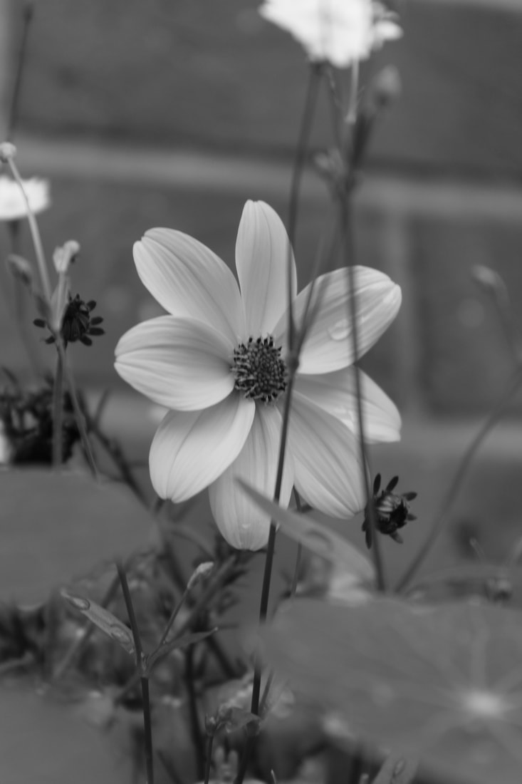
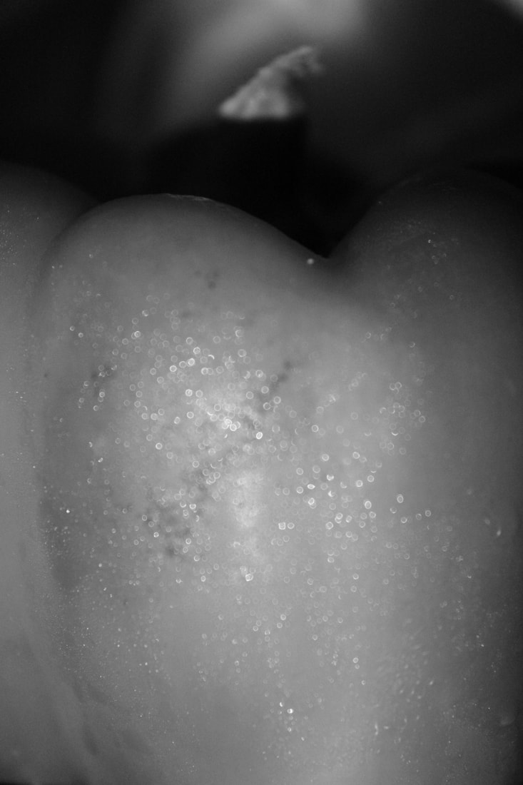
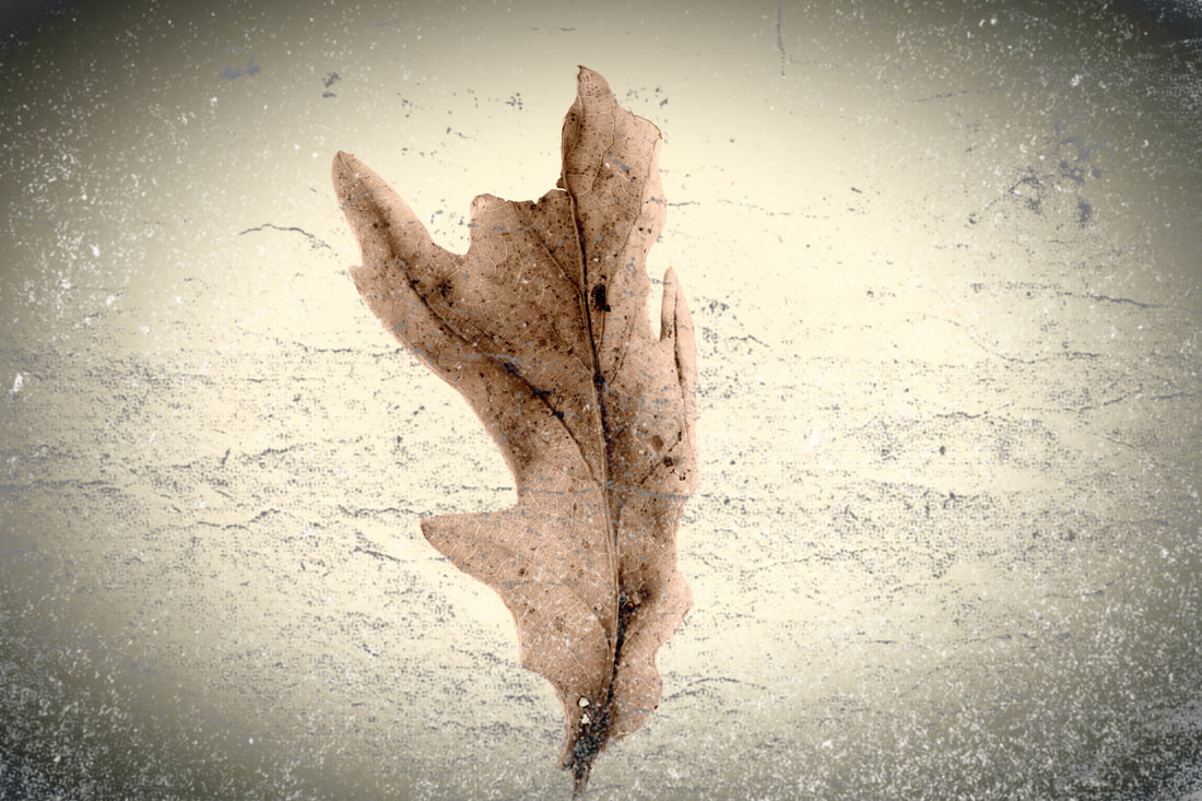
I like this image because by the way it is focused and brings your attention to the middle, where you see different elements, such as shape and line, mixed together to create a natural contrast. The form of the back leaves are almost symmetrical, they practically blend in to the backscene, which I think looks better than a plain backdrop, for this specific photograph.
The slightly grainy affect makes it appear more old-fashioned and less vibrant. The pollen nicely blends with the wall behind; this means the colours almost sync with one another, adding some form of order and sequence. This directs our eyes central as well. |

|
I feel this photo was successful due to the viewpoint in which it was taken from as it captures the flower in a way which personally remind me of a bud, which has newly sprouted into a flower. New life from something so small.
|

|
I think this photograph was one of the best as the perspective (birds-eye view) has a strong impact. I think this because it draws my mind to, yet again, a bud sprouting into a flower, ready for bees to land on it and take its pollen. I particularly like the way in which the leaf towards the right curls, as it adds to the newly-sprouted effect.
|

|
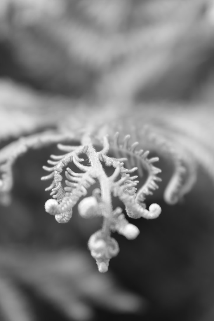
I chose this picture because though it is not very focused, the way the shadow rests upon the leaf is interesting. The contrast between the pollen and where it came from is a nice juxtaposition too, which I believe only adds to my interest of the slightly blurred image.
|
Unedited images/Abstract Photography/Experiment 2:
|


|


|
|
Edited Images/Abstract Photography/Experiment 2:

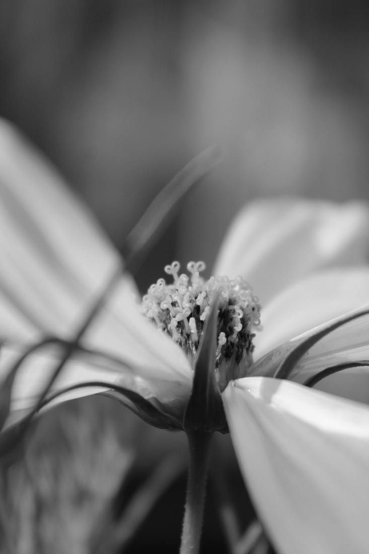
I like this image opposed to others as the water droplets encourage it to stand out. The perspective allows the camera to focus exclusively on the top of the flower, permitting the texture of the petal to attract the attention of the viewer. Little editing, including highlights and shadows, were needed but apart from that not much manipulation was carried out.

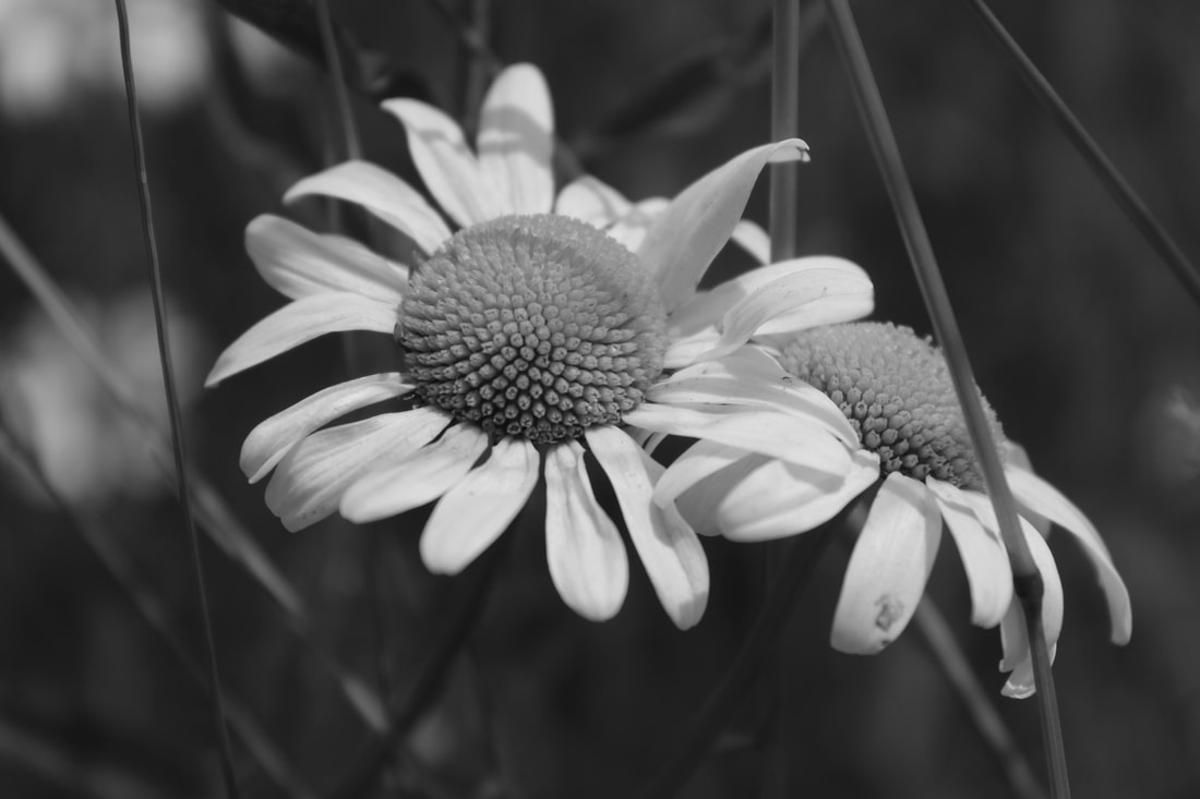
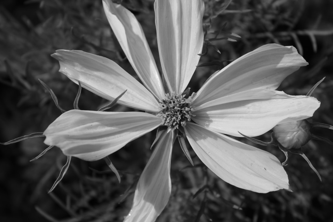
Though this picture can seem bland at first glance, upon further inspection multiple unusual shapes appear- namely the thin-stars and circles. I feel the contrast between the pure petals and dark ground is what brings this image alive. Underneath the flower grow young buds ready to spout, which leads the onlookers eyes towards the crinkling ends, this conveys the theme of death and birth as we see the new 'generation' take over whilst the elder is not quite ready to leave yet.
|

This was one of the images I took closer to home, which I believe is one of the reasons I view it as successful. I walk past it regularly and do not give it much notice, as it's a rather common flower; however, to me, this photo shows the underlying delicacy. The petals act as a shield whilst the star-pollen in the middle a sword. The extra buds behind the 'shield' appear almost as armour.

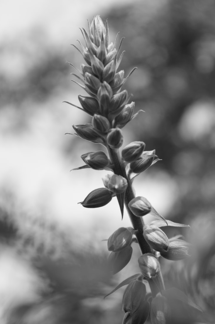
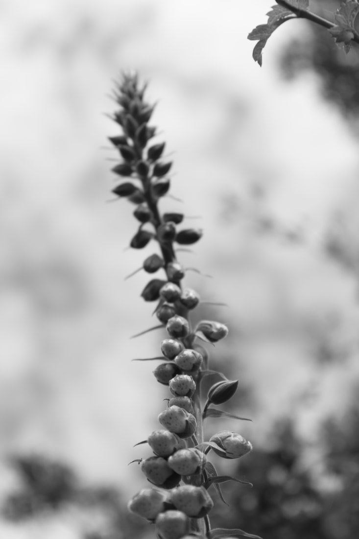
The negative space in this image is useful to us as it does not lead the viewers eye elsewhere other than the subject in shot, it also allows the flower to seem taller than it actually is; whilst leaves and other plant stems frame the outside, the toxic foxglove towers above them- this causes it to seem much larger than it actually is. This is also caused by the bottom part being in focus and the top not, almost as if out of range.
|
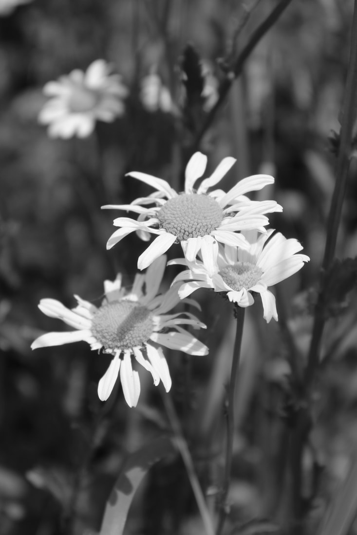
My Best Images:

|

|
Artist Investigation/Edward Weston:
“This then: to photograph a rock, have it look like a rock, but be more than a rock.” – Edward Weston 
|
To begin my Abstract Nature Artist Investigations I chose Edward Weston because he was a famous photographer, well known for his abstract photography. Edward was American, also known for his Still life, landscape and nude photography. I chose this quote as it perfectly explains how something so ordinary and dull can be changed into something amazing. I like this video because the creator of it is someone who is largely influenced by Edward, it shows how Edward creates his images. |
Below are 10 of Edward Westons images which I find inspirational because of the different shapes and textures, which give off different affects.


SEMI Analysis/Edward Weston:

|
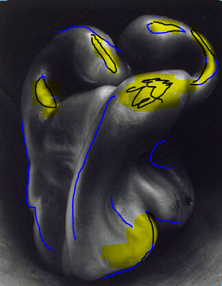
This image is Pepper No.30, which was photographed in 1930, by Edward Weston- it contains the genres of abstract and still life. The props I can see in this picture is 1 green pepper, though its obviously in monochrome. The composition of the photo shows the subject has been places rather close to the camera, but not too close to create a blurred, out of focus affect. This causes the viewers eyes to be led around the photo as they first notice the pepper, then it's almost human-like form. The perspective Winston took this is that of which we use everyday, the fact is simply straight on makes it even more surreal.
The photographer employs a range of visual elements in his work. The most prominent are shape, form and texture. The shape and form on the pepper reminds the viewer of a person trying to scrunch themselves up into a ball, whilst the texture looks like that of a humans back. In summary:
|
Shoot plan/Edward Weston:
Edward Weston inspired me to do this shoot as he was a very good abstract photographer. He often used fruit and vegetables within his photography, which links to abstract nature. The shoot will take place in school, just after midday. I believe if the photos are taken near a window, some effective shadows may appear. I will use onions and maybe baby sweetcorn, placed in plant pot. I also brought a tulip lens hood and gorilla pod; though I don't think they will be needed. The plant pot is to add some sort of frame around the subject/s.
Natural light will be used as I think too much artificial light may lead to a loss of shadows, which could also help to frame the object. The shoot will be low-key, so more light may lead to over-exposure anyway. The angle in which the light is placed largely affects the image, determining which parts are more exposed and which are less exposed. If needed, I will adjust white balance, but probably not lower than -2 or higher than 2. The lighting conditions I believe will produce the best image is most likely on the darker, cloudier side than a bright day. Though, if the weather is brighter than I would have liked I will experiment with high-key. My subject will be lit from the side, and possibly behind if conditions allow.
I shall use the Panasonic Lumix fz82, set to monochrome. I don't particularly intend on using a tripod as handheld often offers more flexibility. I will use a rather quick shutter speed to avoid blur, I am also going to have a fiddle with the ISO and f/ stop to see what type of abstract images I can create.
Contact Sheet/Edward Weston/Experiment 1:

Edited Images/Edward Weston/Experiment 1:


I don't particularly like the outcome of this shoot because I believe I could improve. The shapes of the subject matter aren't as abstract as needed and the pictures aren't of high quality. When I do this shoot again I expect to be using vegetables which hold more obscurity than the previous. Though the underexposure looks on point, you can often se the light source and dirt of plant pot laying beneath; this does not give the overall photo a visually pleasing look.
Unedited Images/Edward Weston/Experiment 2:
|

|
Edited Images/Edward Weston/Experiment 2:

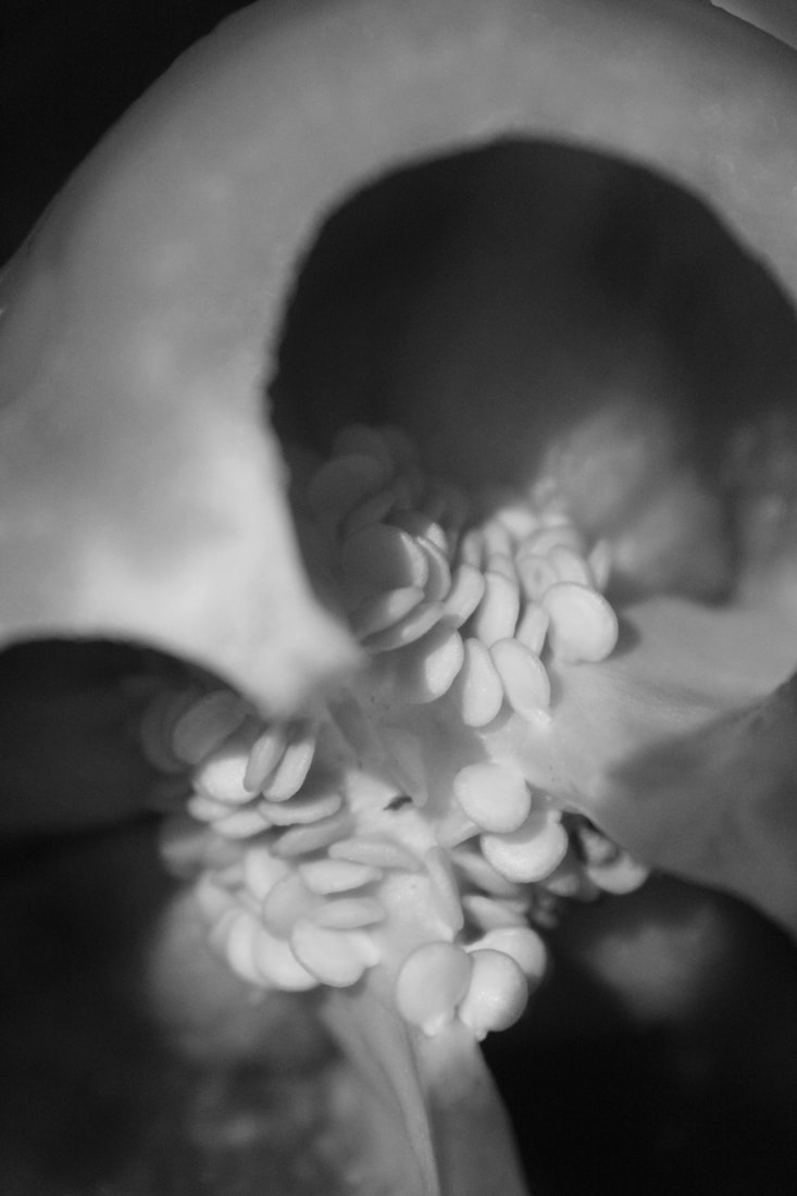
I like this image to an extent. The advantages of it would be the vintage/old-fashioned style editing which I believe allows the seeds and shape to stand out, the dark contrast of the hollow middle, causing the illusion of endless seeds within the pepper.
The main disadvantage of this photograph include the unusual low-quality which appears to be presented due to to the focus on the seeds and blur of the surrounding. However, overall, I like the picture and class it as a favourite from this specific shoot. |

Though the editing of this photo could be largely improved, the mistakes could easily be passed off as part of the plain pattern. I think this should have been digitally manipulated with a similar style to the last, as this shoot should be underexposed and low-key.
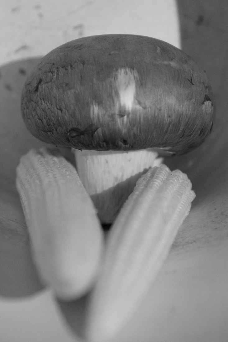
My previous pepper images appears more natural via the vintage editing which makes a dirt-like appearance. The mushroom looks unnatural due to its fake cleanliness. Though I would say its one of the best from is shoot it does not fully meet the success criteria required. |
Abstraction through cyanotypes/Anna Atkins:
|
Anna Atkins (179-1871) was an English photographer who was also largely known for scientific reasons, much like her father. The cyanotype process is rather cheap as not much expensive equipment is needed, neither do you need immense knowledge to copy DIY cyanotype YouTube videos. However, though the hobby isn't as costly as others, some equipment should still be bought to ensure the correct process is used. In addition to this disadvantage, the colour will always stay cyan, meaning people who don't particularly like the colour, or prefer a range of contrasting colours, won't find much enjoyment in this. |


Here are my cyanotypes that I made in lesson. I really enjoyed this technical process because it was interesting to see how it was made and developed using photosensitivity.


Horst P. Horst/The unfamiliar and abstract:

|
|

|


Artist Investigation / Karl Blossfeldt:

“The plant never lapses into mere arid functionalism; it fashions and shapes according to logic and suitability, and with its primeval force compels everything to attain the highest artistic form.” |
After studying the work of Edward Weston, Anna Atkins and Horst P. Horst I will now further my research into Abstract Nature by looking at the work of Karl Blossfeldt.
Karl Blossfeldt was born June 13, 1865, Schielo, Germany and is most famously known for his stark close-up portraits of plants, twigs, seeds and leaves. In these photographs he often used different elements such as texture, the rule of thirds and focal point. I think he used focal point as a priority because his subjects are often in the centre of his photos. I chose this inspiration quote because it sums up the work of Blossfeldt as it speaks of nature and artistic forms, something he worked closely with. This video is inspirational to me because it talks about his life and his upbringing, including what he did and didn't use for his photography. |
Animation Response/Karl Blossfeldt:
|
|
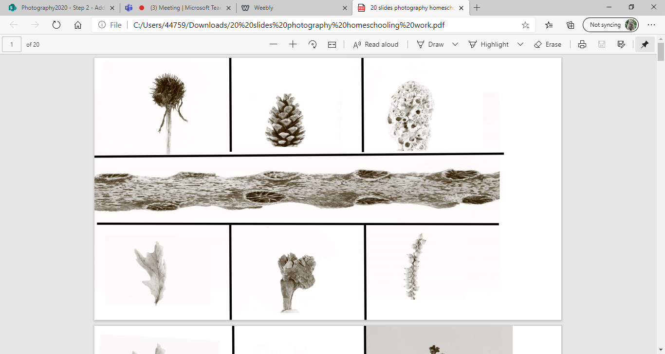
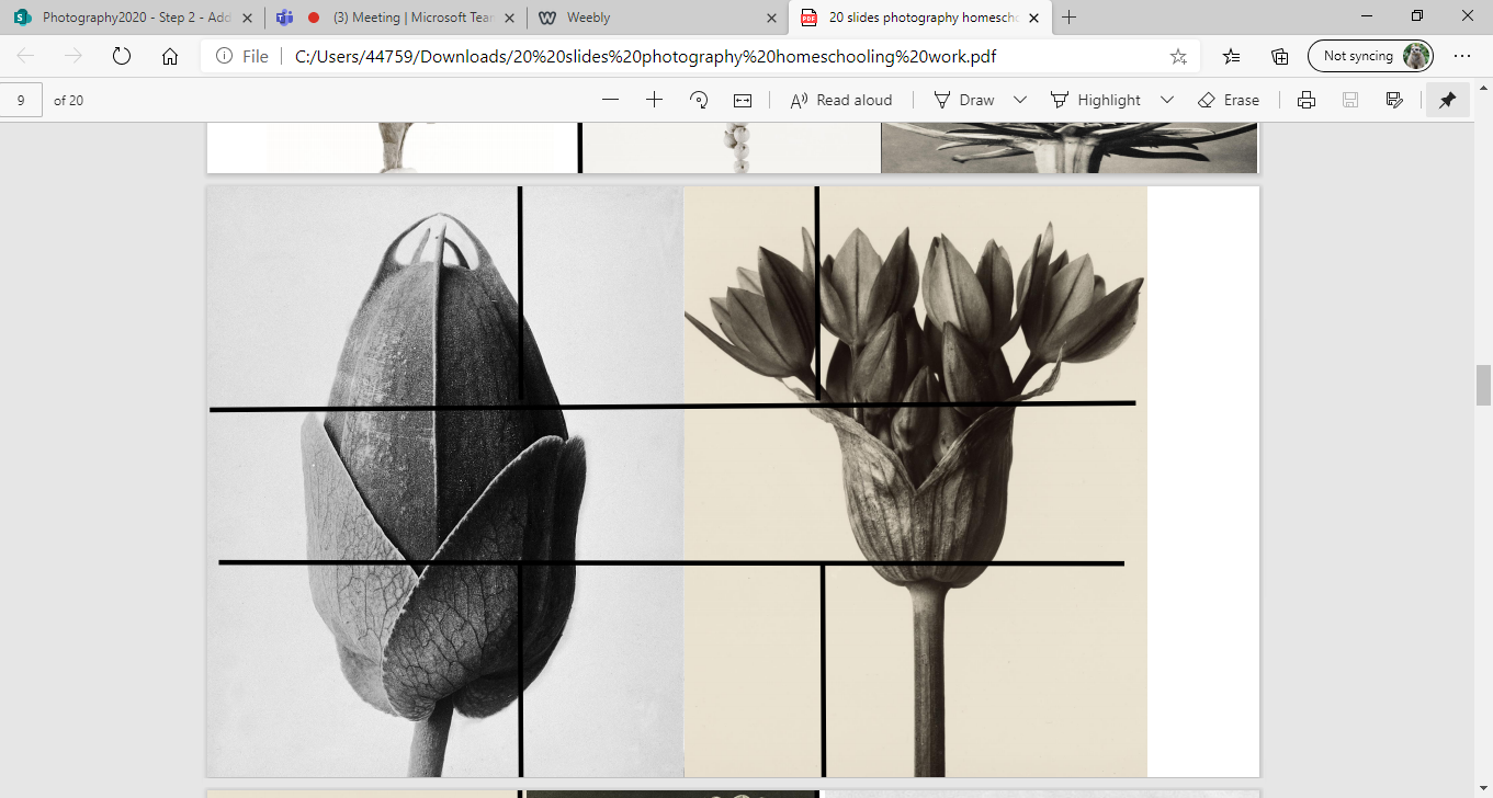
Below are a selection of 10 Karl Blossfeldt images:


Shoot plan/Karl Blossfeldt:
This shoot was inspired by Karl Blossfeldt because I have been exploring his high-key, abstract Nature photography. This greatly inspired me, making me keen to emulate his style. The shoot will take place in the classroom and at home. The classroom was used because the large windows allows natural lighting, whilst doing it at home offers more space and time. The photographs will be taken midday as that is often the brightest part of the day.
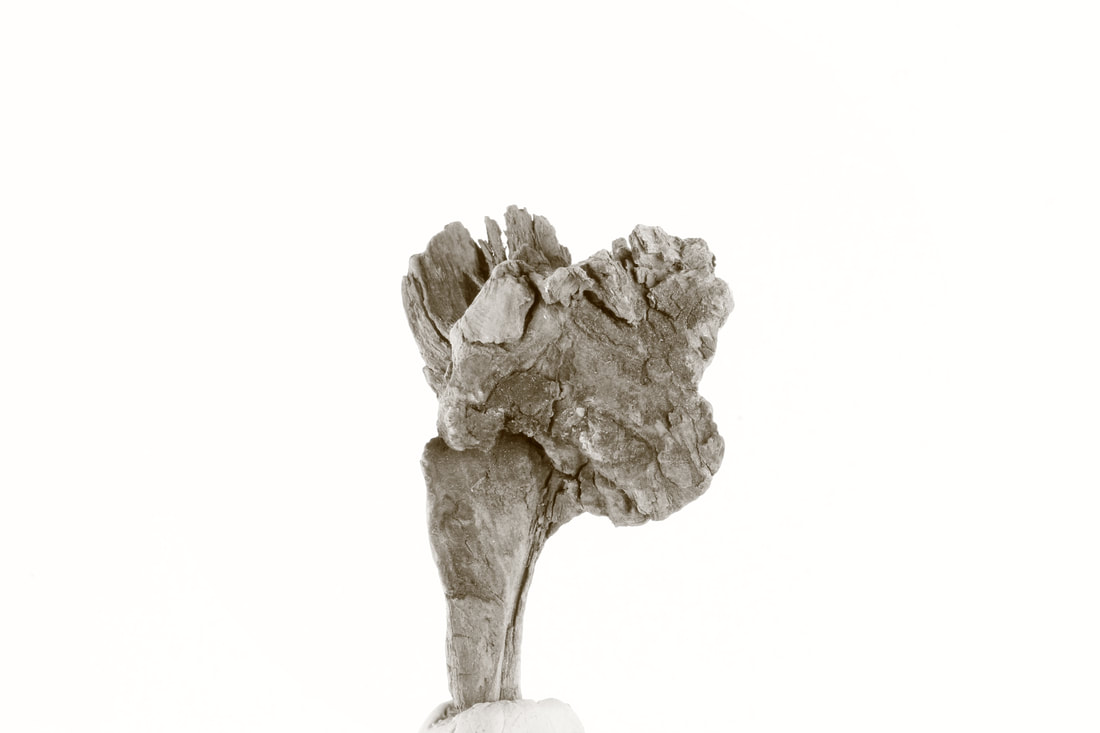
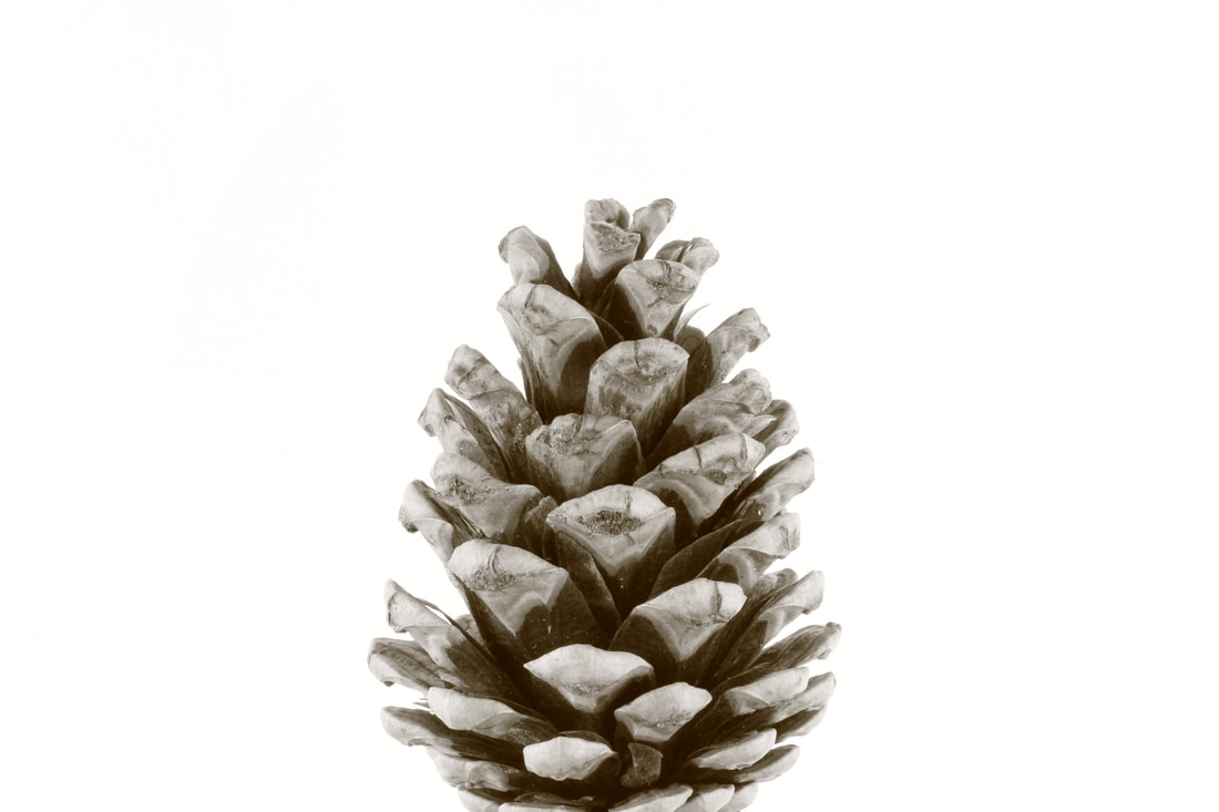
Some considerations such as weather will be accounted for. The props used will be natural forms such as plants, flowers and pinecones as they were commonly seen in Blossfeldt's work and offer a large range of texture and opportunities. Lots of light will be needed as it is high-key. The position of light will affect the images as it may leave one part of the image more shadowed. If low light, settings such as white balance may be altered and artificial lighting used.
My subject will be front lit to avoid shadowing. I may use a Lumix fz82 bridge and macro setting to emulate this style. I also intend to switch between depths of fields to avoid similar images, and a quick shutter speed so a tripod will not have to be used, ensuring maximum flexibility.
Contact sheet/Karl Blossfeldt:

Karl Blossfeldt High Key photography shoot:


Editing Process/ Karl Blossfeldt:
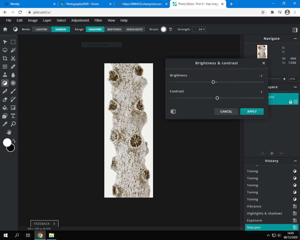
To edit the example of Karl Blossfeldts images I used pixlr, when doing this I focused on cropping and adjusting. Here are screenshots from my process.

|
|
|
1. Cropping using the rule of thirds.
|
2. Adjusting the brightness
|

3. Then I applied a small amount of dodging and burning.
9 best images/Karl Blossfeldt:

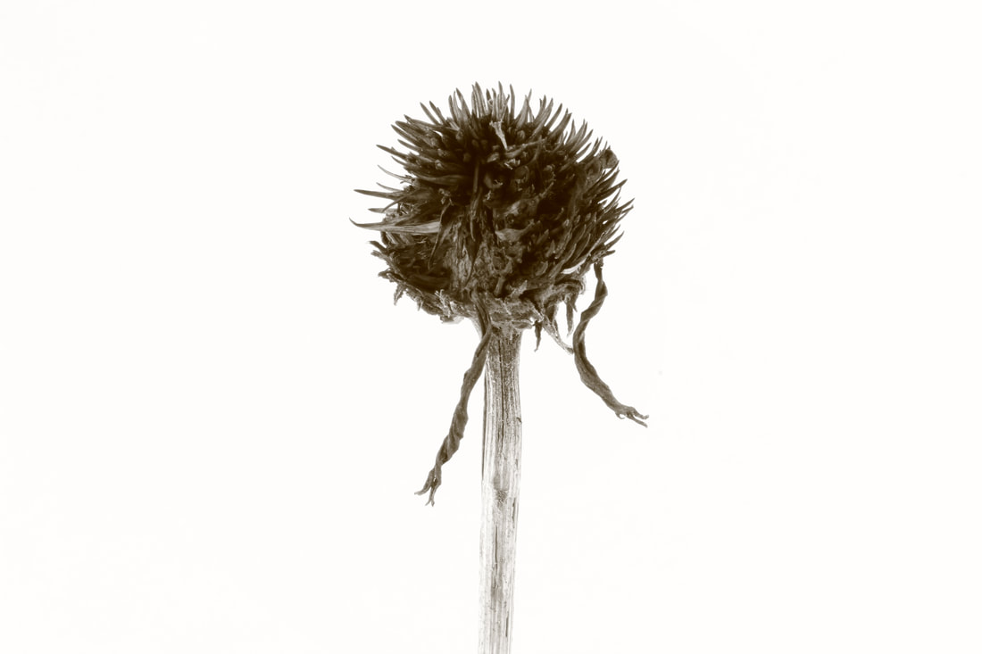
|

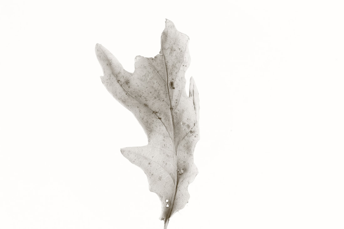
|

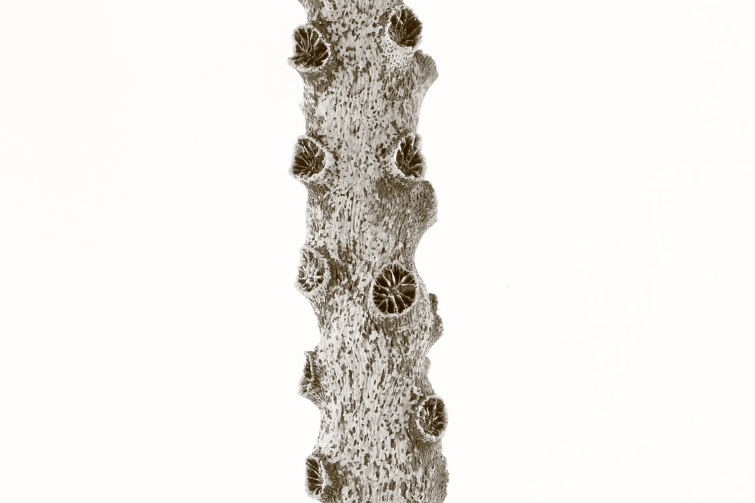
|
|
|
|
My Edited Overlays/Karl Blossfeldt
|
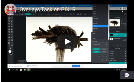
First, I uploaded an image onto Pixlr-E and made some very minor edits. Then, using layers, added an overlay image and merged them, adjusting the Opacity. After this, made some small changes in the hue and temperature. When everything looked okay I saved the changes before moving onto the last step. I used the vignette option to enhance the edge of the photographs slightly. An overlay is an image or texture that is added as an additional layer to your photograph using an editing program. This can cause effects such as rain, snow, and light rays etc. |
|
|


Evaluation of Karl Blossfeldt Investigation :
When evaluating Blossfeldt's work, I think I have gained better knowledge of a large variety of subjects, such as how to set up a shoot and how to use high key photography to my advantage.
In school, I have acquired new vocabulary and explored different types of photography. For the Karl Blossfeldt task, we focused on ‘High Key’ photography and we took shots with tripods, used box lighting, 50 mm prime lenses, varied shutter speeds and a 2 second timer. High key photography is very bright (high exposure) so we made light studios to help emulate Blossfeldt's work effectively. In ‘High Key’ photography there should be no shadows and the subject matter should appear bright and crisp. The florescent lights or ‘soft boxes’ were key to this shoot.
Emulating Blossfeldt's style at home was more difficult as I set up in the study room, so it would be more peaceful. However, this only lead to little light, having to use the back of a pinboard as backdrop and little space to work with.
On Pixlr, I used the cropping tools to enhance composition and to draw attention to the subject matter. There were also other tools such as the magic wand and the selection tool for which I used to correct background colours. It allowed me to change different aspects of the photo individually, which i found very useful.
Additionally there was an occasion where I used Photofunia to edit my photos by adding vintage framing and sepia filters. Photofunia allowed me to access a range of ‘graphic assets’ to suit my project’s needs.
I believe my most successful outcome was the PIXLR overlays as I had to learn new techniques and I now feel more confident when using editing software. By using the overlays, it also have me money confidence when adding additional layers to the original.
I believe I definitely have some areas for improvement such as doing more research into the photographer and his creations, editing better, using photofunia more often and being more descriptive in explanations.
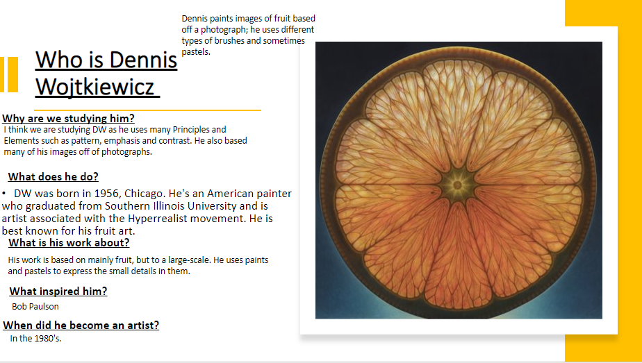
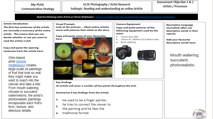
Artist Investigation/ Dennis Wojtkiewicz:
|
Email Quote – Direct Artist Response Why this artist? The final artist in the Abstract Nature project is Dennis Wojtkiewicz. This artist differs from my other artists because he emulates photographs of fruit and uses colour. However, there are similarities such as abstraction and natural forms. Who is he/she? Dennis Wojtkiewicz was born in America and is most famously known for his immaculate photo realistic paintings which contain mouth-watering fruits. His website is: www.wojtkiewiczart.com Why the quote? The quote is from a direct email response from Dennis. W himself. From the email, I was able understand what equipment & techniques he uses such as Canon EOS 90D camera with a Canon EF 100mm f/2.8 Macro USM fixed lens and backlighting. Why this video? This video is inspirational to me because it shows all of DW's greatest work, including succulent grapefruits. |


Photographic Techniques / Macro Photography:

|
Macro photography is extreme close-up photography, usually of very small subjects and living organisms like insects, in which the size of the subject in the photograph is greater than life size.
|

Shoot plan / Dennis Wojtkiewicz:
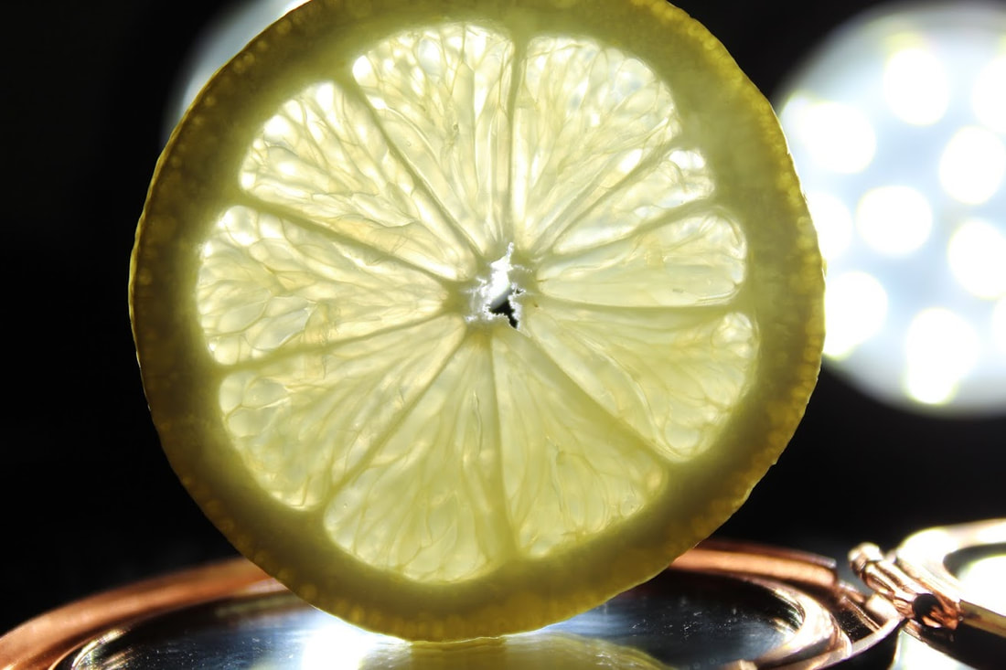
I have been inspired to create a shoot on the work of Dennis Wojtkiewicz because of his amazing talent in photography and art. I will do the shoot indoors with the curtains shut and will use 2 small photography lights as to control the lighting. The subject will be a grapefruit, lemon and lime, freshly cut. The images will be taken on a canon 4000D, using a kit lens and sometimes a reverse ring. A tripod will also be used along with the canon app to avoid shaking. The camera settings shall be f/5.6, ISO 100 and shutter speed 1/1600. I am looking forward to this shoot as the artist does very impressive work which does not look easy to emulate.
Contact Sheet/Dennis Wojtkiewicz:


Unedited Shoot/Dennis Wojtkiewicz:

|

|


|

|
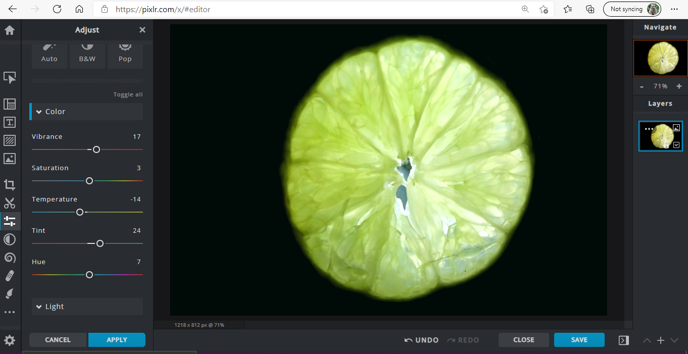
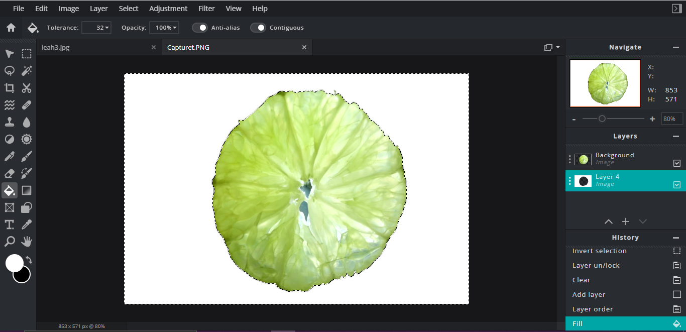
Editing Process/Dennis Wojtkiewicz:
|
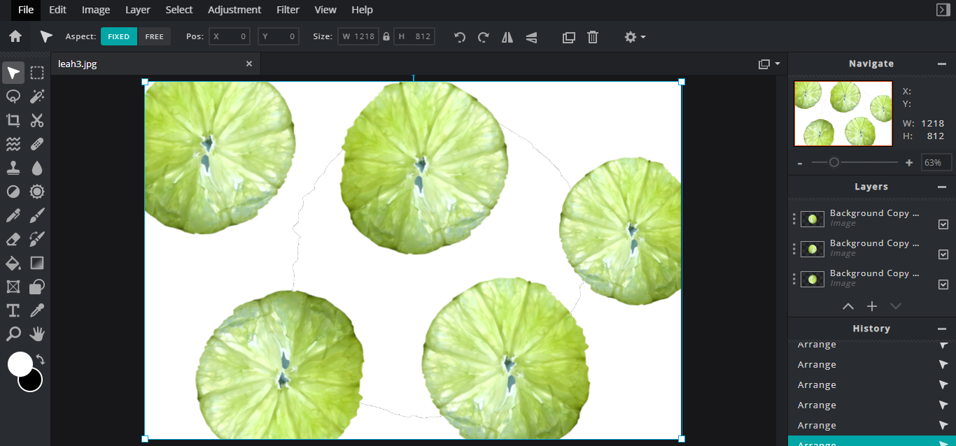
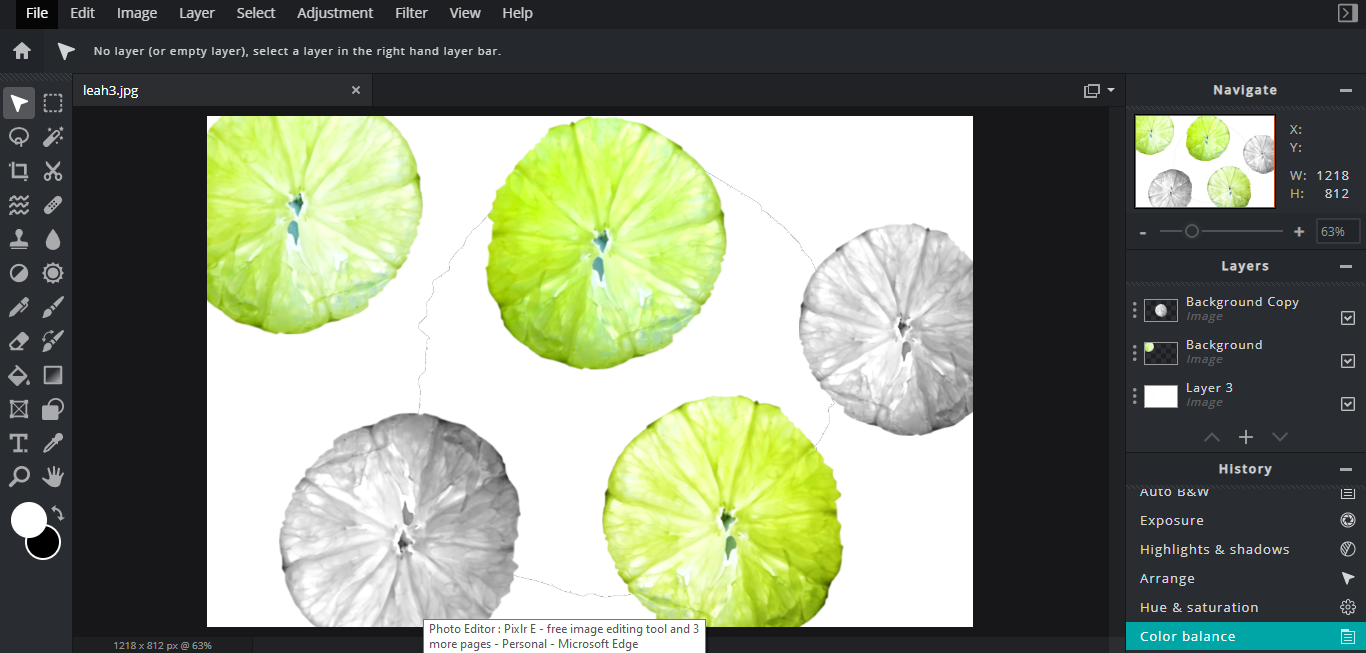
Editing Step 1: I used the adjustment tools to enhance the colour of the lime from my original image shoot. This helped to brighten the fruit, and heighten its exposure. The lime's original rather dark background remains.
Editing Step 2: In this screenshot I used the 'lasso' tool on pixlr to delete the original background and replace it with a white one. This meant I could edit the lime much easier in the future.
Editing Step 3: Then, I selected the lime, copied and pasted it, before placing then separate ones in different places. Editing Step 4: Lastly, I changed the colour of each piece to make the individuals stand out.
|
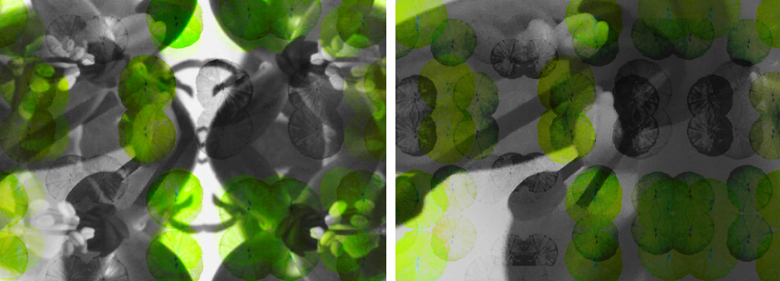
Rational Images/Dennis Wojtkiewicz:
Using rotational symmetry and the work of Horst P. Horst I have created multiple rotational designs, which strong include shape, colour and tone. These will ne further developed using PIXLR E.


Abstract Nature Art Evaluation:
I believe I have gained many important skills throughout the ‘abstract nature’ project. Examples of this may be a broader understanding of ‘abstract photography’, a larger knowledge of how high-key and low-key tones effect the image, and the interesting forms nature creates and how they can be used and manipulated (Digitally and by hand) to create something surreal.
Initially I researched the work of Edward Weston; He created inspiring photography by using natural shapes, such as his famous pepper image, often using low-key tones and the 'dodge and burn' technique to contrast the dark colours with small highlights. Through studying this artist, I was able to explore concepts of line, shape, tone, contrast, space and harmony in my own photography examples. Inspired by their work, I created a series of emulations by using lighting and abstract yet natural shapes. I investigated the technical processes of digital manipulation. Their work helped me understand the theme of abstract nature by showing me how normal things can be changed to look into something completely different simply by taking a different stance.
Personally, I think the most successful outcome of the project was gaining a bigger understanding of how to correctly use the rule of thirds to develop a restful and dynamic composition. The dodge and burn tool has also been useful, as has increasing the ability to see from different angles, working out which is best for a particular form. Space and exposure have been very helpful when learning: The brightness and position of the subject have a large affect on the dynamics of the imagery. Furthermore, research has been a big factor and I believe I have learnt how to carry out adequate research into an artist, whether that be via google or contacting the artist themselves.
My areas of self improvement include more control over settings, better enhancing of photos, further artist research and extra annotation detail. I believe I can improve these over time by practise.
Abstract Nature/ Hand Manipulation Sample board:

